Creating components from templates: Alert
With this template you can add a new Alert component to your project. Alert is a complex component intended to display a message text with additional push buttons. At the runtime the application presents the Alert to the user in order to inform him/her about an event or to ask the user for a confirmation. When one of the push buttons found in the Alert is activated, the component sends signals to associated slot methods where your particular implementation is executed. If the Alert is focused the component can also be controlled by pressing keys on the keyboard or by using hardware buttons.
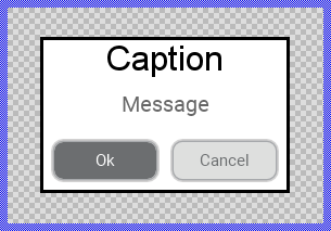
Components created with this template are intended to be adapted to your particular design expectations. After adding the new Alert you should edit the component, change its appearance and if desired also its behavior. Once you have adapted the component, you can embed instances of this Alert wherever you need in your GUI project. Because it serves as template, it is intentionally kept very simple. Nevertheless, Alerts created by the template are working widgets. If desired, they can already be used as they are. The following figure demonstrates the default appearance of the Alert created by using the here described component template:
The approach with component templates has two functions. Primarily the templates should simplify the development of new components. Instead of creating the Alert from scratch you can use the available template. The second function is more educative. The template implements fully working Alert component you can investigate and learn about the corresponding programming aspects. The template is well documented. It contains annotations and inline comments with instructions helping you to understand how the component works and how it can be adapted to your particular needs.
This chapter provides an overview how the Alert component template is used within your own application and how you adapt this component according to your particular needs. You will find here also further details concerning the internal implementation of the Alert component.
Add new Alert component
To create a new Alert component from a template you simply Drag & Drop it between the Templates window and the Composer with an opened unit. This is important in that by using the component templates you add in fact a new class to your project. Classes, in turn, can exist within units only. The following are the typical steps to create a new Alert component from a template:
★First switch to the Composer page for the respective unit, where you want to add the new Alert component.
★Then ensure that the Templates window is visible.
★In Templates window switch to the folder Component Templates.
★In the folder locate the Alert template.
★Drag & Drop the template into the Composer window:
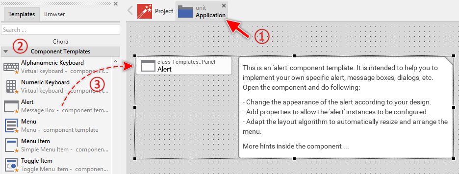
★Eventually name the new added component.
The new created Alert component appears accompanied by annotation providing helpful tips how to proceed. If undesired, you can select and delete the annotation.
Use the Alert component
Once you have created the Alert component, you can use it in your application to display messages to the user or to ask the user for a confirmation. For example, when the user intents to delete a file, an Alert may be displayed asking the user whether or not to proceed.
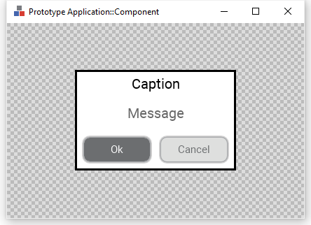
Component templates are intended to create widgets which can be modified and adapted to your particular design expectations. In the following sections you will learn how to do this. Originally, if not yet modified, the Alert appears as a white rectangle surrounded by a border and displaying a caption and message text. Additional two push buttons are available. Our intention is to keep the component templates as minimalistic as possible so they don't distract you with less important design details:
Step 1. Understand existing properties of the Alert
The Alert component exposes several properties permitting instances of the Alert to be configured conveniently. The Alert component descends from the Mosaic class Core::Group and as consequence, it inherits a lot of properties from this base class. Particular to the Alert component are only few following properties:
Property |
Description |
|---|---|
Caption |
The property Caption stores the text to display within the alert header. |
Message |
The property Message stores the text to display within the message area of the alert. |
Button1Label |
The property Button1Label stores the text to display in the first push button. |
Button2Label |
The property Button2Label stores the text to display in the second push button. |
OnButton1 |
The property OnButton1 can store a slot method to signal when the user activates the first push button. |
OnButton2 |
The property OnButton2 can store a slot method to signal when the user activates the second push button. |
Step 2. Present a new Alert instance
The usual approach is to present alerts programmatically as so-called dialogs. The following code demonstrates how to achieve this. It creates an instance of the previously created Alert component (e.g. Application::Alert) and presents it as dialog using the method PresentDialog():
// Create a new instance of the Alert component ... var Application::Alert alert = new Application::Alert; // Configure the properties of the Alert alert.Caption = "WARNING!"; alert.Message = "Should delete the files?"; alert.Button1Label = "Yes"; alert.Button2Label = "No"; alert.OnButton1 = onDeleteFilesSlot; alert.OnButton2 = onDontDeleteFilesSlot; // ... and present it as dialog. rootthis.PresentDialog( alert, null, null, null, null, null, null, null, null, false );
Step 3. Arrange the Alert on the screen
When using the above described PresentDialog() method, the alert is arranged in the center of the superior GUI component. In case of rootthis it is the center of the entire screen. If desired, you can provide in the second parameter of the PresentDialog() method a transition object configured to apply other layout rules to the presented dialog. The transition objects also permit you to display the Alert with additional animations (e.g. sliding). For more details see the section Customize provided Dialog transition animations.
The following steps explain how to position an alert, for example, aligned to the right edge of its owner component, vertically centered, with 20 pixels distance from this edge:
★Configure its property MarginRight with the value 20 and in the property Alignment ensure that only the options AlignHorzRight and AlignVertCenter are enabled.
★Now you can use the configured transition object when presenting your alert:
// Create a new instance of the Alert component ... var Application::Alert alert = new Application::Alert; // Configure the properties of the Alert alert.Caption = "WARNING!"; alert.Message = "Should delete the files?"; [...] // ... and present it as dialog. rootthis.PresentDialog( alert, AlertRightAlignedTransition, null, null, null, null, null, null, null, false );
Step 4. Implement Alert's slot method
In its default version, the Alert component includes two Push Buttons. When the user activates one of the buttons, a signal is sent to the associated slot method. The slot method is connected to the component by simply assigning it to the for this purpose available properties OnButton1 and OnButton2. You can initialize the properties with already existing slot methods or you add a new one and implement it as desired. The following steps describe how to do this:
★First add a new slot method to your GUI component.
★Assign the slot method to the property OnButton1 or OnButton2 of the affected Alert. For example:
// Create a new instance of the Alert component ... var Application::Alert alert = new Application::Alert; // Configure the properties of the Alert alert.Caption = "WARNING!"; alert.Message = ... // Assign slot methods to the Alert alert.OnButton1 = onDeleteFilesSlot; alert.OnButton2 = onDontDeleteFilesSlot; // ... and present the Alert rootthis.PresentDialog( alert, null, null, null, null, null, null, null, null, false );
★Open the slot method for editing.
★In the Code Editor implement your desired operation to execute when the event occurs. For example:
// Obtain information which alert sent the signal. Note, 'sender' refers the // activated button. By using 'Owner' we can access the superior alert // instance. var Core::Group alert = ((Core::Group)sender).Owner; // Dismiss the actually active dialog again. alert.Owner.DismissDialog( alert, null, null, null, null, null, false ); // Perform the operation related to the pressed button DoSomething();
Per default, activating a button does not automatically dismiss the alert. You need to explicitly invoke the method DismissDialog() within your slot method implementation to close the alert. This gives you full control over when and how the alert disappears.
Open the component for editing
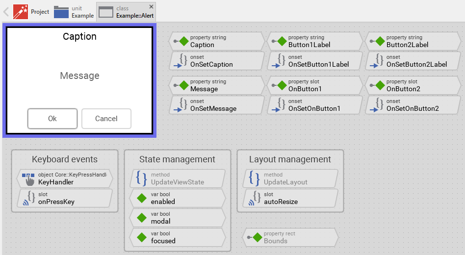
Component templates are intended to create widgets which can be adapted and enhanced to your particular design expectations. For this purpose, once you have added a new Alert component to your project, you can open the component class for editing. Thereupon the implementation of the component appears in a new Composer page:
Originally, if not yet modified, the Alert appears displaying a caption text, a message text, a white background surrounded by a border and two push buttons. Our intention is to keep the component templates as minimalistic as possible so they don't distract you with less important design details. The Alert can react to touch and keyboard inputs. The appearance of the alert border and text reflects the actual state of the alert. Especially when the alert is focused (able to receive keyboard events), the border appears thick.
This default functionality is implemented by following members belonging to the Alert. These members are explicitly intended to be modified. Understanding this internal structure is thus the first step before you start to adapt the Alert to your particular needs:
Icon |
Member |
Description |
|---|---|---|
|
Caption |
The property Caption stores the text to display within the alert header. |
|
OnSetCaption |
The onset method belongs to the property Caption. Each time the value of the property is changed, the code implemented in the method is executed to update the caption text view and recalculate the alert size. |
|
Message |
The property Message stores the text to display within the message area of the alert. |
|
OnSetMessage |
The onset method belongs to the property Message. Each time the value of the property is changed, the code implemented in the method is executed to update the message text view and recalculate the alert size. |
|
Button1Label |
The property Button1Label stores the text to display in the first push button. |
|
OnSetButton1Label |
The onset method belongs to the property Button1Label. Each time the value of the property is changed, the code implemented in the method is executed to update the button's label and recalculate the alert size. |
|
Button2Label |
The property Button2Label stores the text to display in the second push button. |
|
OnSetButton2Label |
The onset method belongs to the property Button2Label. Each time the value of the property is changed, the code implemented in the method is executed to update the button's label and recalculate the alert size. |
|
OnButton1 |
The property OnButton1 can store a slot method to signal when the user activates the first push button. |
|
OnSetOnButton1 |
The onset method belongs to the property OnButton1. Each time the value of the property is changed, the code implemented in the method is executed to connect the button with the specified slot method. |
|
OnButton2 |
The property OnButton2 can store a slot method to signal when the user activates the second push button. |
|
OnSetOnButton2 |
The onset method belongs to the property OnButton2. Each time the value of the property is changed, the code implemented in the method is executed to connect the button with the specified slot method. |
|
KeyHandler |
This key handler reacts to key press events. When the user presses the Tab key, the handler is activated and the method onPressKey is called. This enables keyboard navigation between the push buttons. |
|
onPressKey |
This internal slot method is called when the KeyHandler has been activated (when the user has pressed the Tab key). Thereupon, the method navigates to the next push button in the alert. |
|
autoResize |
This internal slot method is called automatically when the content of the alert changes (caption, message, button labels). The method calculates the optimal size for the alert to fit all content and adjusts the alert's Bounds property accordingly. |
|
Background |
This Filled Rectangle view displays in the template the background of the alert. The background is white per default. |
|
Border |
This Border view displays in the template the border of the alert. Depending on the alert's actual state variables enabled, focused and modal the border's color and thickness changes. |
|
CaptionText |
This Text view displays the caption text at the top of the alert. The text content is determined by the property Caption. Depending on the alert's actual state, the text color changes. |
|
MessageText |
This Text view displays the message text in the center of the alert. The text content is determined by the property Message. The text is wrapped automatically within the available area. Depending on the alert's actual state, the text color changes. |
|
PushButton1 |
This Push Button widget represents the first button in the alert. The button's label is determined by the property Button1Label and when activated, it signals to the slot method specified in the property OnButton1. |
|
PushButton2 |
This Push Button widget represents the second button in the alert. The button's label is determined by the property Button2Label and when activated, it signals to the slot method specified in the property OnButton2. |
|
UpdateViewState |
This method is invoked automatically after the state of the component has been changed. In case of the Alert, the method updates the views Background, Border, CaptionText and MessageText so they reflect the alert's current state. |
|
UpdateLayout |
This method is invoked automatically when the layout of the alert changes (e.g. when the alert is resized or content is modified). The method triggers the autoResize slot to recalculate the alert size. |
|
enabled |
This variable stores the current state of the alert. It is true if the alert is allowed to handle user inputs (the component is enabled). See also Control the Enabled state of nested components. If the alert is actually disabled, the variable is consequently false. |
|
modal |
This variable stores the current state of the alert. It is true if the alert is actually presented as modal dialog (the alert grabs all user inputs and overlays all other GUI components). |
|
focused |
This variable stores the current state of the alert. It is true if the alert lies on the focus path and can receive keyboard events. The user can thereupon control the alert via keyboard. |


Understand the state management of the component
During its lifetime, the Alert will assume different states as direct effect of user interactions and as result of other superior state alternations within the GUI application. To track its current state the Alert manages the above mentioned state variables: enabled, modal and focused. The variables are evaluated and updated within the implementation of the method UpdateViewState. This method evaluates the common component states (Enabled, Modal and Focused). At the end of the method the estimated states are stored in the state variables:
// Estimate the new state var bool isEnabled = aState.contains( Core::ViewState[ Enabled ]); var bool isModal = aState.contains( Core::ViewState[ Modal ]); var bool isFocused = aState.contains( Core::ViewState[ Focused ]); [...] // Remember the new state enabled = isEnabled; focused = isFocused; modal = isModal;
For example, the local variable isFocused will become true if the alert lies on the focus path. Being in this state, the alert should assume the appearance indicating that the user can actively interact with it via keyboard.
When common component states (Enabled, Modal or Focused) have changed, the method UpdateViewState is invoked automatically. You don't need to worry about it. Any other state alternations need to explicitly request an invocation of the UpdateViewState method. When you modify the Alert to handle other user inputs or perform other animations always ensure that each state alternation (each event) does request an invocation of UpdateViewState. In your implementation you use for this purpose the method InvalidateViewState.
Depending on your design expectations the default state management may require adaptations. Generally, you are free to modify the method UpdateViewState, add further state variables to your Alert or even remove the existing functionality if it is not needed in your case.
Adapt the appearance of the component
Originally, if not yet modified, the Alert appears displaying a caption text, a message text, a white background surrounded by a border and two push buttons. Our intention is to keep the component templates as minimalistic as possible so they don't distract you with less important design details. It's up to you to adapt the alert to have the expected appearance. The available possibilities are explained in the following sections. Please note, that you can combine the different approaches according to your application case:
1. Modify existing views
The Alert template contains per default the views Background, Border, CaptionText and MessageText. If desired, you can modify the views. For example, you can display them with other colors depending on the actual state of the alert. For this purpose you change the implementation of the above explained method UpdateViewState responsible for tracking the state alternations within the Alert.
When you open the method UpdateViewState you will see that it does not only update the state variables but also updates the views existing within the component. Accordingly, depending on the actual state of the alert the views Background, Border, CaptionText and MessageText are displayed with other colors and the border with other thickness. By simply modifying this implementation you change the appearance. For example, you change the border color from black to blue when the alert is focused:
if ( !isEnabled ) { Background.Color = #AAAAAAFF; Border.Color = #444444FF; Border.Width = 1; CaptionText.Color = #888888FF; MessageText.Color = #888888FF; } else if ( isFocused ) { Background.Color = #FFFFFFFF; Border.Color = #0000FFFF; // <-- blue color Border.Width = 3; CaptionText.Color = #000000FF; MessageText.Color = #666666FF; } // Enabled but actually not focused for user interaction. else { Background.Color = #FFFFFFFF; Border.Color = #000000FF; Border.Width = 1; CaptionText.Color = #000000FF; MessageText.Color = #666666FF; }
2. Remove existing views
If not needed, you can delete the per default existing views Background, Border, CaptionText or MessageText. Doing this, please don't forget to also remove all references to the deleted views from the implementation of the UpdateViewState and autoResize methods. Otherwise you will get error messages next time the Composer contents is reloaded. To avoid this error message we recommend to perform the steps in following order:
★In the UpdateViewState method adapt the implementation to not refer anymore to the undesired view. For example, if you decided to delete the CaptionText view, simply remove all corresponding code lines. The remaining implementation looks then like this:
if ( !isEnabled ) { Background.Color = #AAAAAAFF; Border.Color = #444444FF; Border.Width = 1; MessageText.Color = #888888FF; } else if ( isFocused ) { Background.Color = #FFFFFFFF; Border.Color = #000000FF; Border.Width = 3; MessageText.Color = #666666FF; } // Enabled but actually not focused for user interaction. else { Background.Color = #FFFFFFFF; Border.Color = #000000FF; Border.Width = 1; MessageText.Color = #666666FF; }
★In the autoResize method adapt the implementation to not refer anymore to the undesired view. For example, if you decided to delete the CaptionText view, simply remove all corresponding code lines related to calculating the message text area.
★If you plan to delete the CaptionText view, you should also remove the property Caption and its corresponding OnSetCaption method as these members are now unnecessary.
★Now you can delete the affected view.
3. Add further views to the component
You can add further views to your Alert. For example, you can add an Image view to display an icon indicating the type of alert (warning, error, info). Or you add additional decorative elements. The appearance of the views (e.g. colors) can be fixed, predetermined at the design time. Or it can change according to the actual state of the alert. Following steps explain the workflow:
★First add the desired view to the component. For example add an Image view.
★Name the just added view according to its function in the component. For example AlertIcon.
★In order to arrange the view within the Alert, move the view, or you simply grab one of its corners and resize it in this way. If you want the view to appear behind other views you can reorder it explicitly.
★In Inspector window configure the properties of the just added view. For example, in case of the Image view you can select the bitmap to display.
★In the UpdateViewState method adapt the implementation to update the properties of the view according to the alert's current state. This can be, for example, the color or opacity of the Image view depending on the actual focused state of the alert. For this purpose you could add following code to the method:
// Update the appearance of the AlertIcon view. if ( !isFocused ) AlertIcon.Opacity = 128; // semi-transparent when not focused // Enabled else AlertIcon.Opacity = 255; // fully opaque when focused
4. Replace existing views
Also possible, you can replace the existing views by other views. For example, in the original version, the Alert displays the message as an ordinary text. To make the component more sophisticated, you could replace the here used Text view by e.g. Attributed Text view to support rich formatted text. For this purpose:
★Think about which view is adequate as replacement for the old view existing per default in the component. An overview of existing views is found in the section Using Views.
★Delete the old view.
★Add the desired view to the component.
★Name the just added view to have the name of the previously removed view.
★Eventually move the view, or you simply grab one of its corners and resize it in this way. If you want the view to appear behind other views you can reorder it explicitly.
★If necessary, in Inspector window configure the properties of the just added view.
★If necessary, modify the implementation of other methods existing in the component if these evaluate/modify the properties of the replaced view.
Configure the layout of the component
The initial size of the Alert is determined by the thick blue border surrounding the Canvas area. However, the Alert component is designed to automatically adjust its size according to the displayed message, caption, and button labels. This auto-sizing behavior is implemented in the autoResize slot method. When you start the Prototyper, you will notice that the alert adapts its size to fit all content.
If you want to manually configure the Canvas area size (for example, to better visualize the alert during editing), you can adjust it by clicking and dragging the edges of the surrounding border (see also Resize the Canvas area). Keep in mind that this manual size adjustment is primarily for design-time convenience and won't affect the runtime auto-sizing behavior.
The views existing per default in the Alert template (Background and Border) are automatically adjusted to fill the area of the alert. The CaptionText view is aligned at the top. The MessageText view and push buttons (PushButton1 and PushButton2) are arranged programmatically in the autoResize method. All other views you have eventually added later to the Alert are not adjusted automatically.
To control the adjustment you have to explicitly configure for each view its Layout property. (see also Configure component layout). Let's assume, in order to display an icon you have added an Image view to the Alert. Then you have arranged the view within the Canvas area according to your design expectation. If you want now that the view remains aligned at a specific corner when the alert resizes, you configure its Layout property accordingly. For example, to keep an icon in the top-right corner next to the caption:
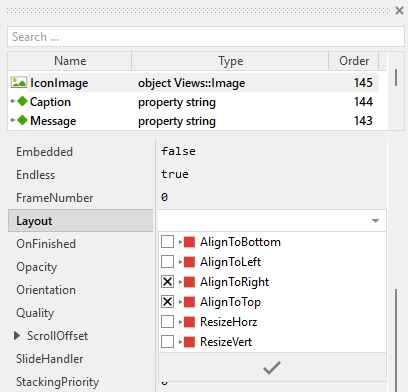
Implement the interface of the component
When creating your own Alert component you should ensure that instances of the alert can be configured to control all the features implemented in it. For example, if you have enhanced the alert to display different icons depending on the alert type (warning, error, info), you should allow this icon to be specified individually for each alert instance. In this way several alert instances can exist at the same time, each displaying a different icon.
To control the features in your alert you use properties. A property can be understood as variable where the corresponding setting is stored, e.g. the icon bitmap to display in the alert. When the value of the property changes, the alert can react to it and update its appearance accordingly. The properties reflect thus the settings within your alert. Together they form the interface of the component.
Usually, each particular setting within a component is represented by the corresponding property. Thus, an alert where icon and message can be configured will require two properties: one for the icon and one for the message. In its original version, the Alert contains already several properties which control the caption, message, button labels, and button slot methods. In order to enhance this interface by your own properties, following steps are necessary:
★Add a new property to the Alert component.
★Name the property according to the setting it should represent. For example, the property intended to store an icon bitmap could be named Icon.
★Determine the data type of the property. For example, the property intended to store an icon bitmap will reference a Resources::Bitmap.
★Determine the initialization value of the property. This value should correspond to the alert's default state. For example, the property intended to store an icon could be initialized with null if no icon should be displayed by default.
★The property is accompanied by its onget method. Except particular cases, this method is not needed and can be deleted now.
★The property is accompanied by its onset method. Open this method for editing.
★Adapt the implementation of the onset method so it updates the alert according to its new value. For example, in case of the property intended to store an icon, you will probably update some Image view where the icon is displayed:
// The value doesn't change - nothing to do. if ( pure Icon == value ) return; // Remember the property's new value. pure Icon = value; // Update the view to display the just modified icon. AlertIcon.Bitmap = value;
That is all. Now when you deal with instances of the Alert component, you can evaluate and modify the properties similarly to how you access variables. For example, the alert message and icon can be adapted to reflect the specific situation. For this purpose you access and modify the affected property directly within Chora code:
var string errorMessage = "File not found!"; // Create and configure the alert var Application::Alert alert = new Application::Alert; alert.Message = errorMessage; alert.Icon = Application::BitmapError; alert.Button1Label = "Retry"; alert.Button2Label = "Cancel"; // Present the alert rootthis.PresentDialog( alert, null, null, null, null, null, null, null, null, false );
Add or remove push buttons
The Alert template contains per default two push buttons. Depending on your application needs, you can add further buttons or remove the existing ones. Following sections explain both scenarios:
Add a third push button
★Add a new Push Button to the Alert component.
★As alternative you can also copy/paste one of the existing buttons.
★Name the new button PushButton3.
★Specify the label of the button to be e.g. "Button 3".
★Add a new property named Button3Label with data type string and initial value "Button3".
★In the onset method of the property Button3Label add code to update the button's label and trigger layout recalculation:
if ( pure Button3Label == value ) return; pure Button3Label = value; PushButton3.Label = value; InvalidateLayout();
★Add a new property named OnButton3 with data type slot and initial value null.
★In the onset method of the property OnButton3 add code to connect the button with the slot method:
if ( pure OnButton3 == value ) return; pure OnButton3 = value; PushButton3.OnActivate = value;
★Modify the autoResize method to include the third button in the size calculation and arrangement:
// Calculate the width of the labels shown within the buttons and ... var int32 wb1 = PushButton1.Appearance.LabelFont.GetTextAdvance( Button1Label, 0, -1 ); var int32 wb2 = PushButton2.Appearance.LabelFont.GetTextAdvance( Button2Label, 0, -1 ); var int32 wb3 = PushButton3.Appearance.LabelFont.GetTextAdvance( Button3Label, 0, -1 ); // ... from the widest label determine the corresponding width of the button. In // this template the buttons have the same width. Ensure, the buttons are not too // tiny (>= 100 pixel). Also get the height of a push button. var int32 wb = math_max( wb1 + 40, wb2 + 40, wb3 + 40, 100 ); var int32 hb = PushButton1.Bounds.h; // Ensure there is enough space for the Caption text and the three Push Buttons. // Note 10 px space between the buttons w = math_max( w, CaptionText.GetContentArea().w, ( wb * 3 ) + 20 ); // ... arrange the three buttons horizontally centered at the bottom var int32 totalButtonWidth = ( wb * 3 ) + 20; var int32 buttonStartX = ( w - totalButtonWidth ) / 2; PushButton1.Bounds = rect( buttonStartX, h - 10 - hb, buttonStartX + wb, h - 10 ); PushButton2.Bounds = rect( buttonStartX + wb + 10, h - 10 - hb, buttonStartX + wb * 2 + 10, h - 10 ); PushButton3.Bounds = rect( buttonStartX + wb * 2 + 20, h - 10 - hb, buttonStartX + wb * 3 + 20, h - 10 );
★If desired, modify the onPressKey method to include the third button in keyboard navigation (no changes needed if the method already searches for all focusable views).
Remove one push button
If you need only a single button (for example, a simple "OK" acknowledgment alert), you can remove the second button:
★In the autoResize method, adapt the implementation to calculate the size and position for only one button:
// Calculate the width of the label shown within the button var int32 wb1 = PushButton1.Appearance.LabelFont.GetTextAdvance( Button1Label, 0, -1 ); // Determine the width of the button. Ensure, the button is not too tiny (>= 100 pixel). var int32 wb = math_max( wb1 + 40, 100 ); var int32 hb = PushButton1.Bounds.h; // Ensure there is enough space for the Caption text and the Push Button. w = math_max( w, CaptionText.GetContentArea().w, wb ); // ... arrange the single button horizontally centered at the bottom PushButton1.Bounds = rect(( w - wb ) / 2, h - 10 - hb, ( w + wb ) / 2, h - 10 );
★Delete the property Button2Label and its OnSetButton2Label method.
★Delete the property OnButton2 and its OnSetOnButton2 method.
★Delete the embedded object PushButton2.
Understand the handling of keyboard inputs
The Alert is an interactive component. It can be controlled via keyboard or hardware buttons. For this purpose the template contains the Key Press Handler object named KeyHandler. To this handler is associated the slot method named onPressKey. The method is thus invoked when the user presses a key matching the filter condition specified in the handler object. This is per default the Tab key:
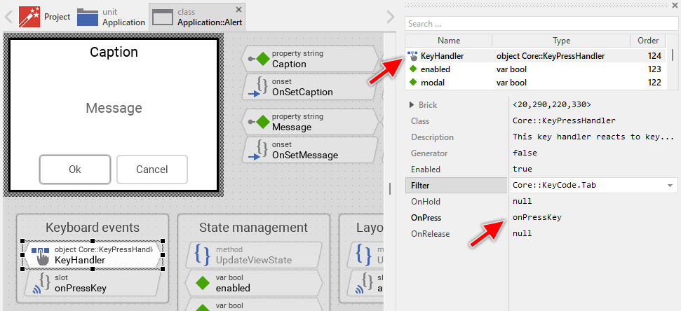
The method takes care of keyboard navigation between the push buttons. When the user presses the Tab key, the method looks for the next button and passes the focus to it:
// Ignore repetitions of key events (e.g. when the user holds the key pressed) if ( KeyHandler.Repetition ) return; // Search for the next button to select var Core::View button = FindNextView( Focus, Core::ViewState[ Enabled, Focusable ]); // If there is no further button, skip to the first one. if ( !button ) button = FindNextView( null, Core::ViewState[ Enabled, Focusable ]); // Ensure the button is selected. Focus = button;
Usually you will not need to edit the implementation of the method. It corresponds already to whatever typical alerts do. Nevertheless, you are free to change this default functionality if you want some particular behavior to be implemented in your alert.
Per default the key handler is configured to accept the Tab key. If necessary you can change this behavior and adapt the alert to react to other keys or key groups. The key handler provides for this purpose the configuration property Filter. For example, if you want the alert to accept navigation with cursor keys (Left and Right), you can modify the key handler's filter. For more details, see Configure the filter condition.
If your device does not contain any keyboard nor hardware buttons, the per default existing key handler and its associated slot method are unnecessary ballast. You can remove them in such case. We recommend to do this in following order to avoid eventual error messages because of broken references between still existing and the already removed members:
★Delete the KeyHandler object.
★Delete the slot methodonPressKey.
★Finally delete the annotation grouping the handler and the slot method.
Understand the automatic size calculation
The Alert component automatically adjusts its size to fit the displayed content: caption, message, and button labels. This auto-sizing behavior is implemented in the autoResize slot method. The method is triggered automatically whenever the content changes (via the UpdateLayout method).
The size calculation algorithm considers following factors:
★Message text width: The method temporarily disables text wrapping to determine the width of the longest line in the message
★Button label widths: The method calculates the required width for each button label and determines the button size
★Caption text width: The method ensures the alert is wide enough for the caption text
★Screen constraints: The method limits the maximum alert size to 4/5 of the screen width to prevent oversized alerts
★Vertical spacing: The method accounts for spacing between caption, message, and buttons
The calculated size ensures that:
★All message text is visible with proper line wrapping
★All button labels fit within their buttons
★The caption text is fully visible
★Proper margins and spacing are maintained
Adapt the autoResize method to your modifications
When you modify the alert by adding additional views (like icons, decorations, or other elements), you may need to adapt the implementation of the autoResize method to correctly account for the additional space required.
Here is the relevant part of the default implementation that determines the width:
// In order to calculate the optimal size of the alert, estimate the // size of the longest message row. To do this, disable temporarily // the line breaking ... MessageText.WrapText = false; // ... and query the size of the longest (non broken) row. var int32 w = MessageText.GetRowArea( MessageText.GetWidestRow()).w; // Finally restore the line breaking again. MessageText.WrapText = true; // Add some additional space to the width. The simplest is to calculate // with the size of the actually used font. w += MessageText.Font.Ascent + MessageText.Font.Descent;
Let's assume you have added an Image view named AlertIcon to display an icon next to the message. The icon is positioned to the left of the message and has a width of 48 pixels. You also want 10 pixels spacing between the icon and the text. In this case, you need to modify the calculation in the autoResize method:
// Query the width of the longest message row var int32 w = MessageText.GetRowArea( MessageText.GetWidestRow()).w; // Add margin w += MessageText.Font.Ascent + MessageText.Font.Descent; // Add space for the icon: icon width (48px) + spacing (10px) w = w + 48 + 10;
Or more elegantly, you can calculate the icon space dynamically:
// Query the width of the longest message row var int32 w = MessageText.GetRowArea( MessageText.GetWidestRow()).w; // Add margin w += MessageText.Font.Ascent + MessageText.Font.Descent; // If an icon is visible, add its width plus spacing if ( AlertIcon.Bitmap ) w = w + AlertIcon.Bitmap.FrameSize.x + 10;
If you have added views that affect the vertical spacing (like a subtitle below the caption), you need to modify the height calculation:
// The complete height includes Caption, Message, Buttons, borders, etc. h += CaptionText.Bounds.h; h += hb; h += 40; // If subtitle is visible, add its height plus spacing if ( SubtitleText.Visible ) h = h + SubtitleText.Bounds.h + 10;
If you don't adapt the autoResize method after adding decorative elements, the alert might appear too small, causing text or icons to be cut off or overlap. Always test your alert with different message lengths and content configurations to ensure the size calculation works correctly.
Perform state changes with animations
In the section Adapt the appearance of the component you learned how state alternations within the Alert are processed and how views existing in the component are updated in order to reflect the actual state. Accordingly, when the alert becomes focused (able to receive keyboard events), the alert does appear highlighted. When the alert loses focus again, the alert restores its normal appearance. The default implementation performs such appearance updates instantly, just in the moment when the respective state change took place.
If desired, you can modify the Alert to update its appearance with animations. For example, instead of instantly switching between the focused and not-focused appearance, such alert can fade-in/out the views, modulate their colors or sizes. For this purpose you use the Animation Effects. With an Animation Effect you can animate a property of a view existing in the alert. Following are the steps how to do this:
★Depending on the data type of the property to animate, add the appropriate Animation Effect to the Alert. For example, to animate a color property, add a Pulse color effect.
★Connect the effect object with the property to animate. For example, if you want to animate the color of the Border view, connect the Pulse color effect with the property Color of the Border view.
★Configure the duration and eventually the desired timing (easing) for the animation.
★Once started, the effect will animate the property endlessly. In our case, however, the animation should stop at its end. For this purpose set the effect's property NoOfCycles to the value 1.
★Configure the key values for the animation. In case of the pulse color effect, it is the start and the end color. For example, to animate the color between black and blue, configure the effect's property Value1 with the #000000FF (black) and the property Value2 with #0000FFFF (blue). This step is appropriate if the key values are fixed, known at the design time. Otherwise, the key values must be set at runtime shortly before the effect is triggered.
★Open the method UpdateViewState and modify its implementation to trigger the effect object when the alert switches between the states focused and not focused. For example in case of the above mentioned pulse color effect to animate the color of the Border, following implementation could be adequate:
// Estimate the new state var bool isEnabled = aState.contains( Core::ViewState[ Enabled ]); var bool isModal = aState.contains( Core::ViewState[ Modal ]); var bool isFocused = aState.contains( Core::ViewState[ Focused ]); [...] // Following code updates the views instantly, without animations. if ( !isEnabled ) { Background.Color = #AAAAAAFF; Border.Width = 1; CaptionText.Color = #888888FF; MessageText.Color = #888888FF; } else if ( isFocused ) { Background.Color = #FFFFFFFF; Border.Width = 3; CaptionText.Color = #000000FF; MessageText.Color = #666666FF; } // Enabled but actually not focused for user interaction. else { Background.Color = #FFFFFFFF; Border.Width = 1; CaptionText.Color = #000000FF; MessageText.Color = #666666FF; } // Switching from not focused -> focused state. Start the animation. if ( isEnabled && isFocused && !focused ) { ColorEffect.Reversed = false; ColorEffect.Enabled = true; } // Switching from focused -> not focused state. Start the animation. else if ( isEnabled && !isFocused && focused ) { ColorEffect.Reversed = true; ColorEffect.Enabled = true; } // Remember the new state enabled = isEnabled; focused = isFocused; modal = isModal;
★Since the properties of the affected views are now modified with animations, you will eventually need to adapt their initial values to correspond to the default state of the alert. For example, you might need to set the property Color of the view Border to the value #000000FF (default color is black).