Creating components from templates: Alphanumeric Keyboard
With this template you can add a new Alphanumeric Keyboard component to your project. Alphanumeric Keyboard component provides a grid with keys the user can touch. Activating a key feeds the corresponding event to the application as if the user had pressed the key on a real keyboard.
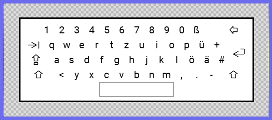
Components created with this template are intended to be adapted to your particular design expectations. After adding the new Alphanumeric Keyboard you should edit the component, change its appearance and if desired also its behavior. Once you have adapted the component, you can embed instances of this Alphanumeric Keyboard wherever you need in your GUI project. Because it serves as template, it is intentionally kept very simple. Nevertheless, Alphanumeric Keyboards created by the template are working widgets. If desired, they can already be used as they are. The following figure demonstrates the default appearance of the Alphanumeric Keyboard created by using the here described component template:
The approach with component templates has two functions. Primarily the templates should simplify the development of new components. Instead of creating the Alphanumeric Keyboard from scratch you can use the available template. The second function is more educative. The template implements fully working Alphanumeric Keyboard component you can investigate and learn about the corresponding programming aspects. The template is well documented. It contains annotations and inline comments with instructions helping you to understand how the component works and how it can be adapted to your particular needs.
This chapter provides an overview how the Alphanumeric Keyboard component template is used within your own application and how you adapt this component according to your particular needs. You will find here also further details concerning the internal implementation of the Alphanumeric Keyboard component.
Add new Alphanumeric Keyboard component
To create a new Alphanumeric Keyboard component from a template you simply Drag & Drop it between the Templates window and the Composer with an opened unit. This is important in that by using the component templates you add in fact a new class to your project. Classes, in turn, can exist within units only. The following are the typical steps to create a new Alphanumeric Keyboard component from a template:
★First switch to the Composer page for the respective unit, where you want to add the new Alphanumeric Keyboard component.
★Then ensure that the Templates window is visible.
★In Templates window switch to the folder Component Templates.
★In the folder locate the Alphanumeric Keyboard template.
★Drag & Drop the template into the Composer window:
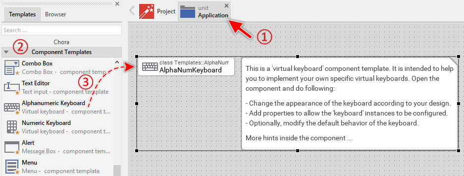
★Eventually name the new added component.
The new created Alphanumeric Keyboard component appears accompanied by annotation providing helpful tips how to proceed. If undesired, you can select and delete the annotation.
Use the Alphanumeric Keyboard component
Once you have created the Alphanumeric Keyboard component, you can use it to assemble more complex components. Technically seen, you embed an instance of the Alphanumeric Keyboard class in-place within the Application component. At the runtime, the Application component takes care of the correct initialization and the displaying of all embedded components, so they appear similarly as you have composed them at the design time.
Step 1. Add new Alphanumeric Keyboard instance
The following are the typical steps to create a new instance of an already existing Alphanumeric Keyboard component:
★First switch to the Composer page for the Application component.
★Then ensure that the Browser window is visible.
★Within the Browser locate the class of the previously created Alphanumeric Keyboard. This can be done easily with Browser's own filter function.
★Select the found class in the Browser window.
★Drag & Drop the selected class into the Composer area.
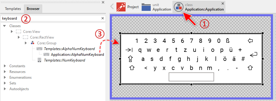
★Eventually name the new instance according to its function within the application.
Component templates are intended to create widgets which can be modified and adapted to your particular design expectations. In the following sections you will learn how to do this. Originally, if not yet modified, the Alphanumeric Keyboard appears as a white rectangle surrounded by a border and filled with text and images to represent the keys. Our intention is to keep the component templates as minimalistic as possible so they don't distract you with less important design details.
Step 2. Inspect the Alphanumeric Keyboard instance
As long as the Alphanumeric Keyboard is selected you can inspect and modify its properties conveniently in the Inspector window as demonstrated with the property Bounds in the screenshot below. This is in so far worth mentioning as diverse features of the Alphanumeric Keyboard are controlled by the corresponding properties. If you are not familiar with the concept of a property and the usage of Inspector window, please read first the preceding chapter Compositing component appearance.
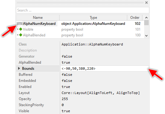
The Alphanumeric Keyboard component descends from the Mosaic class Core::Group. Consequently, all of the properties listed in the above screenshot are inherited from this base class. The Alphanumeric Keyboard itself does not add any new property.
Step 3. Arrange the Alphanumeric Keyboard within the Application component
Once added to the Application component, you can freely move the Alphanumeric Keyboard instance, or you simply grab one of its corners and resize it in this way. You can control the position and the size of the component also by directly modifying its property Bounds.
Step 4. Present the keyboard when needed
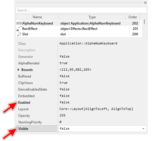
Once you have embedded the Alphanumeric Keyboard instance in your Application component, it is visible whenever the Application component is visible. However, in many applications the virtual keyboard should only appear when the user needs to enter data - for example, when a text editor is focused. The rest of the time, the keyboard should remain hidden to save screen space.
You can control the visibility of the keyboard by modifying its Visible and Enabled properties. To make the keyboard hidden by default, configure both properties to false when the keyboard instance is selected in the Composer:
When the user needs to enter data (for example, when a text editor gains focus), you show the keyboard by setting its properties Visible and Enabled to true and assigning the keyboard instance to the VirtualKeyboard property of the Application component:
// Show the keyboard when it is needed AlphaNumKeyboard.Visible = true; AlphaNumKeyboard.Enabled = true; VirtualKeyboard = AlphaNumKeyboard;
Assigning the keyboard instance to the VirtualKeyboard property is essential for the keyboard to work correctly. This ensures that:
★The keyboard receives all touch events before other GUI components
★The keyboard automatically becomes topmost and remains visible on top of all other views
★The keyboard-generated events are properly delivered to the focused components
When the user finishes entering data (for example, by pressing Enter or when the text editor loses focus), you can hide the keyboard again:
// Hide the keyboard when it is not needed anymore VirtualKeyboard = null; AlphaNumKeyboard.Visible = false; AlphaNumKeyboard.Enabled = false;
Step 5. Present the keyboard with animation
If you want the keyboard to slide in from the bottom of the screen (or perform any other animation) when shown, the most sophisticated approach is to use a fader. Faders provide professional fade-in and fade-out transitions with automatic component management. Following example demonstrates how to present the keyboard using the Effects::PositionFader:
var Effects::PositionFader fader = new Effects::PositionFader; var rect r = AlphaNumKeyboard.Bounds; // Final position of the keyboard: horizontally centered and aligned at bottom edge // of the Application component. r.x += Bounds.orect.center.x - r.center.x; r.y = Bounds.orect.y2 - r.h; // Configure the fade-in animation. The keyboard should slide in from the // bottom edge and be modulated in opacity. fader.Visible = true; fader.OpacityEffect.CycleDuration = 250; fader.OpacityEffect.Value1 = 0; fader.OpacityEffect.Value2 = 255; fader.PositionEffect.CycleDuration = 250; fader.PositionEffect.Timing = Effects::Timing.FastIn_EaseOut; fader.PositionEffect.Value1 = r.origin + point( 0, r.h ); fader.PositionEffect.Value2 = r.origin; // Present the keyboard with animation VirtualKeyboard = AlphaNumKeyboard; FadeGroup( AlphaNumKeyboard, fader, null, null, false );
This approach provides smooth animations and handles the keyboard presentation professionally. The FadeGroup() method is available in the Core::Group class (Base class of the Application component) and manages the fade transitions automatically.
Alternatively, if you prefer to use animation effects directly, you can modify the keyboard's position together with visibility. For this purpose you can use the Move and resize rect effect:
★Configure the effect with the start and end positions of the keyboard.
★Ensure the effect is connected to the property Bounds of the keyboard instance.
★Ensure the effect's timing is configured appropriately.
Then, to show the keyboard, just start the effect. Following code demonstrates the initialization of the effect to slide the keyboard from the bottom edge of the Application component:
var rect r = AlphaNumKeyboard.Bounds; // Final position of the keyboard horizontally center and aligned at bottom edge // of the Application component. r.x += Bounds.orect.center.x - r.center.x; r.y = Bounds.orect.y2 - r.h; // The end and start position of the keyboard RectEffect.Value2 = r; RectEffect.Value1 = r + point( 0, r.h ); // Configure the timing of the effect. The effect should control the Bounds property. RectEffect.Outlet = ^AlphaNumKeyboard.Bounds; RectEffect.NoOfCycles = 1; RectEffect.CycleDuration = 500; // Start the effect. At the same time make the virtual keyboard component visible // and able to react to user inputs. Assign the keyboard to VirtualKeyboard property. RectEffect.Enabled = true; AlphaNumKeyboard.Enabled = true; AlphaNumKeyboard.Visible = true; VirtualKeyboard = AlphaNumKeyboard;
Open the component for editing
Component templates are intended to create widgets which can be adapted and enhanced to your particular design expectations. For this purpose, once you have added a new Alphanumeric Keyboard component to your project, you can open the component class for editing. Thereupon the implementation of the component appears in a new Composer page:
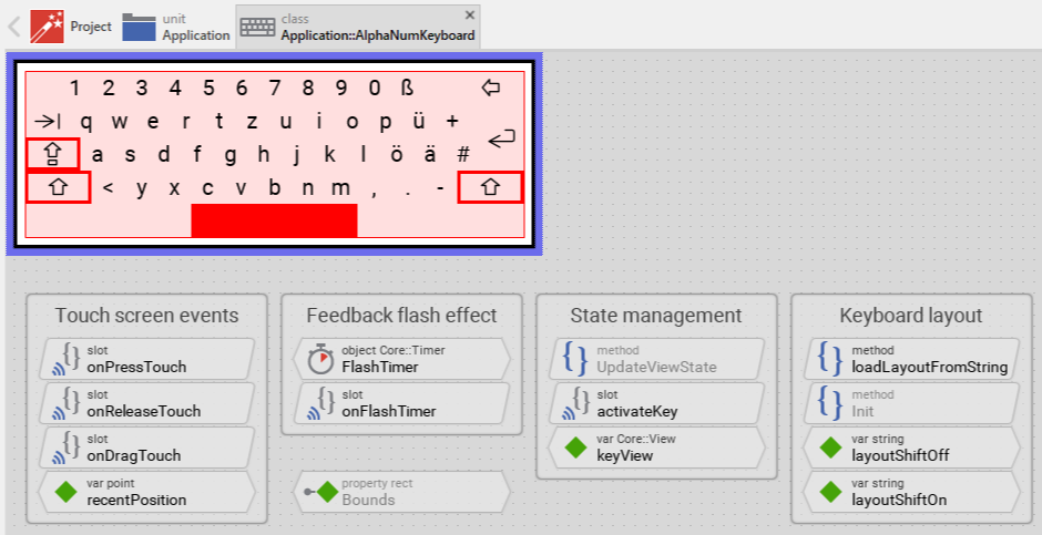
Originally, if not yet modified, the Alphanumeric Keyboard appears displaying a QWERTZ-layout grid with letter, digit, and special character keys as text views, and special function keys (Tab, Caps Lock, Shift, Clear, Enter) as image views. The space bar is indicated by a border rectangle. A white background is surrounded by a border. When a key is pressed, it is highlighted with a red rectangle. When Shift or Caps Lock keys are active, they are indicated with red borders. Our intention is to keep the component templates as minimalistic as possible so they don't distract you with less important design details. The keyboard can react to touch inputs and provides visual feedback with a flash effect for quick taps.
This default functionality is implemented by following members belonging to the Alphanumeric Keyboard. These members are explicitly intended to be modified. Understanding this internal structure is thus the first step before you start to adapt the keyboard to your particular needs:
Icon |
Member |
Description |
|---|---|---|
|
TouchHandler |
This simple touch handler enables the user to interact with the keyboard by touching and dragging. It covers the entire keyboard area and reports touch events to the corresponding slot methods. |
|
onPressTouch |
This internal slot method is called when the user touches the keyboard. It updates the recentPosition variable and requests a keyboard appearance update. |
|
onDragTouch |
This internal slot method is called when the user drags the finger across the keyboard. It updates the recent touch position and triggers visual feedback for the key at the new position. |
|
onReleaseTouch |
This internal slot method is called when the user releases the finger from the keyboard. Depending on the touch duration, it either immediately activates the key or starts the flash timer for quick taps. |
|
FlashTimer |
This timer object provides a short visual feedback flash effect when the user taps a key very quickly. The default duration is 50 milliseconds. |
|
onFlashTimer |
This internal slot method is called when the FlashTimer expires. It ends the flash feedback effect and activates the pressed key. |
|
activateKey |
This internal slot method is called when a key should be activated. It determines which key was pressed, handles layout switching for Shift and Caps Lock keys, and generates the corresponding keyboard event for the application. |
|
Init |
This method is invoked automatically when a new keyboard instance is created. It loads the default keyboard layout (shift off) at initialization time. |
|
Background |
This Filled Rectangle view displays the background of the keyboard. The background is white per default. |
|
Border |
This Border view displays the border of the keyboard with 3 pixel thickness in black color per default. |
|
Highlight |
This Filled Rectangle view provides visual feedback by highlighting the pressed key. It is moved to the position of the pressed key and displayed in red per default. |
|
TextKey01 .. TextKey47 |
These Text views represent the alphanumeric keys. The keyboard layout determines which character each key displays. Keys are arranged in a QWERTZ layout using the Resources::FontMedium font. |
|
ImageKeyTab |
This Image view represents the Tab key using an icon from Resources::KeyIconsSmall bitmap resource. |
|
ImageKeyCapsLock |
This Image view represents the Caps Lock key using an icon from Resources::KeyIconsSmall bitmap resource. |
|
ImageKeyShiftLeft and ImageKeyShiftRight |
These Image views represent the left and right Shift keys using icons from Resources::KeyIconsSmall bitmap resource. |
|
ImageKeyClear |
This Image view represents the Clear (Backspace) key using an icon from Resources::KeyIconsSmall bitmap resource. |
|
ImageKeyEnter |
This Image view represents the Enter key using an icon from Resources::KeyIconsSmall bitmap resource. |
|
AreaKeySpace |
This Border view indicates the area of the space bar key. It is displayed as a gray border rectangle per default. |
|
ActiveKeyCapsLock |
This Border view indicates when the Caps Lock key is active. It is displayed as a red border around the Caps Lock key and is hidden per default. |
|
ActiveKeyShiftLeft and ActiveKeyShiftRight |
These Border views indicate when the Shift keys are active. They are displayed as red borders around the Shift keys and are hidden per default. |
|
UpdateViewState |
This method is invoked automatically after touch events. The method updates the keyboard views to reflect which key is currently pressed and provides visual feedback. |
|
loadLayoutFromString |
This method loads a new keyboard layout by updating all text key views with characters from the provided layout string. The string's characters correspond to keys according to their z-order. |
|
keyView |
This variable stores a reference to the view representing the currently pressed key. It is null if no key is pressed. |
|
recentPosition |
This variable stores the most recent touch position within the keyboard area. |
|
layoutShiftOff |
This variable stores the keyboard layout string for lowercase letters and normal characters. The default layout is German QWERTZ. |
|
layoutShiftOn |
This variable stores the keyboard layout string for uppercase letters and shifted special characters. The default layout is German QWERTZ. |


Understand the state management of the component
During its lifetime, the Alphanumeric Keyboard will react to user touch interactions. To track which key is currently pressed, the keyboard manages the above mentioned variable keyView. This variable either refers to the view representing the pressed key or is null if no key is pressed. The variable is evaluated and updated within the implementation of the method UpdateViewState. This method determines which key the user is currently touching by searching for a view at the recent touch position:
// Determine the new state of the affected keyboard. var Core::View isKeyView = null; var bool isPressed = ( TouchHandler.Down && TouchHandler.Inside ) || FlashTimer.Enabled; // Search for the view representing the key at the recent touch position. if ( isPressed && ( recentPosition == TouchHandler.GetExtent())) isKeyView = FindViewAtPosition( null, recentPosition, Core::ViewState[]);
The local variable isKeyView will refer to the view at the current touch position. The keyboard then updates the appearance by comparing isKeyView (the currently pressed key) with keyView (the previously pressed key). If they differ, the keyboard updates the visual feedback accordingly - highlighting the new key and removing highlight from the previous key.
Additionally, the Alphanumeric Keyboard maintains the state of the Shift and Caps Lock keys. When a Shift key is pressed, the keyboard shows red borders around both shift keys (ActiveKeyShiftLeft and ActiveKeyShiftRight become visible) and loads the shifted layout. After the next character key is pressed, the keyboard automatically returns to the unshifted layout. The Caps Lock key works similarly but keeps the shifted layout active until Caps Lock is pressed again.
Depending on your design expectations, the default state management may require adaptations. Generally, you are free to modify the method UpdateViewState, add further state variables to your keyboard, or change how visual feedback is provided when keys are pressed.
Understand the keyboard layout mechanism
The Alphanumeric Keyboard component uses a flexible layout mechanism that allows easy customization of which characters appear on each key. The layout is controlled by two string variables:
★layoutShiftOff - Contains characters for the normal (unshifted) layout
★layoutShiftOn - Contains characters for the shifted layout (when Shift or Caps Lock is active)
Each character in these strings corresponds to one text key on the keyboard. The default layout is German QWERTZ:
var string layoutShiftOff = "1234567890ßqwertzuiopü+asdfghjklöä#<yxcvbnm,.- "; var string layoutShiftOn = "!\"§$$%&/()=?QWERTZUIOPÜ*ASDFGHJKLÖÄ\'>YXCVBNM;:_ ";
The order of characters in the layout strings corresponds exactly to the z-order of the text views TextKey01 through TextKey47 within the component. For example, the first character in the string ('1' in layoutShiftOff) is displayed on TextKey01, the second character ('2') on TextKey02, and so on.
When the keyboard needs to change its layout, it calls the loadLayoutFromString() method with the desired layout string as parameter. This method traverses all text key views in their z-order and assigns each one the corresponding character from the layout string:
method void loadLayoutFromString( arg string aLayoutString ) { var Core::View view = TextKey01; var int32 keyNo = 0; // Traverse the entire list of views while ( view != null ) { var Views::Text textKeyView = (Views::Text)view; // Is this a 'text' view representing a key? if ( textKeyView != null ) { // From the layout string get the character for this key var string s = aLayoutString[ keyNo ]; // Note: Special text view control characters need % prefix if (( s == "%" ) || ( s == "^" ) || ( s == "~" )) s = '%' + s; // Let the 'text' view display the corresponding sign textKeyView.String = s; keyNo = keyNo + 1; } // Search for next view view = FindNextView( view, Core::ViewState[]); } }
The layout switching is triggered automatically by the activateKey slot method:
★When a Shift key is pressed, the method toggles between layoutShiftOff and layoutShiftOn
★When a Caps Lock key is pressed, the method toggles between layouts permanently
★When a character key is pressed while Shift is active (but not Caps Lock), the method returns to layoutShiftOff automatically
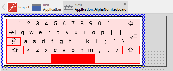
To customize the keyboard layout for your language or requirements, you simply modify the layoutShiftOff and layoutShiftOn strings. For example, to create an English QWERTY layout:
var string layoutShiftOff = "1234567890`qwertyuiop[]asdfghjkl;'\<zxcvbnm,./ "; var string layoutShiftOn = "!@#$$%^&*()~QWERTYUIOP{}ASDFGHJKL:\"|>ZXCVBNM<>? ";
Please note the peculiarity of the $ sign being interpreted as beginning of a macro. Therefore double $$ has to be used. Also several signs require a backslash as prefix. Note the string literal syntax for more details.
Adapt the appearance of the component
Originally, if not yet modified, the Alphanumeric Keyboard appears displaying alphanumeric keys as black text on white background, special function keys as black icons, a gray border indicating the space bar, and a red rectangle that highlights the pressed key. When Shift or Caps Lock are active, red borders appear around the respective keys. Our intention is to keep the component templates as minimalistic as possible so they don't distract you with less important design details. It's up to you to adapt the keyboard to have the expected appearance. The available possibilities are explained in the following sections. Please note, that you can combine the different approaches according to your application case:
1. Modify existing views
The Alphanumeric Keyboard template contains per default the views Background, Border, Highlight, the key views (TextKey01 .. TextKey47, ImageKeyTab, ImageKeyCapsLock, ImageKeyShiftLeft, ImageKeyShiftRight, ImageKeyClear, ImageKeyEnter), the space bar indicator (AreaKeySpace), and the active key indicators (ActiveKeyCapsLock, ActiveKeyShiftLeft, ActiveKeyShiftRight). If desired, you can modify these views. For example, you can change the colors, fonts, or highlight style. For this purpose you change the implementation of the above explained method UpdateViewState responsible for providing visual feedback when keys are pressed.
When you open the method UpdateViewState you will see that it updates the key views depending on whether they are pressed or released. Text key views change their color from black to white when pressed, and image key views do the same. Additionally, the Highlight view is positioned behind the pressed key. By simply modifying this implementation you change the appearance. For example, you can change the highlight color from red to blue:
// If the user is actually pressing a key, arrange the background view // just behind the affected key view so it appears selected. if ( isKeyView != null ) { Highlight.Bounds = isKeyView.GetExtent(); Highlight.Color = #0000FFFF; // <-- blue color instead of red Highlight.Visible = true; } else Highlight.Visible = false;
Or you can change the pressed text color to yellow instead of white:
// If the user has pressed a key represented by a 'text' view, change the // color of the text to appear highlighted. if ( isTextKeyView != null ) isTextKeyView.Color = #FFFF00FF; // <-- yellow color
Similarly, you can modify the appearance of the active key indicators. For example, to change the Shift indicator from red border to blue:
// Modify the existing border indicator color from red to blue: if (( keyView == ImageKeyShiftLeft ) || ( keyView == ImageKeyShiftRight )) { ActiveKeyShiftLeft.Color = #0000FFFF; // Blue instead of red ActiveKeyShiftRight.Color = #0000FFFF; }
2. Remove existing views
If not needed, you can delete some of the per default existing key views. For example, if you don't need the Tab key, you can remove the ImageKeyTab view. Doing this, please don't forget to also remove all references to the deleted views from the implementation of the UpdateViewState and activateKey methods. Otherwise you will get error messages next time the Composer contents is reloaded. To avoid this error message we recommend to perform the steps in following order:
★In the UpdateViewState method adapt the implementation to not refer anymore to the undesired view. Review the method, whether it contains code refering the affected view. Remove the code appropriately.
★In the activateKey method adapt the implementation to not handle the removed key. For example, if you decided to delete the ImageKeyTab view, remove the corresponding code block:
// Has the user touched the 'Tab' key? else if ( keyView == ImageKeyTab ) keyCode = Core::KeyCode.Tab;
★Now you can delete the affected view(s).
If you want to remove some of the text keys (for example, to create a numeric-only alphanumeric keyboard), remember that the keyboard layout mechanism depends on the z-order of text views. After removing text keys, you must:
★Adjust the layout strings layoutShiftOff and layoutShiftOn to have exactly as many characters as remaining text keys.
★Ensure the order of characters in the layout strings still corresponds to the z-order of the remaining text key views.
3. Add further keys to the component
You can add more keys to your keyboard. For example, you can add function keys, additional special characters, or language-specific letters. Following steps explain the workflow:
★Name the just added view according to its function in the keyboard. For example TextKey48 if extending the alphanumeric keys, or ImageKeyCtrl for a special function key.
★In order to arrange the view within the keyboard grid, move the view, or you simply grab one of its corners and resize it in this way. Make sure the view is positioned within the TouchHandler area. If you want the view to appear behind other views you can reorder it explicitly.
★If necessary, you can rearange or resize other views to make space for the new key.
★In Inspector window configure the properties of the just added view. For a text view, the String property will be set by the layout mechanism. For an image view, select the appropriate Bitmap and FrameNumber.
★If you added a text view for alphanumeric characters, extend the layout strings layoutShiftOff and layoutShiftOn with the new characters. The position of the character in the string must correspond to the z-order position of your new text view among all text key views.
★If you added an image view for a special function key, enhance the activateKey method to handle the new key activation. See the existing implementation for the special function keys.
4. Replace existing views
Also possible, you can replace the existing key views by other views. For example, you could replace some text-based keys with image-based keys for a more graphical appearance. For this purpose:
★Think about which views are adequate as replacement for the old views.
★Delete the old view(s).
★Add the desired view(s) to the component.
★Name the just added view according to its function.
★Eventually move the view, or you simply grab one of its corners and resize it in this way. If you want the view to appear behind other views you can reorder it explicitly.
★If necessary, in Inspector window configure the properties of the just added view.
★If necessary, modify the implementation of UpdateViewState and activateKey methods to work with the new view types. You may need to adjust the object runtime cast operations in UpdateViewState to recognize your new view types.
★If you replaced text keys with image keys, adjust the layout strings layoutShiftOff and layoutShiftOn accordingly - remove the characters that corresponded to the removed text keys.
5. Add decoration views
You can add further views to your keyboard for decoration purposes. For example, you can add separator lines between key rows, a background image, or a caption text. Following steps explain the workflow:
★First add the desired view to the component.
★Name the just added view according to its function.
★In order to arrange the view within the keyboard, move the view, or you simply grab one of its corners and resize it in this way. If you want the view to appear behind the keys you can reorder it explicitly by moving it before the key views in the Inspector's members list.
★In Inspector window configure the properties of the just added view.
Decoration views don't participate in key press detection, so you don't need to modify the UpdateViewState or activateKey methods for them.
IMPORTANT
If you add a Text or an Image view and arrange it within the area of the TouchHandler, the view will be considered as a potential key. Therefore avoid placing text or image views within this area unless they should function as keys. If decoration text or image views within the touch area are inevitable, please adapt the UpdateViewState() method to ignore the decoration views.
Customize the keyboard layout
The Alphanumeric Keyboard component allows you to easily customize which characters appear on each key by modifying the layout strings. The default layout is German QWERTZ, but you can adapt it for any language or special purpose.
To customize the keyboard layout, modify the string variables layoutShiftOff and layoutShiftOn:
★Open the component for editing if not already open.
★Locate the variables layoutShiftOff and layoutShiftOn in the component's member list.
★Click on layoutShiftOff to select it and modify its initialization value in the Inspector window. This string determines the normal (lowercase) keyboard layout.
★Similarly, modify layoutShiftOn to set the shifted (uppercase) keyboard layout.
The layout strings must have exactly as many characters as there are text key views in your keyboard (47 by default). Each character in the string corresponds to one text key according to the z-order of views TextKey01 through TextKey47.
Common keyboard layouts
Here are examples of layout strings for different keyboard layouts:
// English QWERTY: var string layoutShiftOff = "1234567890`qwertyuiop[]asdfghjkl;'\<zxcvbnm,./ "; var string layoutShiftOn = "!@#$$%^&*()~QWERTYUIOP{}ASDFGHJKL:\"|>ZXCVBNM<>? "; // French AZERTY: var string layoutShiftOff = "1234567890°azertyuiop^$$qsdfghjklmù*<wxcvbn,;:! "; var string layoutShiftOn = "&é\"'(-è_çà@AZERTYUIOP¨£QSDFGHJKLM%µ>WXCVBN?./§ "; // Spanish QWERTY: var string layoutShiftOff = "1234567890'qwertyuiop´+asdfghjklñç<zxcvbnm,.- "; var string layoutShiftOn = "!\"#$$%&/()=?QWERTYUIOP¨*ASDFGHJKLÑÇ>ZXCVBNM;:_ ";
Please note the peculiarity of the $ sign being interpreted as beginning of a macro. Therefore double $$ has to be used. Also several signs require a backslash as prefix. Note the string literal syntax for more details.
TIP
You can store the layout strings in a constant localized for multiple languages. Then instead of initializing the variables layoutShiftOff and layoutShiftOn with string literals, initialize them with the constants. The variables use then the respective localized value of the constant according to the actually selected language.
Adjusting for fewer or more keys
If you have added or removed text keys, you must ensure the layout strings have the correct length:
★Count your text key views (TextKey01, TextKey02, etc.)
★Ensure both layout strings have exactly that many characters
★The order of characters must match the z-order of text keys in the component
For example, if you removed 5 text keys and now have 42 keys, your layout strings must each have exactly 42 characters.
Configure the layout of the component
The initial size of the Alphanumeric Keyboard is determined by the thick blue border surrounding the Canvas area. You can configure the Canvas area size by clicking and dragging the edges of the surrounding border (see also Resize the Canvas area). For example, to make the keyboard wider, drag on its right edge:
The views existing per default in the Alphanumeric Keyboard template are automatically adjusted to fill the area of the component when it is resized. All other views you have eventually added later to the component are not adjusted automatically.
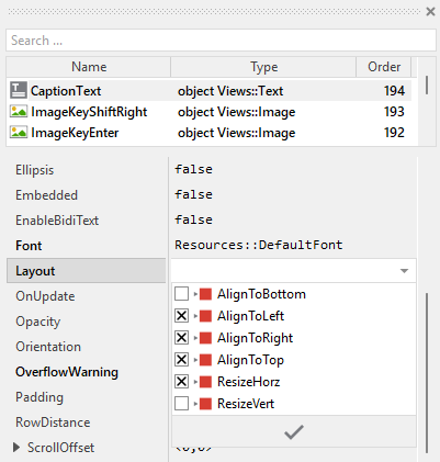
To control the adjustment you have to explicitly configure for each view its Layout property (see also Configure component layout). Let's assume, in order to display a caption text you have added a Text view to the Alphanumeric Keyboard. Then you have arranged the view within the Canvas area according to your design expectation. If you want that the view remains aligned at the top edge filling the width of the component when it is resized, you configure its Layout property as shown below:
Implement the interface of the component
When creating your own Alphanumeric Keyboard component you should ensure that instances of the keyboard can be configured to control all the features implemented in it. For example, if you have enhanced the keyboard by a caption text (e.g. "Enter password"), you should add a property to specify this caption text. In this way keyboard instances can be configured to display different captions.
To control the features in your keyboard you use properties. A property can be understood as variable where the corresponding setting is stored, e.g. the caption text, color value, etc.. When the value of the property changes, the keyboard can react to it and update its appearance accordingly. The properties reflect thus the settings within your keyboard. Together they form the interface of the component.
Usually, each particular setting within a component is represented by the corresponding property. In its original version, the Alphanumeric Keyboard doesn't contain any properties - all settings are fixed in the component's design. In order to enhance this interface by your own properties, following steps are necessary:
★Add a new property to the Alphanumeric Keyboard component.
★Name the property according to the setting it should represent. For example, the property intended to store the caption text could be named Caption.
★Determine the data type of the property. For example, the property intended to store the caption text will use the string data type.
★Determine the initialization value of the property. This value should correspond to the keyboard's default state. For example, the property intended to store the caption text could be initialized with "" (empty string) if no caption text should appear per default.
★The property is accompanied by its onget method. Except particular cases, this method is not needed and can be deleted now.
★The property is accompanied by its onset method. Open this method for editing.
★Adapt the implementation of the onset method so it updates the keyboard according to its new value. For example, in case of the property intended to store the caption text, you will update the respective CaptionText view:
// The value doesn't change - nothing to do. if ( pure Caption == value ) return; // Remember the property's new value. pure Caption = value; // Update the CaptionText view to use the just assigned string. CaptionText.String = value;
That is all. Now when you deal with instances of the Alphanumeric Keyboard component, you can evaluate and modify the properties similarly to how you access variables. Especially, when the keyboard instance is selected, you see in Inspector window the property and can change it there. The modification is immediately visible in the Composer window.
If desired, the properties can also be modified at the runtime of your application. For example, the caption text can be changed dynamically, or you could even provide properties to dynamically change the keyboard layout. For this purpose you access and modify the affected property directly within Chora code:
// Change the caption text AlphaNumKeyboard.Caption = "Enter username"; // Example: Add property to dynamically change the layout AlphaNumKeyboard.UseShiftedLayout = true;
An interesting application of properties in the Alphanumeric Keyboard would be to add properties for controlling the layout strings dynamically. For example:
// In the property onset method for 'LayoutString': if ( pure LayoutString == value ) return; pure LayoutString = value; // Update the keyboard with the new layout loadLayoutFromString( value );
Understand the handling of touch inputs
The Alphanumeric Keyboard is an interactive component that responds to touch and mouse inputs. For this purpose the template contains the Simple Touch Handler object named TouchHandler. The touch handler covers the entire keyboard area where keys are located. To this handler are associated three slot methods: onPressTouch, onReleaseTouch and onDragTouch. As their names imply the methods are invoked at the beginning of the interaction (press), at its end (release) and repeatedly while then user drags the finger (mouse pointer) inside the handler's area:
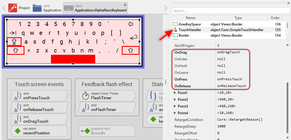
When the user initially touches the keyboard, onPressTouch is called. This method:
★Requests a keyboard appearance update by calling InvalidateViewState()
★Handles the case when the user taps very rapidly - if a flash effect is still running from a previous tap, it completes that tap first
★Stores the current touch position in recentPosition
InvalidateViewState(); // Handle rapid successive taps if ( FlashTimer.Enabled ) { signal activateKey; FlashTimer.Enabled = false; } recentPosition = TouchHandler.CurrentPos;
When the user drags the finger across the keyboard, onDragTouch is called. This method:
★Requests a keyboard appearance update
★Updates the recentPosition to reflect the new touch location
This allows the keyboard to highlight different keys as the user drags between them, providing immediate visual feedback.
When the user releases the finger, onReleaseTouch is called. This method:
★Requests a keyboard appearance update
★Checks if the release occurred inside the keyboard area - if not, no key is activated
★Determines whether to activate the key immediately or start the flash timer
InvalidateViewState(); // User moved finger outside keyboard - don't activate if ( !TouchHandler.Inside ) return; // Long press - activate immediately if ( TouchHandler.HoldPeriod >= FlashTimer.Begin ) signal activateKey; // Quick tap - show flash feedback first else FlashTimer.Enabled = true;
If the user held the key long enough (more than 50ms specified by default in FlashTimer), the key is activated immediately. For very quick taps, the FlashTimer is started to provide a brief visual feedback before activation.
Usually you will not need to edit the implementation of these methods. They correspond already to whatever typical virtual keyboards do. Nevertheless, you are free to change this default functionality if you want some particular behavior to be implemented in your keyboard.
Adapt the feedback (flash) animation
The Alphanumeric Keyboard provides visual feedback when keys are pressed. For longer key presses, the feedback is immediate - the key appearance changes while the user holds it. However, for very quick taps (shorter than 50ms), the key press and release happen so fast that the user might not see any feedback. To solve this, the keyboard uses a flash effect timer. The flash effect is implemented using the Core::Timer object named FlashTimer. The timer prolongates thereupon the visual effect. As soon as the timer expires, it signals its associated slot method: onFlashTimer:
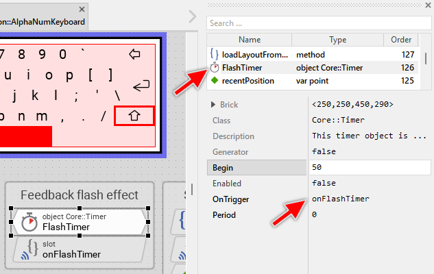
This method takes care of two tasks. At first it requests an invocation of the UpdateViewState method to update the visual appearance of the virtual keyboard. The key at the recently touched position should not appear pressed anymore. The second task is to send a signal to the slot method activateKey. Following code demonstrates this implementation:
// Request the keyboard to update its appearance InvalidateViewState(); // Now activate the key signal activateKey;
The FlashTimer object is configured per default with the value 50 milliseconds. If necessary you can change this behavior and specify other delay. The timer provides for this purpose the property Begin. For example, if you want the feedback effect to take 250 ms, change this property to the value 250. For more details, see Specify the timer interval and the initial delay.
Understand the keyboard event generation
The Alphanumeric Keyboard component generates keyboard events that can be received by other GUI components in your application, such as text editors. The event generation happens in the activateKey slot method. When a key is activated (either immediately after a long press or after the flash effect for quick taps), the activateKey method is called. This method:
★Determines which key was pressed by examining the keyView variable
★Handles special keys (Shift, Caps Lock) by switching the keyboard layout
★Converts regular keys to either a character code or a key code
★Generates keyboard events using the DriveKeyboardHitting() method
var Views::Text textKeyView = (Views::Text)keyView; var char charCode = '\0'; var Core::KeyCode keyCode = Core::KeyCode.NoKey; // Text key - use the displayed character if ( textKeyView != null ) charCode = textKeyView.String[0]; // Tab key else if ( keyView == ImageKeyTab ) keyCode = Core::KeyCode.Tab; // Enter key else if ( keyView == ImageKeyEnter ) keyCode = Core::KeyCode.Enter; // Clear key (Backspace) else if ( keyView == ImageKeyClear ) keyCode = Core::KeyCode.Backspace; // Shift keys - switch layout else if (( keyView == ImageKeyShiftLeft ) || ( keyView == ImageKeyShiftRight )) { ActiveKeyShiftLeft.Visible = !ActiveKeyShiftLeft.Visible; ActiveKeyShiftRight.Visible = ActiveKeyShiftLeft.Visible; ActiveKeyCapsLock.Visible = false; if ( ActiveKeyShiftLeft.Visible ) loadLayoutFromString( layoutShiftOn ); else loadLayoutFromString( layoutShiftOff ); } // Caps Lock key - switch layout permanently else if ( keyView == ImageKeyCapsLock ) { ActiveKeyCapsLock.Visible = !ActiveKeyCapsLock.Visible; ActiveKeyShiftLeft.Visible = false; ActiveKeyShiftRight.Visible = false; if ( ActiveKeyCapsLock.Visible ) loadLayoutFromString( layoutShiftOn ); else loadLayoutFromString( layoutShiftOff ); } // After pressing a character key with Shift active (not Caps Lock), // return to normal layout if ((( charCode != '\0' ) || ( keyCode != Core::KeyCode.NoKey )) && ActiveKeyShiftLeft.Visible ) { ActiveKeyShiftLeft.Visible = false; ActiveKeyShiftRight.Visible = false; loadLayoutFromString( layoutShiftOff ); } // Generate the keyboard events if ( charCode != '\0' ) { GetRoot().DriveKeyboardHitting( Core::KeyCode.NoKey, charCode, true ); GetRoot().DriveKeyboardHitting( Core::KeyCode.NoKey, charCode, false ); } if ( keyCode != Core::KeyCode.NoKey ) { GetRoot().DriveKeyboardHitting( keyCode, '\0', true ); GetRoot().DriveKeyboardHitting( keyCode, '\0', false ); }
For each regular key press, the method generates two events: (1) press event (DriveKeyboardHitting( ..., true )) and (2) corresponding release event (DriveKeyboardHitting( ..., false )). This pair of events simulates the complete key press cycle, just as if the user had pressed a key on a physical keyboard. Depending on the taped view, the method distinguishes between three types of keys:
★Character keys (alphanumeric and special characters): These are represented by text views and generate character codes. The character is extracted from the view's String property, which reflects the currently active layout.
★Special function keys (Tab, Enter, Clear): These are represented by image views and generate key codes from the Core::KeyCode enumeration. For example, the Clear key generates Core::KeyCode.Backspace.
★Layout control keys (Shift, Caps Lock): These keys don't generate keyboard events but instead control the keyboard layout by calling loadLayoutFromString() and showing/hiding the active key indicator borders.
When you add new keys to your keyboard, you need to adapt the activateKey method to handle them:
★For character keys (displayed as text): No changes needed - the method automatically extracts the character from the text view's String property based on the current layout.
★For special function keys (displayed as images): Add a new condition to map the key to the appropriate key code:
// Has the user touched your custom special key? else if ( keyView == ImageKeyCustom ) keyCode = Core::KeyCode.SomeKeyCode;
★For layout control keys: Add conditions similar to the Shift and Caps Lock handling to switch layouts or update visual indicators.
You can find available key codes in the Core::KeyCode enumeration documentation.
Similar to events generated by a physical keyboard, the events generated by a virtual keyboard are delivered to GUI components along the so-called focus path:
★The DriveKeyboardHitting() method sends the event to the root object (the application component)
★The root object forwards the event to the component at the end of the focus path (the currently focused component)
★If a text editor has focus, it will receive and process the character, updating its content accordingly
★If the focused component ignored the event, the event is deliver to the next superior component
This approach follows the standard keyboard event handling pattern in Embedded Wizard, ensuring your virtual keyboard integrates seamlessly with other GUI components. For more details see Handling keyboard events and Keyboard events and the focus path.
Perform state changes with animations
In the section Adapt the appearance of the component you learned how the keyboard updates its appearance when keys are pressed and released. Accordingly, when the user touches a key, the key appears highlighted instantly. When the user releases the key, it returns to its normal appearance immediately. When Shift or Caps Lock keys are activated, their indicator borders appear instantly. The default implementation performs such appearance updates instantly, just in the moment when the respective state change took place.
If desired, you can modify the Alphanumeric Keyboard to update its appearance with animations. For example, instead of instantly switching the highlight color, the keyboard can smoothly fade between colors, or scale the key size for a "bounce" effect. Similarly, the Shift and Caps Lock indicators can fade in/out smoothly. For this purpose you use the Animation Effects. With an Animation Effect you can animate a property of a view existing in the keyboard. Following are the steps how to do this:
★Depending on the data type of the property to animate, add the appropriate Animation Effect to the Alphanumeric Keyboard. For example, to animate the color of the highlight, add a Pulse color effect.
★Connect the effect object with the property to animate. For example, if you want to animate the color of the Highlight view, connect the Pulse color effect with the property Color of the Highlight view.
★Configure the duration and eventually the desired timing (easing) for the animation. For example, a duration of 100 milliseconds with Effects::Timing.EaseIn_EaseOut timing.
★Once started, the effect will animate the property endlessly. In our case, however, the animation should stop at its end. For this purpose set the effect's property NoOfCycles to the value 1.
★Configure the key values for the animation. In case of the pulse color effect, it is the start and the end color. For example, to animate the highlight color from transparent to red, configure the effect's property Value1 with #FF000000 (transparent red) and the property Value2 with #FF0000FF (opaque red). This step is appropriate if the key values are fixed, known at the design time. Otherwise, the key values must be set at runtime shortly before the effect is triggered.
★Open the method UpdateViewState and modify its implementation to trigger the effect object when a key is pressed or released. For example in case of the above mentioned pulse color effect to animate the highlight color, following implementation could be adequate:
// Detect a state alternation when the user presses a new or releases a // previously pressed key. if ( isKeyView != keyView ) { // ... existing code to update views instantly ... // Start the fade-in animation when a key is pressed if (( isKeyView != null ) && ( keyView == null )) { HighlightColorEffect.Reversed = false; HighlightColorEffect.Enabled = true; } // Start the fade-out animation when a key is released else if (( isKeyView == null ) && ( keyView != null )) { HighlightColorEffect.Reversed = true; HighlightColorEffect.Enabled = true; } }
★Since the properties of the affected views are now modified with animations, you will eventually need to adapt their initial values to correspond to the default state of the keyboard. For example, you might need to set the property Color of the Highlight view to the animation's start value.
You can also animate the Shift and Caps Lock indicators. For example, to animate the ActiveKeyShiftLeft border's opacity:
// In the activateKey method when toggling shift state: if (( keyView == ImageKeyShiftLeft ) || ( keyView == ImageKeyShiftRight )) { // Instead of instantly toggling visibility, start fade animation if ( !ActiveKeyShiftLeft.Visible ) { ShiftIndicatorFadeEffect.Reversed = false; ShiftIndicatorFadeEffect.Enabled = true; } else { ShiftIndicatorFadeEffect.Reversed = true; ShiftIndicatorFadeEffect.Enabled = true; } // ... rest of layout switching code ... }