Creating components from templates: Date Picker
With this template you can add a new Date Picker component to your project. Date Picker allows the user to select the day, month and year from three lists the user can conveniently scroll. The special case of leap year is handled automatically. Each time the user interacts with the picker, the component sends signals to associated slot methods where your particular implementation is executed.
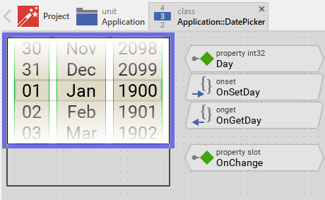
Components created with this template are intended to be adapted to your particular design expectations. After adding the new Date Picker you should edit the component, change its appearance and if desired also its behavior. Once you have adapted the component, you can embed instances of this Date Picker wherever you need in your GUI project. Because it serves as template, it is intentionally kept very simple. Nevertheless, Date Pickers created by the template are working widgets. If desired, they can already be used as they are. The following figure demonstrates the default appearance of the Date Picker created by using the here described component template:
The approach with component templates has two functions. Primarily the templates should simplify the development of new components. Instead of creating the Date Picker from scratch you can use the available template. The second function is more educative. The template implements fully working Date Picker component you can investigate and learn about the corresponding programming aspects. The template is well documented. It contains annotations and inline comments with instructions helping you to understand how the component works and how it can be adapted to your particular needs.
This chapter provides an overview how the Date Picker component template is used within your own application and how you adapt this component according to your particular needs. You will find here also further details concerning the internal implementation of the Date Picker component.
Add new Date Picker component
To create a new Date Picker component from a template you simply Drag & Drop it between the Templates window and the Composer with an opened unit. This is important in that by using the component templates you add in fact a new class to your project. Classes, in turn, can exist within units only. The following are the typical steps to create a new Date Picker component from a template:
★First switch to the Composer page for the respective unit, where you want to add the new Date Picker component.
★Then ensure that the Templates window is visible.
★In Templates window switch to the folder Component Templates.
★In the folder locate the Date Picker template.
★Drag & Drop the template into the Composer window:
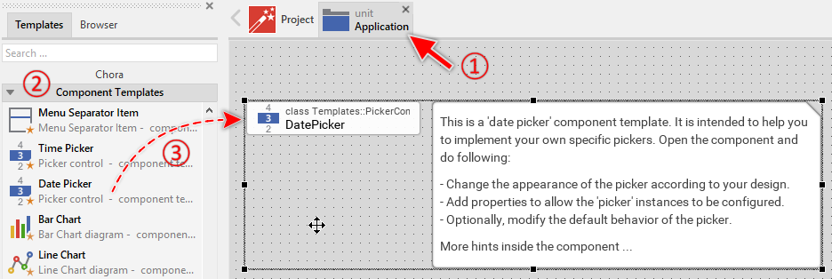
★Eventually name the new added component.
The new created Date Picker component appears accompanied by annotation providing helpful tips how to proceed. If undesired, you can select and delete the annotation.
Use the Date Picker component
Once you have created the Date Picker component, you can use it to assemble more complex components. Technically seen, you embed an instance of the Date Picker class in-place within some superior GUI component. At the runtime, the superior GUI component takes care of the correct initialization and the displaying of all embedded components, so they appear similarly as you have composed them at the design time.
Step 1. Add new Date Picker instance
The following are the typical steps to create a new instance of an already existing Date Picker component:
★First switch to the Composer page for the respective GUI component, where you want to add the new Date Picker.
★Then ensure that the Browser window is visible.
★Within the Browser locate the class of the previously created Date Picker. This can be done easily with Browser's own filter function.
★Select the found class in the Browser window.
★Drag & Drop the selected class into the Composer area.
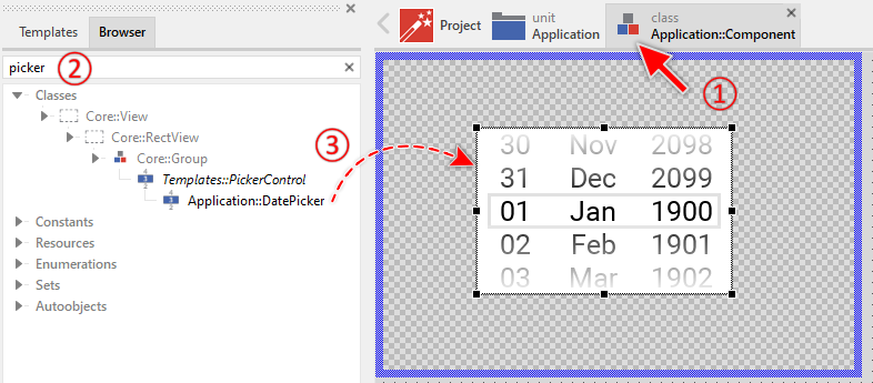
★Eventually name the new instance according to its function within the GUI component (e.g. BirthDate).
Component templates are intended to create widgets which can be modified and adapted to your particular design expectations. In the following sections you will learn how to do this. Originally, if not yet modified, the Date Picker appears as a white rectangle containing three lists to select day, month and year. Our intention is to keep the component templates as minimalistic as possible so they don't distract you with less important design details.
Step 2. Inspect the Date Picker instance
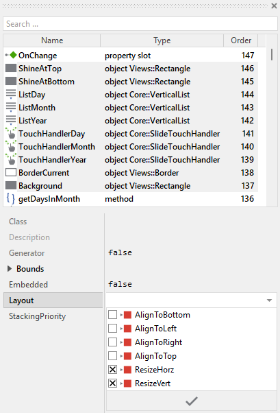
As long as the Date Picker is selected you can inspect and modify its properties conveniently in the Inspector window as demonstrated with the property Bounds in the screenshot below. This is in so far worth mentioning as diverse features of the Date Picker are controlled by the corresponding properties. If you are not familiar with the concept of a property and the usage of Inspector window, please read first the preceding chapter Compositing component appearance.
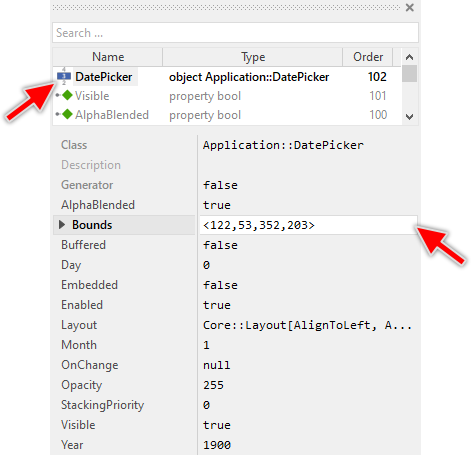
The Date Picker component descends from the Mosaic class Core::Group. Consequently, most of the properties listed in the above screenshot are inherited from this base class. Particular to the Date Picker are only few following properties:
Property |
Description |
|---|---|
Day |
The property Day stores the day of the month. The valid value lies in range 1 .. 31 depending on the actually selected month. |
Month |
The property Month stores the month of the year. The valid value lies in the range 1 .. 12. |
OnChange |
The property OnChange can refer to a slot method, which will receive a signal each time the user selects another date. Thereupon the method's logic will be executed. In the associated slot method you can evaluate the date picker properties Day, Month and Year. |
Year |
The property Year stores the year. The value is valid in range 1900 .. 2100. |
Step 3. Arrange the Date Picker within the superior component
Once added to the component, you can freely move the Date Picker instance, or you simply grab one of its corners and resize it in this way. You can control the position and the size of the component also by directly modifying its property Bounds. If you want the Date Picker to appear behind other views you can reorder it explicitly.
Step 4. Determine the Date Picker's current date value
The Date Picker is intended to allow the user to conveniently select a date value. When the user scrolls one of the three lists (day, month, year), the corresponding date component changes. This alternation is reflected in the Date Picker's properties Day, Month and Year. By evaluating these properties you can simply query the date value which is actually set in the affected picker. Accordingly, when you modify these properties, the affected picker will implicitly update the position of its lists. For example:
// Evaluate the current date of the picker. if ( DatePicker.Month == 12 ) trace "December selection"; [...] // Change the date displayed in the picker. DatePicker.Day = 15; DatePicker.Month = 6; DatePicker.Year = 2024;
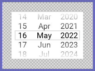
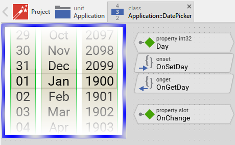
The three properties work together to represent a complete date value. The property Day stores the day of the month and is automatically limited to the valid range depending on the selected month (28-31 days). The property Month stores the month of the year in the range 1 .. 12 (January = 1, February = 2, ..., December = 12). The property Year stores the year in the range 1900 .. 2100. The following figure demonstrates the relations between the three properties and the visual appearance of the Date Picker:
The Date Picker automatically handles the special case of different month lengths and leap years. When you change the month or year, the picker automatically adjusts the Day property if necessary. For example, if the current date is January 31 and you change the month to February, the day will automatically be adjusted to either 28 or 29 depending on whether it's a leap year.
TIP
Please note the Mosaic class Core::Time which is useful to calculate with dates, convert them to various formats, and determine properties like the number of days in a month or whether a year is a leap year.
Step 5. Implement Date Picker's slot method
While the user interacts with the Date Picker, the component sends signals to associated slot methods. Within the slot method your particular implementation can react and process the event. The Date Picker sends signals when the user has finished scrolling one of the three lists and a new date value has been selected.
The slot methods are connected to the picker by simply storing them in the for this purpose available property OnChange. The slot method connected to this property is signaled when the user has finished the interaction with any of the three lists. You can initialize the property OnChange with already existing slot methods or you add a new one and implement it as desired. The following steps describe how to do this:
★First add a new slot method to your GUI component.
★Assign the slot method to the property OnChange of the affected Date Picker.
★Open the slot method for editing.
★In the Code Editor implement your desired operation to execute when the event occurs. Especially your implementation can evaluate the picker's properties Day, Month and Year to determine the selected date. For example:
var int32 birthDay = DatePicker.Day; var int32 birthMonth = DatePicker.Month; var int32 birthYear = DatePicker.Year; // Store the selected birth date SetBirthDate( birthDay, birthMonth, birthYear ); trace "Birth date set to " + string( birthDay, 2 ) + "." + string( birthMonth, 2 ) + "." + string( birthYear, 4 );
When you start the Prototyper now, you can interact with the picker. Thereupon the picker will trigger the associated slot method.
Open the component for editing
Component templates are intended to create widgets which can be adapted and enhanced to your particular design expectations. For this purpose, once you have added a new Date Picker component to your project, you can open the component class for editing. Thereupon the implementation of the component appears in a new Composer page:
Originally, if not yet modified, the Date Picker appears as a white rectangle containing three scrollable lists displaying days (1-31), months (Jan-Dec), and years (1900-2100). The lists can be scrolled by touch interaction, with a border rectangle highlighting the currently selected date value. Gradient shine effects at top and bottom indicate the scrollable nature of the lists. The month list displays abbreviated month names (Jan, Feb, Mar, etc.). Our intention is to keep the component templates as minimalistic as possible so they don't distract you with less important design details.
This default functionality is implemented by following members belonging to the Date Picker. These members are explicitly intended to be modified. Understanding this internal structure is thus the first step before you start to adapt the Date Picker to your particular needs:
Icon |
Member |
Description |
|---|---|---|
|
Day |
The property Day stores the day of the month. The value is automatically limited to the range 1 .. 31 depending on the selected month and year. |
|
Month |
The property Month stores the month of the year. The value is automatically limited to the range 1 .. 12. |
|
Year |
The property Year stores the year. The value is automatically limited to the range 1900 .. 2100. |
|
OnSetDay |
The onset method belongs to the property Day. Each time the value of the property is changed, the code implemented in the method is executed to update the scroll position of the ListDay list. The method also ensures the day value is valid for the currently selected month. |
|
OnGetDay |
The onget method belongs to the property Day. Each time the value of the property is evaluated within an expression, the code implemented in the method calculates the day value from the current scroll position of the ListDay list. |
|
OnSetMonth |
The onset method belongs to the property Month. Each time the value of the property is changed, the code implemented in the method is executed to update the scroll position of the ListMonth list. The method also adjusts the number of days in the ListDay and ensures the day value remains valid. |
|
OnGetMonth |
The onget method belongs to the property Month. Each time the value of the property is evaluated within an expression, the code implemented in the method calculates the month value from the current scroll position of the ListMonth list. |
|
OnSetYear |
The onset method belongs to the property Year. Each time the value of the property is changed, the code implemented in the method is executed to update the scroll position of the ListYear list. The method also adjusts the number of days in the ListDay to handle February in leap years. |
|
OnGetYear |
The onget method belongs to the property Year. Each time the value of the property is evaluated within an expression, the code implemented in the method calculates the year value from the current scroll position of the ListYear list. |
|
OnChange |
The property OnChange can refer to a slot method, which will receive a signal when the user has finished scrolling and selected a new date value. Thereupon the method's logic will be executed. In the associated slot method you can evaluate the picker's properties Day, Month and Year. |
|
onStartSlide |
This internal slot method is called when the user begins touching and dragging one of the three lists. This method is connected to all three touch handlers (TouchHandlerDay, TouchHandlerMonth, TouchHandlerYear). |
|
onEndSlide |
This internal slot method is called when the user releases the touch screen after scrolling one of the lists and the slide animation has finished. The method adjusts the day value if necessary (to handle month length changes) and notifies the owner component that a new date has been selected. This method is connected to all three touch handlers. |
|
OnLoadDayItem |
This internal slot method is called by the ListDay vertical list each time the list needs to load or update a displayed item. The method creates and configures a Text view displaying the day number with two-digit formatting (01, 02, ..., 31). |
|
OnLoadMonthItem |
This internal slot method is called by the ListMonth vertical list each time the list needs to load or update a displayed item. The method creates and configures a Text view displaying the abbreviated month name (Jan, Feb, Mar, etc.). |
|
OnLoadYearItem |
This internal slot method is called by the ListYear vertical list each time the list needs to load or update a displayed item. The method creates and configures a Text view displaying the four-digit year (1900, 1901, ..., 2100). |
|
ListDay |
This Vertical List displays items (1-31) representing the days. The number of items is dynamically adjusted based on the selected month and year. The list supports endless scrolling, meaning items wrap around when scrolling beyond the boundaries. The list is connected to TouchHandlerDay for scroll interaction. |
|
ListMonth |
This Vertical List displays 12 items (Jan-Dec) representing the months. The list supports endless scrolling and is connected to TouchHandlerMonth for scroll interaction. |
|
ListYear |
This Vertical List displays 200 items (1900-2100) representing the years. The list supports endless scrolling and is connected to TouchHandlerYear for scroll interaction. |
|
TouchHandlerDay |
This Slide Touch Handler reacts to touch and drag events in the day list area. It provides smooth scrolling with physics simulation (friction, snap-to-grid behavior) and invokes the associated slot methods: onStartSlide and onEndSlide. |
|
TouchHandlerMonth |
This Slide Touch Handler reacts to touch and drag events in the month list area. It provides smooth scrolling with physics simulation and invokes onStartSlide and onEndSlide. |
|
TouchHandlerYear |
This Slide Touch Handler reacts to touch and drag events in the year list area. It provides smooth scrolling with physics simulation and invokes onStartSlide and onEndSlide. |
|
Background |
This Filled Rectangle view displays the white background of the Date Picker. |
|
BorderCurrent |
This Border view highlights the currently selected date value. The border's color changes depending on whether the user is actively scrolling (sliding state). |
|
ShineAtTop |
This Filled Rectangle view creates a gradient shine effect at the top of the picker to indicate scrollable content above. |
|
ShineAtBottom |
This Filled Rectangle view creates a gradient shine effect at the bottom of the picker to indicate scrollable content below. |
|
UpdateViewState |
This method is invoked automatically after the state of the component has been changed. In case of the Date Picker, the method updates the BorderCurrent view to reflect the picker's current state (especially the sliding state). |
|
getDaysInMonth |
This utility method calculates the number of days in a given month and year. The method takes care of leap years and returns the correct number of days (28, 29, 30, or 31) depending on the month and whether it's a leap year. |
|
enabled |
This variable stores the current state of the picker. It is true if the picker is allowed to handle user inputs (the component is enabled). See also Control the Enabled state of nested components. If the picker is actually disabled, the variable is consequently false. |
|
selected |
This variable stores the current state of the picker. It is true if the picker is actually focused for keyboard inputs (more precisely, the picker is selected within its owner component). |
|
sliding |
This variable stores the current state of the picker. It is true if the user is actively scrolling one of the three lists (the user is interacting with the picker). |


Understand the state management of the component
During its lifetime, the Date Picker will assume different states as direct effect of user interactions and as result of other superior state alternations within the GUI application. To track its current state the Date Picker manages the above mentioned state variables: enabled, selected and sliding. The variables are evaluated and updated within the implementation of the method UpdateViewState. This method evaluates the common component states (Enabled and Selected) and verifies whether the user is actually interacting with one of the picker's three lists via touch screen (the user is sliding). At the end of the method the estimated states are stored in the state variables:
// Estimate the new state var bool isEnabled = aState.contains( Core::ViewState[ Enabled ]); var bool isSelected = aState.contains( Core::ViewState[ Selected ]); var bool isSliding = TouchHandlerDay.Sliding || TouchHandlerMonth.Sliding || TouchHandlerYear.Sliding; [...] // Remember the new state enabled = isEnabled; selected = isSelected; sliding = isSliding;
For example, the local variable isSliding will become true if the user is actually touching and dragging within the area of any of the picker's three lists (the variable Sliding of the TouchHandlerDay, TouchHandlerMonth or TouchHandlerYear is true). Being in this state, the picker should assume an appearance indicating that the user is actively interacting with it.
When common component states (Enabled or Selected) have changed, the method UpdateViewState is invoked automatically. You don't need to worry about it. Any other state alternations need to explicitly request an invocation of the UpdateViewState method. This is especially true for state alternations caused by touch handlers. In the Date Picker, the slot methods onStartSlide and onEndSlide explicitly request the invocation:
// The user has begun an interaction with the date picker. Request the // UpdateViewState() method to be called in order to eventually refresh // the date picker appearance. InvalidateViewState();
Depending on your design expectations the default state management may require adaptations. Generally, you are free to modify the method UpdateViewState, add further state variables to your Date Picker or even remove the existing functionality if it is not needed in your case.
Adapt the appearance of the component
Originally, if not yet modified, the Date Picker appears as a white rectangle with three scrollable lists, a border highlighting the selected value, and gradient shine effects at top and bottom. Our intention is to keep the component templates as minimalistic as possible so they don't distract you with less important design details. It's up to you to adapt the picker to have the expected appearance. The available possibilities are explained in the following sections. Please note, that you can combine the different approaches according to your application case:
1. Modify existing views
The Date Picker template contains per default the views Background, BorderCurrent, ShineAtTop and ShineAtBottom. If desired, you can modify the views. For example, you can display them with other colors depending on the actual state of the picker. For this purpose you change the implementation of the above explained method UpdateViewState responsible for tracking the state alternations within the Date Picker.
When you open the method UpdateViewState you will see that it does not only update the state variables but also updates the view BorderCurrent existing within the component. Accordingly, depending on whether the user is actively sliding, the border color changes. By simply modifying this implementation you change the appearance. For example, you change the border color to blue when the user actively interacts with the picker:
if ( isSliding ) BorderCurrent.Color = #0000FFFF; // <-- blue color else BorderCurrent.Color = #E1E1E1FF; // <-- light gray color
You can also modify other properties of the existing views. For example, you could change the visibility, opacity, or even the size of views depending on the picker's state. You might want to hide the shine effects when the picker is disabled:
if ( !isEnabled ) { ShineAtTop.Visible = false; ShineAtBottom.Visible = false; BorderCurrent.Color = #CCCCCCFF; } else { ShineAtTop.Visible = true; ShineAtBottom.Visible = true; if ( isSliding ) BorderCurrent.Color = #0000FFFF; else BorderCurrent.Color = #E1E1E1FF; }
2. Remove existing views
If not needed, you can delete the per default existing views Background, BorderCurrent, ShineAtTop and ShineAtBottom. Doing this, please don't forget to also remove all references to the deleted views from the implementation of the UpdateViewState method. Otherwise you will get error messages next time the Composer contents is reloaded. To avoid this error message we recommend to perform the steps in following order:
★In the UpdateViewState method adapt the implementation to not refer anymore to the undesired view. For example, if you decided to delete the BorderCurrent view, simply remove all corresponding code lines.
★Now you can delete the affected views.
3. Add further views to the component
You can add further views to your Date Picker. For example, you can add a Text view to display a caption in the upper area of the picker. This caption could label the purpose of the date selection, such as "Birth Date", "Expiry Date", or "Appointment Date". Or you add an Image view to display an icon representing the date picker's function. The appearance of the views (e.g. colors) can be fixed, predetermined at the design time. Or it can change according to the actual state of the picker. For example, if the user is actually scrolling a list, the caption text color can change or an icon can appear highlighted. Following steps explain the workflow:
★First add the desired view to the component. For example add a Text view.
★Name the just added view according to its function in the component. For example CaptionText.
★In order to arrange the view within the Date Picker, move the view, or you simply grab one of its corners and resize it in this way. For a caption text in the upper area, you would position it above the lists. If you want the view to appear behind other views you can reorder it explicitly.
★In Inspector window configure the properties of the just added view. For example, in case of the Text view you can select the font to render the text, set the text alignment, and configure the initial string to display (e.g. "Select Date").
★In the UpdateViewState method adapt the implementation to update the properties of the view according to the picker's current state. This can be, for example, the color of the Text view depending on the actual sliding state of the picker. For this purpose you could add following code to the method:
// Update the appearance of the CaptionText view. if ( !isEnabled ) CaptionText.Color = #CCCCCCFF; // light gray color when disabled else if ( isSliding ) CaptionText.Color = #0000FFFF; // blue color when sliding else CaptionText.Color = #000000FF; // black color in normal state
4. Replace existing views
Also possible, you can replace the existing views by other views. For example, in the original version, the Date Picker displays month names as text. To make the component more sophisticated, you could replace the here used Text views by e.g. Image views displaying custom month graphics or icons. For this purpose:
★Think about which view is adequate as replacement for the old view existing per default in the component. An overview of existing views is found in the section Using Views.
★Delete the old view.
★Add the desired view to the component.
★Name the just added view to have the name of the previously removed view.
★Eventually move the view, or you simply grab one of its corners and resize it in this way. If you want the view to appear behind other views you can reorder it explicitly.
★If necessary, in Inspector window configure the properties of the just added view.
★If necessary, modify the implementation of other methods existing in the component if these evaluate/modify the properties of the replaced view.
Understand the list management
The Date Picker uses three Vertical List objects to display the selectable date values: ListDay with a variable number of items (28-31 depending on month), ListMonth with 12 items (Jan-Dec), and ListYear with 200 items (1900-2100). Each list is responsible for displaying its corresponding date component and supporting scrolling interaction.
The lists are configured with several important properties:
Property |
Description |
|---|---|
NoOfItems |
Specifies the total number of items in the list. For ListDay this is dynamically adjusted between 28 and 31 depending on the selected month and year. For ListMonth this is 12, and for ListYear this is 200 (years 1900-2100). |
ItemHeight |
Specifies the height in pixels of each item. The default value is 30 pixels. |
ItemClass |
Specifies what the items are. In its original version, all lists are configured to use Text views as items. |
Endless |
When true, the list supports infinite scrolling. Scrolling beyond the last item (e.g., past December) automatically wraps to the first item (January). |
SlideHandler |
References the associated Slide Touch Handler that controls the scrolling interaction for this list. |
OnLoadItem |
References the slot method that will be called each time the list needs to load or update a visible item. |
ScrollOffset |
The current scroll position in pixels. Negative values scroll the list downward, positive values scroll upward. This property is synchronized with the corresponding Day, Month, or Year property. |
The vertical list component manages items dynamically. Only the items that are actually visible on screen are created and displayed. As the user scrolls, items that leave the visible area are recycled and reused for newly appearing items. This approach ensures efficient memory usage regardless of the total number of items in the list.
Each time a list needs to display an item, it calls the corresponding slot method: OnLoadDayItem, OnLoadMonthItem, or OnLoadYearItem. These slot methods are responsible for configuring the view that represents the item. The default implementation uses a Text view for each item. For example, the following is the implementation of the OnLoadDayItem method:
// Get the number of the item to load. The list component takes care of the // creation of the corresponding item view. Just access it ... var int32 itemNo = ListDay.Item; var Views::Text itemView = (Views::Text)ListDay.View; // The implementation of this slot method does not match the item class // specified in the associated list component. Or the slot method is not // called in context of the OnLoadItem list operation. if ( itemView == null ) return; // Configure the item view ... itemView.String = string( itemNo + 1, 2 ); itemView.Font = Templates::DefaultFontPicker; itemView.Color = #000000FF; itemView.Alignment = Views::TextAlignment[ AlignHorzCenter, AlignVertCenter ]; // Ensure that the item has correct size. The position of the item will be // managed by the list component. itemView.Bounds.size = ListDay.ViewSize;
Important aspects of the item loading process:
★The property Item of the list provides the index of the item to load (0-based index). For days, this means 0=1st day, 1=2nd day, etc.
★The property View of the list provides access to the view object representing this item. The list component automatically creates instances of the class specified in its ItemClass property (default is Views::Text).
★The string( itemNo + 1, 2 ) expression adds 1 to convert from 0-based index to 1-based day number and formats it with leading zeros (e.g., "01", "02", ..., "31").
★The ViewSize property provides the size each item should have, automatically calculated by the list based on its ItemHeight and width of the list.
The implementation of OnLoadMonthItem is different because it displays month names instead of numbers. It uses a switch statement to select the appropriate month name from the Mosaic resources:
var int32 itemNo = ListMonth.Item; var Views::Text itemView = (Views::Text)ListMonth.View; if ( itemView == null ) return; // Select the text to display in the 'Month' list switch ( itemNo ) { case 1 : itemView.String = Resources::FebruaryAbbr; case 2 : itemView.String = Resources::MarchAbbr; case 3 : itemView.String = Resources::AprilAbbr; case 4 : itemView.String = Resources::MayAbbr; case 5 : itemView.String = Resources::JuneAbbr; case 6 : itemView.String = Resources::JulyAbbr; case 7 : itemView.String = Resources::AugustAbbr; case 8 : itemView.String = Resources::SeptemberAbbr; case 9 : itemView.String = Resources::OctoberAbbr; case 10 : itemView.String = Resources::NovemberAbbr; case 11 : itemView.String = Resources::DecemberAbbr; default : itemView.String = Resources::JanuaryAbbr; } itemView.Font = Templates::DefaultFontPicker; itemView.Color = #000000FF; itemView.Alignment = Views::TextAlignment[ AlignHorzCenter, AlignVertCenter ]; itemView.Bounds.size = ListMonth.ViewSize;
The OnLoadYearItem method is similar to OnLoadDayItem, but it offsets the item number by 1900 to display years in the range 1900-2100:
var int32 itemNo = ListYear.Item; var Views::Text itemView = (Views::Text)ListYear.View; if ( itemView == null ) return; // Configure the item view ... itemView.String = string( itemNo + 1900, 4 ); itemView.Font = Templates::DefaultFontPicker; itemView.Color = #000000FF; itemView.Alignment = Views::TextAlignment[ AlignHorzCenter, AlignVertCenter ]; itemView.Bounds.size = ListYear.ViewSize;
Understand the date value calculation and leap year handling
The Date Picker's three properties Day, Month and Year are directly synchronized with the scroll positions of the three vertical lists ListDay, ListMonth and ListYear. The calculation between scroll position and date value is performed in the onget and onset methods of these properties.
Each onget method calculates the date value from the list's current scroll position. For example, the onget method for the Day property:
// From the actual scroll offset calculate the number of the corresponding // list item. Note, the list displays the actually selected date at the // third position (index 2). Additionally the first item starts with day 1. return 1 + (( -ListDay.ScrollOffset / ListDay.ItemHeight ) + 2 ) % ListDay.NoOfItems;
This calculation performs following operations:
★The ScrollOffset property of the list is negative when scrolling downward (showing later dates). Dividing it by the ItemHeight (30 pixels per default) converts the pixel offset into an item index.
★The +2 offset compensates for the display positioning. The Date Picker is designed to show the currently selected date value at the third visible position (index 2) in each list, with two items visible above and two items visible below the selection.
★The modulo operator % with ListDay.NoOfItems implements the endless scrolling behavior. This is particularly important for the day list because the number of items changes dynamically (28-31) depending on the selected month.
★The +1 at the beginning converts from 0-based list index to 1-based day number (days are counted 1-31, not 0-30).
The Month property calculation is similar, but months are numbered 1-12:
// From the actual scroll offset calculate the number of the corresponding // list item. Note, the list displays the actually selected date at the // third position (index 2). Additionally the first item starts with // month 1: January return 1 + (( -ListMonth.ScrollOffset / ListMonth.ItemHeight ) + 2 ) % 12;
The Year property calculation includes an offset to the base year 1900:
// From the actual scroll offset calculate the number of the corresponding // list item. Note, the list displays the actually selected date at the // third position (index 2). Additionally the first item starts with year 1900 return 1900 + (( -ListYear.ScrollOffset / ListYear.ItemHeight ) + 2 ) % 200;
The three properties Day, Month, and Year are automatically limited to their valid ranges. The limiting is performed in the onset methods before the value is stored. However, the Date Picker includes special logic to handle varying month lengths and leap years.
Conversely, each onset method updates the list's scroll position when the property is modified programmatically. For example, the onset method for the Month property:
// Limit the assigned value to the valid range 1 .. 12 if ( value < 1 ) value = 1; if ( value > 12 ) value = 12; // Adjust the scroll position of the corresponding list. Note, the // list displays the actually selected date scrolled by two items. // Take this displacement in account. Additionally the first item // starts with month 1: January ListMonth.ScrollOffset = ( value - 1 - 2 ) * -ListMonth.ItemHeight; // Changing the month may affect the actually selected day. var int32 daysInMonth = getDaysInMonth( value, Year ); // Ensure the list displays the right number of days ListDay.NoOfItems = daysInMonth; // Adjust the day if necessary if ( Day > daysInMonth ) Day = daysInMonth;
This implementation demonstrates the leap year and month length handling. After updating the month, the method:
★Calls getDaysInMonth() to determine how many days the selected month has.
★Updates ListDay.NoOfItems to display the correct number of days.
★Adjusts the Day property if the current day is invalid for the new month (e.g., changing from January 31 to February would adjust to February 28 or 29).
The onset Year method includes similar logic to handle leap years:
// Limit the assigned value to the valid range. if ( value < 1900 ) value = 1900; if ( value > 2100 ) value = 2100; // Adjust the scroll position of the corresponding list. Note, the // list displays the actually selected date scrolled by two items. // Take this displacement in account. Additionally the first item // starts with year 1900 ListYear.ScrollOffset = ( value - 1900 - 2 ) * -ListYear.ItemHeight; // Changing the year may affect the actually selected day (February // and the leap year). var int32 daysInMonth = getDaysInMonth( Month, value ); // Ensure the list displays the right number of days ListDay.NoOfItems = daysInMonth; // Adjust the day if necessary if ( Day > daysInMonth ) Day = daysInMonth;
The utility method getDaysInMonth() encapsulates the leap year logic:
method int32 getDaysInMonth( arg int32 aMonth, arg int32 aYear ) { return ( new Core::Time ).Initialize2( aYear, aMonth, 1, 0, 0, 0 ).DaysInMonth; }
This method creates a temporary Core::Time object for the first day of the specified month and year, then queries its DaysInMonth property. The Core::Time class automatically handles leap year calculation according to the Gregorian calendar rules.
Finally, the onEndSlide slot method includes additional logic to ensure date validity after user interaction:
// The last list has finished the slide animation. Adjust the day and notify the owner // about the made selection if ( !TouchHandlerDay.Sliding && !TouchHandlerMonth.Sliding && !TouchHandlerYear.Sliding ) { // Changing the month may affect the actually selected day. var int32 daysInMonth = getDaysInMonth( Month, Year ); var int32 day = Day; // Ensure the list displays the right number of days ListDay.NoOfItems = daysInMonth; // Adjust the day so it is valid for the actual month. Day = ( day > daysInMonth )? daysInMonth : day; // Notify the owner of the date picker, that the user has selected another date. postsignal OnChange; }
This ensures that when the user scrolls the month or year while the day is set to 31, and the new month has fewer days, the day is automatically adjusted to the last valid day of that month.
Understand the handling of touch inputs
The Date Picker is an interactive component controlled via touch screen or mouse device. For this purpose the template contains three Slide Touch Handler objects named TouchHandlerDay, TouchHandlerMonth and TouchHandlerYear. Each touch handler covers the area of its corresponding list. To these handlers are associated two slot methods: onStartSlide and onEndSlide. These methods are invoked at the beginning of the slide interaction (start) and when the slide animation has finished (end):
The slide touch handlers provide smooth scrolling with physics simulation. The user can drag a finger up or down within any of the three list areas, and the list will scroll accordingly. When the user releases the finger, the list continues scrolling with simulated inertia (deceleration) until it snaps to the nearest item position. This behavior is controlled by two important properties:
★Friction: Controls how quickly the list decelerates. The default value is 0.2. Lower values result in longer coasting, higher values make the list stop more quickly.
★SnapNext: Determines the snap-to-grid behavior. The default value is <0,30>, which corresponds to the ItemHeight of the lists. This ensures that after scrolling, the list always aligns to show complete items.
The slot methods take care of three tasks. First, they request an invocation of the UpdateViewState method when the user begins or ends interaction with the picker, allowing the visual appearance to reflect the current state. Second, the onEndSlide method adjusts the day value and the number of items in the day list to handle month length changes. Third, it sends a signal to the slot method stored in the property OnChange to notify the owner component that a new date has been selected.
The method onStartSlide is invoked when the user begins touching and dragging any of the three lists:
// The user has begun an interaction with the date picker. Request the // UpdateViewState() method to be called in order to eventually refresh // the date picker appearance. InvalidateViewState();
The method onEndSlide is invoked when the slide animation has finished. This occurs after the user has released the touch and the list has coasted to its final position:
// The user has finished the interaction with the date picker. Request the // UpdateViewState() method to be called in order to eventually refresh // the date picker appearance. InvalidateViewState(); // The last list has finished the slide animation. Adjust the day and notify the owner // about the made selection if ( !TouchHandlerDay.Sliding && !TouchHandlerMonth.Sliding && !TouchHandlerYear.Sliding ) { // Changing the month may affect the actually selected day. var int32 daysInMonth = getDaysInMonth( Month, Year ); var int32 day = Day; // Ensure the list displays the right number of days ListDay.NoOfItems = daysInMonth; // Adjust the day so it is valid for the actual month. Day = ( day > daysInMonth )? daysInMonth : day; // Notify the owner of the date picker, that the user has selected another date. postsignal OnChange; }
Please note that the onEndSlide method checks whether all three touch handlers have finished sliding before performing the day adjustment and sending the signal. This ensures that the owner component receives only one notification even when the user has scrolled multiple lists in quick succession. The day adjustment is particularly important when the user changes from a month with 31 days to one with fewer days - the picker automatically adjusts to the last valid day of the new month.
This is also essential on target devices supporting multi-touch displays. On such devices the user can interact with all three lists simultaneously, by using three fingers (see also Touch screen inputs).
Usually you will not need to edit the implementation of these methods. They correspond already to whatever typical date pickers do. Nevertheless, you are free to change this default functionality if you want some particular behavior to be implemented in your picker. For example, you could modify the friction or snap behavior by adjusting the properties of the touch handlers:
★Select one of the touch handler objects (e.g. TouchHandlerDay).
★In Inspector window modify its properties:
★Friction: Try values between 0.1 (slower deceleration) and 0.5 (faster deceleration).
★SnapNext: Should always match the ItemHeight of the corresponding list to ensure proper alignment.
If your device does not contain any touch screen nor mouse, the per default existing touch handlers and their associated slot methods are unnecessary ballast. You could remove them and implement keyboard-based control instead. In practice this could be achieved by adding three Key Press Handlers. One handler to toggle the selection between the three lists (e.g. Tab key), and the second and third handler to react to Up/Down or Plus/Minus keys and adjust accordingly the scroll position in the currently selected list.
Customize item height and appearance
The default implementation of the Date Picker displays each date value with a height of 30 pixels and uses standard black text on white background. The month list displays abbreviated month names. If your design requires different dimensions or appearance, you can customize these aspects.
Changing the item height
To change the height of items in the lists, you need to modify two related properties:
★Select the list you want to modify (e.g., ListDay).
★In Inspector window modify its ItemHeight property. For example, set it to 40 for taller items.
★Select the corresponding touch handler (e.g., TouchHandlerDay).
★In Inspector window modify its SnapNext property to match the new item height. For example, set it to <0,40>.
★Repeat these steps for the other two lists and touch handlers to maintain a consistent appearance.
The SnapNext property must always match the ItemHeight to ensure that after scrolling, the lists align properly with complete items visible.
Customizing day and year appearance
To change the visual appearance of day and year items (fonts, colors, alignment), you modify the implementation of the OnLoadDayItem and OnLoadYearItem slot methods:
★Open the slot method for editing (e.g., OnLoadDayItem).
★Modify the properties assigned to itemView according to your design expectations:
var int32 itemNo = ListDay.Item; var Views::Text itemView = (Views::Text)ListDay.View; if ( itemView == null ) return; // Customize the appearance: itemView.String = string( itemNo + 1, 2 ); itemView.Font = Resources::FontLarge; // Use larger font itemView.Color = #0066CCFF; // Use blue color itemView.Alignment = Views::TextAlignment[ AlignHorzCenter, AlignVertCenter ]; itemView.Bounds.size = ListDay.ViewSize;
You can customize various aspects:
★Font: Reference any font resource defined in your project.
★Color: Use any color value. You can also make colors conditional based on itemNo to highlight specific dates.
★Alignment: Change how text is positioned within the item area.
★String: Modify the formatting. For example, remove leading zeros by using string( itemNo + 1 ) instead of string( itemNo + 1, 2 ).
You can also make the appearance conditional based on the item number. For example, to highlight the first day of each month:
var int32 itemNo = ListDay.Item; var Views::Text itemView = (Views::Text)ListDay.View; if ( itemView == null ) return; itemView.String = string( itemNo + 1, 2 ); itemView.Font = Templates::DefaultFontPicker; itemView.Alignment = Views::TextAlignment[ AlignHorzCenter, AlignVertCenter ]; // Highlight the first day with different color if ( itemNo == 0 ) itemView.Color = #FF0000FF; // Red for first day else itemView.Color = #000000FF; // Black for other days itemView.Bounds.size = ListDay.ViewSize;
Customizing month names
The month list has a special implementation because it displays text names instead of numbers. To customize the month names, you modify the OnLoadMonthItem slot method:
★Open the slot method OnLoadMonthItem for editing.
★Modify the switch statement to use different month names. You can use:
★Full month names instead of abbreviations: Resources::January instead of Resources::JanuaryAbbr.
★Your own custom month name constants defined in your project.
For example, to use full month names:
var int32 itemNo = ListMonth.Item; var Views::Text itemView = (Views::Text)ListMonth.View; if ( itemView == null ) return; // Select the text to display in the 'Month' list using full names switch ( itemNo ) { case 1 : itemView.String = Resources::February; case 2 : itemView.String = Resources::March; case 3 : itemView.String = Resources::April; case 4 : itemView.String = Resources::May; case 5 : itemView.String = Resources::June; case 6 : itemView.String = Resources::July; case 7 : itemView.String = Resources::August; case 8 : itemView.String = Resources::September; case 9 : itemView.String = Resources::October; case 10 : itemView.String = Resources::November; case 11 : itemView.String = Resources::December; default : itemView.String = Resources::January; } itemView.Font = Templates::DefaultFontPicker; itemView.Color = #000000FF; itemView.Alignment = Views::TextAlignment[ AlignHorzCenter, AlignVertCenter ]; itemView.Bounds.size = ListMonth.ViewSize;
Or to display month numbers instead of names:
var int32 itemNo = ListMonth.Item; var Views::Text itemView = (Views::Text)ListMonth.View; if ( itemView == null ) return; // Display month as number (01, 02, ..., 12) itemView.String = string( itemNo + 1, 2 ); itemView.Font = Templates::DefaultFontPicker; itemView.Color = #000000FF; itemView.Alignment = Views::TextAlignment[ AlignHorzCenter, AlignVertCenter ]; itemView.Bounds.size = ListMonth.ViewSize;
TIP
The constants containing month names (e.g. Resources::February) can be localized and enhanced by further languages used in your application. To achieve that you create a variant of the respective constant inside one of your own units. Then you can modify the initialization value of the constant or configure values for other languages. See also Managing localization.
Using custom views for items
More sophisticated customizations are possible by changing the ItemClass property of the lists to use custom view classes instead of simple Views::Text. This would allow you to display the items with other views. For example, if your application case requires the items to appear with some fancy design, you can provide a bitmap resource containing month icons or symbols as small color rich images (frames inside a multi-frame bitmap resource). Then adapt the property ItemClass of the month list to be Views::Image and adapt the implementation of the slot method as shown below:
// Get the number of the item to load. The list component takes care of the // creation of the corresponding item view. Just access it ... var int32 itemNo = ListMonth.Item; var Views::Image itemView = (Views::Image)ListMonth.View; // The implementation of this slot method does not match the item class // specified in the associated list component. Or the slot method is not // called in context of the OnLoadItem list operation. if ( itemView == null ) return; // Configure the item view ... itemView.Bitmap = Application::MonthIconsBitmap; itemView.FrameNumber = itemNo; // Ensure that the item has correct size. The position of the item will be // managed by the list component. itemView.Bounds.size = ListMonth.ViewSize;
Configure the layout of the component
The initial size of the Date Picker is determined by the thick blue border surrounding the Canvas area. It corresponds to the size that all instances of this Date Picker component will have by default. If desired, you can adjust the Canvas area and change this default size accordingly. This could be for example the case when you plan to create a larger Date Picker with more spacing or additional elements like a caption. For this purpose you click and drag the edges of the surrounding border (see also Resize the Canvas area). Once the size is changed, you can then adapt (move, resize) the views and lists existing within the component:
The resulting size of the Date Picker is by default fixed. When you resize a picker instance, the content of the picker remains with the original size. This is because the picker uses texts with fixed predetermined height. Nevertheless, if your application case requires the pickers to be flexible in size, you will need to:
★Configure the Layout property of all views and touch handlers existing in the Date Picker according to your expected layout rules. With this property you can determine how the views and touch handler adapt their position/size when the picker itself is resized.
When you configure all views and touch handler with following layout setting, the views will adjust their position and size proportionally to changes of the picker's own size:
★Calculate the item height dynamically from the current height of the picker. For this purpose overwrite the inherited method UpdateLayout and calculate in the method from the picker's height the optimal item height. See also Implement your own layout algorithm.
★In the OnLoadDay, OnLoadMonth and OnLoadYear slot method select a font with appropriate height corresponding to the actual item height.
If you add other decorative views or want to adjust the positions of the lists, you can similarly configure their Layout properties. However, be careful when modifying the positions of the three lists and their associated touch handlers - they must remain synchronized (each touch handler must cover its corresponding list area).
Implement the interface of the component
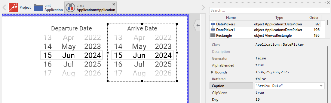
When creating your own Date Picker component you should ensure that instances of the picker can be configured to control all the features implemented in it. For example, if you have enhanced the picker to display a caption text, you should allow this caption to be specified individually for each picker instance. In this way several picker instances can exist at the same time, each displaying another caption like "Birth Date", "Expiry Date", or "Event Date".
To control the features in your picker you use properties. A property can be understood as variable where the corresponding setting is stored, e.g. the caption text to display in the picker. When the value of the property changes, the picker can react to it and update its appearance accordingly. The properties reflect thus the settings within your picker. Together they form the interface of the component.
Usually, each particular setting within a component is represented by the corresponding property. Thus, a picker where caption and icon can be configured will require two properties: one for the caption text and one for the icon bitmap. In its original version, the Date Picker contains already four properties Day, Month, Year and OnChange. They allow the picker instance to configure its current date value or to receive notifications when the user selects a new date. In order to enhance this interface by your own properties, following steps are necessary:
★Add a new property to the Date Picker component.
★Name the property according to the setting it should represent. For example, the property intended to store the caption text could be named Caption.
★Determine the data type of the property. For example, the property intended to store the caption text will store a string.
★Determine the initialization value of the property. This value should correspond to the picker's default state. For example, the property intended to store the caption text should be initialized with the string the picker will display if no other text is specified (e.g. "Select Date").
★The property is accompanied by its onget method. Except particular cases, this method is not needed and can be deleted now.
★The property is accompanied by its onset method. Open this method for editing.
★Adapt the implementation of the onset method so it updates the picker according to its new value. For example, in case of the property intended to store the caption text, you will probably update the Text view where the caption is displayed:
// The value doesn't change - nothing to do. if ( pure Caption == value ) return; // Remember the property's new value. pure Caption = value; // Update the view to display the just modified caption. CaptionText.String = value;
That is all. Now when you deal with instances of the Date Picker component, you can evaluate and modify the properties similarly to how you access variables. Especially, when the picker instance is selected, you see in Inspector window the property and can change it there. The modification is immediately visible in the Composer window:
If desired, the properties can also be modified at the runtime of your application. The picker caption, for example, can be adapted to provide useful information for the user concerning the date selection purpose. For this purpose you access and modify the affected property directly within Chora code:
// Let different pickers display their specific purpose BirthDatePicker.Caption = "Birth Date"; ExpiryDatePicker.Caption = "Expiry Date"; EventDatePicker.Caption = "Event Date"; // Configure the birth date picker with a specific date BirthDatePicker.Day = 21; BirthDatePicker.Month = 12; BirthDatePicker.Year = 1971;
Perform state changes with animations
In the section Adapt the appearance of the component you learned how state alternations within the Date Picker are processed and how views existing in the component are updated in order to reflect the actual state. Accordingly, when the user starts scrolling a list (begins the sliding interaction), the picker can appear with a modified appearance. When the user releases and the sliding animation finishes, the picker restores its normal appearance. The default implementation performs such appearance updates instantly, just in the moment when the respective interaction took place.
If desired, you can modify the Date Picker to update its appearance with animations. For example, instead of instantly switching the BorderCurrent color between the sliding and non-sliding states, the picker can smoothly fade the color. Or you can animate the opacity of decorative views. For this purpose you use the Animation Effects. With an Animation Effect you can animate a property of a view existing in the picker. Following are the steps how to do this:
★Depending on the data type of the property to animate, add the appropriate Animation Effect to the Date Picker. For example, to animate a color property, add a Pulse color effect.
★Connect the effect object with the property to animate. For example, if you want to animate the color of the BorderCurrent view, connect the Pulse color effect with the property Color of the BorderCurrent view.
★Configure the duration and eventually the desired timing (easing) for the animation.
★Once started, the effect will animate the property endlessly. In our case, however, the animation should stop at its end. For this purpose set the effect's property NoOfCycles to the value 1.
★Configure the key values for the animation. In case of the pulse color effect, it is the start and the end color. For example, to animate the border color between light gray and blue, configure the effect's property Value1 with #E1E1E1FF (light gray) and the property Value2 with #0000FFFF (blue). This step is appropriate if the key values are fixed, known at the design time. Otherwise, the key values must be set at runtime shortly before the effect is triggered.
★Open the method UpdateViewState and modify its implementation to trigger the effect object when the picker switches between the sliding and not sliding states. For example in case of the above mentioned pulse color effect to animate the color of the BorderCurrent, following implementation could be adequate:
// Estimate the new state var bool isEnabled = aState.contains( Core::ViewState[ Enabled ]); var bool isSelected = aState.contains( Core::ViewState[ Selected ]); var bool isSliding = TouchHandlerDay.Sliding || TouchHandlerMonth.Sliding || TouchHandlerYear.Sliding; // Following code updates the views instantly, without animations. // We keep this for the disabled state. if ( !isEnabled ) BorderCurrent.Color = #CCCCCCFF; // For enabled state, use animations for sliding transitions else { // Switching from not sliding -> sliding state. Start the animation. if ( isSliding && !sliding ) { ColorEffect.Reversed = false; ColorEffect.Enabled = true; } // Switching from sliding -> not sliding state. Start the animation. else if ( !isSliding && sliding ) { ColorEffect.Reversed = true; ColorEffect.Enabled = true; } } // Remember the new state enabled = isEnabled; selected = isSelected; sliding = isSliding;
★Since the properties of the affected views are now modified with animations, you will eventually need to adapt their initial values to correspond to the default state of the picker. For example, you might need to set the property Color of the view BorderCurrent to the value #E1E1E1FF (default color is light gray).