Embedded Wizard Connect for Figma: Figma user guide and best practice
This chapter is primarily intended for Figma designers and, in most cases, provides sufficient information to understand how a Figma design can be optimized for achieving optimal conversion results. As a designer, it is purely optional to read the subsequent chapters following this one.
In general, Figma imposes almost no restrictions on how designs can be created. On one hand, this flexibility allows designers to freely create without rigid constraints, such as specific naming conventions or project structuring requirements. However, a well-organized Figma design project typically adheres to certain guidelines to ensure effective collaboration - whether among multiple designers or across interdisciplinary teams, such as software developers. Consequently, the concept of following design guidelines will likely be familiar to most Figma users.
While the Embedded Wizard Connect for Figma plugin does not require any template constraints, adhering to certain recommendations can help streamline the transition from design to code. As noted, these recommendations are entirely optional, meaning the plugin can generally convert any design. Nevertheless, this chapter provides insights into these recommendations and how they can enhance the workflow.
Object naming
Figma does not strictly require designers to name objects properly. By default, it names objects based on their type. For example, a newly added rectangle will be labeled Rectangle n, where n is an incrementing number, and text elements are named according to their content. In this regard, Figma is quite flexible. However, it is a recommended practice to name objects based on their intended purpose rather than their type. For instance, a button may have different states such as released, pressed, or disabled. Including these states in the object names, e.g., ButtonReleased, ButtonPressed, or ButtonDisabled, can assist embedded software engineers in understanding the purpose of specific objects within the design. Refer to the following illustration for examples of recommended and not recommended naming practices.
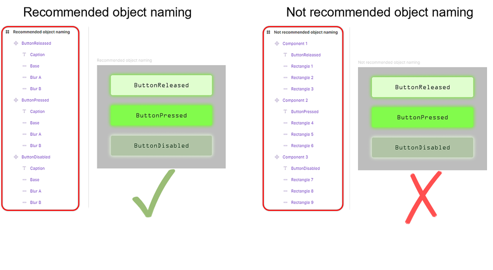
Object naming.
When using the Embedded Wizard Connect for Figma plugin, embedded software engineers can choose to retain the same names assigned by the designer within the Figma design. Employing clear, descriptive naming conventions provides a foundational level of structure in the exported Embedded Wizard unit. As shown in the next illustration, the names from Figma are directly reflected in the resulting Embedded Wizard unit.
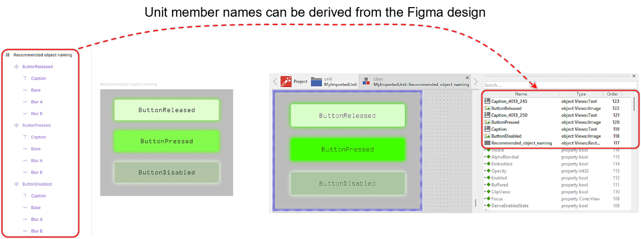
Copied object names after import into Embedded Wizard.
Although following this recommendation significantly benefits other team members, it is not mandatory. If, for any reason, the object names in the Figma design cannot be renamed, the embedded software engineers can configure the plugin to assign generic names within Embedded Wizard instead or use a Name mapping feature.
Using texts
Texts used within Embedded Wizard rely on a font resource. A font resource is typically associated with a specific font file (e.g. .ttf), which has to be installed on the user’s computer or stored within the Embedded Wizard project directory. Unfortunately, Figma utilizes its own internal font manager resulting in that the used fonts cannot be automatically exported as part of the exported .ewx file. Instead, users must manually ensure that the correct font file is added to the Embedded Wizard project. If the required font files are missing, errors will occur in the resulting Embedded Wizard project:
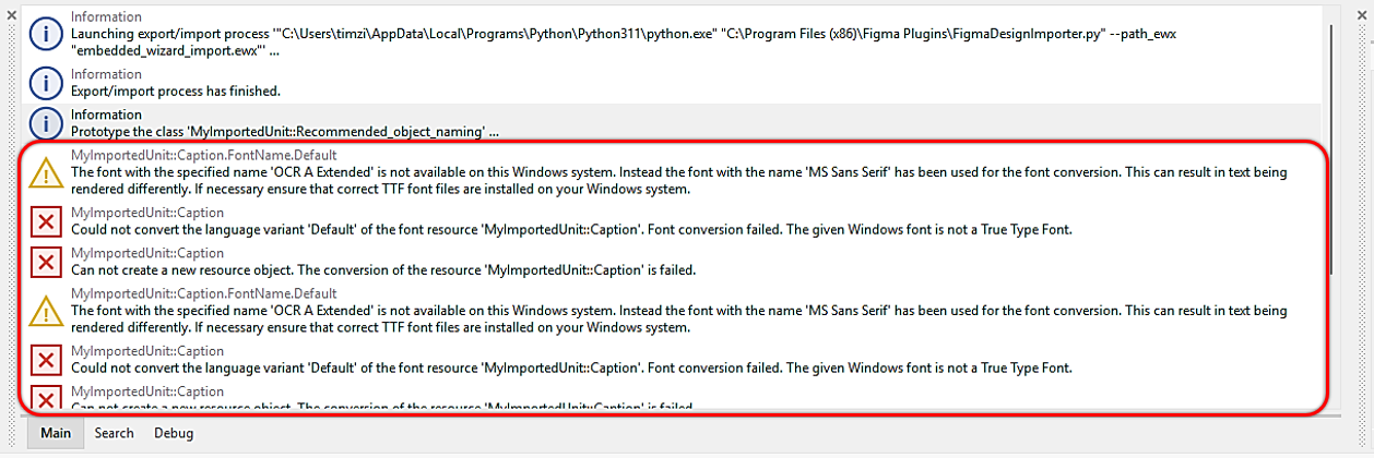
Error messages when font files are not available.
To prevent such issues, designers should ensure that all necessary font files are readily available and provided to the embedded software engineer. This enables the engineer to include these fonts in the GUI project and configure them appropriately within Embedded Wizard Studio.
Another challenge to consider is that Figma may internally handles font names differently than Embedded Wizard. This discrepancy can lead to error messages, even if the correct font file is already installed on the engineer's computer. Refer to the following illustration:
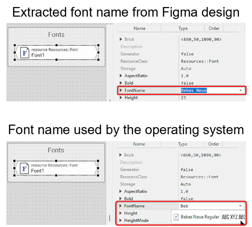
Differently managed font name by Figma.
As shown, the font in Figma is labeled as Bebas Neue, whereas in Embedded Wizard, the same font is accessible as Bebas Neue Regular. In such cases, it is necessary to collaborate with the Embedded Wizard software engineer to identify the correct font naming. While this may cause minor friction, these issues are typically resolved quickly and without difficulty. Once the correct font name mapping is identified, the Name mapping feature of the Embedded Wizard Connect for Figma plugin can be used to automate the renaming of the fonts utilized in the design.
Components and instances
In Figma, one or multiple design elements can be selected and converted into an component. An component represents a reusable object that can be inserted as instance into various locations within the design. Whenever the original component is modified, all linked instances automatically reflect those changes. For more details on this feature, we also encourage to read the relevant documentation.
In most cases, components are used to replicate the same elements across a design project - for example, buttons. A component can consist of multiple design elements, such as rectangles, shadows, or text. It is generally wanted to treat a component and its instances as unified elements rather than single design elements. Using the Embedded Wizard Connect for Figma plugin, users can decide whether a component/instance should be exported as a single image or as individual graphical objects. However, having the freedom to make this choice relies on the proper use of components/instances from the outset.
Consider the following design: there is a frame named Components and another frame named Implementation. In this example, the decorative element labeled Hexagon A appears three times within the Implementation frame.
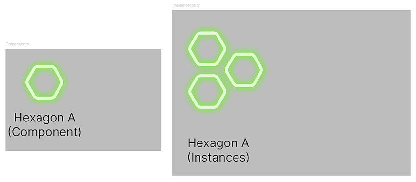
Figma components.
If the decorative element needs to be modified, it is only necessary to make changes to the main component. Consequently, all linked decorative elements in the Implementation frame will update automatically. This is illustrated in the following example:
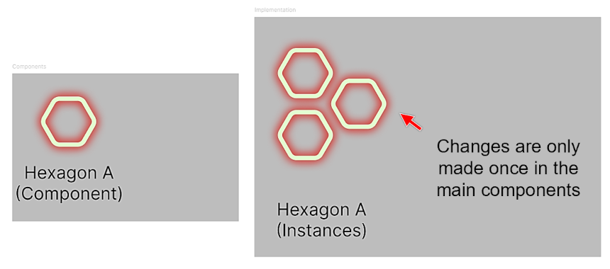
Modification of Figma main component.
In the context of the automatic design-to-code conversion process, this feature offers two key advantages
★For components and instances, the plugin user can choose whether the object should be exported as a single image or as individual images.
★When components and instances are utilized, the plugin can optimize the exported bitmap or SVG resources, enabling reuse.
Given these advantages, it is recommended to utilize components and instances whenever a design element is intended for reuse. A best practice is to organize all main components within a separate frame, as demonstrated in the previous two illustrations. This frame can be named according to preference.
Most Figma users are familiar with the concept of grouping a set of graphical elements. While groups might seem similar to components and instances at first glance, the underlying concepts are fundamentally different. Unlike components and instances, all elements within a group are always exported as individual elements. This behavior is demonstrated in the following example:
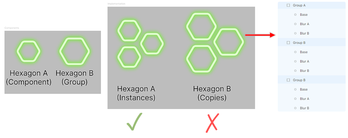
Figma components - Best practice.
In Figma, the decorative element Hexagon B is grouped rather than converted into a component. Consequently, its copies in the right frame (Group A, Group B, and Group C) are exported as separate graphical objects rather than as a unified component. Due to this behavior, it is not advisable to create a group and duplicate it across the entire design project.
Frame sizing
When designing in Figma, the size of a frame typically does not impact the design process. However, in embedded projects, the final output device usually corresponds to a display with a fixed resolution, such as 800x480 pixels. This fixed resolution is referred to as the native resolution, and every image used by the embedded software engineer must align with it. Therefore, it is crucial to consider the native resolution when designing the user interface in Figma. To achieve this, always configure the width (W) and height (H) parameters according to the native resolution.
The following illustration provides examples of best practices versus common pitfalls. While both designs may appear visually similar, the second design results in an exported GUI that cannot be fully displayed on the target device's screen.
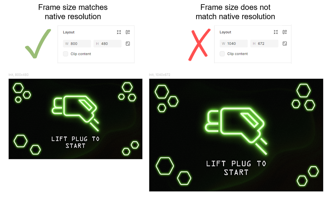
Correct frame sizing in Figma.
Prototyping
Figma offers a limited set of dynamic actions through its prototyping feature. However, these actions are not converted into dynamic behaviors within the resulting Embedded Wizard unit, which is instead a static representation of the Figma design. Embedded Wizard, on the other hand, provides extensive possibilities for implementing dynamic behaviors. To ensure a smooth transition from design to development, it is advisable to document interaction flows and animations directly within the Figma file rather than relying on the prototyping feature.
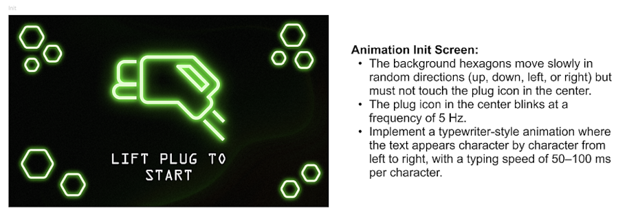
Dynamic behaviour explained as prosa text.
Based on the documented interaction and animation details, the embedded software engineer can implement the desired dynamic behaviors using Effects and Chora code.
Masking
In Figma, Frames, Groups, or Sections are commonly used to mask the containing content. However, masking is not fully supported by the automatic design-to-code conversion process. For designs that involve complex masking, it is recommended to either convert the parent frame into a component or instance or apply the same layer effects individually to each child element.