Creating components from templates: Graph
With this template you can add a new Graph component to your project. Graph is a component intended to collect and display data values as a curve. As such this widget is not suitable to be controlled by the user interactively. However, the Graph can be connected to a Slide Touch Handler and so permit an interactive scrolling of the displayed curve.
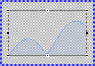
Components created with this template are intended to be adapted to your particular design expectations. After adding the new Graph you should edit the component, change its appearance and if desired also its behavior. Once you have adapted the component, you can embed instances of this Graph wherever you need in your GUI project. Because it serves as template, it is intentionally kept very simple. Nevertheless, Graphs created by the template are working widgets. If desired, they can already be used as they are. The following figure demonstrates the default appearance of the Graph created by using the here described component template:
The approach with component templates has two functions. Primarily the templates should simplify the development of new components. Instead of creating the Graph from scratch you can use the available template. The second function is more educative. The template implements fully working Graph component you can investigate and learn about the corresponding programming aspects. The template is well documented. It contains annotations and inline comments with instructions helping you to understand how the component works and how it can be adapted to your particular needs.
This chapter provides an overview how the Graph component template is used within your own application and how you adapt this component according to your particular needs. You will find here also further details concerning the internal implementation of the Graph component.
Unlike the Bar Chart, Line Chart, and Pie Chart templates which create individual view instances for each data value, the Graph component uses an optimized rendering approach with path-based views. This makes the Graph more suitable for displaying larger numbers of data values. However, it's important to note that the more values you display in the Graph, the more CPU processing is required to calculate and render the curve.
The acceptable number of values depends on your target system's CPU performance - more powerful processors can handle more data points while maintaining smooth rendering and responsive user interaction. For simpler applications with a limited number of data values where individual styling of each data point is important, the Bar Chart, Line Chart, or Pie Chart templates may be more appropriate choices as they provide more flexibility for customizing individual elements.
Add new Graph component
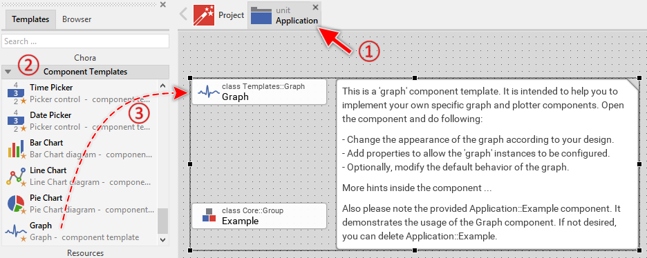
To create a new Graph component from a template you simply Drag & Drop it between the Templates window and the Composer with an opened unit. This is important in that by using the component templates you add in fact a new class to your project. Classes, in turn, can exist within units only. The following are the typical steps to create a new Graph component from a template:
★First switch to the Composer page for the respective unit, where you want to add the new Graph component.
★Then ensure that the Templates window is visible.
★In Templates window switch to the folder Component Templates.
★In the folder locate the Graph template.
★Drag & Drop the template into the Composer window:
In order to demonstrate the usage of the Graph component, the template includes an Example component. It is recommended to study this example component before deletion to understand these important concepts. If not needed afterwards, just select and delete the Example class.
★Eventually name the new added component.
The new created Graph component appears accompanied by annotation providing helpful tips how to proceed. If undesired, you can select and delete the annotation.
Use the Graph component
Once you have created the Graph component, you can use it to assemble more complex components. Technically seen, you embed an instance of the Graph class in-place within some superior GUI component. At the runtime, the superior GUI component takes care of the correct initialization and the displaying of all embedded components, so they appear similarly as you have composed them at the design time.
Step 1. Add new Graph instance
The following are the typical steps to create a new instance of an already existing Graph component:
★First switch to the Composer page for the respective GUI component, where you want to add the new Graph.
★Then ensure that the Browser window is visible.
★Within the Browser locate the class of the previously created Graph. This can be done easily with Browser's own filter function.
★Select the found class in the Browser window.
★Drag & Drop the selected class into the Composer area.
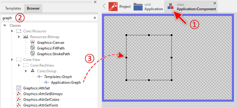
★Eventually name the new instance according to its function within the GUI component.
Component templates are intended to create widgets which can be modified and adapted to your particular design expectations. In the following sections you will learn how to do this. Originally, if not yet modified, the Graph displays a curve stroked and filled with solid colors. Our intention is to keep the component templates as minimalistic as possible so they don't distract you with less important design details.
Please note, the just added graph is still empty (it does not contain any data). Therefore no curve is shown. To understand how to properly provide data to the graph, it is recommended to study the Example component.
Step 2. Inspect the Graph instance
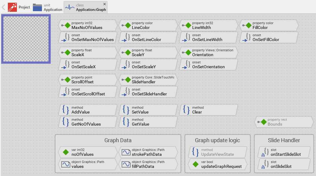
As long as the Graph is selected you can inspect and modify its properties conveniently in the Inspector window as demonstrated with the property Bounds in the screenshot below. This is in so far worth mentioning as diverse features of the Graph are controlled by the corresponding properties. If you are not familiar with the concept of a property and the usage of Inspector window, please read first the preceding chapter Compositing component appearance.
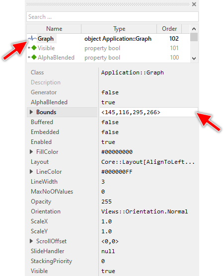
The Graph component descends from the Mosaic class Core::Group. Consequently, most of the properties listed in the above screenshot are inherited from this base class. Particular to the Graph are only few following properties:
Property |
Description |
|---|---|
FillColor |
The property FillColor stores the color to fill the shape determined by the line segments. |
LineColor |
The property LineColor stores the color to draw the line segments between the data values. |
LineWidth |
The property LineWidth stores the width of the drawn line segments expressed in pixel. |
MaxNoOfValues |
The property MaxNoOfValues determines the maximum number of data entries this graph component may store at the runtime. Trying to add more values will discard the oldest values and shift the entire graph accordingly. |
Orientation |
The property Orientation determines whether the graph should be displayed with normal or rotated orientation. |
ScaleX |
The property ScaleX determines the scaling factor in X-direction. |
ScaleY |
The property ScaleY determines the scaling factor in Y-direction. |
ScrollOffset |
The property ScrollOffset stores the displacement of the graph content. Changing of this property automatically causes the graph to move the displayed curves. |
SlideHandler |
The property SlideHandler provides an interface, where a Slide Touch Handler can be attached. In this manner the handler can control the graph and the user can scroll the graph content by simply touching the slide handler on the screen. |
Step 3. Arrange the Graph within the superior component
Once added to the component, you can freely move the Graph instance, or you simply grab one of its corners and resize it in this way. You can control the position and the size of the component also by directly modifying its property Bounds. If you want the Graph to appear behind other views you can reorder it explicitly.
Step 4. Add and manage data values
The Graph component stores data values internally using an efficient circular buffer mechanism. This makes it particularly suitable for displaying continuous data streams such as sensor readings, monitoring data, or any time-series information. The following properties and methods are available to manage the data:
Method |
Description |
|---|---|
MaxNoOfValues |
The property MaxNoOfValues determines the maximum number of data entries this graph component may store at the runtime. Trying to add more values will discard the oldest values and shift the entire graph accordingly. |
AddValue() |
Appends a new data value to the end of the graph. If the graph is already full (contains MaxNoOfValues entries), the oldest value is automatically discarded and all remaining values shift to make room. |
SetValue() |
Modifies an already stored data value at a specific index position. |
GetValue() |
Retrieves the data value stored at a specific index position. |
GetNoOfValues() |
Returns the current number of data values stored in the graph. |
Clear() |
Discards all stored data values. The graph becomes empty. |
This circular buffer behavior is ideal for displaying the most recent data in streaming applications. For example, if MaxNoOfValues is configured to 100, the graph will always display the latest 100 data points, automatically discarding older values as new ones arrive. The property MaxNoOfValues determines the maximum capacity of the internal data buffer. When you use AddValue() to append new values:
★If the buffer is not yet full, the new value is simply appended to the end.
★If the buffer is already full (contains exactly MaxNoOfValues entries), the oldest value is automatically discarded, all remaining values shift by one position, and the new value is appended.
To append a new value to the graph, use the AddValue() method:
// Append a new value to the graph Graph.AddValue( 42.5 ); // The graph now contains one more value var int32 count = Graph.GetNoOfValues(); // Returns 1 // Append more values Graph.AddValue( 38.2 ); Graph.AddValue( 51.7 ); // Now the graph contains 3 values
The following example from the Example component demonstrates a practical pattern for continuously adding calculated values:
// This variable is used to generate varying data var float x_value; [...] // Calculate a new value using trigonometric functions // The result is in range 0.0 .. 1.0 var float y_value = ( math_sin( x_value ) * math_cos( x_value * 1.33 )).abs; // Scale the value to desired range (0 .. 150) and append it Graph.AddValue( y_value * 150 ); // Advance for next calculation x_value += 5.0;
Once values are stored in the graph, you can access and modify them using their index. The first value has index 0, the second has index 1, and so on:
// Query how many values are currently stored var int32 count = Graph.GetNoOfValues(); // Retrieve the value at index 5 var float value = Graph.GetValue( 5 ); // Modify the value at index 5 Graph.SetValue( 5, 60.0 ); // Retrieve the last (most recent) value var float lastValue = Graph.GetValue( count - 1 );
To discard all stored data and reset the graph to an empty state, use the Clear() method. This is useful when, for example, you want to restart data collection or switch to a different data source:
// Remove all data from the graph Graph.Clear(); // The graph is now empty var int32 count = Graph.GetNoOfValues(); // Returns 0
Step 5. Configure scaling factors
The Graph component provides two properties, ScaleX and ScaleY, which control the visual size of the displayed graph content. These scaling factors determine how much space each data value occupies on the screen.
The ScaleX property determines the horizontal spacing between consecutive data values (or vertical spacing for rotated orientations). We can say, ScaleX determines the distance (the step) between two consecutive value expressed in pixel. If ScaleX is equal 1.0, the values are distrubuted pixelwise along the x-axis. The total width of the graph content can thus be calculated as:
total_content_width = ( GetNoOfValues() - 1 ) * ScaleX;
For example:
★With 100 stored values and ScaleX = 1.0, the total content width is 99 pixels
★With 100 stored values and ScaleX = 10.0, the total content width is 990 pixels
★With 100 stored values and ScaleX = 0.5, the total content width is 49.5 pixels
// Configure horizontal scaling Graph.ScaleX = 10.0; // Calculate the resulting content width var int32 contentWidth = int32(( Graph.GetNoOfValues() - 1 ) * Graph.ScaleX );
The ScaleY property determines the vertical scaling of the data values. A stored value of 100.0 with ScaleY = 1.0 will be displayed as 100 pixels tall. With ScaleY = 0.5, the same value appears as 50 pixels tall.
// Configure vertical scaling Graph.ScaleY = 1.5; // A value of 80.0 will now appear as 120 pixels tall (80 * 1.5)
The scaling factors determine how "zoomed in" or "zoomed out" the graph appears. Larger scaling values show more detail but require more screen area (or scrolling) to see all data. Smaller scaling values show more data at once but with less detail:
// Zoomed in - high detail, requires scrolling Graph.ScaleX = 20.0; Graph.ScaleY = 2.0; // Zoomed out - overview of more data Graph.ScaleX = 2.0; Graph.ScaleY = 0.5; // Balanced view Graph.ScaleX = 10.0; Graph.ScaleY = 1.0;
The scaling factors can be changed dynamically at runtime, for example in response to user interaction. When scaling changes, the graph automatically recalculates and updates the display:
// Double the horizontal zoom level Graph.ScaleX = Graph.ScaleX * 2.0; // Calculate new content width after scaling var int32 newWidth = int32(( Graph.GetNoOfValues() - 1 ) * Graph.ScaleX );
Step 6. Scroll the graph content
When the total content width (determined by scaling and number of values) exceeds the component's bounds, the content becomes scrollable. The ScrollOffset property then controls which portion is visible:
// Graph component is 300 pixels wide // Contains 100 values with ScaleX = 10.0 // Total content width = 990 pixels // Therefore, content extends 690 pixels beyond visible area // Scroll to show the beginning horizontally (values 0..29) Graph.ScrollOffset.x = 0; // Scroll to show the end (values 70..99) Graph.ScrollOffset.x = -690; // Scroll to show middle section Graph.ScrollOffset.x = -345; // Query current scroll position var point offset = Graph.ScrollOffset; // Scroll programmatically to show beginning Graph.ScrollOffset = <0,0>; // Scroll to show content at the end var int32 contentWidth = int32(( Graph.GetNoOfValues() - 1 ) * Graph.ScaleX ); Graph.ScrollOffset.x = Graph.Bounds.w - contentWidth;
A common pattern when continuously adding new values is to automatically scroll the graph to keep the latest data visible. The Example component demonstrates this:
// Append a new value to the graph Graph.AddValue( y_value * 150 ); // Calculate the total width of graph content var int32 graphWidth = int32(( Graph.GetNoOfValues() - 1 ) * Graph.ScaleX ); // Adjust scroll position to show the end (latest values) // The math_min ensures we don't scroll beyond the beginning Graph.ScrollOffset.x = math_min( Graph.Bounds.w - graphWidth, 0 );
This calculation determines how far to scroll to align the end of the content with the right edge of the component:
★If content width < component width: ScrollOffset.x = 0 (no scrolling needed)
★If content width > component width: ScrollOffset.x is negative (scroll to show end)
Step 7. Enable interactive scrolling
Besides the property ScrollOffset the Graph component includes built-in support for interactive scrolling through touch gestures. This allows users to pan through large amounts of data by dragging their finger across the screen. The scrolling functionality is implemented through the SlideHandler property. To enable interactive scrolling, you need to add a Slide Touch Handler to your component containing the Graph and connect it to the graph:
★Add a new Slide Touch Handler to your GUI component.
★Arrange the handler to cover the area where users should be able to touch and scroll. This would be usually the area of the Graph component.
★In the Inspector window, assign the Slide Touch Handler to the Graph's SlideHandler property.
★Eventually configure the handler's sliding direction by setting its properties SlideHorz and SlideVert to true or false.
★Configure friction and acceleration to control the scrolling physics and inertia effects.
★Configure snap positions to make scrolling stop at specific points positions for better alignment.
★Configure rubber band behavior to control what happens when scrolling reaches the boundaries.
Once connected, the Graph component automatically handles all aspects of the scrolling interaction. When the user touches and drags within the handler's area, the graph content moves smoothly following the finger movement.
Step 8. Implement zoom/pinch gestures
The Graph component can be enhanced with pinch-to-zoom functionality, allowing users to interactively adjust the ScaleX and ScaleY properties using a two-finger pinch gesture. This provides an intuitive way to zoom in for detail or zoom out for an overview. The Example component demonstrates a complete implementation of this feature. Pinch-to-zoom functionality expects that your device contains a multi-touch display able to track at least two simultaneous touch interactions. Note, during Prototyping in Embedded Wizard you can simulate multi touch inputs by using a simple mouse. See also Touch Screen Inputs.
A pinch gesture is detected by tracking two simultaneous touch points. As the user moves their fingers closer together or farther apart, the distance between the touch points changes, which can be translated into a zoom factor:
★Fingers moving apart = zoom in (increase scale)
★Fingers moving together = zoom out (decrease scale)
To implement this, you need two Simple Touch Handler objects, one for each finger.
★Add two Simple Touch Handlers to your GUI component covering the same area as the Graph.
★Add a variable to store the scale factor at the moment the gesture begins. Name it startScalefactor and determine its data type to be float.
★Add a slot method and name it onStartPinch. This method will be called when the user first touches with two fingers. The method remembers the recent scaling factor just at the beginning of the interaction:
// Remember the current scale factor startScaleFactor = Graph.ScaleX;
★Add a further slot method onPinch that will be called continuously as the user moves their fingers:
// Only process if both fingers are down if ( !SimpleTouchHandler1.Down || !SimpleTouchHandler2.Down ) return; // Calculate initial distance between fingers var point start = SimpleTouchHandler1.HittingPos - SimpleTouchHandler2.HittingPos; // Calculate current distance between fingers var point cur = SimpleTouchHandler1.CurrentPos - SimpleTouchHandler2.CurrentPos; // Calculate the length of both vectors var float startLen = math_sqrt(( start.x * start.x ) + ( start.y * start.y )); var float curLen = math_sqrt(( cur.x * cur.x ) + ( cur.y * cur.y )); var float factor = 1.0; // Calculate zoom factor from distance ratio if ( startLen > 0.0 ) factor = curLen / startLen; // Apply the zoom factor to the graph Graph.ScaleX = startScaleFactor * factor; // Adjust scroll position to prevent gaps (see below) var int32 graphWidth = int32(( Graph.GetNoOfValues() - 1 ) * Graph.ScaleX ); var int32 gap = Graph.Bounds.w - ( graphWidth + Graph.ScrollOffset.x ); if ( gap > 0 ) Graph.ScrollOffset.x = math_min( Graph.ScrollOffset.x + gap, 0 );
★Connect the slot method onStartPinch to the property OnPress of the both touch handlers.
★Connect the slot method onPinch to the property OnDrag of the both touch handlers.
The key to pinch gesture detection is calculating the distance between the two touch points using the Pythagorean theorem:
// Get vector between two finger positions var point fingerDistance = SimpleTouchHandler1.CurrentPos - SimpleTouchHandler2.CurrentPos; // Calculate Euclidean distance: sqrt(x² + y²) var float distance = math_sqrt(( fingerDistance.x * fingerDistance.x ) + ( fingerDistance.y * fingerDistance.y ));
By comparing the initial distance (startLen) with the current distance (curLen), we obtain a zoom factor:
★If curLen = 2 * startLen, the user has moved fingers twice as far apart → zoom factor = 2.0
★If curLen = 0.5 * startLen, the user has moved fingers to half distance → zoom factor = 0.5
When the user zooms out (decreases the scale factor), the total content width becomes smaller. If the graph was scrolled to show the end of the data, zooming out might create an unwanted gap between the end of the content and the right edge of the component. The following code prevents this ensuring that the graph content always fills the visible area or extends to the right edge, providing a better visual experience:
// Calculate current content width after scaling var int32 graphWidth = int32(( Graph.GetNoOfValues() - 1 ) * Graph.ScaleX ); // Calculate gap between content end and component right edge var int32 gap = Graph.Bounds.w - ( graphWidth + Graph.ScrollOffset.x ); // If there's a gap, adjust scroll position to close it if ( gap > 0 ) Graph.ScrollOffset.x = math_min( Graph.ScrollOffset.x + gap, 0 );
The example above demonstrates zooming the X axis (ScaleX) only. For applications requiring zoom in both directions, you can apply the same factor to ScaleY:
// Apply zoom factor to both axes Graph.ScaleX = startScaleFactorX * factor; Graph.ScaleY = startScaleFactorY * factor;
Note that pinch-to-zoom can coexist with scroll functionality. In the Example component, the Slide Touch Handler has the property RetargetCondition = Core::RetargetReason[ForeignPress] configured. This allows the pinch gesture to take precedence when two fingers are detected, while single-finger touches still enable scrolling. For more details about gesture coordination, see Combine several Touch Handlers together.
Step 9. Configure graph orientation
The Graph component can display its content in four different orientations controlled by the property Orientation. This property accepts values from the enumeration Views::Orientation. The orientation determines how data values are arranged and in which direction the graph grows as new values are added:
Orientation |
Description |
|---|---|
Views::Orientation.Normal |
The graph grows from left to right. Values are arranged horizontally with the first value on the left. The Y-axis represents the data values (bottom = 0, increasing upward). |
Views::Orientation.Rotated_90 |
The graph grows from top to bottom. Values are arranged vertically with the first value at the top. The X-axis represents the data values (right = 0, increasing leftward). |
Views::Orientation.Rotated_180 |
The graph grows from right to left. Values are arranged horizontally with the first value on the right. The Y-axis represents the data values (top = 0, increasing downward). |
Views::Orientation.Rotated_270 |
The graph grows from bottom to top. Values are arranged vertically with the first value at the bottom. The X-axis represents the data values (left = 0, increasing rightward). |
You can set the orientation in the Inspector window when configuring a Graph instance, or programmatically at runtime:
// Display graph with normal orientation (left to right, bottom to top) Graph.Orientation = Views::Orientation.Normal; // Display graph rotated 90 degrees (top to bottom, right to left) Graph.Orientation = Views::Orientation.Rotated_90; // Display graph rotated 180 degrees (right to left, top to bottom) Graph.Orientation = Views::Orientation.Rotated_180; // Display graph rotated 270 degrees (bottom to top, left to right) Graph.Orientation = Views::Orientation.Rotated_270;
The following figures demonstrate the Graph configured with Normal (left) and Rotated_180 (right) orientation. Both Graphs are fed with same data. Changing the orientation rotates the curve and moves the origin of the coordinate system appropriately:
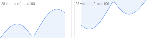
The orientation can be changed dynamically at runtime. When changed, the graph automatically recalculates its display. Note that changing orientation does not affect the stored data values, only how they are displayed:
// Switch between horizontal and vertical display if ( showVertical ) Graph.Orientation = Views::Orientation.Rotated_270; else Graph.Orientation = Views::Orientation.Normal;
Step 10. Display streaming data
The Graph component is particularly well-suited for displaying streaming data such as sensor readings, system monitoring, network traffic, or any time-series data that continuously updates. The circular buffer mechanism automatically manages data storage, and the built-in scrolling support allows users to navigate through historical data while new values continue to arrive. To achieve that the Graph automatically handles overflows:
★Configure MaxNoOfValues to the desired buffer size (e.g., 100, 500, 1000)
★Call AddValue() continuously as new data arrives
★When the buffer is full, the oldest value is automatically discarded and remaining values shift to make room for the new value
★No manual buffer management or overflow checking required
This makes the Graph ideal for applications that collect data indefinitely, such as:
★Temperature monitoring over 24 hours (e.g., 1440 values at 1 per minute)
★Audio level meters showing the last 100 samples
★Network bandwidth graphs showing the last 5 minutes of data
★Heart rate monitors displaying the last 60 seconds
When continuously adding new data, you typically want the graph to automatically scroll to keep the latest values visible. The Example component demonstrates the complete pattern, see the method onAddData:
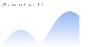
// 1. Calculate the new data value var float y_value = ( math_sin( x_value ) * math_cos( x_value * 1.33 )).abs; x_value += 5.0; // 2. Append the value to the graph Graph.AddValue( y_value * 150 ); // 3. Calculate the total width of the graph content var int32 graphWidth = int32(( Graph.GetNoOfValues() - 1 ) * Graph.ScaleX ); // 4. Adjust scroll position to show the latest data Graph.ScrollOffset.x = math_min( Graph.Bounds.w - graphWidth, 0 ); // 5. Update display information (optional) InfoText.String = string( Graph.GetNoOfValues()) + " values of max." + string( Graph.MaxNoOfValues );
Let's break down the auto-scrolling calculation:
★Calculate total content width: (GetNoOfValues() - 1) * ScaleX
★Calculate desired scroll position: Component width - Content width
★Limit to valid range: math_min( desired_position, 0 )
The math_min() ensures:
★If content width < component width: ScrollOffset = 0 (content fits, no scrolling)
★If content width > component width: ScrollOffset is negative (scroll to show end)
When multiple values arrive in quick succession, you can add them all at once and then perform the scroll operation to optimize the update process:
var int32 i;
// Add all received values
for ( i = 0; i < receivedCount; i++ )
Graph.AddValue( receivedValues );
// Auto-scroll once after all additions
var int32 graphWidth = int32(( Graph.GetNoOfValues() - 1 ) * Graph.ScaleX );
Graph.ScrollOffset.x = math_min( Graph.Bounds.w - graphWidth, 0 );
);
// Auto-scroll once after all additions
var int32 graphWidth = int32(( Graph.GetNoOfValues() - 1 ) * Graph.ScaleX );
Graph.ScrollOffset.x = math_min( Graph.Bounds.w - graphWidth, 0 );
Open the component for editing
Component templates are intended to create widgets which can be adapted and enhanced to your particular design expectations. For this purpose, once you have added a new Graph component to your project, you can open the component class for editing. Thereupon the implementation of the component appears in a new Composer page:
Originally, if not yet modified, the Graph appears with an empty canvas area. The curve representing the data is created dynamically at runtime using path-based views. Our intention is to keep the component templates as minimalistic as possible so they don't distract you with less important design details. The line segments forming the curve are displayed using a Views::StrokePath view, and the filled area behind the curve is displayed using a Views::FillPath view, both configured and positioned according to the stored data values.
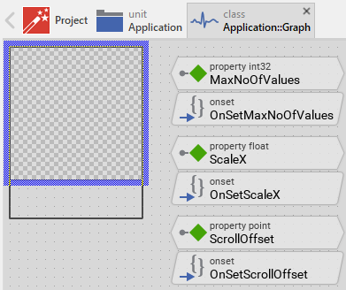
This default functionality is implemented by following members belonging to the Graph. These members are explicitly intended to be modified. Understanding this internal structure is thus the first step before you start to adapt the Graph to your particular needs:
Icon |
Member |
Description |
|---|---|---|
|
MaxNoOfValues |
The property MaxNoOfValues determines the maximum capacity of the internal data buffer. When the buffer is full and a new value is added, the oldest value is automatically discarded. |
|
OnSetMaxNoOfValues |
The onset method belongs to the property MaxNoOfValues. Each time the value of the property is changed, the code implemented in the method is executed to resize the internal data structures while preserving existing values. |
|
LineColor |
The property LineColor stores the color to draw the line segments forming the curve. |
|
OnSetLineColor |
The onset method belongs to the property LineColor. Each time the value of the property is changed, the code implemented in the method is executed to update the StrokePath view's color. |
|
LineWidth |
The property LineWidth stores the width of the drawn line segments expressed in pixels. |
|
OnSetLineWidth |
The onset method belongs to the property LineWidth. Each time the value of the property is changed, the code implemented in the method is executed to update the StrokePath view's width. |
|
FillColor |
The property FillColor stores the color to fill the area behind the curve. |
|
OnSetFillColor |
The onset method belongs to the property FillColor. Each time the value of the property is changed, the code implemented in the method is executed to update the FillPath view's color and visibility. |
|
ScaleX |
The property ScaleX determines the horizontal scaling factor for the graph content. |
|
OnSetScaleX |
The onset method belongs to the property ScaleX. Each time the value of the property is changed, the code implemented in the method is executed to set the updateGraphRequest flag, scheduling a recalculation of the display paths. |
|
ScaleY |
The property ScaleY determines the vertical scaling factor for the graph content. |
|
OnSetScaleY |
The onset method belongs to the property ScaleY. Each time the value of the property is changed, the code implemented in the method is executed to set the updateGraphRequest flag, scheduling a recalculation of the display paths. |
|
Orientation |
The property Orientation determines whether the graph should be displayed with normal or rotated orientation. |
|
OnSetOrientation |
The onset method belongs to the property Orientation. Each time the value of the property is changed, the code implemented in the method is executed to set the updateGraphRequest flag, scheduling a recalculation with the new orientation. |
|
ScrollOffset |
The property ScrollOffset stores the displacement of the graph content relative to the component's bounds. |
|
OnSetScrollOffset |
The onset method belongs to the property ScrollOffset. Each time the value of the property is changed, the code implemented in the method is executed to update the Offset property of both StrokePath and FillPath views. |
|
SlideHandler |
The property SlideHandler can refer to a Core::SlideTouchHandler that should control the scrolling behavior of the graph. When connected, the handler automatically manages the ScrollOffset property. |
|
OnSetSlideHandler |
The onset method belongs to the property SlideHandler. Each time the value of the property is changed, the code implemented in the method is executed to establish or dissolve the connection between the handler and the graph component. |
|
values |
This Graphics::Path object stores the raw data values as coordinate pairs (x = index, y = value). This is the primary data storage for the graph. |
|
noOfValues |
This internal variable tracks the current number of data values stored in the values path object. |
|
strokePathData |
This Graphics::Path object stores the transformed coordinates for the line segments forming the curve. It is calculated from values by applying scaling, orientation, and translation. This object is used by the StrokePath view. |
|
fillPathData |
This Graphics::Path object stores the closed polygon coordinates for the filled area behind the curve. It is derived from strokePathData by adding closing edges. This object is used by the FillPath view. |
|
updateGraphRequest |
This internal variable serves as a flag. When set to true, it indicates that the strokePathData and fillPathData need to be recalculated from the raw values data. |
|
onStartSlideSlot |
This internal slot method is invoked by the connected Slide Touch Handler when the user begins a slide gesture. It calculates the valid scroll range based on current content size and configures the handler accordingly. |
|
onSlideSlot |
This internal slot method is invoked by the connected Slide Touch Handler during a slide gesture. It updates the ScrollOffset property to reflect the current slide position. |
|
StrokePath |
This Views::StrokePath view displays the line segments forming the curve using the coordinates from strokePathData. |
|
FillPath |
This Views::FillPath view displays the filled area behind the curve using the coordinates from fillPathData. |
|
AddValue |
This method appends a new data value to the graph. If the buffer is full, it automatically discards the oldest value and shifts the remaining values. |
|
SetValue |
This method modifies a data value at a specific index position. |
|
GetValue |
This method retrieves a data value from a specific index position. |
|
GetNoOfValues |
This method returns the current number of data values stored in the graph. |
|
Clear |
This method discards all stored data values, resetting the graph to an empty state. |
|
UpdateViewState |
This method is invoked automatically when the updateGraphRequest flag is set. It performs the transformation of raw values into display coordinates and updates both strokePathData and fillPathData. |


Understand the graph update logic
The Graph component manages data values and their visual representation through a three-stage update process. Understanding this data flow is essential before adapting the component to your particular needs. To manage data, the Graph uses following Path Data objects:
Path Object |
Purpose |
Coordinate System |
|---|---|---|
values |
Stores raw data values as they are provided by AddValue() and SetValue() methods |
x = index (0, 1, 2, ...), y = data value |
strokePathData |
Stores a copy of values with scaling and orientation applied and ready to be displayed on the screen as the curve |
x and y in pixels relative to component origin |
fillPathData |
Stores a copy of strokePathData enhanced with additional edges to close the polygon for the filled area behind the curve |
x and y in pixels relative to component origin |
Stage 1: Raw value storage
When you call AddValue(), the provided data value is stored in the values object (see Store data in a sub-path and Evaluate and modify the coordinates stored in the Path Data object):
// Handle circular buffer overflow if ( noOfValues == MaxNoOfValues ) { values.ShiftNodes( 0, 1, -1.0, 0.0 ); // Shift all values left noOfValues--; } // Store the value with coordinates (index, value) if ( !noOfValues ) values.Begin( 0, 0, aValue ); // First value else values.AddLine( 0, noOfValues, aValue ); // Subsequent values noOfValues++; // Request transformation to display coordinates updateGraphRequest = true; InvalidateViewState();
At this stage, the provided values is stored as raw data (without any scaling nor rotation) in a simple coordinate system where:
★X coordinate = index of the value (0, 1, 2, 3, ...)
★Y coordinate = actual data value (e.g. 42.5, 38.2, 51.7, ...)
Stage 2: Transformation to display coordinates
When the updateGraphRequest flag is set, the UpdateViewState() method is invoked. This method performs a series of transformations to convert the raw values into display coordinates. The transformations involve scaling, rotation and translation of the graph (see also Apply 2D transformations during the path creation):
if ( updateGraphRequest ) { var point size = StrokePath.Bounds.size; var bool fill = FillColor.alpha > 0; // Initialize the stroke path for transformation strokePathData.InitSubPath( 0, noOfValues - 1 ); strokePathData.InitMatrix(); // Apply transformations based on orientation switch ( Orientation ) { case Views::Orientation.Normal : { // Position origin at bottom-left, flip Y axis, apply scaling strokePathData.Translate( 0.5, size.y - 0.5 ); strokePathData.Scale( ScaleX, -ScaleY ); strokePathData.AddCopy( 0, values, 0, 0, -1 ); } // ... other orientations } updateGraphRequest = false; }
The transformation sequence for Normal orientation:
★InitMatrix() - Reset transformation matrix to identity
★Translate( 0.5, size.y - 0.5 ) - Position the coordinate system origin at the bottom-left corner of the component. The 0.5 pixel offset in the Translate() operation is crucial for proper positioning of graph points at centers of pixel, which results in sharper, crisper lines.
★Scale( ScaleX, -ScaleY ) - Apply horizontal and vertical scaling factors. The negative ScaleY flips the Y axis so values increase upward.
★AddCopy( 0, values, 0, 0, -1 ) - Copy all coordinates from the raw values object to the strokePathData object, applying the previosuly configured transformations. The strokePathData object stores thereupon a copy of the data from the values object with all necessary scaling/rotation transformations. The coordinates in strokePathData object corresponds thus to the pixel on the screen.
Please note, that each orientation requires a different transformation sequence to correctly position and orient the graph:
Orientation |
Origin Position |
Scale Factors |
Rotation |
|---|---|---|---|
Normal |
Bottom-left (0.5, size.y - 0.5) |
(ScaleX, -ScaleY) |
None |
Rotated_90 |
Bottom-right (size.x - 0.5, size.y - 0.5) |
(ScaleY, -ScaleX) |
90 degrees |
Rotated_180 |
Top-right (size.x - 0.5, 0.5) |
(-ScaleX, ScaleY) |
None |
Rotated_270 |
Top-left (0.5, 0.5) |
(-ScaleY, ScaleX) |
90 degrees |
Stage 3: Creating the filled polygon
After the curve is calculated in strokePathData, the content of strokePathData is copied to fillPathData and the path in fillPathData is closed resulting in a polygon to fill the area behind the curve:
// Initialize fill path (needs extra edges for closing) fillPathData.InitSubPath( 0, fill? noOfValues + 1 : 0 ); if ( fill ) { // Start at bottom-left fillPathData.Begin( 0, strokePathData.GetNodeX( 0, 0 ), size.y ); // Copy all curve points fillPathData.AddCopy( 0, strokePathData, 0, 0, -1 ); // Close to bottom-right fillPathData.AddLine( 0, strokePathData.GetNodeX( 0, noOfValues - 1 ), size.y ); fillPathData.Close( 0 ); }
The update trigger mechanism
Data or scaling/orientation alternation sets the updateGraphRequest flag to trigger the update of the Path Data objects. For example, the AddValue method:
// ... store value in 'values' path ... [...] // ... then request an update updateGraphRequest = true; InvalidateViewState(); }
The InvalidateViewState() call schedules the UpdateViewState() method for execution, which checks the updateGraphRequest flag and performs the above explained transformations if needed.
Adapt the appearance of the component
Originally, if not yet modified, the Graph displays data as line segments with an optional filled area behind the curve, both using solid colors. Our intention is to keep the component templates as minimalistic as possible so they don't distract you with less important design details. It's up to you to adapt the widget to have the expected appearance. The available possibilities are explained in the following sections. Please note that you can combine the different approaches according to your application case:
1. Modify the StrokePath and FillPath views
The graph component contains two main views that determine its visual appearance:
View |
Description |
|---|---|
StrokePath |
Displays the line segments forming the curve. You can adjust its color (LineColor property), width (LineWidth property), line caps, and join styles. |
FillPath |
Displays the filled area behind the curve. You can adjust its color (FillColor property) or hide it by setting color to transparent. |
You can adjust these views' size, position, and layout behavior:
★Select the view in the Composer.
★Configure the view's property Layout to control how it resizes when the graph component itself is resized. See Configure the layout of the component for details.
IMPORTANT
The StrokePath and FillPath views should have matching bounds to ensure proper alignment of line segments and filled area. If you resize one view, adjust the other accordingly.
Customize line caps and joins
Beyond the basic LineColor and LineWidth properties, you can enhance the StrokePath view with additional styling:
★Select the StrokePath view in the Composer.
★In the Inspector window, you can configure additional properties:
★StartCap and EndCap - Controls the appearance of line endpoints (Graphics::PathCap.Flat, Round, Square, Triangle)
★Join - Controls the appearance of line corners (Graphics::PathJoin.Miter, Round, Bevel)
★MiterLimit - Controls the miter join sharpness for sharp corners
For example, to create a smooth curve with rounded endpoints:
StrokePath.StartCap = Graphics::PathCap.Round; StrokePath.EndCap = Graphics::PathCap.Round; StrokePath.Join = Graphics::PathJoin.Round;
2. Add gradient fills
Instead of solid colors for the line segments and filled area, you can use gradient fills by configuring the corner color properties of the StrokePath and FillPath views. Both views provide four color properties that determine the color at each corner of the view's bounds:
Property |
Description |
|---|---|
ColorTL |
Color at the top-left corner of the view. |
ColorTR |
Color at the top-right corner of the view. |
ColorBL |
Color at the bottom-left corner of the view. |
ColorBR |
Color at the bottom-right corner of the view. |
By setting these properties to different colors, you create a four-point gradient that interpolates smoothly between the corner colors. For example, to add a vertical gradient to the filled area behind the curve, adapt the OnSetFillColor method. This example assigns the specified color to the top edge while the bottom edge fades to transparent:
// No changes - nothing to do if ( value == pure FillColor ) return; // Remember the new color. pure FillColor = value; // Create a vertical gradient: color at top, transparent at bottom FillPath.ColorTL = value; FillPath.ColorTR = value; FillPath.ColorBL = color( value.red, value.green, value.blue, 0 ); // Transparent FillPath.ColorBR = color( value.red, value.green, value.blue, 0 ); // Transparent FillPath.Visible = value.alpha > 0;
In its original version, the FillPath view is pre-configured with a common color in its property Color. Modifying the individual corner properties will have no effect since the resulting color is derived from both values. You need to reset it:
★Select the FillPath view.
★In Inspector look for the selected view's property Color.
★Click on this property and press the keys CtrlR to restore the original (inherited) value. Alternatively, enter the white opaque color #FFFFFFFF in this property.
Similarly, you can add a horizontal gradient to the curve. This example creates a fade-in effect from left to right:
// No changes - nothing to do if ( value == pure LineColor ) return; // Remember the new color. pure LineColor = value; // Create a horizontal gradient: transparent on left, color on right StrokePath.ColorTL = color( value.red, value.green, value.blue, 0 ); StrokePath.ColorBL = color( value.red, value.green, value.blue, 0 ); StrokePath.ColorTR = value; StrokePath.ColorBR = value;
The StrokePath view is also pre-configured with a common color. Reset it as described above:
★Select the StrokePath view.
★In Inspector look for the selected view's property Color.
★Click on this property and press the keys CtrlR to restore the original (inherited) value. Alternatively, enter the white opaque color #FFFFFFFF in this property.
The following figures show the Graph after the above modifications. On the left the filled area appears with a vertical gradient. On the right, the lines appear with a horizontal gradient:

3. Add decorative views to the graph
You can enhance the Graph by adding decorative views such as backgrounds, grid lines, axis labels, value indicators, or legends:
★Add the desired views to the Graph component. For example, add Text views for labels or Line views for grid lines.
★Name the added views according to their function (e.g., GridLineHorizontal, AxisLabelY, GraphBackground).
★Arrange and configure the views in the Composer.
★Configure their Layout property to control resizing behavior.
Configure the layout of the component
The initial size of the Graph is determined by the thick blue border surrounding the Canvas area. It corresponds to the size that all instances of this Graph component will have by default. If desired, you can adjust the Canvas area and change this default size accordingly. For this purpose you click and drag the edges of the surrounding border (see also Resize the Canvas area). Once the size is changed, you can then adapt (move, resize) the views existing within the component, particularly the StrokePath and FillPath views. For example, to make the Graph taller you adjust its bottom edge:
The resulting size of the Graph, however, is not necessarily fixed. It can be adjusted for each component instance individually when the instance is arranged within a superior GUI component or it can change dynamically at the runtime. The GUI application can thus contain multiple instances of the Graph, each with another size. From this arises the question, how will the Graph react to its size alternation?
In case of the StrokePath and FillPath views existing per default in the Graph template, these views are automatically adjusted to fill the area of the widget. All other views you have eventually added later to the Graph are not adjusted automatically.
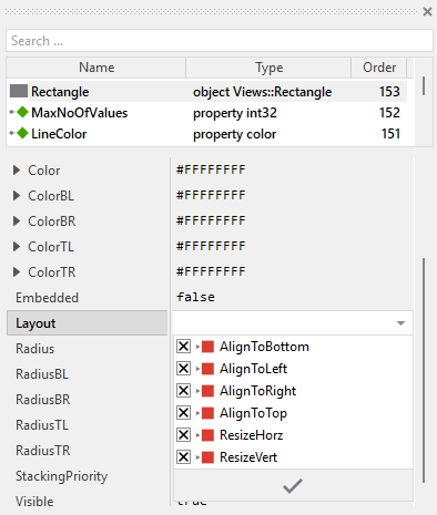
To control the adjustment you have to explicitly configure for each view its Layout property. (see also Configure component layout). Let's assume, in order to display a background decoration you have added a Rectangle view to the Graph. Then you have arranged the view within the Canvas area according to your design expectation. If you want now that the view grows and shrinks according to size changes of the Graph, you enable in the property Layout of this view following settings:
Now the Graph knows how to react to its size changes. Each widget instance can have individual size and the enclosed views are automatically arranged within the available area.
Implement the interface of the component
When creating your own Graph component you should ensure that instances of the widget can be configured to control all the features implemented in it. For example, if you have enhanced the component to display some caption text or a background grid, you should allow these settings to be specified individually for each instance. In this way several Graph instances can exist at the same time, each displaying another caption or having different visual characteristics.
To control the features in your component you use properties. A property can be understood as variable where the corresponding setting is stored, e.g. the caption text to display in the Graph or whether a grid should be visible. When the value of the property changes, the component can react to it and update its appearance accordingly. The properties reflect thus the settings within your widget. Together they form the interface of the component.
In its original version, the Graph contains already already nine properties MaxNoOfValues, LineColor, LineWidth .. SlideHandler. These properties allow each Graph instance to be configured independently. In order to enhance this interface by your own properties, following steps are necessary:
★Add a new property to the Graph component.
★Name the property according to the setting it should represent. For example, the property intended to store the caption text could be named Caption.
★Determine the data type of the property. For example, the property intended to store the caption text will store a string. A property controlling grid visibility would store a bool.
★Determine the initialization value of the property. This value should correspond to the widget's default state. For example, the property intended to store the caption text should be initialized with exact the string the widget will display if no other text is specified (e.g. "Graph").
★The property is accompanied by its onget method. Except particular cases, this method is not needed and can be deleted now.
★The property is accompanied by its onset method. Open this method for editing.
★Adapt the implementation of the onset method so it updates the Graph according to its new value. For example, in case of the property intended to store the caption text, you will probably update some Text view where the caption is displayed:
// The value doesn't change - nothing to do. if ( pure Caption == value ) return; // Remember the property's new value. pure Caption = value; // Update the view to display the just modified caption. CaptionText.String = value;
Another example: if you have added a property to control the visibility of a background grid:
// The value doesn't change - nothing to do. if ( pure ShowGrid == value ) return; // Remember the property's new value. pure ShowGrid = value; // Update the grid lines visibility GridLine25.Visible = value; GridLine50.Visible = value; GridLine75.Visible = value;
That is all. Now when you deal with instances of the Graph component, you can evaluate and modify the properties similarly to how you access variables. Especially, when an instance is selected, you see in Inspector window the property and can change it there. The modification is immediately visible in the Composer window:

If desired, the properties can also be modified at the runtime of your application. For example, you might update the caption of the graph:
// Update caption based on data source if ( currentSensor == 1 ) Graph.Caption = "Temperature Sensor 1"; else Graph.Caption = "Temperature Sensor 2";
Understand scrolling with Slide Touch Handler
The Graph component implements a sophisticated scrolling mechanism that automatically manages the interaction between the displayed graph content and the user's touch gestures. When a Slide Touch Handler is connected to the Graph's SlideHandler property, the Graph takes care of calculating valid scroll ranges and updating the visible portion of the content as the user drags their finger across the screen.
The scrolling functionality is built on a collaboration between three components:
Component |
Responsibility |
|---|---|
Slide Touch Handler |
Detects and tracks touch gestures, manages the physics simulation (inertia, friction), and provides the current offset value based on user input. |
Graph component |
Calculates the valid scroll range based on content size, configures the handler with appropriate limits, and updates the display according to the handler's offset. |
ScrollOffset property |
Stores the current displacement of the graph content and controls which portion is visible within the component bounds. |
The connection between these components is established through two internal slot methods: onStartSlideSlot and onSlideSlot.
The onStartSlideSlot method
The slot method onStartSlideSlot is invoked automatically when the user begins a slide gesture by touching the screen and starting to drag. This method's primary responsibility is to calculate the valid scroll range and configure the Slide Touch Handler accordingly:
// Estimate the rectangle enclosing the displayed path. Note the stroke/Path // views scroll the content. Thus add the scroll offset. var rect area = strokePathData.GetSubPathBounds( 0 ) + ScrollOffset; var rect bounds = StrokePath.Bounds; // No content to scroll if ( area.w <= 0 ) { area.x1 = 0; area.x2 = 0; } if ( area.h <= 0 ) { area.y1 = 0; area.y2 = 0; } if ( area.x1 > 0 ) area.x1 = 0; if ( area.y1 > 0 ) area.y1 = 0; // The resulting offset and the slide range var point offset = area.origin; var point minOffset = bounds.size - area.size; // If the graph is smaller than the visible area - nothing to slide if ( minOffset.x > 0 ) minOffset.x = 0; if ( minOffset.y > 0 ) minOffset.y = 0; // Initialize the slide handler pure SlideHandler.Offset = pure ScrollOffset; pure SlideHandler.MinOffset = pure ScrollOffset + minOffset - offset; pure SlideHandler.MaxOffset = pure ScrollOffset - offset;
Let's break down this calculation:
★Determine content bounds: The method first calculates the rectangle that encloses all the graph content by calling strokePathData.GetSubPathBounds( 0 ). This returns the bounding box of all coordinates stored in the path data. The current ScrollOffset is added to account for the content's displacement.
★Determine visible area: The bounds variable stores the size of the visible area (the StrokePath view's bounds).
★Calculate scroll limits: The method calculates minOffset and maxOffset to determine how far the content can be scrolled. These values ensure that the user cannot scroll past the beginning or end of the content, preventing empty space from appearing.
★Configure the handler: The calculated limits are assigned to the Slide Touch Handler's MinOffset and MaxOffset properties, and the current ScrollOffset is assigned to the handler's Offset property.
The scroll range calculation ensures:
★When content width <= visible width: No horizontal scrolling is allowed (minOffset.x = 0)
★When content width > visible width: The user can scroll to show any portion of the content, but not beyond its boundaries
The onSlideSlot method
The slot method onSlideSlot is invoked continuously during a slide gesture as the user moves their finger. This method has a simple but crucial task: synchronizing the Graph's ScrollOffset property with the Slide Touch Handler's current offset:
// Adapt the scroll position of the container ScrollOffset = pure SlideHandler.Offset;
As the Slide Touch Handler tracks the user's finger movement and updates its internal Offset value (considering physics simulation, friction, boundaries, etc.), the onSlideSlot method immediately applies this offset to the Graph by modifying the ScrollOffset property. This causes the StrokePath and FillPath views to update their displayed content, creating a smooth scrolling effect that follows the user's gesture.
Connection establishment
The connection between the Graph and the Slide Touch Handler is established through the property SlideHandler and is implemented in the OnSetSlideHandler onset method:
// Nothing to do if ( value == pure SlideHandler ) return; // Disconnect from the old handler if ( pure SlideHandler != null ) { pure SlideHandler.privateOnStart = null; pure SlideHandler.privateOnSlide = null; } // Remember the new handler and connect with it pure SlideHandler = value; if ( value != null ) { value.privateOnStart = onStartSlideSlot; value.privateOnSlide = onSlideSlot; }
This method assigns the Graph's slot methods to the handler's internal callback properties privateOnStart and privateOnSlide, establishing the communication channel between the two components.
Optimize the graph rendering
Drawing complex graphs with many data points can be CPU intensive, especially on resource-constrained embedded systems. The Graph component provides several configuration options to optimize rendering performance at the cost of visual quality.
Disable anti-aliasing
By default, the StrokePath and FillPath views render with anti-aliasing enabled, which produces smooth, high-quality curves. However, anti-aliasing requires additional processing. For better performance, you can disable it by setting the Quality property of both views to false:
★Select the StrokePath view in the Composer.
★In the Inspector window, locate the property Quality.
★Set Quality to false.
★Repeat the same steps for the FillPath view.
When anti-aliasing is disabled, the rendered lines and filled areas may appear more jagged, particularly on curves and diagonal lines, but the rendering is significantly faster.
Use flat line caps and joins
The shape of line endpoints (caps) and corners (joins) also affects rendering complexity. Rounded caps and joins require more processing than flat ones. To optimize performance, configure the StrokePath view to use flat caps and joins:
★Select the StrokePath view in the Composer.
★In the Inspector window, configure following properties:
★Set StartCap to Graphics::PathCap.Flat
★Set EndCap to Graphics::PathCap.Flat
★Set Join to Graphics::PathJoin.Bevel
Flat caps and bevel joins are rendered faster than rounded alternatives, particularly when the graph contains many segments.