Creating components from templates: Menu Separator Item
With this template you can add a new Menu Separator Item component to your project. Menu Separator Item is a very simple widget intended to separate menu items within a menu. As such this item doesn't react to user inputs. Generally menu items are used within menus only. Therefore when using a Menu Separator Item you will also need to add at least one Menu component to your project.
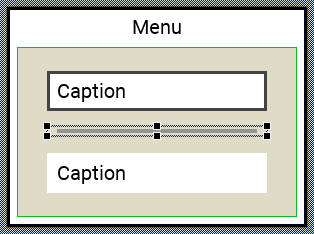
Components created with this template are intended to be adapted to your particular design expectations. After adding the new Menu Separator Item you should edit the component, change its appearance and if desired also its behavior. Once you have adapted the component, you can embed instances of this Menu Separator Item wherever you need in your GUI project. Because it serves as template, it is intentionally kept very simple. Nevertheless, Menu Separator Items created by the template are working widgets. If desired, they can already be used as they are. The following figure demonstrates the default appearance of the Menu Separator Item created by using the here described component template:
The approach with component templates has two functions. Primarily the templates should simplify the development of new components. Instead of creating the Menu Separator Item from scratch you can use the available template. The second function is more educative. The template implements fully working Menu Separator Item component you can investigate and learn about the corresponding programming aspects. The template is well documented. It contains annotations and inline comments with instructions helping you to understand how the component works and how it can be adapted to your particular needs.
This chapter provides an overview how the Menu Separator Item component template is used within your own application and how you adapt this component according to your particular needs. You will find here also further details concerning the internal implementation of the Menu Separator Item component.
Add new Menu Separator Item component
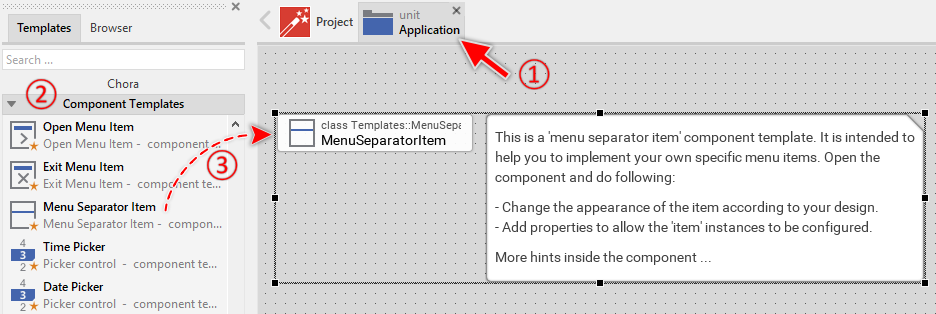
To create a new Menu Separator Item component from a template you simply Drag & Drop it between the Templates window and the Composer with an opened unit. This is important in that by using the component templates you add in fact a new class to your project. Classes, in turn, can exist within units only. The following are the typical steps to create a new Menu Separator Item component from a template:
★First switch to the Composer page for the respective unit, where you want to add the new Menu Separator Item component.
★Then ensure that the Templates window is visible.
★In Templates window switch to the folder Component Templates.
★In the folder locate the Menu Separator Item template.
★Drag & Drop the template into the Composer window:
★Eventually name the new added component.
The new created Menu Separator Item component appears accompanied by annotation providing helpful tips how to proceed. If undesired, you can select and delete the annotation.
Use the Menu Separator Item component
Once you have created the Menu Separator Item component, you can use it to assemble menu components. Technically seen, you embed an instance of the Menu Separator Item class in-place within a superior Menu GUI component. At the runtime, the superior Menu GUI component takes care of the correct initialization, arrangement and the displaying of all embedded item components.
Step 1. Add new Menu Separator Item instance
The following are the typical steps to create a new instance of an already existing Menu Separator Item component:
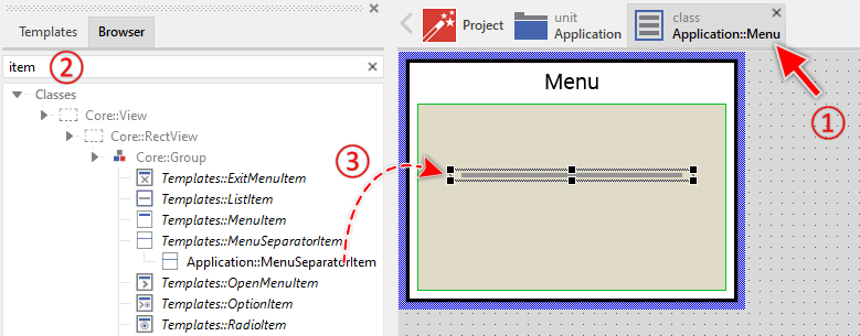
★First switch to the Composer page for the respective Menu GUI component, where you want to add the new Menu Separator Item.
★Then ensure that the Browser window is visible.
★Within the Browser locate the class of the previously created Menu Separator Item. This can be done easily with Browser's own filter function.
★Select the found class in the Browser window.
★Drag & Drop the selected class into the Composer area.
★Eventually name the new instance according to its function within the menu component.
Component templates are intended to create widgets which can be modified and adapted to your particular design expectations. In the following sections you will learn how to do this. Originally, if not yet modified, the Menu Separator Item will appear as thick gray bar. Our intention is to keep the component templates as minimalistic as possible so they don't distract you with less important design details.
Step 2. Inspect the Menu Separator Item instance
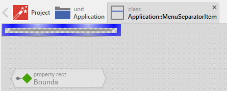
As long as the Menu Separator Item is selected you can inspect and modify its properties conveniently in the Inspector window as demonstrated with the property Bounds in the screenshot below. This is in so far worth mentioning as diverse features of the Menu Separator Item are controlled by the corresponding properties. If you are not familiar with the concept of a property and the usage of Inspector window, please read first the preceding chapter Compositing component appearance.
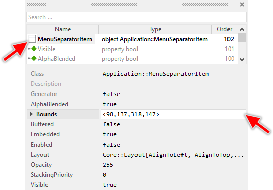
The Menu Separator Item component descends from the Mosaic class Core::Group. Consequently, all of the properties listed in the above screenshot are inherited from this base class. The Menu Separator Item itself does not add any new property.
Step 3. Arrange the Menu Separator Item within the Menu component
The position of the Menu Separator Item doesn't matter. The Menu component will automatically arrange the items within its area and if necessary enlarge or reduce their size. Moreover, the size of the menu itself is adapted to the number and to the size of the enclosed items. This layout algorithm is part of the Menu component template. Consequently, when you move an item within the menu, it does not have any effect on its final position.
However, the order in which the items will be displayed at the runtime does correspond to the order in which the item objects are stored within the menu component. This is the order in which the items have been originally added. Consequently, the first added item appears at the top of the menu while the last added item is arranged at the end of the menu. See also the column Order in the members area of the Inspector window:
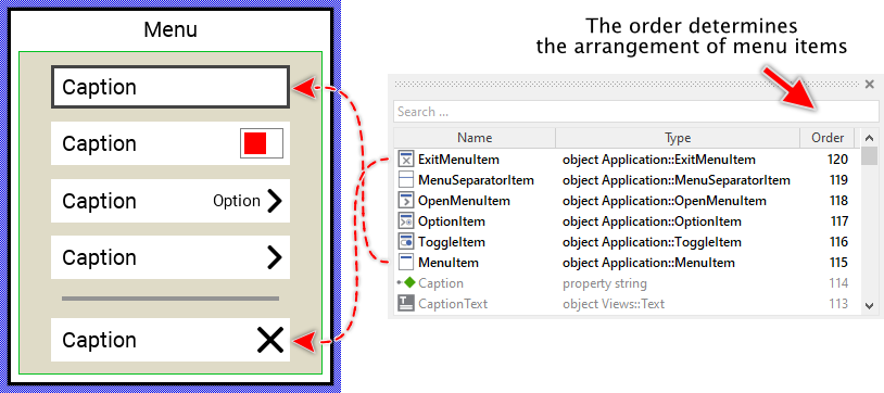
★If necessary you can reorder the item objects in the Inspector window to correspond to the order in which the items should appear in the menu.
Even if the position of an item doesn't matter, we recommend to move the item objects within the menu so you have a good overview of the items existing inside it. If the menu area is too small, you can enlarge it by clicking and dragging the thick blue Canvas border. Resizing the Canvas area of the menu manually has no effect on the final size of the menu. At the runtime the menu will adapt its size to the number and the size of the enclosed items.
Open the component for editing
Component templates are intended to create widgets which can be adapted and enhanced to your particular design expectations. For this purpose, once you have added a new Menu Separator Item component to your project, you can open the component class for editing. Thereupon the implementation of the component appears in a new Composer page:
Originally, if not yet modified, the Menu Separator Item appears as a simple gray horizontal bar. Our intention is to keep the component templates as minimalistic as possible so they don't distract you with less important design details. Unlike interactive menu items, the Menu Separator Item is purely decorative and does not react to user inputs.
This default functionality is implemented by following members belonging to the Menu Separator Item. These members are explicitly intended to be modified. Understanding this internal structure is thus the first step before you start to adapt the Menu Separator Item to your particular needs:
Icon |
Member |
Description |
|---|---|---|
|
Background |
This Filled Rectangle view displays in the template the separator line. Per default, it appears as a gray horizontal bar positioned in the middle of the item's area. |

As you can see, the Menu Separator Item is intentionally kept very simple. It contains only a single view to display the separator line. There are no touch handlers, keyboard handlers, timers, or state management mechanisms since the separator does not respond to user interactions.
Adapt the appearance of the component
Originally, if not yet modified, the Menu Separator Item appears as a gray horizontal bar. Our intention is to keep the component templates as minimalistic as possible so they don't distract you with less important design details. It's up to you to adapt the separator to have the expected appearance. The available possibilities are explained in the following sections. Please note, that you can combine the different approaches according to your application case:
1. Modify existing views
The Menu Separator Item template contains per default the view Background. If desired, you can modify this view. For example, you can change its color, thickness, or alignment within the item area. For this purpose you simply modify the properties of the view in the Inspector window or by adjusting its initialization values in the component definition.
★To change the separator color, select the Background view and modify its Color property.
★To change the separator thickness, adjust the Bounds property.
2. Remove existing views
If you want to replace the separator with a completely different visual element, you can delete the Background view. Simply delete the view. However, make sure you add a replacement view, otherwise the separator will be invisible. If your intention is to have the separator as distance between adjacent items only, then don't add any further views.
3. Add further views to the component
You can add further views to your Menu Separator Item to create more sophisticated separators. For example:
★Add an Image view to display a decorative separator graphic
★Add multiple Filled Rectangle views to create a double-line separator
★Add a Text view to create a labeled section divider (a kind of header for following items)
Following steps explain the workflow:
★First add the desired view to the component. For example add an Image view.
★Name the just added view according to its function in the component. For example SeparatorGraphic.
★In order to arrange the view within the Menu Separator Item, move the view, or you simply grab one of its corners and resize it in this way. If you want the view to appear behind other views you can reorder it explicitly.
★In Inspector window configure the properties of the just added view. For example, in case of the Image view you can select the bitmap to display.
★Configure the Layout property of the view to control how it adjusts when the menu width changes (see Configure the layout of the component).
4. Replace existing views
Also possible, you can replace the existing Background view by other views. For example, instead of using a simple rectangle, you could use an Image view to display a decorative separator graphic, or a Border view to create a more sophisticated visual effect. For this purpose:
★Think about which view is adequate as replacement for the old view existing per default in the component. An overview of existing views is found in the section Using Views.
★Delete the old view.
★Add the desired view to the component.
★Name the just added view to have the name of the previously removed view (e.g. Background).
★Eventually move the view, or you simply grab one of its corners and resize it in this way. If you want the view to appear behind other views you can reorder it explicitly.
★If necessary, in Inspector window configure the properties of the just added view.
Configure the layout of the component
The initial size of the Menu Separator Item is determined by the thick blue border surrounding the Canvas area. It corresponds to the default size that all instances of this Menu Separator Item component will have. However, when menu items are embedded within a menu, the Menu component will automatically adjust the width of items to match the menu width.
The height of the Menu Separator Item is typically kept constant. The default template uses a height of 10 pixels. You can adjust this height by modifying the Canvas area. For this purpose you click and drag the edges of the surrounding border (see also Resize the Canvas area). For example, to create more spacing between menu items, you could increase the separator height to 20 or 30 pixels.
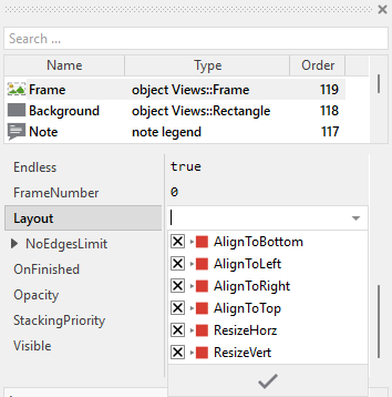
The view existing per default in the Menu Separator Item template (Background) is configured to automatically adjust its width to match the item width, while maintaining its vertical position and thickness. This is controlled by the Layout property of the view configured with Core::Layout[AlignToBottom, AlignToLeft, AlignToRight, AlignToTop, ResizeHorz].
The settings AlignToLeft and AlignToRight ensure that both left and right edges of the view remain at a fixed distance from the item edges. In combination with ResizeHorz, this causes the view to stretch horizontally when the item width changes. The settings AlignToTop and AlignToBottom keep the view vertically centered at its original position.
If you add additional views to the separator, you should configure their Layout property accordingly. For example, if you want a decorative frame to fill the entire Separator Item, then arrange the view appropriately to occupy the entire component and configure its Layout property as shown below:
Implement the interface of the component
When creating your own Menu Separator Item component you can optionally add properties to make the separator configurable. For example, you could add properties to control the separator color, thickness, or style. This allows you to have multiple separator instances with different appearances without creating multiple separator component classes.
To control the features in your separator you use properties. A property can be understood as variable where the corresponding setting is stored, e.g. the color or thickness of the separator line. When the value of the property changes, the separator can react to it and update its appearance accordingly. The properties reflect thus the settings within your separator. Together they form the interface of the component.
In its original version, the Menu Separator Item does not contain any properties beyond those inherited from Core::Group. This is intentional to keep the template as simple as possible. However, you can add properties according to your needs. Following steps explain how to add a property to control the separator color:
★Add a new property to the Menu Separator Item component.
★Name the property according to the setting it should represent. For example, the property intended to store the separator color could be named Color.
★Determine the data type of the property. For example, the property intended to store the separator color will be of type color.
★Determine the initialization value of the property. This value should correspond to the separator's default state. For example, the property intended to store the color could be initialized with #949494FF (gray).
★The property is accompanied by its onget method. Except particular cases, this method is not needed and can be deleted now.
★The property is accompanied by its onset method. Open this method for editing.
★Adapt the implementation of the onset method so it updates the separator according to its new value. For example, in case of the property intended to store the color, you will update the Background view's color:
// The value doesn't change - nothing to do. if ( pure Color == value ) return; // Remember the property's new value. pure Color = value; // Update the view to display the separator with the new color. Background.Color = value;
That is all. Now when you deal with instances of the Menu Separator Item component, you can evaluate and modify the properties similarly to how you access variables. Especially, when the separator instance is selected, you see in Inspector window the property and can change it there. The modification is immediately visible in the Composer window.
If desired, the properties can also be modified at the runtime of your application. For this purpose you access and modify the affected property directly within Chora code:
// Change separator color to match a theme separator.Color = themeColor;
Differences from interactive menu items
Unlike Menu Item, Open Menu Item, Exit Menu Item, and other interactive menu item templates, the Menu Separator Item is purely decorative and does not respond to user interactions. This has several implications:
★No touch handling: The separator does not contain touch handlers, so it cannot be pressed or dragged by the user.
★No keyboard handling: The separator does not contain keyboard handlers and cannot receive focus. When users navigate through the menu with cursor keys, the focus automatically skips over separator items.
★No state management: The separator has no enabled, selected, or pressed states. Its appearance is constant and does not change based on user interaction.
★No event handlers: The separator does not need slot methods to respond to activation, flash timers, or other events.
★Simpler structure: Due to the lack of interactive functionality, the separator component is significantly simpler than interactive menu items, making it easier to understand and customize.
★No OnActivate property: Unlike interactive items, the separator has no mechanism to trigger actions when activated.
This simplified structure makes the Menu Separator Item template an ideal starting point if you need to learn about component creation, as it focuses purely on visual appearance without the complexity of interaction handling.