Creating components from templates: Menu
With this template you can add a new Menu component to your project. Menu is a complex component intended to manage and automatically arrange menu items. At the runtime the user can interact with the menu, scroll and activate the items. Please note that the items are available as separate component templates. When using the Menu component template in your project you will probably also add at least one Menu Item component. The following table provides an overview of the available Menu Item component templates:
Icon |
Template name |
Description |
|---|---|---|
|
Menu item is a simple widget the user can press in order to perform an action. Once you have added the menu item component to a unit, you can embed instances of this item wherever you edit a menu in your GUI project. |
|
|
Toggle item is a simple menu item widget the user can press in order to toggle a value. It is also suitable to serve as a 'check box item'. Once you have added the menu item component to a unit, you can embed instances of this item wherever you edit a menu in your GUI project. |
|
|
Radio item is a simple menu item widget the user can press in order select an option. Once you have added the menu item component to a unit, you can embed instances of this item wherever you edit a menu in your GUI project. |
|
|
Slider item is a simple menu item widget the user can interact with in order to change a number value by touching and dragging a knob. Once you have added the menu item component to a unit, you can embed instances of this item wherever you edit a menu in your GUI project. |
|
|
Open menu item is a simple menu item widget the user can press in order to enter a sub menu. Once you have added the menu item component to a unit, you can embed instances of this item wherever you edit a menu in your GUI project. |
|
|
Exit menu item is a simple menu item widget the user can press in order to leave the actual menu and return to the superior menu. Once you have added the menu item component to a unit, you can embed instances of this item wherever you edit a menu in your GUI project. |
|
|
Menu separator item is a very simple widget intended to separate menu items within a menu. As such the menu separator item doesn't react to user inputs. Once you have added the menu separator item component to a unit, you can embed instances of this item wherever you edit a menu in your GUI project. |


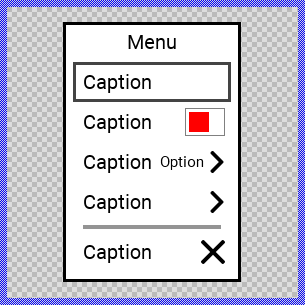
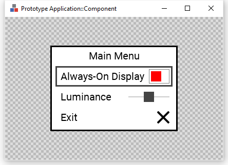
Components created with this template are intended to be adapted to your particular design expectations. After adding the new Menu you should edit the component, change its appearance and if desired also its behavior. Once you have adapted the component, you can embed instances of this Menu wherever you need in your GUI project. Because it serves as template, it is intentionally kept very simple. Nevertheless, Menus created by the template are working widgets. If desired, they can already be used as they are. The following figure demonstrates the default appearance of the Menu created by using the here described component template and diverse menu item templates:
The approach with component templates has two functions. Primarily the templates should simplify the development of new components. Instead of creating the Menu from scratch you can use the available template. The second function is more educative. The template implements fully working Menu component you can investigate and learn about the corresponding programming aspects. The template is well documented. It contains annotations and inline comments with instructions helping you to understand how the component works and how it can be adapted to your particular needs.
This chapter provides an overview how the Menu component template is used within your own application and how you adapt this component according to your particular needs. You will find here also further details concerning the internal implementation of the Menu component.
Add new Menu component
To create a new Menu component from a template you simply Drag & Drop it between the Templates window and the Composer with an opened unit. This is important in that by using the component templates you add in fact a new class to your project. Classes, in turn, can exist within units only. The following are the typical steps to create a new Menu component from a template:
★First switch to the Composer page for the respective unit, where you want to add the new Menu component.
★Then ensure that the Templates window is visible.
★In Templates window switch to the folder Component Templates.
★In the folder locate the Menu template.
★Drag & Drop the template into the Composer window:
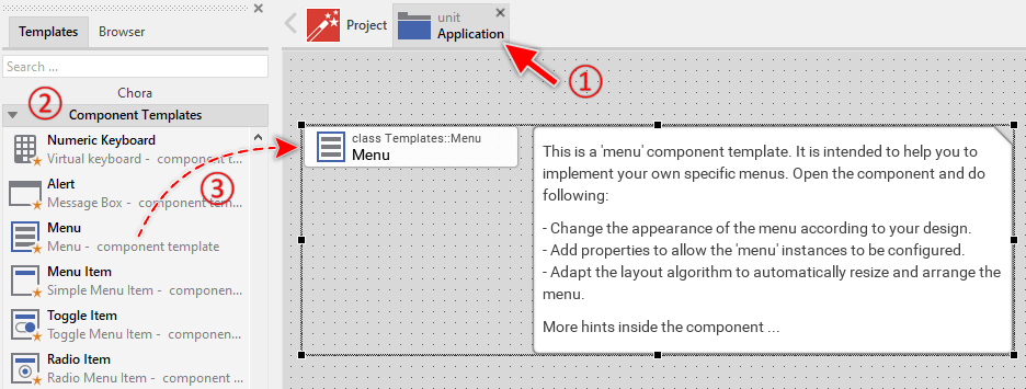
★Eventually name the new added component.
The new created Menu component appears accompanied by annotation providing helpful tips how to proceed. If undesired, you can select and delete the annotation.
Use the Menu component
Once you have created the Menu component, you can use it to assemble one or more application specific menus. From technical point of view, you fill the Menu component with all desired menu items. At the runtime, when the Menu component is presented to the user, the component takes care of correct displaying the items, handling user inputs and scrolling large menus containing many items.
Step 1. Subclassing the Menu component
Except very simple use cases, GUI applications implement more than one menu. Complex applications integrate an entire tree-like menu system composed of a top-level and several nested sub-level menus. When interacting with such menu system the user navigates between superior and sub menus forth and back conveniently. In more sophisticated use cases an application can even implement multiple separate context specific menu systems. In other words, an application may contain multiple menus, each containing a completely different set of menu items.
For reasons of efficiency and reusability it is less recommended to create the individual menus each as a separate copy of the Menu component template. Instead, consider the once created Menu component as a generic, common menu implementation. The individual menus (e.g. MainMenu, SettingsMenu, NetworkMenu, VideoMenu, EngineMenu, etc.) are just components descending from the generic Menu component. In this manner, the implementation of the Menu component is not duplicated. Nevertheless, the descending menu components inherit the common implementation and all menus appear and behave equally. See also Subclassing components.
The following are the typical steps to create a new component by deriving it from the already existing, generic Menu component. Please note, since components are classes they can exist within units only:
★First switch to the Composer page for the respective unit, where you want to add the derived menu component.
★Then ensure that the Browser window is visible.
★Within the Browser locate the class of the previously created Menu. This can be done easily with Browser's own filter function.
★Select the found class in the Browser window.
★Press and hold the keys CtrlShift.
★Drag & Drop the selected class into the Composer area.
★Release the keys CtrlShift.
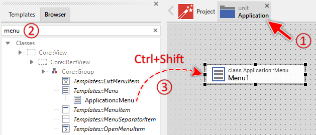
★Eventually name the new component according to its function within the menu system (e.g. MainMenu).
You can repeat the above steps for all individual menus you plan to implement in your application. Each derived menu component appears in the unit as a separate brick. From technical point of view it is a separate class descending from the common Menu component class.
Step 2. Fill the menu with menu items
The following are the typical steps to fill a menu with menu items. Technically seen, you embed an instance of the item class in-place within a superior menu component. At the runtime, the menu component takes care of the correct initialization, arrangement and the displaying of all embedded item components:
★First switch to the Composer page for the respective menu component, where you want to add the items (e.g. MainMenu component).
★Then ensure that the Browser window is visible.
★Within the Browser locate the class of the desired item, e.g. the class ToggleItem. This can be done easily with Browser's own filter function. An overview of the available item types is found the table at the beginning of this chapter.
★Select the found class in the Browser window.
★Drag & Drop the selected class into the Composer area.
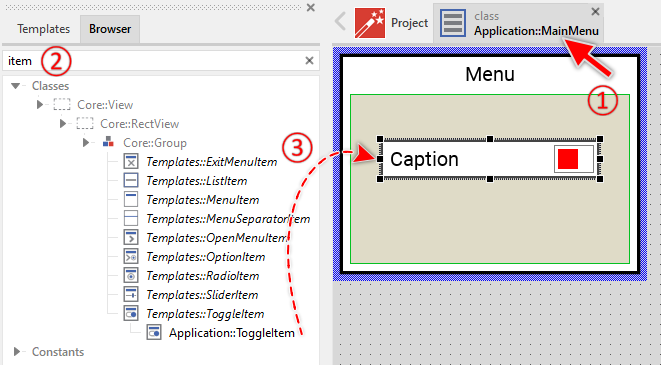
★Eventually name the new item instance according to its function within the menu component.
★Eventually modify the properties of the item (e.g. you can change its Caption property, etc.).
★You can repeat the above steps for all required items.
Step 3. Arrange the items within the menu component
The position of the items doesn't matter. The Menu component will automatically arrange the items within its area and if necessary enlarge or reduce their size. Moreover, the size of the menu itself is adapted to the number and to the size of the enclosed items. This layout algorithm is part of the Menu component template. Consequently, when you move an item within the menu, it does not have any effect on its final position.
However, the order in which the items will be displayed at the runtime does correspond to the order in which the item objects are stored within the menu component. This is the order in which the items have been originally added. Consequently, the first added item appears at the top of the menu while the last added item is arranged at the end of the menu. See also the column Order in the members area of the Inspector window:
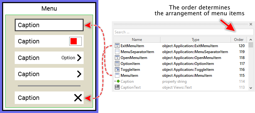
★If necessary you can reorder the item objects in the Inspector window to correspond to the order in which the items should appear in the menu.
Even if the position of an item doesn't matter, we recommend to move the item objects within the menu so you have a good overview of the items existing inside it. If the menu area is too small, you can enlarge it by clicking and dragging the thick blue Canvas border. Resizing the Canvas area of the menu manually has no effect on the final size of the menu. At the runtime the menu will adapt its size to the number and the size of the enclosed items.
Step 4. Present the Menu
The usual approach is to present menus programmatically as so-called dialogs. The following code demonstrates how to achieve this. It creates an instance of the concrete menu component (e.g. Application::MainMenu) and presents it as dialog using the method PresentDialog():
// Create a new instance of the menu component ... var Application::MainMenu menu = new Application::MainMenu; // ... and present it as dialog. rootthis.PresentDialog( menu, null, null, null, null, null, null, null, null, false );
Component templates are intended to create widgets which can be modified and adapted to your particular design expectations. In the following sections you will learn how to do this. Originally, if not yet modified, the Menu appears as a white rectangle surrounded by a border and displaying a caption text. Additionally all items existing within the menu are automatically arranged from top to bottom. Our intention is to keep the component templates as minimalistic as possible so they don't distract you with less important design details:
Step 5. Arrange the Menu on the screen
When using the above described PresentDialog() method, the menu is arranged in the center of the superior GUI component. In case of rootthis it is the center of the entire screen. If desired, you can provide in the second parameter of the PresentDialog() method a transition object configured to apply other layout rules to the presented dialog. The transition objects also permit you to display the Menu with additional animations (e.g. sliding). For more details see the section Customize provided Dialog transition animations.
The following steps explain how to position a menu, for example, aligned to the right edge of its owner component, vertically centered, with 20 pixels distance from this edge:
★Configure its property MarginRight with the value 20 and in the property Alignment ensure that only the options AlignHorzRight and AlignVertCenter are enabled.
★Now you can use the configured transition object when presenting your menu:
// Create a new instance of the menu component ... var Application::MainMenu menu = new Application::MainMenu; // ... and present it as dialog. rootthis.PresentDialog( menu, MenuRightAlignedTransition, null, null, null, null, null, null, null, false );
Open the component for editing
Component templates are intended to create widgets which can be adapted and enhanced to your particular design expectations. For this purpose, once you have added a new Menu component to your project, you can open the component class for editing. Thereupon the implementation of the component appears in a new Composer page:
Originally, if not yet modified, the Menu appears displaying a caption text, a white background surrounded by a border and an area where the menu items are automatically arranged. Our intention is to keep the component templates as minimalistic as possible so they don't distract you with less important design details. The Menu can react to touch and keyboard inputs for navigation and automatically scrolls large menus containing many items. The appearance of the menu border and caption text reflects the actual state of the menu. Especially when the menu is focused (able to receive keyboard events), the border appears thick.
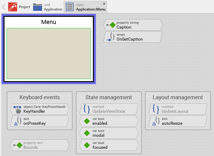
This default functionality is implemented by following members belonging to the Menu. These members are explicitly intended to be modified. Understanding this internal structure is thus the first step before you start to adapt the Menu to your particular needs:
Icon |
Member |
Description |
|---|---|---|
|
Caption |
The property Caption stores the text to display within the menu header. |
|
OnSetCaption |
The onset method belongs to the property Caption. Each time the value of the property is changed, the code implemented in the method is executed to update the caption text view and recalculate the menu size. |
|
KeyHandler |
This key handler reacts to key press events. When the user presses cursor keys (Up, Down, Left, Right), the handler is activated and the method onPressKey is called. This enables keyboard navigation between menu items. |
|
onPressKey |
This internal slot method is called when the KeyHandler has been activated (when the user has pressed a cursor key). Thereupon, the method navigates to the neighbor menu item in the corresponding direction and scrolls the menu if necessary. |
|
autoResize |
This internal slot method is called automatically when the number or size of menu items changes. The method calculates the optimal size for the menu to fit all items and adjusts the menu's Bounds property accordingly. |
|
Background |
This Filled Rectangle view displays in the template the background of the menu. The background is white per default. |
|
Border |
This Border view displays in the template the border of the menu. Depending on the menu's actual state variables enabled, focused and modal the border's color and thickness changes. |
|
CaptionText |
This Text view displays the caption text at the top of the menu. The text content is determined by the property Caption. Depending on the menu's actual state, the text color changes. |
|
Outline |
This Outline view groups all menu items together and manages their automatic arrangement. The outline handles scrolling for large menus and determines the formation (vertical/horizontal) of the items. Per default, items are arranged vertically from top to bottom. |
|
SlideTouchHandler |
This Slide Touch Handler enables the user to scroll the menu items by touching and dragging with a finger or mouse. The handler provides inertia and friction for smooth scrolling behavior. |
|
UpdateViewState |
This method is invoked automatically after the state of the component has been changed. In case of the Menu, the method updates the views Background, Border and CaptionText so they reflect the menu's current state. |
|
UpdateLayout |
This method is invoked automatically when the layout of the menu changes (e.g. when items are added, removed, or the menu is resized). The method triggers the autoResize slot to recalculate the menu size. |
|
enabled |
This variable stores the current state of the menu. It is true if the menu is allowed to handle user inputs (the component is enabled). See also Control the Enabled state of nested components. If the menu is actually disabled, the variable is consequently false. |
|
modal |
This variable stores the current state of the menu. It is true if the menu is actually presented as modal dialog (the menu grabs all user inputs and overlays all other GUI components). |
|
focused |
This variable stores the current state of the menu. It is true if the menu lies on the focus path and can receive keyboard events. The user can thereupon control the menu via keyboard. |


Understand the state management of the component
During its lifetime, the Menu will assume different states as direct effect of user interactions and as result of other superior state alternations within the GUI application. To track its current state the Menu manages the above mentioned state variables: enabled, modal and focused. The variables are evaluated and updated within the implementation of the method UpdateViewState. This method evaluates the common component states (Enabled, Modal and Focused). At the end of the method the estimated states are stored in the state variables:
// Estimate the new state var bool isEnabled = aState.contains( Core::ViewState[ Enabled ]); var bool isModal = aState.contains( Core::ViewState[ Modal ]); var bool isFocused = aState.contains( Core::ViewState[ Focused ]); [...] // Remember the new state enabled = isEnabled; focused = isFocused; modal = isModal;
For example, the local variable isFocused will become true if the menu lies on the focus path. Being in this state, the menu should assume the appearance indicating that the user can actively interact with it via keyboard.
When common component states (Enabled, Modal or Focused) have changed, the method UpdateViewState is invoked automatically. You don't need to worry about it. Any other state alternations need to explicitly request an invocation of the UpdateViewState method. When you modify the Menu to handle other user inputs or perform other animations always ensure that each state alternation (each event) does request an invocation of UpdateViewState. In your implementation you use for this purpose the method InvalidateViewState.
Depending on your design expectations the default state management may require adaptations. Generally, you are free to modify the method UpdateViewState, add further state variables to your Menu or even remove the existing functionality if it is not needed in your case.
Adapt the appearance of the component
Originally, if not yet modified, the Menu appears displaying a caption text, a white background surrounded by a border and an area where the menu items are automatically arranged. Our intention is to keep the component templates as minimalistic as possible so they don't distract you with less important design details. It's up to you to adapt the menu to have the expected appearance. The available possibilities are explained in the following sections. Please note, that you can combine the different approaches according to your application case:
1. Modify existing views
The Menu template contains per default the views Background, Border and CaptionText. If desired, you can modify the views. For example, you can display them with other colors depending on the actual state of the menu. For this purpose you change the implementation of the above explained method UpdateViewState responsible for tracking the state alternations within the Menu.
When you open the method UpdateViewState you will see that it does not only update the state variables but also updates the views existing within the component. Accordingly, depending on the actual state of the menu the views Background, Border and CaptionText are displayed with other colors and the border with other thickness. By simply modifying this implementation you change the appearance. For example, you change the border color from black to blue when the menu is focused:
if ( !isEnabled ) { Background.Color = #AAAAAAFF; Border.Color = #444444FF; Border.Width = 1; CaptionText.Color = #888888FF; } else if ( isFocused ) { Background.Color = #FFFFFFFF; Border.Color = #0000FFFF; // <-- blue color Border.Width = 3; CaptionText.Color = #000000FF; } // Enabled but actually not focused for user interaction. else { Background.Color = #FFFFFFFF; Border.Color = #000000FF; Border.Width = 1; CaptionText.Color = #000000FF; }
2. Remove existing views
If not needed, you can delete the per default existing views Background, Border or CaptionText. Doing this, please don't forget to also remove all references to the deleted views from the implementation of the UpdateViewState and autoResize methods. Otherwise you will get error messages next time the Composer contents is reloaded. To avoid this error message we recommend to perform the steps in following order:
★In the UpdateViewState method adapt the implementation to not refer anymore to the undesired view. For example, if you decided to delete the CaptionText view, simply remove all corresponding code lines. The remaining implementation looks then like this:
if ( !isEnabled ) { Background.Color = #AAAAAAFF; Border.Color = #444444FF; Border.Width = 1; } else if ( isFocused ) { Background.Color = #FFFFFFFF; Border.Color = #000000FF; Border.Width = 3; } // Enabled but actually not focused for user interaction. else { Background.Color = #FFFFFFFF; Border.Color = #000000FF; Border.Width = 1; }
★In the autoResize method adapt the implementation to not refer anymore to the undesired view. For example, if you decided to delete the CaptionText view, simply remove all corresponding code lines:
// Ensure the menu is large enough to display at least the caption text // with an additional border around it. var point ts = CaptionText.GetContentArea().size + <20,20>; if ( s.x < ts.x ) s.x = ts.x; if ( s.y < ts.y ) s.y = ts.y;
★If you plan to delete the CaptionText view, you should also remove the property Caption and its corresponding OnSetCaption method as these members are now unnecessary.
★Now you can delete the affected view.
3. Add further views to the component
You can add further views to your Menu. For example, you can add an Image view to display an icon or logo within the menu header. Or you add additional Text views to display supplementary information. The appearance of the views (e.g. colors) can be fixed, predetermined at the design time. Or it can change according to the actual state of the menu. Following steps explain the workflow:
★First add the desired view to the component. For example add an Image view.
★Name the just added view according to its function in the component. For example MenuIcon.
★In order to arrange the view within the Menu, move the view, or you simply grab one of its corners and resize it in this way. If you want the view to appear behind other views you can reorder it explicitly.
★In Inspector window configure the properties of the just added view. For example, in case of the Image view you can select the bitmap to display.
★In the UpdateViewState method adapt the implementation to update the properties of the view according to the menu's current state. This can be, for example, the color or opacity of the Image view depending on the actual enabled state of the menu. For this purpose you could add following code to the method:
// Update the appearance of the MenuIcon view. if ( !isEnabled ) MenuIcon.Opacity = 128; // semi-transparent when disabled // Enabled else MenuIcon.Opacity = 255; // fully opaque when enabled
4. Replace existing views
Also possible, you can replace the existing views by other views. For example, in the original version, the Menu displays the caption as an ordinary text. To make the component more sophisticated, you could replace the here used Text view by e.g. Attributed Text view to support rich formatted text. For this purpose:
★Think about which view is adequate as replacement for the old view existing per default in the component. An overview of existing views is found in the section Using Views.
★Delete the old view.
★Add the desired view to the component.
★Name the just added view to have the name of the previously removed view.
★Eventually move the view, or you simply grab one of its corners and resize it in this way. If you want the view to appear behind other views you can reorder it explicitly.
★If necessary, in Inspector window configure the properties of the just added view.
★If necessary, modify the implementation of other methods existing in the component if these evaluate/modify the properties of the replaced view.
Configure the layout of the component
The initial size of the Menu is determined by the thick blue border surrounding the Canvas area. However, the Menu component is designed to automatically adjust its size according to the number and size of the enclosed menu items. This auto-sizing behavior is implemented in the autoResize slot method. When you start the Prototyper, you will notice that the menu adapts its size to fit all items.
If you want to manually configure the Canvas area size (for example, to better visualize the menu during editing), you can adjust it by clicking and dragging the edges of the surrounding border (see also Resize the Canvas area). Keep in mind that this manual size adjustment is primarily for design-time convenience and won't affect the runtime auto-sizing behavior.
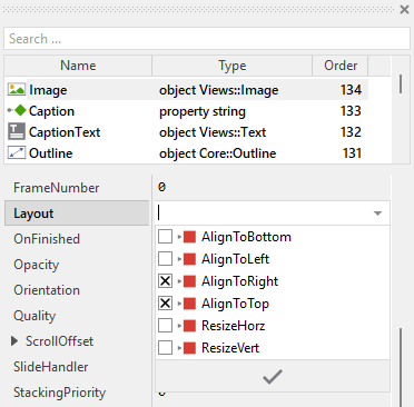
The views existing per default in the Menu template (Background, Border, Outline and SlideTouchHandler) are automatically adjusted to fill the area of the menu. The CaptionText view is aligned at the top. All other views you have eventually added later to the Menu are not adjusted automatically.
To control the adjustment you have to explicitly configure for each view its Layout property. (see also Configure component layout). Let's assume, in order to display an icon you have added an Image view to the Menu. Then you have arranged the view within the Canvas area according to your design expectation. If you want now that the view remains aligned at a specific corner when the menu resizes, you configure its Layout property accordingly. For example, to keep an icon in the top-right corner:
Implement the interface of the component
When creating your own Menu component you should ensure that instances of the menu can be configured to control all the features implemented in it. For example, if you have enhanced the menu to display some icon, you should allow this icon to be specified individually for each menu instance. In this way several menu instances can exist at the same time, each displaying another icon.
To control the features in your menu you use properties. A property can be understood as variable where the corresponding setting is stored, e.g. the icon bitmap to display in the menu. When the value of the property changes, the menu can react to it and update its appearance accordingly. The properties reflect thus the settings within your menu. Together they form the interface of the component.
Usually, each particular setting within a component is represented by the corresponding property. Thus, a menu where icon and background color can be configured will require two properties: one for the icon and one for the color. In its original version, the Menu contains already one property Caption which stores the text to display in the menu header. In order to enhance this interface by your own properties, following steps are necessary:
★Add a new property to the Menu component.
★Name the property according to the setting it should represent. For example, the property intended to store an icon bitmap could be named Icon.
★Determine the data type of the property. For example, the property intended to store an icon bitmap will reference a Resources::Bitmap.
★Determine the initialization value of the property. This value should correspond to the menu's default state. For example, the property intended to store an icon could be initialized with null if no icon should be displayed by default.
★The property is accompanied by its onget method. Except particular cases, this method is not needed and can be deleted now.
★The property is accompanied by its onset method. Open this method for editing.
★Adapt the implementation of the onset method so it updates the menu according to its new value. For example, in case of the property intended to store an icon, you will probably update some Image view where the icon is displayed:
// The value doesn't change - nothing to do. if ( pure Icon == value ) return; // Remember the property's new value. pure Icon = value; // Update the view to display the just modified icon. Image.Bitmap = value;
That is all. Now when you deal with instances of the Menu component, you can evaluate and modify the properties similarly to how you access variables. Especially, when the menu instance is selected, you see in Inspector window the property and can change it there. The modification is immediately visible in the Composer window.
If desired, the properties can also be modified at the runtime of your application. For example, the menu caption can be adapted to reflect the current context. For this purpose you access and modify the affected property directly within Chora code:
var string contextName = ... // Let the menu display concrete context information. menu.Caption = "Settings: " + contextName;
Understand the handling of keyboard inputs
The Menu is an interactive component. It can be controlled via keyboard or hardware buttons. For this purpose the template contains the Key Press Handler object named KeyHandler. To this handler is associated the slot method named onPressKey. The method is thus invoked when the user presses a key matching the filter condition specified in the handler object. These are per default the cursor keys (Up, Down, Left, Right):
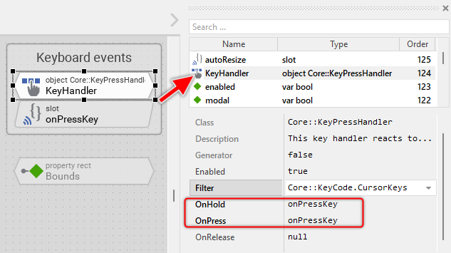
The method takes care of keyboard navigation between menu items. When the user presses a cursor key, the method determines the navigation direction and looks for the next menu item in that direction. If found, the focus is passed to the found item. In case of large menus, the method also scrolls to the focused item with an animation effect:
var Core::Direction dir = Core::Direction.None; var Core::View item = Focus; // Determine the direction to look for other items to select switch ( KeyHandler.Code ) { case Core::KeyCode.Left : dir = Core::Direction.Left; case Core::KeyCode.Right : dir = Core::Direction.Right; case Core::KeyCode.Up : dir = Core::Direction.Top; case Core::KeyCode.Down : dir = Core::Direction.Bottom; default:; } // Look for the neighbor item accordingly the determined direction item = FindViewInDirection( item, dir, Core::ViewState[ Enabled, Focusable ]); // If found -> pass the focus to it // In case of large menus - scroll to the item with an animation effect if ( item != null ) { Focus = item; // Prepare the animation effect. If you don't want the scroll animation, // just remove the following 3 lines and pass 'null' in the EnsureVisible() // method instead of 'effect'. var Effects::PointEffect effect = new Effects::PointEffect; effect.Timing = Effects::Timing.FastIn_EaseOut; effect.CycleDuration = 100; // Scroll to the item Outline.EnsureVisible( item, true, effect, null ); }
Usually you will not need to edit the implementation of the method. It corresponds already to whatever typical menus do. Nevertheless, you are free to change this default functionality if you want some particular behavior to be implemented in your menu. For example, you can modify the scroll animation duration or disable the animation completely.
Per default the key handler is configured to accept the cursor keys (Up, Down, Left, Right). If necessary you can change this behavior and adapt the menu to react to other keys or key groups. The key handler provides for this purpose the configuration property Filter. For example, if you want the menu to also accept navigation with W, A, S, D keys, you can add an additional key handler. For more details, see Configure the filter condition.
If your device does not contain any keyboard nor hardware buttons, the per default existing key handler and its associated slot method are unnecessary ballast. You can remove them in such case. We recommend to do this in following order to avoid eventual error messages because of broken references between still existing and the already removed members:
★Delete the KeyHandler object.
★Delete the slot methodonPressKey.
★Finally delete the annotation grouping the handler and the slot method.
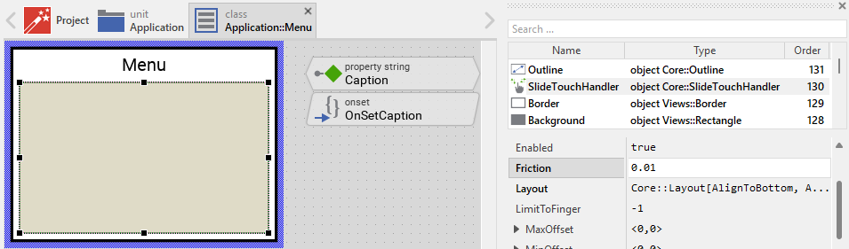
Understand the touch/mouse scroll handling
The Menu is an interactive component that supports touch-based and mouse-based scrolling for large menus. For this purpose the template contains the Slide Touch Handler object named SlideTouchHandler. This handler covers the entire area where menu items are displayed and enables the user to scroll by touching and dragging:
The handler provides following scrolling features:
★Inertia: When the user releases the finger/mouse after a fast drag, the menu continues scrolling and gradually slows down
★Friction: The deceleration rate is controlled by the handler's Friction property
★Bounds restriction: The menu can't be scrolled beyond its content boundaries
Usually you will not need to modify the handler's configuration. However, you can adjust the scrolling behavior by changing following properties:
Property |
Description |
|---|---|
SlideHorz |
Enables/disables horizontal scrolling. Set to false per default for vertical menus. |
SlideVert |
Enables/disables vertical scrolling. Set to true per default for vertical menus. |
Friction |
Controls the deceleration rate after releasing the finger/mouse. Higher values (e.g. 0.05) cause faster deceleration. Lower values (e.g. 0.005) cause longer inertia. Default value is 0.01. |
If your device does not support touch or mouse input, you can remove the SlideTouchHandler object. In such case, keyboard navigation (via the KeyHandler) will be the only way to navigate through menu items.
Understand the automatic item arrangement
The Menu component automatically arranges all enclosed menu items using the Outline view. This outline view groups the items together and manages their layout according to the configured Formation property. Per default, items are arranged vertically from top to bottom.
The automatic arrangement occurs whenever:
★New items are added to the menu
★Existing items are removed from the menu
★Items change their visibility
★The menu itself is resized
The arrangement algorithm is triggered by the UpdateLayout method, which then invokes the autoResize slot method. This method calculates the optimal size for the menu based on:
★The number of visible items
★The minimum size required by each item (returned by each item's GetMinimalSize method)
★The space needed for the menu's caption and borders
★The maximum allowed menu size (60% of the screen size per default)
If the calculated size exceeds the maximum allowed size, the menu becomes scrollable. The SlideTouchHandler enables smooth touch-based scrolling with inertia and friction effects.
Changing the item formation
Per default, items are arranged vertically (top to bottom). If you want to arrange items horizontally, you need to:
★Select the Outline view and change its Formation property to Core::Formation.LeftToRight or Core::Formation.RightToLeft.
★Select the SlideTouchHandler and configure it to enable horizontal scrolling: Set SlideHorz to true and SlideVert to false.
★Important: You will also need to adapt the GetMinimalSize() methods found in the item components to calculate the minimum height instead of minimum width.
Adapt the autoResize method to your modifications
The autoResize method is responsible for calculating the optimal size of the menu based on its content. When you modify the menu by adding additional views (like icons, decorations, or other elements), you may need to adapt the implementation of this method to correctly account for the additional space required.
In its original implementation, the method calculates the menu size based on following main factors:
★Items area: The space needed to display all menu items
★Caption area: The space needed for the caption text
★Decorations: The space needed for borders
Here is the relevant part of the default implementation that determines the minimum width:
// Determine the area occupied by all items var point s = Outline.GetContentArea( Core::ViewState[ Visible ]).size; // Depending on the formation of the items (horizontal or vertical) adjust the // items area to be large enough for the highest or widest item. if (( Outline.Formation == Core::Formation.LeftToRight ) || ( Outline.Formation == Core::Formation.RightToLeft )) s.y = size.y; else s.x = size.x; // Take in account the area occupied by caption and borders. This can be // calculated from the difference between the actual size of the complete // menu and the size of the Outline area. s = s + Bounds.size - Outline.Bounds.size; // Ensure the menu is large enough to display at least the caption text // with an additional border around it. var point ts = CaptionText.GetContentArea().size + <20,20>; if ( s.x < ts.x ) s.x = ts.x; if ( s.y < ts.y ) s.y = ts.y;
The critical calculation is where the method ensures the menu is wide enough for the caption text plus 20 pixels margin:
var point ts = CaptionText.GetContentArea().size + <20,20>;
Let's assume you have added an Image view named MenuIcon to display an icon next to the caption text. The icon is positioned to the right of the caption and has a width of 36 pixels. You also want 10 pixels spacing between the icon and the text. In this case, you need to modify the calculation in the autoResize method:
// Ensure the menu is large enough to display at least the caption text // with an additional border around it. Also include space for the icon // and spacing between icon and text. var point ts = CaptionText.GetContentArea().size + <20,20>; // Add space for the icon: icon width (36px) + spacing (10px) ts.x = ts.x + 36 + 10;
Or more elegantly, you can calculate the icon space dynamically:
// Ensure the menu is large enough to display at least the caption text // with an additional border around it. var point ts = CaptionText.GetContentArea().size + <20,20>; // If an icon is visible, add its width plus spacing if ( MenuIcon.Bitmap ) ts.x = ts.x + MenuIcon.Bitmap.FrameSize.x + 10;
In the last case, assigning an icon with different size should trigger the menu to update its layout. For this purpose you should invoke InvalidateViewState every time a new icon is assigned to the menu. Assuming you have implemented a property Icon for such purpose, then you would adapt the onset method of this property.
If you have added multiple decorative elements around the caption (for example, an icon on the left and a status indicator on the right), you need to account for all of them:
// Ensure the menu is large enough to display at least the caption text // with an additional border around it. var point ts = CaptionText.GetContentArea().size + <20,20>; // Add space for left icon if visible if ( MenuIcon.Bitmap ) ts.x = ts.x + MenuIcon.Bitmap.FrameSize.w + 10; // Add space for right status indicator if visible if ( StatusIndicator.Visible ) ts.x = ts.x + StatusIndicator.Bounds.w + 10;
If you want to change the default 20 pixels margin around the caption text (for example, to use 30 pixels left margin and 15 pixels right margin), modify the calculation as shown below. Don't forget to reposition the caption text view to lie 30 pixel away from the left edge of the menu:
// Ensure the menu is large enough to display at least the caption text // with custom margins: 30px left + 15px right = 45px horizontal // and 10px top + 10px bottom = 20px vertical var point ts = CaptionText.GetContentArea().size + <45,20>;
Similarly, if you have added views that affect the minimum height of the menu (like a subtitle text below the caption), you need to modify the height calculation:
// Ensure the menu is large enough to display at least the caption text // with an additional border around it. var point ts = CaptionText.GetContentArea().size + <20,20>; // If subtitle is visible, add its height plus spacing if ( SubtitleText.Visible ) ts.y = ts.y + SubtitleText.Bounds.h + 5;
If you don't adapt the autoResize method after adding decorative elements, the menu might appear too small, causing text or icons to be cut off or overlap. Always test your menu with different caption lengths and item configurations to ensure the size calculation works correctly.
The autoResize method calculates the minimum size. The actual menu size at runtime will be at least this size, but can be larger if needed to accommodate all items. The method also limits the maximum size to 60% of the screen size per default. If you need different maximum size constraints, modify the following section in the method:
// Limit the max. menu size to e.g. 60% size of the screen size var int32 maxW = ( $ScreenSize.x * 3 ) / 5; var int32 maxH = ( $ScreenSize.y * 3 ) / 5;
Perform state changes with animations
In the section Adapt the appearance of the component you learned how state alternations within the Menu are processed and how views existing in the component are updated in order to reflect the actual state. Accordingly, when the menu becomes focused (able to receive keyboard events), the menu does appear highlighted. When the menu loses focus again, the menu restores its normal appearance. The default implementation performs such appearance updates instantly, just in the moment when the respective state change took place.
If desired, you can modify the Menu to update its appearance with animations. For example, instead of instantly switching between the focused and not-focused appearance, such menu can fade-in/out the views, modulate their colors or sizes. For this purpose you use the Animation Effects. With an Animation Effect you can animate a property of a view existing in the menu. Following are the steps how to do this:
★Depending on the data type of the property to animate, add the appropriate Animation Effect to the Menu. For example, to animate a color property, add a Pulse color effect.
★Connect the effect object with the property to animate. For example, if you want to animate the color of the Border view, connect the Pulse color effect with the property Color of the Border view.
★Configure the duration and eventually the desired timing (easing) for the animation.
★Once started, the effect will animate the property endlessly. In our case, however, the animation should stop at its end. For this purpose set the effect's property NoOfCycles to the value 1.
★Configure the key values for the animation. In case of the pulse color effect, it is the start and the end color. For example, to animate the color between black and blue, configure the effect's property Value1 with the #000000FF (black) and the property Value2 with #0000FFFF (blue). This step is appropriate if the key values are fixed, known at the design time. Otherwise, the key values must be set at runtime shortly before the effect is triggered.
★Open the method UpdateViewState and modify its implementation to trigger the effect object when the menu switches between the states focused and not focused. For example in case of the above mentioned pulse color effect to animate the color of the Border, following implementation could be adequate:
// Estimate the new state var bool isEnabled = aState.contains( Core::ViewState[ Enabled ]); var bool isModal = aState.contains( Core::ViewState[ Modal ]); var bool isFocused = aState.contains( Core::ViewState[ Focused ]); [...] // Following code updates the views instantly, without animations. if ( !isEnabled ) { Background.Color = #AAAAAAFF; Border.Width = 1; CaptionText.Color = #888888FF; } else if ( isFocused ) { Background.Color = #FFFFFFFF; Border.Width = 3; CaptionText.Color = #000000FF; } // Enabled but actually not focused for user interaction. else { Background.Color = #FFFFFFFF; Border.Width = 1; CaptionText.Color = #000000FF; } // Switching from not focused -> focused state. Start the animation. if ( isEnabled && isFocused && !focused ) { ColorEffect.Reversed = false; ColorEffect.Enabled = true; } // Switching from focused -> not focused state. Start the animation. else if ( isEnabled && !isFocused && focused ) { ColorEffect.Reversed = true; ColorEffect.Enabled = true; } // Remember the new state enabled = isEnabled; focused = isFocused; modal = isModal;
★Since the properties of the affected views are now modified with animations, you will eventually need to adapt their initial values to correspond to the default state of the menu. For example, you might need to set the property Color of the view Border to the value #000000FF (default color is black).