Creating components from templates: Pie Chart
With this template you can add a new Pie Chart component to your project. Pie Chart is a component intended to display diagrams composed of slices. As such this widget is not suitable to be controlled by the user interactively.
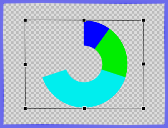
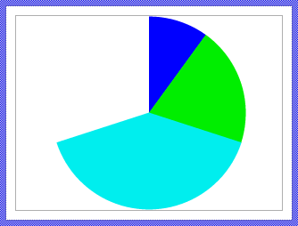
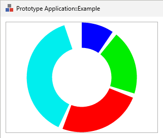
Components created with this template are intended to be adapted to your particular design expectations. After adding the new Pie Chart you should edit the component, change its appearance and if desired also its behavior. Once you have adapted the component, you can embed instances of this Pie Chart wherever you need in your GUI project. Because it serves as template, it is intentionally kept very simple. Nevertheless, Pie Charts created by the template are working widgets. If desired, they can already be used as they are. The following figure demonstrates the default appearance of the Pie Chart created by using the here described component template:
The approach with component templates has two functions. Primarily the templates should simplify the development of new components. Instead of creating the Pie Chart from scratch you can use the available template. The second function is more educative. The template implements fully working Pie Chart component you can investigate and learn about the corresponding programming aspects. The template is well documented. It contains annotations and inline comments with instructions helping you to understand how the component works and how it can be adapted to your particular needs.
This chapter provides an overview how the Pie Chart component template is used within your own application and how you adapt this component according to your particular needs. You will find here also further details concerning the internal implementation of the Pie Chart component.
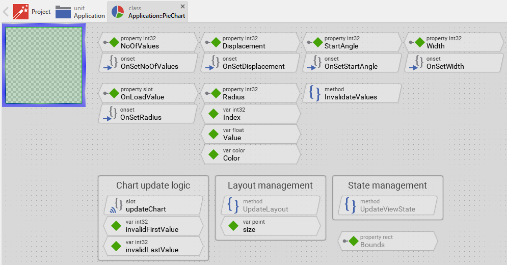
The Pie Chart component internally manages multiple filled path view instances to display the data. Each slice requires its own view with associated path data, which means that the more slices you need to display simultaneously, the more memory and CPU resources are consumed. Therefore, this chart type is best suited for displaying a limited number of data values at once. The definition of "limited" depends on your target system's capabilities - devices with more CPU power and RAM can handle more complex charts with more slices.
For applications that need to display many data values (e.g., hundreds or thousands of data points), the Graph component template is a more efficient alternative as it uses a different rendering approach optimized for larger datasets. However, keep in mind that even the Graph component requires more CPU processing as the number of displayed values increases.
Add new Pie Chart component
To create a new Pie Chart component from a template you simply Drag & Drop it between the Templates window and the Composer with an opened unit. This is important in that by using the component templates you add in fact a new class to your project. Classes, in turn, can exist within units only. The following are the typical steps to create a new Pie Chart component from a template:
★First switch to the Composer page for the respective unit, where you want to add the new Pie Chart component.
★Then ensure that the Templates window is visible.
★In Templates window switch to the folder Component Templates.
★In the folder locate the Pie Chart template.
★Drag & Drop the template into the Composer window:
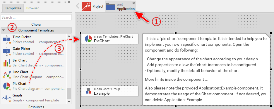
In order to demonstrate the usage of the Pie Chart component, the template includes an Example component. This example demonstrates practical usage patterns including how to implement the data loading via OnLoadValue slot method and how to animate slice values using animation effects. It is recommended to study this example component before deletion to understand these important concepts. If not needed afterwards, just select and delete the Example class.
★Eventually name the new added component.
The new created Pie Chart component appears accompanied by annotation providing helpful tips how to proceed. If undesired, you can select and delete the annotation.
Use the Pie Chart component
Once you have created the Pie Chart component, you can use it to assemble more complex components. Technically seen, you embed an instance of the Pie Chart class in-place within some superior GUI component. At the runtime, the superior GUI component takes care of the correct initialization and the displaying of all embedded components, so they appear similarly as you have composed them at the design time.
Step 1. Add new Pie Chart instance
The following are the typical steps to create a new instance of an already existing Pie Chart component:
★First switch to the Composer page for the respective GUI component, where you want to add the new Pie Chart.
★Then ensure that the Browser window is visible.
★Within the Browser locate the class of the previously created Pie Chart. This can be done easily with Browser's own filter function.
★Select the found class in the Browser window.
★Drag & Drop the selected class into the Composer area.
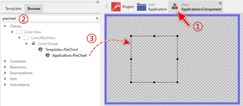
★Eventually name the new instance according to its function within the GUI component.
Component templates are intended to create widgets which can be modified and adapted to your particular design expectations. In the following sections you will learn how to do this. Originally, if not yet modified, the Pie Chart displays the values as circle segments filled with solid colors. Our intention is to keep the component templates as minimalistic as possible so they don't distract you with less important design details.
Please note, the just added pie chart is still empty (it does not contain any data). Therefore no circle segments are shown. To understand how to properly provide data to the chart, it is recommended to study the Example component which demonstrates the implementation of the OnLoadValue slot method and shows how to animate slice values.
Step 2. Inspect the Pie Chart instance
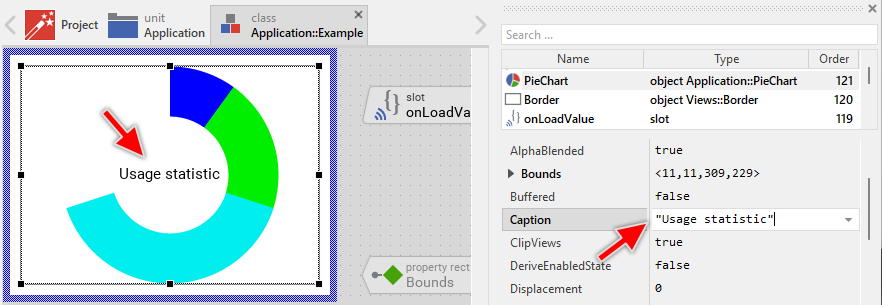
As long as the Pie Chart is selected you can inspect and modify its properties conveniently in the Inspector window as demonstrated with the property Bounds in the screenshot below. This is in so far worth mentioning as diverse features of the Pie Chart are controlled by the corresponding properties. If you are not familiar with the concept of a property and the usage of Inspector window, please read first the preceding chapter Compositing component appearance.
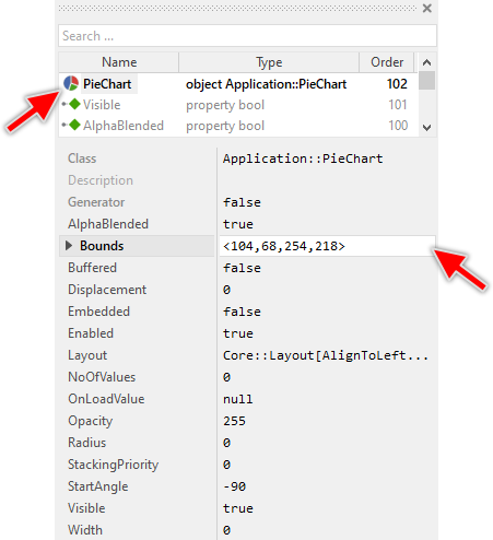
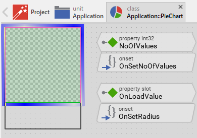
The Pie Chart component descends from the Mosaic class Core::Group. Consequently, most of the properties listed in the above screenshot are inherited from this base class. Particular to the Pie Chart are only few following properties:
Property |
Description |
|---|---|
Displacement |
The property Displacement stores the offset in pixel to move the slices away from the center of the chart. This results in the slices being separated. |
NoOfValues |
The property NoOfValues stores how many slices are currently managed within the chart component. This value should correspond to the number of data entries the chart presents to the user. |
OnLoadValue |
The property OnLoadValue should refer to a slot method, which will be invoked by the chart component in order to load the data for a given slice. The slot method receives no parameters. Instead, within the slot method implementation you access the Index variable to identify which slice is being loaded, and set the Value and Color variables to specify the slice's data. When the referred property is modified by other widget or the application logic, the Pie Chart is automatically notified to remain in sync with the property. |
Radius |
The property Radius specifies the outer radius of the pie slices expressed in pixel. If this value is 0 (zero), the radius is calculated automatically from the bounds of the Pie Chart component. |
StartAngle |
The property StartAngle specifies the angle in degrees where the first slice starts. Changing this property has the effect of the entire chart being rotated. For example, in order to arrange the first slice at the clock position 12:00, initialize this property with the value -90. |
Width |
The property Width specifies the width of a ring (or donut) expressed in pixel. If this value is 0 (zero), the chart displays slices instead of rings. |
Step 3. Arrange the Pie Chart within the superior component
Once added to the component, you can freely move the Pie Chart instance, or you simply grab one of its corners and resize it in this way. You can control the position and the size of the component also by directly modifying its property Bounds. If you want the Pie Chart to appear behind other views you can reorder it explicitly.
Step 4. Determine the number of slices and configure their appearance
The Pie Chart is intended to display multiple slices representing individual data values. The number of slices is determined by the widget's property NoOfValues. By evaluating this property you can query how many slices are currently displayed in the affected widget. When you modify the property NoOfValues, the Pie Chart will automatically update to show the correct number of slices. For example:
// Query the current number of slices var int32 count = PieChart.NoOfValues; [...] // Change the number of slices to display 3 slices PieChart.NoOfValues = 3;
The appearance of the slices is controlled by several properties that define their size, rotation, and spacing:
Property |
Description |
|---|---|
Displacement |
The property Displacement stores the offset in pixel to move the slices away from the center of the chart. This results in the slices being separated. |
Radius |
The property Radius specifies the outer radius of the pie slices expressed in pixel. If this value is 0 (zero), the radius is calculated automatically from the bounds of the Pie Chart component. |
StartAngle |
The property StartAngle specifies the angle in degrees where the first slice starts. Changing this property has the effect of the entire chart being rotated. For example, in order to arrange the first slice at the clock position 12:00, initialize this property with the value -90. |
Width |
The property Width specifies the width of a ring (or donut) expressed in pixel. If this value is 0 (zero), the chart displays slices instead of rings. |
The outer radius of the slices is controlled by the property Radius expressed in pixel units. If set to 0 (zero), the radius is calculated automatically to fit within the component's bounds. When the radius is calculated automatically, the chart will always fit within its bounds. If you specify an explicit radius value, you need to ensure the component is large enough to accommodate the chart, especially when using displacement. For example:
// Use automatic radius calculation (fit to component bounds) PieChart.Radius = 0; // Configure explicit radius of 60 pixels. Ensure the Pie Chart // is at least 120x120 pixel large to avoid clipping of the pie segments. PieChart.Radius = 60;
The property Width determines whether the chart displays as regular pie slices or as donut rings. When set to 0 (zero), the chart displays traditional pie slices. When set to a value greater than zero, the chart displays rings (donuts) with the specified width. For example:
// Display as traditional pie slices PieChart.Width = 0; // Display as donut with 70 pixel ring width PieChart.Width = 70;
The property StartAngle specifies the angle in degrees where the first slice begins. This effectively rotates the entire chart. The angle is measured clockwise from the positive X-axis (3 o'clock position). For example:
// First slice starts at 3 o'clock position PieChart.StartAngle = 0; // First slice starts at 12 o'clock position PieChart.StartAngle = -90; // First slice starts at 9 o'clock position PieChart.StartAngle = -180;
The property Displacement specifies an offset in pixels to move the slices away from the center of the chart. This creates an "exploded" pie chart effect where slices are separated with gaps between them. The displacement is automatically scaled based on the size of each slice to create uniform gaps. Larger slices move less distance than smaller slices, resulting in equal spacing between all slices. For example:
// No separation between slices PieChart.Displacement = 0; // Separate slices with 5 pixel displacement PieChart.Displacement = 5;
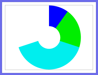
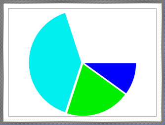
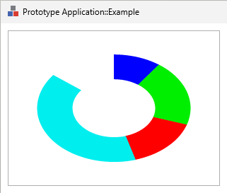
The following figures demonstrate a Pie Chart configured with Width set to 0 (left image - traditional slices) and Width set to 70 (middle image - donut rings). The right image shows a Pie Chart with Displacement set to 5 and StartAngle set to 0:
Step 5. Provide data for the slices
The Pie Chart loads data dynamically at runtime through a callback mechanism. To provide the data (value and color) for each slice, you need to implement a slot method and connect it to the chart's OnLoadValue property. The chart will invoke this slot method automatically whenever it needs to load or reload data for a slice.
The data exchange between the Pie Chart and your slot method uses three variables that are members of the Pie Chart component:
Variable |
Description |
|---|---|
Index |
This variable identifies which slice is being loaded. The first slice has index 0, the second slice has index 1, and so on. Your slot method should read this variable to determine which data to provide. |
Value |
This variable should be set by your slot method to specify the size of the slice. The value ranges from 0.0 to 1.0, where 0.0 means an empty slice and 1.0 means a slice that fills the entire circle (360 degrees). |
Color |
This variable should be set by your slot method to specify the color of the slice. |
The following example demonstrates a typical implementation pattern:
★First add a new slot method to your GUI component.
★Name the slot method according to its function, for example onLoadSliceData.
★Implement the slot method to provide the data based on the Index variable:
// Determine which slice is being loaded var int32 sliceIndex = PieChart.Index; // Based on the index, provide the corresponding data // Here we access some data source (e.g., array, data model, etc.) var float sliceValue = GetDataValue( sliceIndex ); var color sliceColor = GetDataColor( sliceIndex ); // Assign the data to the Pie Chart variables PieChart.Value = sliceValue; PieChart.Color = sliceColor;
★In the Inspector window when configuring the Pie Chart instance, connect the slot method to the Pie Chart by assigning it to the OnLoadValue property.
A simpler example without external data sources could look like this:
var float val = 0.0; var color clr = #000000FF; // Provide data based on slice index switch ( PieChart.Index ) { case 0 : { val = 0.25; clr = #FF0000FF; } // Red slice occupying 25% (90°) case 1 : { val = 0.35; clr = #00FF00FF; } // Green slice occupying 35% (126°) case 2 : { val = 0.20; clr = #0000FFFF; } // Blue slice occupying 20% (72°) case 3 : { val = 0.20; clr = #FFFF00FF; } // Yellow slice occupying 20% (72°) default :; } // Assign the values PieChart.Value = val; PieChart.Color = clr;
When the underlying data changes and the Pie Chart needs to update its appearance, you must explicitly request the reload operation by calling the method InvalidateValues. This method accepts two parameters specifying the range of slices to reload:
// Reload all slices PieChart.InvalidateValues( 0, PieChart.NoOfValues - 1 ); // Reload only slices 1, 2, and 3 PieChart.InvalidateValues( 1, 3 ); // Reload a single slice (slice number 2) PieChart.InvalidateValues( 2, 2 );
After calling InvalidateValues, the Pie Chart will automatically invoke your OnLoadValue slot method for each affected slice to reload its data.
Open the component for editing
Component templates are intended to create widgets which can be adapted and enhanced to your particular design expectations. For this purpose, once you have added a new Pie Chart component to your project, you can open the component class for editing. Thereupon the implementation of the component appears in a new Composer page:
Originally, if not yet modified, the Pie Chart appears with an empty canvas area. The slices are created dynamically at runtime within an Outline view. Our intention is to keep the component templates as minimalistic as possible so they don't distract you with less important design details. The slices are displayed as Filled Path views, each positioned, shaped, and colored according to the data provided through the OnLoadValue callback mechanism.
This default functionality is implemented by following members belonging to the Pie Chart. These members are explicitly intended to be modified. Understanding this internal structure is thus the first step before you start to adapt the Pie Chart to your particular needs:
Icon |
Member |
Description |
|---|---|---|
|
NoOfValues |
The property NoOfValues stores how many slices are currently managed within the chart component. This value should correspond to the number of data entries the chart presents to the user. |
|
OnSetNoOfValues |
The onset method belongs to the property NoOfValues. Each time the value of the property is changed, the code implemented in the method is executed to schedule an update of all slices. |
|
Displacement |
The property Displacement stores the offset in pixel to move the slices away from the center of the chart. |
|
OnSetDisplacement |
The onset method belongs to the property Displacement. Each time the value of the property is changed, the code implemented in the method is executed to request an update of all slices. |
|
StartAngle |
The property StartAngle determines the angle where the first slice starts, effectively controlling the rotation of the entire chart. |
|
OnSetStartAngle |
The onset method belongs to the property StartAngle. Each time the value of the property is changed, the code implemented in the method is executed to reload all slice data with the new rotation angle. |
|
Width |
The property Width determines the width of rings when displaying the chart as a donut. A value of 0 displays traditional pie slices. |
|
OnSetWidth |
The onset method belongs to the property Width. Each time the value of the property is changed, the code implemented in the method is executed to request an update of all slices. |
|
Radius |
The property Radius specifies the outer radius of the slices. A value of 0 enables automatic radius calculation based on component bounds. |
|
OnSetRadius |
The onset method belongs to the property Radius. Each time the value of the property is changed, the code implemented in the method is executed to request an update of all slices. |
|
OnLoadValue |
The property OnLoadValue can refer to any slot method that should be invoked to load the data for a slice. When the Pie Chart needs to load data, it will invoke this slot method. |
|
Index |
This variable identifies the slice which is about to be loaded by the external slot method OnLoadValue. The external slot method should read this variable to determine which slice's data to provide. |
|
Value |
This variable is intended to receive the value for the currently loaded slice. The external slot method OnLoadValue should set this variable. The value ranges from 0.0 to 1.0 corresponding to the slice's proportion of the complete circle. |
|
Color |
This variable is intended to receive the color for the currently loaded slice. The external slot method OnLoadValue should set this variable. |
|
invalidFirstValue |
This internal variable stores the index of the first slice which needs an update. Used internally by the update logic. |
|
invalidLastValue |
This internal variable stores the index of the last slice which needs an update. Used internally by the update logic. |
|
size |
This internal variable stores the previous size of the chart component. It is used to detect when the component is resized and needs a complete update of all slices. |
|
updateChart |
This internal slot method manages the creation, positioning, and updating of all slice views. It is invoked automatically when slices need to be loaded or reloaded. |
|
InvalidateValues |
This method forces the chart component to reload the data for one or more slices. It accepts two parameters specifying the range of slices to reload. |
|
Outline |
This Outline view serves as the container for all slice views. The Outline manages the slices and provides potential scrolling capabilities. |
|
UpdateLayout |
This method is invoked automatically after the size of the component has changed. It detects size changes and triggers a complete reload of all slices. |
|
UpdateViewState |
This method is invoked automatically after the state of the component has changed. In case of the Pie Chart, this method can be used to update the chart's appearance based on state changes (enabled, focused, etc.). |


Understand the chart update logic
The Pie Chart component manages slices dynamically at runtime. Unlike static views that are defined at design time, the slices are created, positioned, and removed automatically as needed. This dynamic behavior is controlled by the above mentioned slot method updateChart and the method InvalidateValues.
The update workflow
The update workflow follows these steps:
★When the chart needs to reload data (triggered by property changes or explicit InvalidateValues calls), the variables invalidFirstValue and invalidLastValue are set to mark the range of slices that need updating.
★The updateChart slot method is scheduled for execution using postsignal.
★When updateChart executes, it processes all slices from index 0 to NoOfValues - 1.
★For each slice, the method checks if a Views::FillPath view already exists. If not, it creates a new one along with an associated Graphics::Path object to store the slice shape.
★Due to the sequential nature of pie slices (each slice's starting angle depends on the sum of all previous slices' values), if any slice is marked for update, all slices from that point onward are reloaded to ensure correct positioning.
★For each slice being loaded, the data is obtained by invoking the external OnLoadValue slot method.
★The slice's shape is calculated based on the Value, StartAngle, Displacement, Radius, Width, and the accumulated sum of previous slice values.
★The slice's color is updated from the Color variable.
★The Graphics::Path object is reconfigured with the calculated arc segments to represent the slice or ring shape.
★If NoOfValues was reduced, excess slice views are removed.
The following code snippet from the updateChart method demonstrates the core update logic:
// These views are managed by the Outline. Search for already existing views. var Views::FillPath view = (Views::FillPath)Outline.FindNextView( null, Core::ViewState[]); // Now process all slices for ( i = 0; i < noOfValues; i++ ) { // Due to sequential slice arrangement, reload all if any is invalid var bool reload = invalidLastValue >= invalidFirstValue; // Create new view if needed if ( !view ) { view = new Views::FillPath; reload = true; // Associate a path data object to store the slice shape view.Path = new Graphics::Path; view.Embedded = true; Add( view, 0 ); } // Load the data? if ( reload ) { // Query the data from external slot method Index = i; Value = 0.0; Color = #00000000; signal OnLoadValue; // Limit value to valid range if ( Value < 0.0 ) Value = 0.0; if ( Value > 1.0 ) Value = 1.0; // Update the view's color view.Color = Color; // Calculate slice shape and position // ... (shape calculation code) // Accumulate values for next slice positioning sum += Value; } // Find next view view = (Views::FillPath)Outline.FindNextView( view, Core::ViewState[]); } // Remove excess views if NoOfValues was reduced while ( view ) { var Core::View tmpView = view; view = (Views::FillPath)Outline.FindNextView( view, Core::ViewState[]); Remove( tmpView ); }
Slice shape calculation algorithm
The shape of each slice is calculated using vector path operations. The algorithm creates either pie slices or donut rings depending on the Width property. Parameters affecting slice shape:
Parameter |
Description |
|---|---|
Value |
The normalized value (0.0 to 1.0) determining what proportion of the circle the slice occupies. Multiplied by 360° to get the slice angle. |
StartAngle |
The rotation angle for the entire chart, added to the calculated start position of each slice. |
Radius |
The outer radius of the slices. If 0, automatically calculated from component bounds. |
Width |
The width of rings for donut display. If 0, displays traditional pie slices. |
Displacement |
The offset to move slices away from center, scaled by slice size for uniform gaps. |
Accumulated sum |
The sum of all previous slice values, used to calculate where the current slice starts. |
For each slice, the following calculations are performed:
// Calculate the angle where the slice starts and how large it is var float startAngle = sum * 360.0 + StartAngle; var float sliceAngle = Value * 360.0; var float sliceAngle2 = sliceAngle / 2; var float dirAngle = startAngle + sliceAngle2; // Scale displacement by slice size for uniform gaps var float displacement = Displacement * ( 1.0 - Value ); // Limit radius to keep displaced slices fully visible var float radius = math_max( maxRadius - displacement, minRadius );
Vector shapes created in Embedded Wizard are internally composed of straight line segments (so-called edges). The more edges used for a curve, the more smooth will it appear. On the other hand, the more edges used, the more CPU intensive will be the rendering of the shape. The implementation of the Pie Chart estimates the number of edges for each arc based on the arc length:
// Estimate number of edges for outer arc (~6 pixels per edge) var int32 noOfOuterArcEdges = (int32)(( sliceAngle * radius ) / 360.0 ) + 1; // For donuts, estimate inner arc edges var int32 noOfInnerArcEdges = 0; var bool displayRings = width && ( width < radius ); if ( displayRings ) noOfInnerArcEdges = (int32)(( sliceAngle * ( radius - width )) / 360.0 ) + 1;
The slice shape is constructed using Graphics::Path operations:
// Access the path data object var Graphics::Path path = view.Path; // Configure path capacity (the expected number of edges) path.InitSubPath( 0, noOfOuterArcEdges + noOfInnerArcEdges + 2 ); // Transform coordinate system for displacement path.InitMatrix(); path.Rotate( dirAngle ); path.Translate( displacement - 0.5, 0 ); // Add the outer arc path.AddArc( 0, 0.0, 0.0, radius, radius, sliceAngle2, -sliceAngle2, noOfOuterArcEdges ); // For donut display if ( displayRings ) { // Add inner arc in opposite direction path.AddArc( 0, 0.0, 0.0, radius - width, radius - width, -sliceAngle2, sliceAngle2, noOfInnerArcEdges ); path.Close( 0 ); } // For pie slice display else { // Connect to center and close path.AddLine( 0, 0.0, 0.0 ); path.Close( 0 ); }
Furthermore, for each view, its Bounds property is set to cover the entire Outline area, and its Offset property is set to the center of that area, establishing the coordinate system origin at the chart's center:
view.Bounds = bounds; view.Offset = bounds.orect.center;
Selective updates with InvalidateValues
The InvalidateValues method allows marking specific slice ranges for reload:
method void InvalidateValues( arg int32 aFirstValue, arg int32 aLastValue ) { // Nothing to invalidate if ( aFirstValue > aLastValue ) return; // Remember the range - build union with previously invalidated values invalidFirstValue = math_min( invalidFirstValue, aFirstValue ); invalidLastValue = math_max( invalidLastValue, aLastValue ); // Schedule the update postsignal updateChart; }
IMPORTANT
Due to the sequential nature of pie slices (where each slice's position depends on the sum of all previous slices), the actual update logic in updateChart will reload all slices if any slice is marked as invalid. This ensures correct positioning of all subsequent slices. This behavior differs from other Charts (e.g. Bar Chart where individual bars can be updated independently).
This mechanism is particularly useful when animating individual slices or updating data. For example, in the Example component, only slice #2 is invalidated when the animation effect changes its value:
// Trigger reload for slice #2 (which causes all slices to reload) PieChart.InvalidateValues( 2, 2 );
Adapt the appearance of the component
Originally, if not yet modified, the Pie Chart displays slices as simple filled path views with solid colors arranged within an Outline view. Our intention is to keep the component templates as minimalistic as possible so they don't distract you with less important design details. It's up to you to adapt the widget to have the expected appearance. The available possibilities are explained in the following sections. Please note, that you can combine the different approaches according to your application case:
1. Modify the Outline view
The Outline view defines the area where slices are displayed. You can adjust its size, position, and layout behavior:
★Select the Outline view in the Composer.
★Configure the view's property Layout to control how it resizes when the chart component itself is resized. See Configure the layout of the component for details.
2. Replace FillPath views with other view types
In its default implementation, the Pie Chart uses FillPath views to display slices. You can modify the updateChart method to use other view types instead, such as:
★StrokePath for outlined slices without fill
★Custom combinations of multiple views for each slice (e.g., filled path with stroke outline)
To replace the view type, follow these steps:
★Open the slot method updateChart for editing.
★Replace all occurrences of Views::FillPath with your desired view class name. For example, to use stroked path views:
// OLD: var Views::FillPath view = (Views::FillPath)Outline.FindNextView( null, Core::ViewState[]); // NEW: var Views::StrokePath view = (Views::StrokePath)Outline.FindNextView( null, Core::ViewState[]);
★Also replace the view creation code:
// OLD: view = new Views::FillPath; // NEW: view = new Views::StrokePath;
★Replace the view casting in the cleanup loop:
// OLD: view = (Views::FillPath)Outline.FindNextView( view, Core::ViewState[]); // NEW: view = (Views::StrokePath)Outline.FindNextView( view, Core::ViewState[]);
★Adapt the property assignments to match the new view type. For example, if using Views::StrokePath, you might want to configure the stroke width:
// Set the stroke properties view.Width = 5.0; view.Color = Color;
★If necessary, add new variables to store additional attributes. See Extend the data loading mechanism for details.
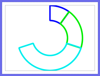
Following figure demonstrates the effect of the above modification. The slices appear now outlined and not filled:
3. Customize the slice shape algorithm
The default shape calculation creates circular slices or rings with slices arranged consecutively without gaps. You can modify this behavior in the updateChart method to implement custom layouts. Instead of slices being arranged directly adjacent to each other, you can introduce angular gaps (e.g., 5 degrees) between each slice. This creates a visually separated appearance while keeping all slices at the same radius. To implement angular gaps, modify the angle calculation in the updateChart slot method:
★Define the desired gap angle in degrees at the beginning of the method:
// Some common parameters for the calculation. // ... var float width = Width; var float gapAngle = 5.0; // <-- Define gap angle (e.g., 5 degrees) // Calculate total angle consumed by gaps and remaining angle available for slices var float totalGapAngle = noOfValues * gapAngle; var float availableAngle = 360.0 - totalGapAngle; // ...
★Modify the angle calculation within the reload section to use the available angle and add gaps:
// Load the data? if ( reload ) { // ... var Graphics::Path path = (Graphics::Path)view.Path; // Calculate angles using available angle and adding accumulated gaps var float startAngle = (sum * availableAngle) + (i * gapAngle) + StartAngle; // <-- Modified var float sliceAngle = Value * availableAngle; // <-- Modified var float sliceAngle2 = sliceAngle / 2; var float dirAngle = startAngle + sliceAngle2; // ... rest of the path construction code remains the same // Accumulate the values of all processed slices sum += Value; }
The following figure demonstrates the effect of this modification. Please note the gaps between the slices:
Another example demonstrating the possibilities to modify the Pie Chart shape calculation could be to create elliptical slices instead of circular ones. To achieve that you modify the scaling of the coordinate system. For example, to squash the Pie Chart to 70% of its original height invoke path.Scale( 1.0, 0.7 ) immediately after initializing the coordinate system:
path.InitMatrix(); path.Scale( 1.0, 0.7 ); // <--- Added to scale the coordinate system path.Rotate( dirAngle ); path.Translate( displacement - 0.5, 0 );
The following figure demonstrates the effect of this modification. Please note the gaps between the slices:
4. Add decorative views to the chart
You can enhance the Pie Chart by adding decorative views such as backgrounds, labels, legends, or center decorations:
★Add the desired views to the Pie Chart component. For example, add Text views for labels or Image views for icons.
★Name the added views according to their function (e.g., Caption, Background).
★Arrange and configure the views in the Composer.
★Configure their Layout property to control resizing behavior.
★If the views should update dynamically based on chart data, modify the UpdateViewState or UpdateLayout methods to update their properties.
5. Add slice labels or value indicators
You can display labels for each slice by creating text views dynamically alongside the slice views. This requires managing pairs of views (one for the slice shape, one for the label) in the updateChart method.
The approach involves:
★Modifying the loop in updateChart to create and manage both a slice view and a text view for each slice.
★Calculating appropriate label positions based on the slice's center angle and radius.
★Setting the label text from data provided by the OnLoadValue slot method.
This approach is explained in detail in Extend the data loading mechanism.
Configure the layout of the component
The initial size of the Pie Chart is determined by the thick blue border surrounding the Canvas area. It corresponds to the size that all instances of this Pie Chart component will have by default. If desired, you can adjust the Canvas area and change this default size accordingly. For this purpose you click and drag the edges of the surrounding border (see also Resize the Canvas area). Once the size is changed, you can then adapt (move, resize) the views existing within the component, particularly the Outline view. For example, to make the Pie Chart taller you adjust its bottom edge:
The resulting size of the Pie Chart, however, is not necessarily fixed. It can be adjusted for each component instance individually when the instance is arranged within a superior GUI component or it can change dynamically at the runtime. The GUI application can thus contain multiple instances of the Pie Chart, each with another size. From this arises the question, how the Pie Chart will react to its size alternation?
In case of the Outline view existing per default in the Pie Chart template, the view is automatically adjusted to fill the area of the widget. All other views you have eventually added later to the Pie Chart are not adjusted automatically.
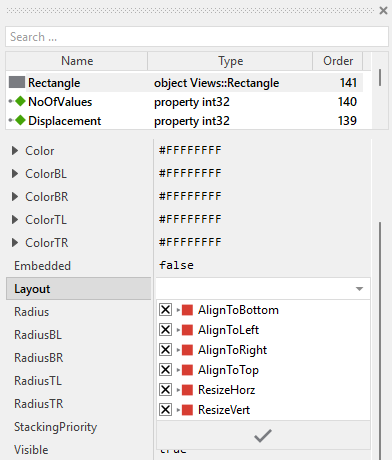
To control the adjustment you have to explicitly configure for each view its Layout property. (see also Configure component layout). Let's assume, in order to display a background decoration you have added a Rectangle view to the Pie Chart. Then you have arranged the view within the Canvas area according to your design expectation. If you want now that the view grows and shrinks according to size changes of the Pie Chart, you enable in the property Layout of this view following settings:
Now the Pie Chart knows how to react to its size changes. Each widget instance can have individual size and the enclosed views are automatically arranged within the available area.
When the Pie Chart component is resized, the UpdateLayout method is invoked automatically. This method detects the size change and triggers a complete reload of all slices by calling InvalidateValues. This ensures that the slices are resized and repositioned correctly to fill the new available space:
// If size changed, force update of all slices if ( size != aSize ) { InvalidateValues( 0, NoOfValues ); size = aSize; }
If you add views that should update their position or size when the chart is resized, you can extend the UpdateLayout method with your own calculations as alternative approach to configuring the view's property Layout. For example, to position a caption text at the top center of the chart:
// Position caption at top center CaptionText.Bounds.origin = point(( aSize.x - CaptionText.Bounds.w ) / 2, 10 ); // Update slices if size changed if ( size != aSize ) { InvalidateValues( 0, NoOfValues ); size = aSize; }
The automatic radius calculation (when Radius property is 0) takes the new component size into account, ensuring that slices always fit within the available bounds even when displaced.
Implement the interface of the component
When creating your own Pie Chart component you should ensure that instances of the widget can be configured to control all the features implemented in it. For example, if you have enhanced the component to display some caption text or a legend, you should allow this text to be specified individually for each instance. In this way several Pie Chart instances can exist at the same time, each displaying another caption or having different visual characteristics.
To control the features in your component you use properties. A property can be understood as variable where the corresponding setting is stored, e.g. the caption text to display in the Pie Chart or whether a legend should be visible. When the value of the property changes, the component can react to it and update its appearance accordingly. The properties reflect thus the settings within your widget. Together they form the interface of the component.
Usually, each particular setting within a component is represented by the corresponding property. Thus, a Pie Chart where caption and legend visibility can be configured will require two properties: one for the caption text and one for the legend visibility flag. In its original version, the Pie Chart contains already six properties NoOfValues, Displacement, StartAngle, Width, Radius and OnLoadValue. These allow the component instance to configure the number of slices, their appearance, and the data source. In order to enhance this interface by your own properties, following steps are necessary:
★Add a new property to the Pie Chart component.
★Name the property according to the setting it should represent. For example, the property intended to store the caption text could be named Caption.
★Determine the data type of the property. For example, the property intended to store the caption text will store a string. A property controlling legend visibility would store a bool.
★Determine the initialization value of the property. This value should correspond to the widget's default state. For example, the property intended to store the caption text should be initialized with exact the string the widget will display if no other text is specified (e.g. "Chart").
★The property is accompanied by its onget method. Except particular cases, this method is not needed and can be deleted now.
★The property is accompanied by its onset method. Open this method for editing.
★Adapt the implementation of the onset method so it updates the Pie Chart according to its new value. For example, in case of the property intended to store the caption text, you will probably update some Text view where the caption is displayed:
// The value doesn't change - nothing to do. if ( pure Caption == value ) return; // Remember the property's new value. pure Caption = value; // Update the view to display the just modified caption. CaptionText.String = value;
Another example: if you have added a property to control whether a center decoration should be visible:
// The value doesn't change - nothing to do. if ( pure ShowCenterIcon == value ) return; // Remember the property's new value. pure ShowCenterIcon = value; // Update the center icon visibility CenterIcon.Visible = value;
That is all. Now when you deal with instances of the Pie Chart component, you can evaluate and modify the properties similarly to how you access variables. Especially, when an instance is selected, you see in Inspector window the property and can change it there. The modification is immediately visible in the Composer window:
If desired, the properties can also be modified at the runtime of your application. The caption, for example, can be adapted to provide useful information for the user concerning the displayed data. For this purpose you access and modify the affected property directly within Chora code:
var string dataSource = ... // Let the Pie Chart display concrete details about the data source. PieChart.Caption = "Source: " + dataSource;
Extend the data loading mechanism
In its original implementation, the Pie Chart loads only two attributes for each slice: the Value (determining the slice's size) and the Color. These attributes are stored in the corresponding variables and are set by the external OnLoadValue slot method during the data loading process. If your application requires more sophisticated slice representations, you can extend this mechanism by adding additional variables to store extra attributes.
Common scenarios for extending the data loading mechanism include:
★Text labels to display on or near each slice
★Individual opacity values per slice
★Custom stroke widths or styles for slice outlines
★Icons or other additional information associated with each slice
Adding new data attributes
The following steps demonstrate how to add a new attribute to be loaded for each slice. As an example, we will add support for displaying text labels on each slice:
★Add a new variable to the Pie Chart component.
★Rename the variable according to the attribute it should store, e.g. Label.
★Configure the data type of the variable to match the attribute type. For a text label, use string.
★Open the updateChart slot method for editing.
★In the section where the external slot method OnLoadValue is invoked, initialize your new variable with a default value before calling the slot method:
// Load the data? if ( reload ) { // Query the data from external slot method Index = i; Value = 0.0; Color = #00000000; Label = ""; // <-- Initialize the new attribute signal OnLoadValue; // ... rest of the code }
★After the OnLoadValue slot method returns, you can use the new variable for additional display purposes. For labels, this might involve creating text views (see next section for details).
★The external OnLoadValue slot method should now set this new variable. Modify your slot method implementation accordingly:
var float val = 0.0; var color clr = #000000FF; var string label = ""; // Provide data based on slice index switch ( PieChart.Index ) { case 0 : { val = 0.25; clr = #FF0000FF; label = "Category A"; } case 1 : { val = 0.35; clr = #00FF00FF; label = "Category B"; } case 2 : { val = 0.20; clr = #0000FFFF; label = "Category C"; } case 3 : { val = 0.20; clr = #FFFF00FF; label = "Category D"; } default :; } // Assign the values PieChart.Value = val; PieChart.Color = clr; PieChart.Label = label;
Managing multiple view types per slice
If your slices consist of multiple views (e.g., a filled path for the slice itself and a text view for the label), you need to manage both view types in the updateChart method. The recommended approach is to arrange the views in pairs: FillPath1, Text1, FillPath2, Text2, FillPath3, Text3, and so on.
This approach requires modifying the loop to search for views of a common base type (Core::View or Core::RectView), then checking each view's actual type. Since each slice manages two views, you need to call FindNextView twice per iteration.
Here's the general pattern for managing paired views:
// Start with the first view in the Outline var Core::View view = Outline.FindNextView( null, Core::ViewState[]); // Process all slices for ( i = 0; i < noOfValues; i++ ) { var bool reload = invalidLastValue >= invalidFirstValue; var Views::FillPath sliceView = null; var Views::Text labelView = null; // Process the first view (should be the slice FillPath) if ( view != null ) { sliceView = (Views::FillPath)view; // If typecast succeeded, this is a FillPath view. Move to next view if ( sliceView != null ) view = Outline.FindNextView( view, Core::ViewState[]); } // If no FillPath view exists, create one if ( sliceView == null ) { sliceView = new Views::FillPath; sliceView.Path = new Graphics::Path; sliceView.Embedded = true; Add( sliceView, 0 ); reload = true; } // Process the second view (should be the label Text) if ( view != null ) { labelView = (Views::Text)view; // If typecast succeeded, this is a Text view. Move to next view if ( labelView != null ) view = Outline.FindNextView( view, Core::ViewState[]); } // If no Text view exists, create one if ( labelView == null ) { labelView = new Views::Text; labelView.Embedded = true; labelView.Font = Resources::FontSmall; Add( labelView, 0 ); reload = true; } // Load the data if needed if ( reload ) { // Query the data from external slot method Index = i; Value = 0.0; Color = #00000000; Label = ""; signal OnLoadValue; // Limit the resulting value to the range 0.0..1.0 if ( Value < 0.0 ) Value = 0.0; if ( Value > 1.0 ) Value = 1.0; // Update the slice view's color sliceView.Color = Color; // Calculate slice shape and position // ... (calculate as shown in previous sections) // Calculate the angle and radius for label positioning var float labelAngle = sum * 360.0 + ( Value * 180.0 ) + StartAngle; var float labelRadius = radius * 0.7; // Position label at 70% of radius // Calculate label position using trigonometry var float labelX = math_cos( labelAngle ) * labelRadius; var float labelY = math_sin( labelAngle ) * labelRadius; // Update the label view's text and position labelView.String = Label; labelView.Color = #FFFFFFFF; // Calculate label bounds (centered on calculated position) // Note: Outline center is at bounds.center var point center = Outline.Bounds.orect.center; var int32 labelW = 80; // Label width var int32 labelH = 20; // Label height labelView.Bounds = rect( center.x + (int32)labelX - ( labelW / 2 ), center.y + (int32)labelY - ( labelH / 2 ), center.x + (int32)labelX + ( labelW / 2 ), center.y + (int32)labelY + ( labelH / 2 )); // Accumulate values for next slice sum += Value; } } // Remove excess views if NoOfValues was reduced // Since each slice has 2 views, we need to remove pairs while ( view != null ) { var Core::View tmpView = view; view = Outline.FindNextView( view, Core::ViewState[]); Remove( tmpView ); }
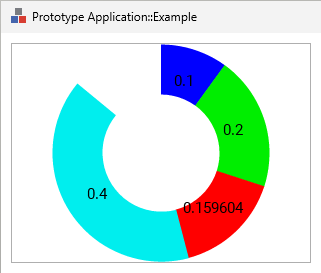
The following figures show the result of this adaptation assuming the OnLoadValue slot method provides for each slice the corresponding label text:
Advanced: Using StrokePath for slice outlines
If you want to add outlines around filled slices, you can manage three views per slice: a FillPath for the fill, a StrokePath for the outline, and optionally a Text view for labels. The approach is similar to the paired views pattern, but with three views per iteration instead of two.
The key is to ensure that both the FillPath and StrokePath views use the same Graphics::Path object, so they render the same shape:
var Views::FillPath fillView = null; var Views::StrokePath strokeView = null; // Process the first view (should be the slice FillPath) if ( view != null ) { fillView = (Views::FillPath)view; // If typecast succeeded, this is a FillPath view. Move to next view if ( fillView != null ) view = Outline.FindNextView( view, Core::ViewState[]); } // If no FillPath view exists, create one if ( fillView == null ) { fillView = new Views::FillPath; fillView.Path = new Graphics::Path; fillView.Embedded = true; Add( fillView, 0 ); reload = true; } // Process the second view (should be the StrokePath) if ( view != null ) { strokeView = (Views::StrokePath)view; // If typecast succeeded, this is a StrokePath view. Move to next view if ( strokeView != null ) view = Outline.FindNextView( view, Core::ViewState[]); } // If no StrokePath view exists, create one if ( strokeView == null ) { strokeView = new Views::StrokePath; strokeView.Path = fillView.Path; // <-- Reuse the Path Data object strokeView.Embedded = true; Add( strokeView, 0 ); reload = true; } [...] // Arrange the both view to fill the complete 'outline' area. The center of the view's coordinate // system should lie in the center of this area. fillView.Bounds = bounds; fillView.Offset = bounds.orect.center; strokeView.Bounds = bounds; strokeView.Offset = bounds.orect.center; // Configure the StrokePath view strokeView.Color = ... strokeView.Width = 5.0; // 5 pixel thick // Access the path data object associated to the view. It contains the slice shape. Since // the object is shared across the FillPath and StrokePath, you can access it from one of // the views. var Graphics::Path path = (Graphics::Path)fillView.Path; [...]
When you update the path data for the slice shape, both views will automatically use the updated path, ensuring the outline perfectly matches the filled area.