Creating components from templates: Radio Item
With this template you can add a new Radio Item component to your project. Radio Item is a simple widget the user can press in order to select an option within a list of available options. Each time the user interacts with the Radio Item, the component sends signals to associated slot methods where your particular implementation is executed. If the Radio Item is focused the component can also be controlled by pressing keys on the keyboard or by using hardware buttons. Generally menu items are used within menus only. Therefore when using a Radio Item you will also need to add at least one Menu component to your project.
Components created with this template are intended to be adapted to your particular design expectations. After adding the new Radio Item you should edit the component, change its appearance and if desired also its behavior. Once you have adapted the component, you can embed instances of this Radio Item wherever you need in your GUI project. Because it serves as template, it is intentionally kept very simple. Nevertheless, Radio Items created by the template are working widgets. If desired, they can already be used as they are.
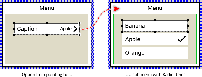
The following figure demonstrates the default appearance of the Radio Item created by using the here described component template. Please note, that Radio Items are used in sub menus containing the available options. The here described template includes also an additional Option Item which exists to refer the sub menu. When the user activates the Option Item, the corresponding sub menu is presented where the user can select the desired option:
The approach with component templates has two functions. Primarily the templates should simplify the development of new components. Instead of creating the Radio Item from scratch you can use the available template. The second function is more educative. The template implements fully working Radio Item component you can investigate and learn about the corresponding programming aspects. The template is well documented. It contains annotations and inline comments with instructions helping you to understand how the component works and how it can be adapted to your particular needs.
This chapter provides an overview how the Radio Item component template is used within your own application and how you adapt this component according to your particular needs. You will find here also further details concerning the internal implementation of the Radio Item component.
Add new Radio Item component
To create a new Radio Item component from a template you simply Drag & Drop it between the Templates window and the Composer with an opened unit. This is important in that by using the component templates you add in fact a new class to your project. Classes, in turn, can exist within units only. The following are the typical steps to create a new Radio Item component from a template:
★First switch to the Composer page for the respective unit, where you want to add the new Radio Item component.
★Then ensure that the Templates window is visible.
★In Templates window switch to the folder Component Templates.
★In the folder locate the Radio Item template.
★Drag & Drop the template into the Composer window:
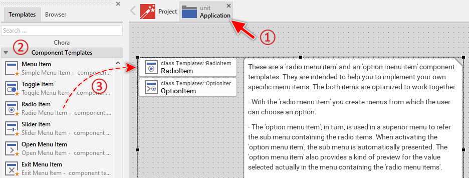
The Radio Item template is composed of two components: RadioItem and OptionItem. The RadioItem is intended to create sub menus containing all possible options the user can select from (like radio buttons). The OptionItem, in turn, is used in superior menus to refer to this sub menu and display which radio item is currently selected in the associated sub menu. When the user activates the option item, the associated sub menu is presented automatically. For more details concerning the relations between the option and the radio items, see the description at the beginning of this chapter.
★Eventually name the new added RadioItem and OptionItem components.
The new created Radio Item and Option Item components appear accompanied by annotation providing helpful tips how to proceed. If undesired, you can select and delete the annotation.
Use the Radio Item
Once you have created the Radio Item component, you can use it to assemble menu components. Technically seen, you embed an instance of the Radio Item class in-place within a superior Menu GUI component. At the runtime, the superior Menu GUI component takes care of the correct initialization, arrangement and the displaying of all embedded item components.
Please note, the Radio Item components are used to compose menus where the user makes the choice from available options. Such menus contain two or more Radio Items. The Option Item components, in turn, are used in superior menus to refer the sub menu containing the Radio Items. In such case the Option Items displays which Radio Item in the corresponding sub menu is actually selected. When the user activates the Option Item, the sub menu is presented and the user can now select other Radio Item.
Step 1. Add new Radio Item instance
The following are the typical steps to create a new instance of an already existing Radio Item component:
★First switch to the Composer page for the respective Menu GUI component, where you want to add the new Radio Item.
★Then ensure that the Browser window is visible.
★Within the Browser locate the class of the previously created Radio Item. This can be done easily with Browser's own filter function.
★Select the found class in the Browser window.
★Drag & Drop the selected class into the Composer area.
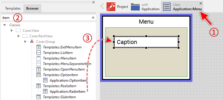
★Eventually name the new instance according to its function within the menu component.
Component templates are intended to create widgets which can be modified and adapted to your particular design expectations. In the following sections you will learn how to do this. Originally, if not yet modified, the Radio Item will appear as white rectangle with item caption text. Our intention is to keep the component templates as minimalistic as possible so they don't distract you with less important design details.
Step 2. Inspect the Radio Item instance
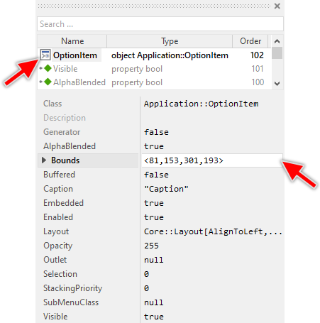
As long as the Radio Item is selected you can inspect and modify its properties conveniently in the Inspector window as demonstrated with the property Bounds in the screenshot below. This is in so far worth mentioning as diverse features of the Radio Item are controlled by the corresponding properties. If you are not familiar with the concept of a property and the usage of Inspector window, please read first the preceding chapter Compositing component appearance.
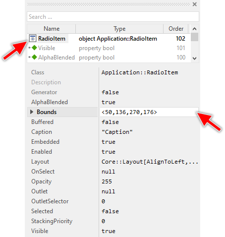
The Radio Item component descends from the Mosaic class Core::Group. Consequently, most of the properties listed in the above screenshot are inherited from this base class. Particular to the Radio Item are only few following properties:
Property |
Description |
|---|---|
Caption |
The property Caption stores the text to display within the item. |
OnSelect |
The property OnSelect can refer to a slot method, which will receive a signal as soon as the user has selected the radio item. Thereupon the method's logic will be executed. |
Outlet |
The property Outlet can refer to any other int32 property the item should remain synchronized with. When the user selects the radio item, the affected property is automatically updated to the value found in the property OutletSelector. On the other hand, when the referred property is modified by another component, the radio item is automatically notified to remain in sync with the property. The item appears selected, when the referred property has the value equal to OutletSelector. This approach follows the Model-View-Controller (MVC) programming paradigm. Here the radio item represents the view and controller. The property referred via Outlet can be seen as a part of the model. See also Outlet properties. |
OutletSelector |
The property OutletSelector contains a value identifying the radio item within a group of radio items. At the runtime, the item compares this value with the value of the property referred by Outlet and if both are equal, the radio item assumes the selected state (its property Selected is true). If the values are different, the radio item appears not selected. This selector is useful to build a group of radio item that refers to the same outlet. Different selectors for each radio item manages automatically the group of radio items. |
Selected |
The property Selected stores the current state of the radio item. As long as the property is false, the item should appear in the not-selected state. As long as the property is true, the item should appear in selected state. |
Step 3. Arrange the Radio Item within the Menu component
The position of the Radio Item doesn't matter. The Menu component will automatically arrange the items within its area and if necessary enlarge or reduce their size. Moreover, the size of the menu itself is adapted to the number and to the size of the enclosed items. This layout algorithm is part of the Menu component template. Consequently, when you move an item within the menu, it does not have any effect on its final position.
However, the order in which the items will be displayed at the runtime does correspond to the order in which the item objects are stored within the menu component. This is the order in which the items have been originally added. Consequently, the first added item appears at the top of the menu while the last added item is arranged at the end of the menu. See also the column Order in the members area of the Inspector window:
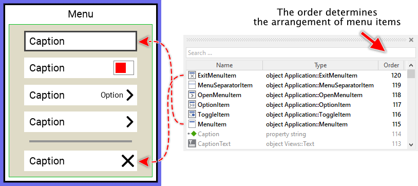
★If necessary you can reorder the item objects in the Inspector window to correspond to the order in which the items should appear in the menu.
Even if the position of an item doesn't matter, we recommend to move the item objects within the menu so you have a good overview of the items existing inside it. If the menu area is too small, you can enlarge it by clicking and dragging the thick blue Canvas border. Resizing the Canvas area of the menu manually has no effect on the final size of the menu. At the runtime the menu will adapt its size to the number and the size of the enclosed items.
Step 4. Configure the Radio Item properties
Radio Items work together as a group to provide mutually exclusive selection. To create a functioning group of radio items, you need to configure their properties correctly:
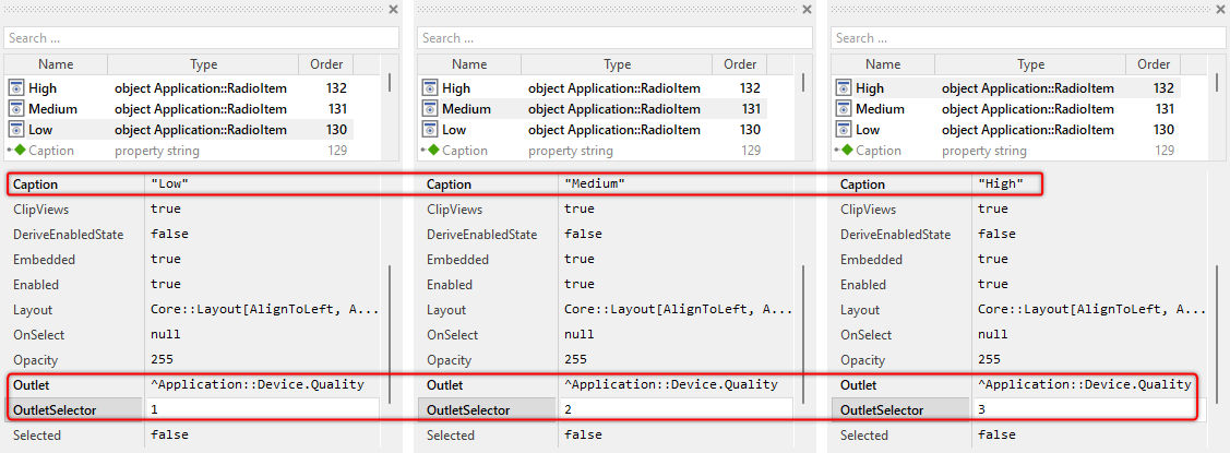
★Configure the Caption property of each Radio Item to display the option name (e.g. "Low", "Medium", "High").
★Configure the OutletSelector property of each Radio Item with a unique integer value. For example: First item = 1, second item = 2, third item = 3, etc.
★If you want to use the MVC (Model-View-Controller) pattern, configure the Outlet property of all Radio Items to reference the same property in your data model. This property must be of type int32. When configured, the Radio Items will automatically synchronize with this property.
★Optionally, configure the OnSelect property to connect a slot method that will be notified when the item is selected.
TIP
The OutletSelector values determine which item is selected. When a Radio Item is activated, it stores its OutletSelector value into the property referenced by Outlet. All other Radio Items referencing the same Outlet automatically synchronize and update their selection state accordingly. An item appears selected when its OutletSelector value corresponds to the value of the property referenced by Outlet. This creates the mutually exclusive radio button behavior.
The following example demonstrates how to configure three Radio Items for quality selection. The items are connected to a common property Application::Device.Quality. Consequently, the selection in all Radio Items remains in sync with the property value:
Step 5. Understand the MVC pattern usage
The Radio Item implements the Model-View-Controller (MVC) programming paradigm:
★Model: The property referenced via Outlet (e.g. DeviceSettings.Quality) represents the model - it stores the actual data value.
★View: The Radio Item's visual appearance (caption text, check mark visibility) represents the view - it displays the current state.
★Controller: The touch and keyboard handlers represent the controller - they handle user interactions and update the model.
This architecture provides several advantages:
★Multiple Radio Items can share the same outlet property, automatically creating a mutually exclusive selection group.
★When one Radio Item is selected, all others referencing the same outlet are automatically notified and update their state.
★The selection state can be modified programmatically by changing the outlet property value, and all connected Radio Items will update automatically.
★The same outlet property can be referenced by Option Items to display the current selection.
When the value of the property changes, the affected Radio Items are notified:
// Programmatically change the 'quality' selection. Application::Device.Quality = 2; // Selects "High" radio item // All radio items are automatically notified
Step 6. Implement Radio Item's slot method
While the user interacts with the Radio Item, the component sends signals to the associated slot method specified in the OnSelect property. Within the slot method your particular implementation can react and process the selection event:
★First add a new slot method to your GUI component (the component where you have embedded the menu containing the radio items).
★Assign the slot method to the property OnSelect of the affected Radio Item.
★Open the slot method for editing.
★In the Code Editor implement your desired operation to execute when the item is selected. For example:
// User selected the "High Quality" radio item EnableHighQualityMode();
You can assign one and the same slot method to multiple Radio Item instances. At the runtime, when the slot method is signaled, evaluate the sender value to query which Radio Item has caused this event:
if ( sender == RadioItem1 ) trace "User selected thew first item"; if ( sender == RadioItem2 ) trace "User selected thew second item"; if ( sender == RadioItem3 ) trace "User selected thew third item";
The implementation of a slot method is an alternative approach to the Outlet property. Nevertheless, both approaches can be combined. When using the Outlet property to synchronize Radio Items with a data model property, the slot method is called before the outlet property is updated. This allows you to validate or reject the selection if needed.
Use the Option Item
Once you have created the Radio Item component, you can use its Option Item to assemble menu components. Technically seen, you embed an instance of the Option Item class in-place within a superior Menu GUI component. At the runtime, the superior Menu GUI component takes care of the correct initialization, arrangement and the displaying of all embedded item components.
Please note, the Option Item components are used in superior menus to refer a sub menu containing Radio Items. In such case the Option Items displays which Radio Item in the corresponding sub menu is actually selected. When the user activates the Option Item, the sub menu is presented and the user can now select other Radio Item.
Step 1. Add new Option Item instance
The following are the typical steps to create a new instance of an already existing Option Item component:
★First switch to the Composer page for the respective Menu GUI component, where you want to add the new Option Item.
★Then ensure that the Browser window is visible.
★Within the Browser locate the class of the previously created Option Item. This can be done easily with Browser's own filter function.
★Select the found class in the Browser window.
★Drag & Drop the selected class into the Composer area.

★Eventually name the new instance according to its function within the menu component.
Component templates are intended to create widgets which can be modified and adapted to your particular design expectations. In the following sections you will learn how to do this. Originally, if not yet modified, the Option Item will appear as white rectangle with item caption text and second text displaying the content of the actually selected Radio Item from the associated sub menu. The arrow image on the right indicates that a sub menu will be presented when the item is activated. Our intention is to keep the component templates as minimalistic as possible so they don't distract you with less important design details.
Step 2. Inspect the Option Item instance
As long as the Option Item is selected you can inspect and modify its properties conveniently in the Inspector window as demonstrated with the property Bounds in the screenshot below. This is in so far worth mentioning as diverse features of the Option Item are controlled by the corresponding properties. If you are not familiar with the concept of a property and the usage of Inspector window, please read first the preceding chapter Compositing component appearance.
The Option Item component descends from the Mosaic class Core::Group. Consequently, most of the properties listed in the above screenshot are inherited from this base class. Particular to the Option Item are only few following properties:
Property |
Description |
|---|---|
Caption |
The property Caption stores the text to display within the item. |
Outlet |
The property Outlet can refer to any other int32 property the item should remain synchronized with. When the user selects a Radio Item, the affected property is automatically updated to the value found in the item's property OutletSelector. On the other hand, when the referred property is modified by another component, the Option Item is automatically notified to remain in sync with the property. This approach follows the Model-View-Controller (MVC) programming paradigm. Here the item represents the view and controller and the property referred via Outlet can be seen as a part of the model. See also Outlet properties. |
Selection |
The property Selection stores a value representing the current selection. This corresponds to the value OutletSelector of the actually selected item. |
SubMenuClass |
The property SubMenuClass determines the class of the menu GUI component to create and present when the user activates the menu item. This menu should consist of Radio Menu items. |
Step 3. Arrange the Option Item within the Menu component
The position of the Option Item doesn't matter. The Menu component will automatically arrange the items within its area and if necessary enlarge or reduce their size. Moreover, the size of the menu itself is adapted to the number and to the size of the enclosed items. This layout algorithm is part of the Menu component template. Consequently, when you move an item within the menu, it does not have any effect on its final position.
However, the order in which the items will be displayed at the runtime does correspond to the order in which the item objects are stored within the menu component. This is the order in which the items have been originally added. Consequently, the first added item appears at the top of the menu while the last added item is arranged at the end of the menu. See also the column Order in the members area of the Inspector window:
★If necessary you can reorder the item objects in the Inspector window to correspond to the order in which the items should appear in the menu.
Even if the position of an item doesn't matter, we recommend to move the item objects within the menu so you have a good overview of the items existing inside it. If the menu area is too small, you can enlarge it by clicking and dragging the thick blue Canvas border. Resizing the Canvas area of the menu manually has no effect on the final size of the menu. At the runtime the menu will adapt its size to the number and the size of the enclosed items.
Step 4. Configure the Option Item properties
Option Items serve as entry points to sub menus containing Radio Items. To create a functioning Option Item, you need to configure its properties:
★Configure the Caption property to display the setting name (e.g. "Quality", "Language", "Theme").
★Configure the SubMenuClass property to reference the menu component class that contains the Radio Items. This menu will be presented when the user activates the Option Item.
★If you want to use the MVC (Model-View-Controller) pattern, configure the Outlet property to reference the same property that the Radio Items in the sub menu reference. This enables automatic preview text updates.
★Optionally, configure the Selection property with the initial selection value (must match one of the OutletSelector values in the sub menu).
The SubMenuClass property must reference a class that descends from Core::Group. The Option Item validates this requirement in its OnSetSubMenuClass onset method. If you try to assign an invalid class, an exception will be thrown with the message: "The specified SubMenuClass does not descend from Core::Group."
Open the Radio Item component for editing
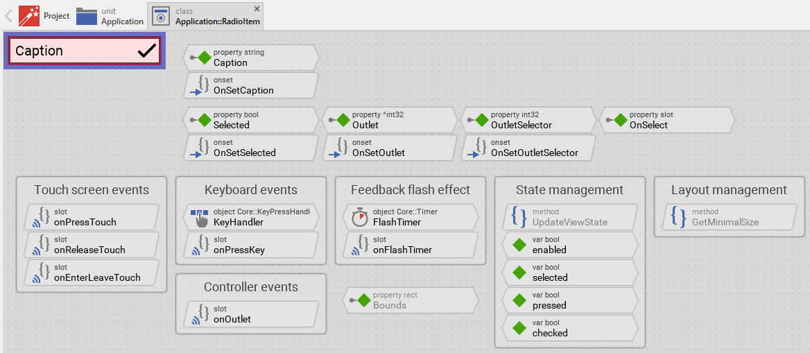
Component templates are intended to create widgets which can be adapted and enhanced to your particular design expectations. For this purpose, once you have added a new Radio Item component to your project, you can open the component class for editing. Thereupon the implementation of the component appears in a new Composer page:
Originally, if not yet modified, the Radio Item appears as a white rectangle with a caption text and a check mark image on the right side. The check mark is only visible when the item is selected. When the user interacts with the item, it changes color to provide visual feedback. Our intention is to keep the component templates as minimalistic as possible so they don't distract you with less important design details. The Radio Item can react to touch, mouse and keyboard inputs. The color reflects the actual state of the item.
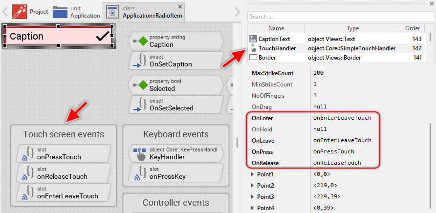
This default functionality is implemented by following members belonging to the Radio Item. These members are explicitly intended to be modified. Understanding this internal structure is thus the first step before you start to adapt the Radio Item to your particular needs:
Icon |
Member |
Description |
|---|---|---|
|
Caption |
The property Caption stores the text to display within the item. |
|
OnSetCaption |
The onset method belongs to the property Caption. Each time the value of the property is changed, the code implemented in the method is executed to update the caption text view and trigger layout recalculation in the owner menu. |
|
Selected |
The property Selected stores the current state of the radio item. As long as the property is false, the item appears in the not-selected state. As long as the property is true, the item appears in selected state with visible check mark. |
|
OnSetSelected |
The onset method belongs to the property Selected. Each time the value of the property is changed, the code implemented in the method triggers an update of the item's appearance to reflect the new selection state. |
|
Outlet |
The property Outlet can refer to any other int32 property the item should remain synchronized with. This implements the Model-View-Controller pattern. When the user selects the radio item, the affected property is automatically updated. On the other hand, when the referred property is modified elsewhere, the radio item is automatically notified and updates its state. |
|
OnSetOutlet |
The onset method belongs to the property Outlet. When the property value changes, this method detaches from the old outlet, attaches to the new outlet, and synchronizes the item's state with the new outlet's value. |
|
OutletSelector |
The property OutletSelector contains a value identifying the radio item within a group of radio items. This value is stored in the outlet property when the item is selected, enabling mutually exclusive selection behavior. |
|
OnSetOutletSelector |
The onset method belongs to the property OutletSelector. When the selector value changes, this method updates the item's selection state by comparing the new selector with the current outlet value. |
|
OnSelect |
The property OnSelect can refer to a slot method, which will receive a signal as soon as the user has selected the radio item. Thereupon the method's logic will be executed. |
|
onOutlet |
This internal slot method is connected to the outlet property as observer. It is called automatically when the outlet property value changes. The method reads the new value and updates the Selected state of the radio item accordingly. |
|
onPressTouch |
This internal slot method is called when the user touches the item area (when the interaction begins). This slot method is connected to the member TouchHandler. The method focuses the item and handles the feedback flash effect. |
|
onReleaseTouch |
This internal slot method is called when the user releases the touch screen after touching the item (when the interaction ends). This slot method is connected to the member TouchHandler. The method selects the radio item if the touch ended inside the item area. |
|
onEnterLeaveTouch |
This internal slot method is called when the user drags the finger/mouse while pressing the item and enters or leaves the item's area. The method updates the item's appearance to show pressed or released state. |
|
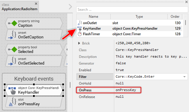
KeyHandler |
This key handler reacts to key press events. When the user presses the key specified in the property Filter of the key handler (per default Enter), the handler is activated and the method onPressKey is called. |
|
onPressKey |
This internal slot method is called when the KeyHandler has been activated (when the user has pressed the Enter key). Thereupon, the method flashes the item briefly and selects it. |
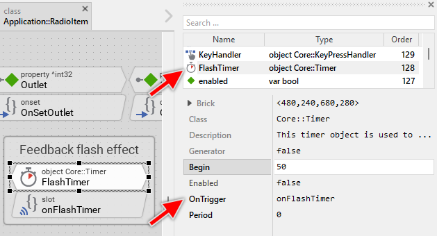
|
FlashTimer |
This Timer object is used to flash the item when the user has tapped it very quickly or the item has been selected with the keyboard. This is just a visual feedback effect. The timer's Begin property defines the flash duration (50 milliseconds per default). |
|
onFlashTimer |
This internal slot method is called when the FlashTimer expires. The method ends the flash feedback effect and selects the radio item by updating the Selected property and the outlet property if configured. |
|
Background |
This Filled Rectangle view displays in the template the background of the item. The background is white per default. |
|
Border |
This Border view displays in the template the border of the item. The border appears only when the item is selected (focused) or pressed. Depending on the item's actual state variables enabled, selected and pressed the border's visibility and color changes. |
|
CaptionText |
This Text view displays the caption text of the item. The text content is determined by the property Caption. Depending on the item's actual state, the text color changes between black and white/gray. The text view is configured with ellipsis mode to truncate long text with [...] sign. |
|
CheckImage |
This Image view displays the check mark indicating that the radio item is selected. The image is only visible when the item's Selected property is true. The check mark uses frame 8 from the Resources::NavigationIconsMedium bitmap resource. |
|
TouchHandler |
This Simple Touch Handler reacts to touch and mouse events and invokes the associated slot methods: onPressTouch, onReleaseTouch and onEnterLeaveTouch. |
|
UpdateViewState |
This method is invoked automatically after the state of the component has been changed. In case of the Radio Item, the method updates the views Background, Border, CaptionText and CheckImage so they reflect the item's current state. |
|
GetMinimalSize |
This method is invoked by the owner menu to determine the minimum width required by this item. The method calculates the width based on the caption text length, margins, and the check mark image width. This information is used by the menu for automatic size adjustment. |
|
enabled |
This variable stores the current state of the item. It is true if the item is allowed to handle user inputs (the component is enabled). See also Control the Enabled state of nested components. If the item is actually disabled, the variable is consequently false. |
|
selected |
This variable stores the current state of the item. It is true if the item is actually focused for keyboard inputs (more precisely, the item is selected within its owner menu component). The user can thereupon control the item via keyboard. |
|
pressed |
This variable stores the current state of the item. It is true if the item should appear pressed. This is usually the case when the user touches the item actively or presses a key intended to select the item (the user is pressing the item or the flash effect is active). |
|
checked |
This variable stores the current selection state of the radio item. It is true when the item is selected (corresponds to the Selected property value). This variable is used to track state changes and trigger animations if desired. |


Understand the state management of the Radio Item
During its lifetime, the Radio Item will assume different states as direct effect of user interactions and as result of other superior state alternations within the GUI application. To track its current state the Radio Item manages the above mentioned state variables: enabled, selected, pressed and checked. The variables are evaluated and updated within the implementation of the method UpdateViewState. This method evaluates the common component states (Enabled and Selected), verifies whether the user is actually interacting with the item, and reads the selection state from the Selected property. At the end of the method the estimated states are stored in the state variables:
// Estimate the new state var bool isEnabled = aState.contains( Core::ViewState[ Enabled ]); var bool isSelected = aState.contains( Core::ViewState[ Selected ]); var bool isPressed = ( TouchHandler.Down && TouchHandler.Inside ) || FlashTimer.Enabled; var bool isChecked = Selected; [...] // Remember the new state enabled = isEnabled; selected = isSelected; pressed = isPressed; checked = isChecked;
The variable isChecked directly reflects the value of the Selected property. This property, in turn, is synchronized with the outlet property when the Outlet is configured. The radio item automatically compares its OutletSelector value with the outlet property value to determine if it should be selected.
When common component states (Enabled or Selected) have changed, the method UpdateViewState is invoked automatically. You don't need to worry about it. Any other state alternations need to explicitly request an invocation of the UpdateViewState method. This is especially true for state alternations caused by touch handlers, keyboard handlers, timer objects, or outlet property changes. When you modify the Radio Item to handle other user inputs or perform other animations always ensure that each state alternation (each event) does request an invocation of UpdateViewState. In your implementation you use for this purpose the method InvalidateViewState.
The selection state management in Radio Item is more complex than in simple Menu Items because it must:
★Track the local selection state (Selected property)
★Synchronize with the outlet property value
★Compare the outlet value with OutletSelector to determine selection
★Update the outlet when the user selects the item
★React to outlet changes from other sources
This complexity enables the mutually exclusive radio button behavior: when one Radio Item in a group is selected, all others automatically deselect because their OutletSelector no longer matches the outlet value.
Depending on your design expectations the default state management may require adaptations. Generally, you are free to modify the method UpdateViewState, add further state variables to your Radio Item or even remove the existing functionality if it is not needed in your case.
Adapt the appearance of the Radio Item
Originally, if not yet modified, the Radio Item appears as a white rectangle with a caption text and a check mark on the right side. The check mark is only visible when the item is selected. Our intention is to keep the component templates as minimalistic as possible so they don't distract you with less important design details. It's up to you to adapt the item to have the expected appearance. The available possibilities are explained in the following sections. Please note, that you can combine the different approaches according to your application case:
1. Modify existing views
The Radio Item template contains per default the views Background, Border, CaptionText and CheckImage. If desired, you can modify the views. For example, you can display them with other colors depending on the actual state of the item. For this purpose you change the implementation of the above explained method UpdateViewState responsible for tracking the state alternations within the Radio Item.
When you open the method UpdateViewState you will see that it does not only update the state variables but also updates the views existing within the component. Accordingly, depending on the actual state of the item the views Background, Border, CaptionText and CheckImage are displayed with other colors, the border's visibility changes, and the check mark shows or hides. By simply modifying this implementation you change the appearance. For example, you change the pressed color from red to blue:
if ( !isEnabled ) { Background.Color = #AAAAAAFF; Border.Visible = false; CaptionText.Color = #888888FF; CheckImage.Color = #888888FF; } else if ( isPressed ) { Background.Color = #0000FFFF; // <-- blue color Border.Color = #000000FF; Border.Visible = true; CaptionText.Color = #FFFFFFFF; CheckImage.Color = #FFFFFFFF; } else if ( isSelected ) { Background.Color = #FFFFFFFF; Border.Color = #444444FF; Border.Visible = true; CaptionText.Color = #000000FF; CheckImage.Color = #000000FF; } // Enabled but not pressed nor selected. else { Background.Color = #FFFFFFFF; Border.Visible = false; CaptionText.Color = #000000FF; CheckImage.Color = #000000FF; } // Finally show/hide the check image depending on the actual state CheckImage.Visible = isChecked;
The check mark visibility is controlled separately at the end of the method based on the isChecked variable. This ensures the check mark is displayed only for selected radio items, regardless of other state combinations.
2. Replace the check mark image
The Radio Item template uses a check mark image from the Resources::NavigationIconsMedium bitmap resource (frame 8). If you want to use a different icon or your own custom bitmap:
★Select the CheckImage view in the Composer.
★In the Inspector window, change the Bitmap property to reference your desired bitmap resource.
★If needed, adjust the FrameNumber property to select the correct frame from a multi-frame bitmap.
★If you want to change the size or position of the check mark, adjust the Bounds property of the CheckImage view.
★Don't forget to adapt the GetMinimalSize method to account for the new icon size:
// Calculate minimum width including custom icon size var bool ellipsis = CaptionText.Ellipsis; CaptionText.Ellipsis = false; var point size = point( CaptionText.GetContentArea().w + 10 + CheckImage.Bounds.w, 0 ); CaptionText.Ellipsis = ellipsis; size.y = 40; return size;
3. Use radio button style instead of check mark
If you prefer the traditional radio button appearance with circles instead of check marks:
★Add two Image views to the Radio Item: one for the unchecked state and one for the checked state.
★Name them appropriately (e.g. RadioUnchecked and RadioChecked).
★Configure both image views with appropriate bitmap resources showing empty and filled circles.
★In the UpdateViewState method, control their visibility based on the isChecked variable:
// Show checked or unchecked radio button RadioUnchecked.Visible = !isChecked; RadioChecked.Visible = isChecked;
★Delete the original CheckImage view if you don't need it anymore.
4. Add icons to radio items
You can enhance Radio Items by adding icons that represent each option visually:
★Add an Image view to the Radio Item.
★Name the view (e.g. OptionIcon).
★Position the icon view on the left side of the caption text.
★Add a propertyIcon of type Resources::Bitmap to the Radio Item.
★In the onset method of the Icon property, update the icon view:
onset Icon { if ( pure Icon == value ) return; pure Icon = value; OptionIcon.Bitmap = value; // Changing the icon affects minimum size if ( Owner ) Owner.InvalidateLayout(); }
★Adapt the GetMinimalSize method to include the icon width.
★When configuring Radio Item instances, set the Icon property to the desired bitmap for each option.
5. Remove existing views
If not needed, you can delete the per default existing views Background, Border, CaptionText and CheckImage. Doing this, please don't forget to also remove all references to the deleted views from the implementation of the UpdateViewState and GetMinimalSize method. Otherwise you will get error messages next time the Composer contents is reloaded. To avoid this error message we recommend to perform the steps in following order:
6. Replace existing views
Also possible, you can replace the existing views by other views. For example, in the original version, the Radio Item displays the caption as an ordinary text. To make the component more sophisticated, you could replace the here used Text view by e.g. Attributed Text view to support rich formatted text. For this purpose:
★Think about which view is adequate as replacement for the old view existing per default in the component. An overview of existing views is found in the section Using Views.
★Delete the old view.
★Add the desired view to the component.
★Name the just added view to have the name of the previously removed view.
★Eventually move the view, or you simply grab one of its corners and resize it in this way. If you want the view to appear behind other views you can reorder it explicitly.
★If necessary, in Inspector window configure the properties of the just added view.
★If necessary, modify the implementation of other methods existing in the component if these evaluate/modify the properties of the replaced view.
Configure the layout of the Radio Item component
The initial size of the Radio Item is determined by the thick blue border surrounding the Canvas area. It corresponds to the default size that all instances of this Radio Item component will have. However, when menu items are embedded within a menu, the Menu component will automatically adjust the size of items according to:
★The content of the item (especially the caption text length)
★The minimum size calculated by the item's GetMinimalSize method
★The formation of the menu (horizontal or vertical)
★The available space within the menu
★The available space on the display
If desired, you can adjust the Canvas area of the item component itself. This affects the default height and visual proportions of the item during editing. For this purpose you click and drag the edges of the surrounding border (see also Resize the Canvas area). Once the size is changed, you can then adapt (move, resize) the views existing within the component.
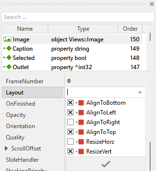
The views existing per default in the Radio Item template (Background, Border, CaptionText and TouchHandler) are configured to automatically adjust to fill the area of the item. The CheckImage is configured to stay aligned at the right edge of the item. All other views you have eventually added later to the Radio Item are not adjusted automatically.
To control the adjustment you have to explicitly configure for each view its Layout property. (see also Configure component layout). Let's assume, in order to display an icon you have added an Image view to the Radio Item. Then you have arranged the view within the Canvas area according to your design expectation. If you want now that the view is centered vertically and remains aligned at the left side when the item width changes, you enable in the property Layout of this view following settings:
Implement the interface of the Radio Item
When creating your own Radio Item component you should ensure that instances of the item can be configured to control all the features implemented in it. For example, if you have enhanced the item to display some icon, you should allow this icon to be specified individually for each item instance. In this way several item instances can exist at the same time, each displaying another icon and representing different selectable options.
To control the features in your item you use properties. A property can be understood as variable where the corresponding setting is stored, e.g. the icon bitmap to display in the item or the outlet selector value. When the value of the property changes, the item can react to it and update its appearance accordingly. The properties reflect thus the settings within your item. Together they form the interface of the component.
Usually, each particular setting within a component is represented by the corresponding property. Thus, a radio item where caption, selection state, outlet and outlet selector can be configured will require four properties. In its original version, the Radio Item contains already four properties Caption, Selected, Outlet and OutletSelector. The first stores the text to display, the second stores the current selection state, the third can refer to any other int32 property the item should remain synchronized with, and the fourth contains a value identifying the radio item within a group of radio items. In order to enhance this interface by your own properties, following steps are necessary:
★Add a new property to the Radio Item component.
★Name the property according to the setting it should represent. For example, the property intended to store an icon bitmap could be named Icon.
★Determine the data type of the property. For example, the property intended to store an icon bitmap will reference a Resources::Bitmap.
★Determine the initialization value of the property. This value should correspond to the item's default state. For example, the property intended to store an icon could be initialized with null if no icon should be displayed by default.
★The property is accompanied by its onget method. Except particular cases, this method is not needed and can be deleted now.
★The property is accompanied by its onset method. Open this method for editing.
★Adapt the implementation of the onset method so it updates the item according to its new value. For example, in case of the property intended to store an icon, you will probably update some Image view where the icon is displayed:
// The value doesn't change - nothing to do. if ( pure Icon == value ) return; // Remember the property's new value. pure Icon = value; // Update the view to display the just modified icon. ItemIconImage.Bitmap = value; // Changing the icon may affect the minimum width of the item. Request the // superior menu to recalculate its layout. if ( Owner ) Owner.InvalidateLayout();
★If the new property affects the minimum size of the item (like icon or additional decorations do), adapt also the GetMinimalSize method to include the space needed by the new element.
That is all. Now when you deal with instances of the Radio Item component, you can evaluate and modify the properties similarly to how you access variables. Especially, when the item instance is selected, you see in Inspector window the property and can change it there. The modification is immediately visible in the Composer window.
If desired, the properties can also be modified at the runtime of your application. For example, the caption or the selection state can be adapted dynamically. For this purpose you access and modify the affected property directly within Chora code:
// Set the radio item to be selected radioItem.Selected = true; // Or connect to an outlet property for automatic synchronization radioItem.Outlet = ^Application::DeviceSettings.NetworkMode; radioItem.OutletSelector = 1; // Represents "Wi-Fi mode"
Understand the handling of touch inputs in Radio Item
The Radio Item is an interactive component. It can be controlled via touch screen or by the mouse device. For this purpose the template contains the Simple Touch Handler object named TouchHandler. Per default, this handler covers the entire area of the item - this is thus the touch sensitive area. To this handler are associated three slot methods: onPressTouch, onReleaseTouch and onEnterLeaveTouch. As their names imply the methods are invoked at the beginning of the interaction (press), at its end (release) and when the user drags the finger and enters or leaves the item's area:
The methods take care of two tasks. As first they request an invocation of the UpdateViewState method if due to the performed touch (mouse) interaction the visual appearance of the item does need the update. The second task is the activation of the item when the user successfully touches and releases within the item's area, which selects the radio item and notifies the owner component.
The Radio Item uses a feedback flash effect to provide visual feedback when the user taps the item very quickly. If the user holds the finger pressed for a short moment (at least 50 milliseconds per default), the item is activated immediately when released. If the user taps very quickly (less than 50 milliseconds), a short flash effect is shown first before the item is activated. This ensures the user always gets visual feedback.
The slot method onPressTouch is invoked when the user touches the item area:
// Clicking on a menu item focuses (selects) the item. If you don't want it, // remove the following code line. Owner.Focus = this; // The item is still performing the feedback flash effect from the preceding // tap. This can occur when the user taps the item in a very rapid succession. // Thus complete this preceding tap (simulate the timer expiration) before // starting a new item interaction. if ( FlashTimer.Enabled ) { // Select the item and notify the owner of the item. if ( !Selected ) { Selected = true; postsignal OnSelect; // If a property is associated to the item, update it accordingly and notify // other widgets also associated to this property. if ( Outlet != null ) { Outlet^ = OutletSelector; notifyobservers Outlet; } } FlashTimer.Enabled = false; }
Later, when the user finalizes the touch (mouse) interaction, the item is activated depending on whether the finger/mouse is still inside the item's area and how long the user held the item pressed. This functionality is implemented in the slot method onReleaseTouch:
// Did the user moved the finger outside the item's area? In such case // the item is not activated. if ( !TouchHandler.Inside ) return; // The touch interaction has been passed over to another touch handler. // The item is not activated in such case. if ( TouchHandler.AutoDeflected ) return; // The user has pressed and held the item for longer time. This was enough // long to give a visual 'press' feedback to the user. The item can be // activated immediately. if ( TouchHandler.HoldPeriod >= FlashTimer.Begin ) { // Select the item and notify the owner of the item. if ( !Selected ) { Selected = true; postsignal OnSelect; // If a property is associated to the item, update it accordingly and notify // other widgets also associated to this property. if ( Outlet != null ) { Outlet^ = OutletSelector; notifyobservers Outlet; } } } // The user has tapped the item very quickly. Defer the item activation // to give the user first a short visual feedback that the item has been // pressed. else FlashTimer.Enabled = true;
The slot method onEnterLeaveTouch is invoked when the user drags the finger while touching the item and enters or leaves the item's area. This method is also invoked at the begining and at the end of the touch interaction. The method simply requests a visual update to show the item as pressed or released:
// Every time the user touches the item or drags the finger inside/outside // the item's area request the item update its appearance. The update will // occur in the UpdateViewState() method. InvalidateViewState();
Usually you will not need to edit the implementation of these methods. It corresponds already to whatever typical radio items do. Nevertheless, you are free to change this default functionality if you want some particular behavior to be implemented in your item. For example, you can modify the flash duration by changing the Begin property of the FlashTimer object. A shorter duration (e.g. 25 milliseconds) makes the flash faster, a longer duration (e.g. 100 milliseconds) makes it slower.
Per default the TouchHandler is configured to handle all touch events. If necessary you can change this behavior and restrict the item to react only when the user performs a particular touch interaction. The TouchHandler provides for this purpose diverse configuration properties like MinStrikeCount, MaxStrikeCount, NoOfFingers or LimitToFinger. For more details, see Configure the filter condition.
If your device does not contain any touch screen nor mouse, the per default existing TouchHandler and its associated slot methods are unnecessary ballast. You can remove them in such case. We recommend to do this in following order to avoid eventual error message because of broken references between still existing and the already removed members:
★First remove all expressions accessing TouchHandler from the UpdateViewState method.
★Edit the onPressKey method and remove the expressions accessing TouchHandler.
★Delete the three slot methods: onPressTouch, onReleaseTouch and onEnterLeaveTouch.
★Finally delete the annotation grouping the slot methods.
Understand the handling of keyboard inputs in Radio Item
The Radio Item is an interactive component. It can be controlled via keyboard or hardware buttons. For this purpose the template contains the Key Press Handler object named KeyHandler. To this handler is associated the slot methodonPressKey. The method is thus invoked when the user presses the key matching the filter condition specified in the handler object. This is per default the Enter key:
The method takes care of activating the item and showing the feedback flash effect. Similar to the touch handling, the method ensures that the user always gets visual feedback by showing a flash effect before selecting the radio item:
// Ignore keyboard events when the user is interacting with the item via the // touch screen. if ( TouchHandler.Down ) return; // Pressing the key flashes the item for a short period. This is a kind of // feedback effect. Request the item to update its appearance accordingly. // The update will occur in the UpdateViewState() method. InvalidateViewState(); // The item is still performing the feedback flash effect from the preceding // tap/key event. This can occur when the user taps the item or presses the // key in a very rapid succession. Thus complete this preceding tap (simulate // the timer expiration) before starting a new item interaction. if ( FlashTimer.Enabled ) { // Select the item and notify the owner of the item. if ( !Selected ) { Selected = true; postsignal OnSelect; // If a property is associated to the item, update it accordingly and notify // other widgets also associated to this property. if ( Outlet != null ) { Outlet^ = OutletSelector; notifyobservers Outlet; } } FlashTimer.Enabled = false; } // Start the feedback flash effect. FlashTimer.Enabled = true;
Usually you will not need to edit the implementation of this method. It corresponds already to whatever typical radio items do. Nevertheless, you are free to change this default functionality if you want some particular behavior to be implemented in your item.
Per default the key handler is configured to accept the Enter key. If necessary you can change this behavior and adapt the item to react to other keys. The key handler provides for this purpose the configuration property Filter. For example, if you want the item to be activated with the Space key, set the property Filter of the object KeyHandler to the value Core::KeyCode.Space. For more details, see Configure the filter condition.
If your device does not contain any keyboard nor hardware buttons, the per default existing key handler and its associated slot method are unnecessary ballast. You can remove them in such case. We recommend to do this in following order to avoid eventual error messages because of broken references between still existing and the already removed members:
★Delete the KeyHandler object.
★Delete the slot methodonPressKey.
★Finally delete the annotation grouping the handler and the slot method.
Understand the feedback flash effect in Radio Item
The Radio Item uses a feedback flash effect to provide visual feedback when the user interacts with the item very quickly. This ensures that the user always sees a visible response to their action, even for very brief taps or key presses.
The flash effect is implemented using the Timer object named FlashTimer. This timer is configured with a duration (50 milliseconds per default) that determines how long the item should appear in the pressed state:
The timer is started in two situations:
★Quick tap: When the user taps the item very quickly (touch duration less than 50ms), the timer is started to show the pressed state briefly before selecting the radio item.
★Keyboard activation: When the user presses the Enter key, the timer is started to show visual feedback before selecting the radio item.
When the timer expires, the slot method onFlashTimer is called, which ends the flash effect and selects the radio item:
// The feedback flash timer is finished. Request the item to update its // appearance. The update will occur in the UpdateViewState() method. InvalidateViewState(); // With the end of the feedback flash effect the item is activated. // Select the item and notify the owner of the item. if ( !Selected ) { Selected = true; postsignal OnSelect; // If a property is associated to the item, update it accordingly and notify // other widgets also associated to this property. if ( Outlet != null ) { Outlet^ = OutletSelector; notifyobservers Outlet; } }
The flash duration can be adjusted by modifying the Begin property of the FlashTimer object:
★Shorter duration (e.g. 25 milliseconds): Faster flash, more responsive feel
★Longer duration (e.g. 100 milliseconds): Slower flash, more pronounced feedback
If you don't want the flash effect at all, you can simplify the touch and keyboard handling by removing the timer and directly setting the Selected property in the touch/keyboard handlers. However, this is not recommended as users expect visual feedback for their interactions.
Understand the GetMinimalSize method in Radio Item
The GetMinimalSize method plays a crucial role in the automatic layout system of menus. This method is called by the owner menu to determine how much horizontal space the item requires at minimum. The menu uses this information to:
★Calculate the minimum width needed to display all items without truncating content
★Adjust its own size to fit all items comfortably
★Determine when scrolling is needed for large menus
The default implementation calculates the minimum width based on the caption text length plus the check image width plus margins:
// We assume: the item requires space for the caption, 10 pixel margin on // its left side and some space for the check image on the right. // Important: perform the calculation without the caption text being evtl. // truncated and replaced by an ellipsis sign. var bool ellipsis = CaptionText.Ellipsis; CaptionText.Ellipsis = false; var point size = point( CaptionText.GetContentArea().w + 10 + CheckImage.Bounds.w, 0 ); CaptionText.Ellipsis = ellipsis; // Assume the min. height corresponds to the actual design height of the item. size.y = 40; return size;
Please note that the calculation temporarily disables the ellipsis mode of the text view to get the full text width without truncation. This ensures that the menu knows how much space is really needed to display the complete caption.
If you have modified the item appearance by adding icons, badges, or other decorations, you must adapt this method to include the additional space needed. For example, if you added an icon on the left side, take its width as well as an additional margin in account:
// Include space for: icon + margin (10px) + caption + check image var bool ellipsis = CaptionText.Ellipsis; CaptionText.Ellipsis = false; var point size = point( ItemIcon.Bounds.w + 10 + CaptionText.GetContentArea().w + CheckImage.Bounds.w, 0 ); CaptionText.Ellipsis = ellipsis; size.y = 40; return size;
TIP
For horizontal menus: If you configure the menu to arrange items horizontally (by setting the Formation property of the menu's Outline to Core::Formation.LeftToRight), you need to adapt this method to calculate the minimum height instead of minimum width.
Perform state changes with animations in Radio Item
In the section Adapt the appearance of the component you learned how state alternations within the Radio Item are processed and how views existing in the component are updated in order to reflect the actual state. Accordingly, when the user touches the item (starts pressing it), the item does appear pressed. When the user releases the item again (ends pressing it), the item restores its released appearance. The default implementation performs such appearance updates instantly, just in the moment when the respective interaction took place.
If desired, you can modify the Radio Item to update its appearance with animations. For example, instead of instantly switching between the pressed and released appearance, such item can fade-in/out the background color, scale or fade the check image, or show other animated transitions. For this purpose you use the Animation Effects. With an Animation Effect you can animate a property of a view existing in the item. Following are the steps how to do this:
★Depending on the data type of the property to animate, add the appropriate Animation Effect to the Radio Item. For example, to animate a color property, add a Pulse color effect.
★Connect the effect object with the property to animate. For example, if you want to animate the background color, connect the Pulse color effect with the property Color of the Background view.
★Configure the duration and eventually the desired timing (easing) for the animation.
★Once started, the effect will animate the property endlessly. In our case, however, the animation should stop at its end. For this purpose set the effect's property NoOfCycles to the value 1.
★Configure the key values for the animation. In case of the pulse color effect, it is the start and the end color. For example, to animate the color between white and red, configure the effect's property Value1 with the #FFFFFFFF (white) and the property Value2 with #FF0000FF (red). This step is appropriate if the key values are fixed, known at the design time. Otherwise, the key values must be set at runtime shortly before the effect is triggered.
★Open the method UpdateViewState and modify its implementation to trigger the effect object when the item switches between the states pressed and not pressed. For example in case of the above mentioned pulse color effect to animate the background color, following implementation could be adequate:
// Estimate the new state var bool isEnabled = aState.contains( Core::ViewState[ Enabled ]); var bool isSelected = aState.contains( Core::ViewState[ Selected ]); var bool isPressed = ( TouchHandler.Down && TouchHandler.Inside ) || FlashTimer.Enabled; var bool isChecked = Selected; [...] // Following code updates the views instantly, without animations // (except the background color which is now animated) if ( !isEnabled ) { Border.Visible = false; CaptionText.Color = #888888FF; CheckImage.Color = #888888FF; } else if ( isPressed ) { Border.Color = #000000FF; Border.Visible = true; CaptionText.Color = #FFFFFFFF; CheckImage.Color = #FFFFFFFF; } else if ( isSelected ) { Border.Color = #444444FF; Border.Visible = true; CaptionText.Color = #000000FF; CheckImage.Color = #000000FF; } // Enabled but not pressed nor selected. else { Border.Visible = false; CaptionText.Color = #000000FF; CheckImage.Color = #000000FF; } // Show/hide the check image depending on the actual state. CheckImage.Visible = isChecked; // Switching from not pressed -> pressed state. Start the animation. if ( isEnabled && isPressed && !pressed ) { ColorEffect.Reversed = false; ColorEffect.Enabled = true; } // Switching from pressed -> not pressed state. Start the animation. else if ( isEnabled && !isPressed && pressed ) { ColorEffect.Reversed = true; ColorEffect.Enabled = true; } // Remember the new state enabled = isEnabled; selected = isSelected; pressed = isPressed; checked = isChecked;
★Since the properties of the affected views are now modified with animations, you will eventually need to adapt their initial values to correspond to the default state of the item. For example, you might need to set the property Color of the view Background to the value #FFFFFFFF (default color is white).
Open the Option Item component for editing
Component templates are intended to create widgets which can be adapted and enhanced to your particular design expectations. For this purpose, once you have added a new Option Item component to your project, you can open the component class for editing. Thereupon the implementation of the component appears in a new Composer page:
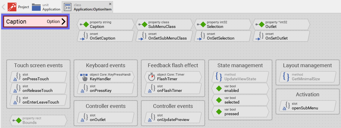
Originally, if not yet modified, the Option Item appears as a white rectangle with a caption text on the left side, a preview text on the right side showing the currently selected option, and an arrow icon indicating that a sub menu will open. When the user interacts with the item, it changes color to provide visual feedback. Our intention is to keep the component templates as minimalistic as possible so they don't distract you with less important design details. The Option Item can react to touch, mouse and keyboard inputs.
This default functionality is implemented by following members belonging to the Option Item. These members are explicitly intended to be modified. Understanding this internal structure is thus the first step before you start to adapt the Option Item to your particular needs:
Icon |
Member |
Description |
|---|---|---|
|
Caption |
The property Caption stores the text to display on the left side of the item (the setting name, e.g. "Quality", "Language"). |
|
OnSetCaption |
The onset method belongs to the property Caption. Each time the value of the property is changed, the code implemented in the method is executed to update the caption text view and trigger layout recalculation in the owner menu. |
|
SubMenuClass |
The property SubMenuClass determines the class of the menu GUI component to create and present when the user activates the menu item. This menu should consist of Radio Menu Items. The property must reference a class descending from Core::Group. |
|
OnSetSubMenuClass |
The onset method belongs to the property SubMenuClass. It validates that the assigned class descends from Core::Group and triggers an update of the preview text to reflect the options available in the new sub menu. If the validation fails, an exception is thrown. |
|
Selection |
The property Selection stores a value representing the current selection. This corresponds to the value OutletSelector of the actually selected Radio Item in the sub menu. |
|
OnSetSelection |
The onset method belongs to the property Selection. When the selection value changes, this method triggers an update of the preview text to show the caption of the newly selected Radio Item. |
|
Outlet |
The property Outlet can refer to any other int32 property the item should remain synchronized with. This property should be the same property that the Radio Items in the sub menu reference. When the outlet value changes, the Option Item automatically updates its preview text. |
|
OnSetOutlet |
The onset method belongs to the property Outlet. When the property value changes, this method detaches from the old outlet, attaches to the new outlet as observer, and synchronizes the item's state with the new outlet's value. |
|
onOutlet |
This internal slot method is connected to the outlet property as observer. It is called automatically when the outlet property value changes (typically when a Radio Item in the sub menu is selected). The method reads the new value and updates the Selection property accordingly. |
|
onUpdatePreview |
This internal slot method is called when the preview text needs to be updated. The method creates a temporary instance of the sub menu, finds the selected Radio Item, extracts its caption, and displays it in the PreviewText view. |
|
openSubMenu |
This internal slot method is called when the user has activated the Option Item. The method creates an instance of the sub menu specified in SubMenuClass and presents it as a dialog using PresentDialog() method. This is the core functionality that distinguishes the Option Item from basic menu items. |
|
onPressTouch |
This internal slot method is called when the user touches the item area (when the interaction begins). This slot method is connected to the member TouchHandler. The method focuses the item and handles the feedback flash effect. |
|
onReleaseTouch |
This internal slot method is called when the user releases the touch screen after touching the item (when the interaction ends). This slot method is connected to the member TouchHandler. The method opens the sub menu if the touch ended inside the item area. |
|
onEnterLeaveTouch |
This internal slot method is called when the user drags the finger/mouse while pressing the item and enters or leaves the item's area. The method updates the item's appearance to show pressed or released state. |
|
KeyHandler |
This key handler reacts to key press events. When the user presses the key specified in the property Filter of the key handler (per default Enter), the handler is activated and the method onPressKey is called. |
|
onPressKey |
This internal slot method is called when the KeyHandler has been activated (when the user has pressed the Enter key). Thereupon, the method flashes the item briefly and opens the sub menu. |
|
FlashTimer |
This Timer object is used to flash the item when the user has tapped it very quickly or the item has been activated with the keyboard. This is just a visual feedback effect. The timer's Begin property defines the flash duration (50 milliseconds per default). |
|
onFlashTimer |
This internal slot method is called when the FlashTimer expires. The method ends the flash feedback effect and opens the sub menu. |
|
Background |
This Filled Rectangle view displays in the template the background of the item. The background is white per default. |
|
Border |
This Border view displays in the template the border of the item. The border appears only when the item is selected (focused) or pressed. Depending on the item's actual state variables enabled, selected and pressed the border's visibility and color changes. |
|
CaptionText |
This Text view displays the caption text on the left side of the item. The text content is determined by the property Caption. Depending on the item's actual state, the text color changes between black and white/gray. The text view is configured with ellipsis mode to truncate long text with [...] sign. |
|
PreviewText |
This Text view displays the preview text on the right side of the item showing the caption of the currently selected Radio Item from the sub menu. The text is right-aligned and uses a smaller font than the caption. The text view is configured with ellipsis mode to truncate long text with [...] sign. |
|
ArrowImage |
This Image view displays the arrow icon on the far right indicating that a sub menu will be opened. The arrow provides visual feedback that activating this item will enter a sub menu. Per default, it displays frame 3 (right arrow) from the Resources::NavigationIconsMedium bitmap resource. |
|
TouchHandler |
This Simple Touch Handler reacts to touch and mouse events and invokes the associated slot methods: onPressTouch, onReleaseTouch and onEnterLeaveTouch. |
|
UpdateViewState |
This method is invoked automatically after the state of the component has been changed. In case of the Option Item, the method updates the views Background, Border, CaptionText, PreviewText and ArrowImage so they reflect the item's current state. |
|
GetMinimalSize |
This method is invoked by the owner menu to determine the minimum width required by this item. The method calculates the width based on twice the caption text width (to accommodate both caption and preview text) plus margins. This information is used by the menu for automatic size adjustment. |
|
enabled |
This variable stores the current state of the item. It is true if the item is allowed to handle user inputs (the component is enabled). See also Control the Enabled state of nested components. If the item is actually disabled, the variable is consequently false. |
|
selected |
This variable stores the current state of the item. It is true if the item is actually focused for keyboard inputs (more precisely, the item is selected within its owner menu component). The user can thereupon control the item via keyboard. |
|
pressed |
This variable stores the current state of the item. It is true if the item should appear pressed. This is usually the case when the user touches the item actively or presses a key intended to activate the item (the user is pressing the item or the flash effect is active). |
Understand the state management of the Option Item
During its lifetime, the Option Item will assume different states as direct effect of user interactions and as result of other superior state alternations within the GUI application. To track its current state the Option Item manages the above mentioned state variables: enabled, selected and pressed. The variables are evaluated and updated within the implementation of the method UpdateViewState. This method evaluates the common component states (Enabled and Selected) and verifies whether the user is actually interacting with the item via touch screen or keyboard (the user is pressing the item). At the end of the method the estimated states are stored in the state variables:
// Estimate the new state var bool isEnabled = aState.contains( Core::ViewState[ Enabled ]); var bool isSelected = aState.contains( Core::ViewState[ Selected ]); var bool isPressed = ( TouchHandler.Down && TouchHandler.Inside ) || FlashTimer.Enabled; [...] // Remember the new state enabled = isEnabled; selected = isSelected; pressed = isPressed;
For example, the local variable isPressed will become true if the user is actually touching within the area of the item AND the finger/mouse is still inside the item's boundaries (the variables Down and Inside of the TouchHandler are both true) or the feedback flash timer is active (the variable Enabled of the FlashTimer is true). Being in this state, the item should assume the appearance indicating that the user is actively pressing it.
When common component states (Enabled or Selected) have changed, the method UpdateViewState is invoked automatically. You don't need to worry about it. Any other state alternations need to explicitly request an invocation of the UpdateViewState method. This is especially true for state alternations caused by touch handlers, keyboard handlers or timer objects. When you modify the Option Item to handle other user inputs or perform other animations always ensure that each state alternation (each event) does request an invocation of UpdateViewState. In your implementation you use for this purpose the method InvalidateViewState.
Depending on your design expectations the default state management may require adaptations. Generally, you are free to modify the method UpdateViewState, add further state variables to your Option Item or even remove the existing functionality if it is not needed in your case.
For example, the default implementation of the Option Item template manages the state selected. This state indicates that the item is actually selected within the superior menu. The item could thus receive keyboard events. However, whether the item is really able to receive events does depend on the selection status of its owner menu and all other superior components. Only when the item lies on the focus path, the item will receive keyboard events. If your application case requires the item to distinguish this additional state, you can add a variable focused similar to the approach described in the Horizontal Slider template.
Unlike the Radio Item which additionally manages a checked state variable to track whether the item is selected or not, the Option Item focuses on the presentation of options through a sub menu. The current selection is tracked separately through the Selection property and displayed in the PreviewText view, but this does not affect the state management of the item's visual appearance.
Adapt the appearance of the Option Item
Originally, if not yet modified, the Option Item appears as a white rectangle with caption text on the left, preview text on the right, and an arrow icon. Our intention is to keep the component templates as minimalistic as possible so they don't distract you with less important design details. It's up to you to adapt the item to have the expected appearance.
1. Modify the preview text style
The PreviewText view displays the currently selected option. You can customize its appearance by modifying its properties:
★Select the PreviewText view in the Composer.
★In the Inspector window, you can modify:
★Font: Change to a different font (default is Resources::FontSmall)
★Color: Change the text color
★Alignment: Change the text alignment (default is right-aligned)
★If you want the preview text to change color based on the item's state, add code to the UpdateViewState method:
// In UpdateViewState method: if ( !isEnabled ) { Background.Color = #AAAAAAFF; Border.Visible = false; CaptionText.Color = #888888FF; PreviewText.Color = #888888FF; // Gray when disabled ArrowImage.Color = #888888FF; } else if ( isPressed ) { Background.Color = #FF0000FF; Border.Color = #000000FF; Border.Visible = true; CaptionText.Color = #FFFFFFFF; PreviewText.Color = #FFFFFFAA; // Slightly transparent white when pressed ArrowImage.Color = #FFFFFFFF; } // ... etc.
2. Replace the arrow icon
If you want to use a different arrow icon or your own custom bitmap:
★Select the ArrowImage view in the Composer.
★In the Inspector window, change the Bitmap property to reference your desired bitmap resource.
★If needed, adjust the FrameNumber property to select the correct frame from a multi-frame bitmap.
★If you want to change the size or position of the arrow, adjust the Bounds property.
3. Adjust the layout proportions
By default, the caption and preview text share the horizontal space roughly equally. You can adjust this proportion:
★Select the CaptionText view and adjust its Bounds.w (width).
★Select the PreviewText view and adjust its Bounds.x (left position) and Bounds.w (width) to match.
★Ensure the ArrowImage is positioned correctly relative to the preview text.
4. Remove existing views
If not needed, you can delete the per default existing views Background, Border, CaptionText, PreviewText and ArrowImage. Doing this, please don't forget to also remove all references to the deleted views from the implementation of the UpdateViewState and GetMinimalSize method. Otherwise you will get error messages next time the Composer contents is reloaded. To avoid this error message we recommend to perform the steps in following order:
5. Replace existing views
Also possible, you can replace the existing views by other views. For example, in the original version, the Option Item displays the caption as an ordinary text. To make the component more sophisticated, you could replace the here used Text view by e.g. Attributed Text view to support rich formatted text. For this purpose:
★Think about which view is adequate as replacement for the old view existing per default in the component. An overview of existing views is found in the section Using Views.
★Delete the old view.
★Add the desired view to the component.
★Name the just added view to have the name of the previously removed view.
★Eventually move the view, or you simply grab one of its corners and resize it in this way. If you want the view to appear behind other views you can reorder it explicitly.
★If necessary, in Inspector window configure the properties of the just added view.
★If necessary, modify the implementation of other methods existing in the component if these evaluate/modify the properties of the replaced view.
Configure the layout of the Option Item
The initial size of the Option Item is determined by the thick blue border surrounding the Canvas area. It corresponds to the default size that all instances of this Option Item component will have. However, when menu items are embedded within a menu, the Menu component will automatically adjust the size of items according to:
★The content of the item (especially the caption text and preview text length)
★The minimum size calculated by the item's GetMinimalSize method
★The formation of the menu (horizontal or vertical)
★The available space within the menu
★The available space on the display
If desired, you can adjust the Canvas area of the item component itself. This affects the default height and visual proportions of the item during editing. For this purpose you click and drag the edges of the surrounding border (see also Resize the Canvas area). Once the size is changed, you can then adapt (move, resize) the views existing within the component.
The views existing per default in the Option Item template (Background, Border, CaptionText, PreviewText and TouchHandler) are configured to automatically adjust to fill the area of the item. The ArrowImage is configured to stay aligned at the right edge of the item. The CaptionText is aligned to the left while the PreviewText is aligned to the right. All other views you have eventually added later to the Option Item are not adjusted automatically.
To control the adjustment you have to explicitly configure for each view its Layout property. (see also Configure component layout). Let's assume, in order to display an icon you have added an Image view to the Option Item. Then you have arranged the view within the Canvas area according to your design expectation. If you want now that the view is centered vertically and remains aligned at the left side when the item width changes, you enable in the property Layout of this view following settings:
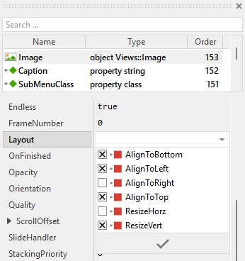
Implement the interface of the Option Item
When creating your own Option Item component you should ensure that instances of the item can be configured to control all the features implemented in it. For example, if you have enhanced the item to display some icon, you should allow this icon to be specified individually for each item instance. In this way several item instances can exist at the same time, each displaying another icon and opening different sub menus with different options.
To control the features in your item you use properties. A property can be understood as variable where the corresponding setting is stored, e.g. the icon bitmap to display in the item or the class of the sub menu to open. When the value of the property changes, the item can react to it and update its appearance accordingly. The properties reflect thus the settings within your item. Together they form the interface of the component.
Usually, each particular setting within a component is represented by the corresponding property. Thus, an option item where icon, caption, sub menu class and current selection can be configured will require four properties. In its original version, the Option Item contains already four properties Caption, SubMenuClass, Selection and Outlet. The first stores the text to display, the second determines which menu component to create and present when the user activates the menu item, the third stores a value representing the current selection, and the fourth can refer to any other int32 property the item should remain synchronized with. In order to enhance this interface by your own properties, following steps are necessary:
★Add a new property to the Option Item component.
★Name the property according to the setting it should represent. For example, the property intended to store an icon bitmap could be named Icon.
★Determine the data type of the property. For example, the property intended to store an icon bitmap will reference a Resources::Bitmap.
★Determine the initialization value of the property. This value should correspond to the item's default state. For example, the property intended to store an icon could be initialized with null if no icon should be displayed by default.
★The property is accompanied by its onget method. Except particular cases, this method is not needed and can be deleted now.
★The property is accompanied by its onset method. Open this method for editing.
★Adapt the implementation of the onset method so it updates the item according to its new value. For example, in case of the property intended to store an icon, you will probably update some Image view where the icon is displayed:
// The value doesn't change - nothing to do. if ( pure Icon == value ) return; // Remember the property's new value. pure Icon = value; // Update the view to display the just modified icon. ItemIconImage.Bitmap = value; // Changing the icon may affect the minimum width of the item. Request the // superior menu to recalculate its layout. if ( Owner ) Owner.InvalidateLayout();
★If the new property affects the minimum size of the item (like icon or additional decorations do), adapt also the GetMinimalSize method to include the space needed by the new element.
That is all. Now when you deal with instances of the Option Item component, you can evaluate and modify the properties similarly to how you access variables. Especially, when the item instance is selected, you see in Inspector window the property and can change it there. The modification is immediately visible in the Composer window.
If desired, the properties can also be modified at the runtime of your application. For example, the caption, the sub menu class or the selection can be adapted dynamically. For this purpose you access and modify the affected property directly within Chora code:
var int32 currentMode = ... // Set the option item's selection optionItem.Selection = 2; // Corresponds to some radio item's OutletSelector // Or connect to an outlet property for automatic synchronization optionItem.Outlet = ^DeviceSettings.NetworkMode; optionItem.SubMenuClass = Application::NetworkOptionsMenu;
Understand the handling of touch inputs in Option Item
The Option Item is an interactive component. It can be controlled via touch screen or by the mouse device. For this purpose the template contains the Simple Touch Handler object named TouchHandler. Per default, this handler covers the entire area of the item - this is thus the touch sensitive area. To this handler are associated three slot methods: onPressTouch, onReleaseTouch and onEnterLeaveTouch. As their names imply the methods are invoked at the beginning of the interaction (press), at its end (release) and when the user drags the finger and enters or leaves the item's area:
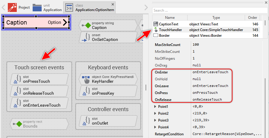
The methods take care of two tasks. As first they request an invocation of the UpdateViewState method if due to the performed touch (mouse) interaction the visual appearance of the item does need the update. The second task is the activation of the item when the user successfully touches and releases within the item's area, which triggers the opening of the sub menu containing the option radio items.
The Option Item uses a feedback flash effect to provide visual feedback when the user taps the item very quickly. If the user holds the finger pressed for a short moment (at least 50 milliseconds per default), the item is activated immediately when released. If the user taps very quickly (less than 50 milliseconds), a short flash effect is shown first before the item is activated. This ensures the user always gets visual feedback.
The slot method onPressTouch is invoked when the user touches the item area:
// Clicking on a menu item focuses (selects) the item. If you don't want it, // remove the following code line. Owner.Focus = this; // The item is still performing the feedback flash effect from the preceding // tap. This can occur when the user taps the item in a very rapid succession. // Thus complete this preceding tap (simulate the timer expiration) before // starting a new item interaction. if ( FlashTimer.Enabled ) { postsignal openSubMenu; FlashTimer.Enabled = false; }
Later, when the user finalizes the touch (mouse) interaction, the item is activated depending on whether the finger/mouse is still inside the item's area and how long the user held the item pressed. This functionality is implemented in the slot method onReleaseTouch:
// Did the user moved the finger outside the item's area? In such case // the item is not activated. if ( !TouchHandler.Inside ) return; // The touch interaction has been passed over to another touch handler. // The item is not activated in such case. if ( TouchHandler.AutoDeflected ) return; // The user has pressed and held the item for longer time. This was enough // long to give a visual 'press' feedback to the user. The item can be // activated immediately - open the sub menu. if ( TouchHandler.HoldPeriod >= FlashTimer.Begin ) postsignal openSubMenu; // The user has tapped the item very quickly. Defer the item activation // to give the user first a short visual feedback that the item has been // pressed. else FlashTimer.Enabled = true;
The slot method onEnterLeaveTouch is invoked when the user drags the finger while touching the item and enters or leaves the item's area. This method is also invoked at the begining and at the end of the touch interaction. The method simply requests a visual update to show the item as pressed or released:
// Every time the user touches the item or drags the finger inside/outside // the item's area request the item update its appearance. The update will // occur in the UpdateViewState() method. InvalidateViewState();
Usually you will not need to edit the implementation of these methods. It corresponds already to whatever typical menu items do. Nevertheless, you are free to change this default functionality if you want some particular behavior to be implemented in your item. For example, you can modify the flash duration by changing the Begin property of the FlashTimer object. A shorter duration (e.g. 25 milliseconds) makes the flash faster, a longer duration (e.g. 100 milliseconds) makes it slower.
Per default the TouchHandler is configured to handle all touch events. If necessary you can change this behavior and restrict the item to react only when the user performs a particular touch interaction. The TouchHandler provides for this purpose diverse configuration properties like MinStrikeCount, MaxStrikeCount, NoOfFingers or LimitToFinger. For more details, see Configure the filter condition.
If your device does not contain any touch screen nor mouse, the per default existing TouchHandler and its associated slot methods are unnecessary ballast. You can remove them in such case. We recommend to do this in following order to avoid eventual error message because of broken references between still existing and the already removed members:
★First remove all expressions accessing TouchHandler from the UpdateViewState method.
★Edit the onPressKey method and remove the expressions accessing TouchHandler.
★Delete the three slot methods: onPressTouch, onReleaseTouch and onEnterLeaveTouch.
★Finally delete the annotation grouping the slot methods.
Understand the handling of keyboard inputs in Option Item
The Option Item is an interactive component. It can be controlled via keyboard or hardware buttons. For this purpose the template contains the Key Press Handler object named KeyHandler. To this handler is associated the slot methodonPressKey. The method is thus invoked when the user presses the key matching the filter condition specified in the handler object. This is per default the Enter key:
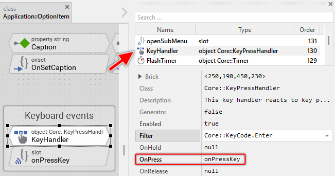
The method takes care of activating the item and showing the feedback flash effect. Similar to the touch handling, the method ensures that the user always gets visual feedback by showing a flash effect before opening the sub menu:
// Ignore keyboard events when the user is interacting with the item via the // touch screen. if ( TouchHandler.Down ) return; // Pressing the key flashes the item for a short period. This is a kind of // feedback effect. Request the item to update its appearance accordingly. // The update will occur in the UpdateViewState() method. InvalidateViewState(); // The item is still performing the feedback flash effect from the preceding // tap/key event. This can occur when the user taps the item or presses the // key in a very rapid succession. Thus complete this preceding tap (simulate // the timer expiration) before starting a new item interaction. if ( FlashTimer.Enabled ) { postsignal openSubMenu; FlashTimer.Enabled = false; } // Start the feedback flash effect. FlashTimer.Enabled = true;
Usually you will not need to edit the implementation of this method. It corresponds already to whatever typical menu items do. Nevertheless, you are free to change this default functionality if you want some particular behavior to be implemented in your item.
Per default the key handler is configured to accept the Enter key. If necessary you can change this behavior and adapt the item to react to other keys. The key handler provides for this purpose the configuration property Filter. For example, if you want the item to be activated with the Space key, set the property Filter of the object KeyHandler to the value Core::KeyCode.Space. For more details, see Configure the filter condition.
If your device does not contain any keyboard nor hardware buttons, the per default existing key handler and its associated slot method are unnecessary ballast. You can remove them in such case. We recommend to do this in following order to avoid eventual error messages because of broken references between still existing and the already removed members:
★Delete the KeyHandler object.
★Delete the slot methodonPressKey.
★Finally delete the annotation grouping the handler and the slot method.
Understand the feedback flash effect in Option Item
The Option Item uses a feedback flash effect to provide visual feedback when the user interacts with the item very quickly. This ensures that the user always sees a visible response to their action, even for very brief taps or key presses.
The flash effect is implemented using the Timer object named FlashTimer. This timer is configured with a duration (50 milliseconds per default) that determines how long the item should appear in the pressed state:
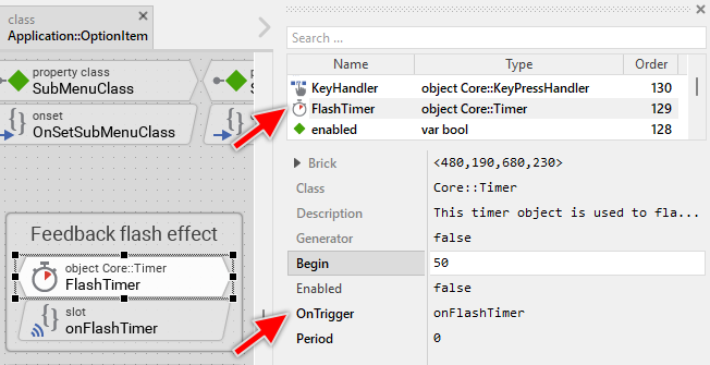
The timer is started in two situations:
★Quick tap: When the user taps the item very quickly (touch duration less than 50ms), the timer is started to show the pressed state briefly before opening the sub menu.
★Keyboard activation: When the user presses the Enter key, the timer is started to show visual feedback before opening the sub menu.
When the timer expires, the slot method onFlashTimer is called, which ends the flash effect and opens the sub menu:
// The feedback flash timer is finished. Request the item to update its // appearance. The update will occur in the UpdateViewState() method. InvalidateViewState(); // With the end of the feedback flash effect the item is activated - // the sub menu is opened. postsignal openSubMenu;
The flash duration can be adjusted by modifying the Begin property of the FlashTimer object:
★Shorter duration (e.g. 25 milliseconds): Faster flash, more responsive feel
★Longer duration (e.g. 100 milliseconds): Slower flash, more pronounced feedback
If you don't want the flash effect at all, you can simplify the touch and keyboard handling by removing the timer and directly calling the openSubMenu slot in the touch/keyboard handlers. However, this is not recommended as users expect visual feedback for their interactions.
Understand the GetMinimalSize method in Option Item
The GetMinimalSize method plays a crucial role in the automatic layout system of menus. This method is called by the owner menu to determine how much horizontal space the item requires at minimum. The menu uses this information to:
★Calculate the minimum width needed to display all items without truncating content
★Adjust its own size to fit all items comfortably
★Determine when scrolling is needed for large menus
The default implementation calculates the minimum width based on twice the caption text length plus margins. This accounts for both the caption text and the preview text (which could potentially be as long as the caption):
// We assume: the item requires space for 2 x caption and 10 pixel margin on // its side. Important: perform the calculation without the caption text being // evtl. truncated and replaced by an ellipsis sign. var bool ellipsis = CaptionText.Ellipsis; CaptionText.Ellipsis = false; var point size = point(( CaptionText.GetContentArea().w + 10 ) * 2, 0 ); CaptionText.Ellipsis = ellipsis; // Assume the min. height corresponds to the actual design height of the item. size.y = 40; return size;
Please note that the calculation temporarily disables the ellipsis mode of the text view to get the full text width without truncation. This ensures that the menu knows how much space is really needed to display the complete caption.
The default calculation assumes the preview text could be as long as the caption text (hence multiplying by 2). However, if you know that your option texts will be shorter or longer, you might want to adjust this calculation. Ideally, you would calculate based on the actual longest option string from the sub menu, but this could be expensive at runtime.
If you have modified the item appearance by adding icons, badges, or other decorations, you must adapt this method to include the additional space needed. For example, if you added an icon on the left side, take its width as well as an additional margin in account:
// Include space for: icon + margin (10px) + caption + preview + arrow var bool ellipsis = CaptionText.Ellipsis; CaptionText.Ellipsis = false; var point size = point( ItemIcon.Bounds.w + 10 + ( CaptionText.GetContentArea().w + 10 ) * 2 + ArrowImage.Bounds.w, 0 ); CaptionText.Ellipsis = ellipsis; size.y = 40; return size;
TIP
For horizontal menus: If you configure the menu to arrange items horizontally (by setting the Formation property of the menu's Outline to Core::Formation.LeftToRight), you need to adapt this method to calculate the minimum height instead of minimum width.
Understand the sub menu presentation in Option Item
When the user activates an Option Item, it opens the associated sub menu as a modal dialog. This is implemented in the openSubMenu slot method. This method is invoked when the user activates the item (either through touch, mouse or keyboard input) and is responsible for creating and presenting the sub menu. Usually, the sub menu will contain Radio Items associated to the Option Item.
slot openSubMenu { /* The following code creates a new instance of the menu GUI component specified in the property 'SubMenuClass' and presents the component as dialog. HINT: Depending on your design requirements you can modify the PresentDialog() invocation in order to determine the animations to show/hide the menu. Actually, the following implementation hides the superior menu when entering the sub menu. If you don't want it, remove the expression 'Effects::ShowHideCentered' and replace it by 'null'. In this manner the superior will remain visible while the sub menu is active. */ if ( Owner && Owner.IsCurrentDialog() && SubMenuClass ) GetRoot().PresentDialog((Core::Group)new SubMenuClass, null, null, null, null, Effects::ShowHideCentered, null, null, null, false ); }
The implementation performs following checks:
★Owner.IsCurrentDialog() - verifies that the menu containing this item is currently (still) the active dialog
★SubMenuClass is not null - ensures a valid sub menu class is specified
You can customize how the sub menu appears and disappears by modifying the PresentDialog() invocation. The method provides several parameters to control the presentation:
★Dialog transition animations: The 6th parameter determines how the superior menu is hidden when entering the sub menu. The default implementation uses Effects::ShowHideCentered, which simply hides the menu. You can use other transition objects to achieve different effects. In turn, if you provide null in this parameter, the superior menu remains visible.
// Use fade animation when hiding superior menu GetRoot().PresentDialog((Core::Group)new SubMenuClass, null, null, null, null, Effects::FadeInOutCentered, null, null, null, false ); // Keep the superior menu visible while sub menu is active GetRoot().PresentDialog((Core::Group)new SubMenuClass, null, null, null, null, null, null, null, null, false );
★Sub menu positioning: The 2nd parameter controls the position and animation of the sub menu itself. You can create custom transition object configured with particular constraints for the positioning of the sub menu and animations to perform when the sub menu is shown:
// Present sub menu sliding from right side GetRoot().PresentDialog((Core::Group)new SubMenuClass, Effects::SlideLeftCentered, null, null, null, null, null, null, null, false ); // Present sub menu at specific position GetRoot().PresentDialog((Core::Group)new SubMenuClass, MyCustomTransition, null, null, null, null, null, null, null, false );
For more details about dialog transitions and positioning, see Customize provided Dialog transition animations.
Understand the preview text generation in Option Item
One of the features of the Option Item is its ability to automatically display the currently selected option from the associated sub menu. This is implemented through the onUpdatePreview slot method, which performs the following steps:
★Creates a temporary instance of the sub menu class specified in SubMenuClass.
★Iterates through all embedded views in the sub menu using FindNextView().
★Checks each view to see if it is a Radio Item (by casting to Application::RadioItem type).
★For each Radio Item found, checks if its OutletSelector matches the current Selection value, or if its Selected property is true.
★When a matching Radio Item is found, extracts its Caption property value.
★Updates the PreviewText view to display the extracted caption.
Here is the complete implementation:
slot onUpdatePreview { var string previewString; // The preview string is determined by the Radio Menu Item selected actually // in the sub menu. if ( SubMenuClass ) { // Instantiate temporarily the sub menu and ... var Core::Group subMenu = (Core::Group)new SubMenuClass; var Core::View view; // ... evaluate all views existing in the sub menu searching for a Radio Item // matching the actual selection. while ( !!(view = subMenu.FindNextView( view, Core::ViewState[ Embedded ]))) { var Application::RadioItem radioItem = (Application::RadioItem)view; // Found a selected radio item? Then query its caption. if ( radioItem && (( radioItem.OutletSelector == Selection ) || radioItem.Selected )) { previewString = radioItem.Caption; break; } } } // Update the preview text to the caption of the found Radio Item. PreviewText.String = previewString; }
This mechanism is triggered automatically in three situations:
★When the Selection property changes (in the OnSetSelection onset method).
★When the SubMenuClass property changes (in the OnSetSubMenuClass onset method).
★When the Outlet property changes and receives a value from the data model (in the onOutlet slot method).
IMPORTANT
If you rename the Radio Item component class or place it in a different unit, you must adapt the line var Application::RadioItem radioItem = (Application::RadioItem)view; in the onUpdatePreview method to use the correct fully qualified class name. Otherwise, the preview text will not be updated correctly.
Perform state changes with animations
In the section Adapt the appearance of the component you learned how state alternations within the Option Item are processed and how views existing in the component are updated in order to reflect the actual state. Accordingly, when the user touches the item (starts pressing it), the item does appear pressed. When the user releases the item again (ends pressing it), the item restores its released appearance. The default implementation performs such appearance updates instantly, just in the moment when the respective interaction took place.
If desired, you can modify the Option Item to update its appearance with animations. For example, instead of instantly switching between the pressed and released appearance, such item can fade-in/out the background color, scale the arrow image, fade or slide the preview text, or show other animated transitions. For this purpose you use the Animation Effects. With an Animation Effect you can animate a property of a view existing in the item. Following are the steps how to do this:
★Depending on the data type of the property to animate, add the appropriate Animation Effect to the Option Item. For example, to animate a color property, add a Pulse color effect.
★Connect the effect object with the property to animate. For example, if you want to animate the background color, connect the Pulse color effect with the property Color of the Background view.
★Configure the duration and eventually the desired timing (easing) for the animation.
★Once started, the effect will animate the property endlessly. In our case, however, the animation should stop at its end. For this purpose set the effect's property NoOfCycles to the value 1.
★Configure the key values for the animation. In case of the pulse color effect, it is the start and the end color. For example, to animate the color between white and red, configure the effect's property Value1 with the #FFFFFFFF (white) and the property Value2 with #FF0000FF (red). This step is appropriate if the key values are fixed, known at the design time. Otherwise, the key values must be set at runtime shortly before the effect is triggered.
★Open the method UpdateViewState and modify its implementation to trigger the effect object when the item switches between the states pressed and not pressed. For example in case of the above mentioned pulse color effect to animate the background color, following implementation could be adequate:
// Estimate the new state var bool isEnabled = aState.contains( Core::ViewState[ Enabled ]); var bool isSelected = aState.contains( Core::ViewState[ Selected ]); var bool isPressed = ( TouchHandler.Down && TouchHandler.Inside ) || FlashTimer.Enabled; [...] // Following code updates the views instantly, without animations // (except the background color which is now animated) if ( !isEnabled ) { Border.Visible = false; CaptionText.Color = #888888FF; PreviewText.Color = #888888FF; ArrowImage.Color = #888888FF; } else if ( isPressed ) { Border.Color = #000000FF; Border.Visible = true; CaptionText.Color = #FFFFFFFF; PreviewText.Color = #FFFFFFFF; ArrowImage.Color = #FFFFFFFF; } else if ( isSelected ) { Border.Color = #444444FF; Border.Visible = true; CaptionText.Color = #000000FF; PreviewText.Color = #000000FF; ArrowImage.Color = #000000FF; } // Enabled but not pressed nor selected. else { Border.Visible = false; CaptionText.Color = #000000FF; PreviewText.Color = #000000FF; ArrowImage.Color = #000000FF; } // Switching from not pressed -> pressed state. Start the animation. if ( isEnabled && isPressed && !pressed ) { ColorEffect.Reversed = false; ColorEffect.Enabled = true; } // Switching from pressed -> not pressed state. Start the animation. else if ( isEnabled && !isPressed && pressed ) { ColorEffect.Reversed = true; ColorEffect.Enabled = true; } // Remember the new state enabled = isEnabled; selected = isSelected; pressed = isPressed;
★Since the properties of the affected views are now modified with animations, you will eventually need to adapt their initial values to correspond to the default state of the item. For example, you might need to set the property Color of the view Background to the value #FFFFFFFF (default color is white).
TIP
The Option Item has a unique feature with the preview text that displays the currently selected option. You could add animations for the preview text updates - fade out old text and fade in new text when the selection changes. You could also animate the arrow image with a pulse or rotation effect when the sub menu is about to open.