Creating components from templates: Text Editor
With this template you can add a new Text Editor component to your project. Text Editor provides functionality to enter, edit and delete text - be it single or multiline. The user can scroll the text by using the keyboard or by touching the screen. When the user touches the screen for a while, a magnifying glass appears permitting the user to move the caret directly with the finger. Each time the user modifies the text in the Editor, the component sends signals to associated slot methods where your particular implementation is executed.
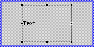
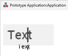
Components created with this template are intended to be adapted to your particular design expectations. After adding the new Text Editor you should edit the component, change its appearance and if desired also its behavior. Once you have adapted the component, you can embed instances of this Text Editor wherever you need in your GUI project. Because it serves as template, it is intentionally kept very simple. Nevertheless, Text Editors created by the template are working widgets. If desired, they can already be used as they are. The following figure demonstrates the default appearance of the Text Editor created by using the here described component template:
The approach with component templates has two functions. Primarily the templates should simplify the development of new components. Instead of creating the Text Editor from scratch you can use the available template. The second function is more educative. The template implements fully working Text Editor component you can investigate and learn about the corresponding programming aspects. The template is well documented. It contains annotations and inline comments with instructions helping you to understand how the component works and how it can be adapted to your particular needs.
This chapter provides an overview how the Text Editor component template is used within your own application and how you adapt this component according to your particular needs. You will find here also further details concerning the internal implementation of the Text Editor component.
Add new Text Editor component
To create a new Text Editor component from a template you simply Drag & Drop it between the Templates window and the Composer with an opened unit. This is important in that by using the component templates you add in fact a new class to your project. Classes, in turn, can exist within units only. The following are the typical steps to create a new Text Editor component from a template:
★First switch to the Composer page for the respective unit, where you want to add the new Text Editor component.
★Then ensure that the Templates window is visible.
★In Templates window switch to the folder Component Templates.
★In the folder locate the Text Editor template.
★Drag & Drop the template into the Composer window:
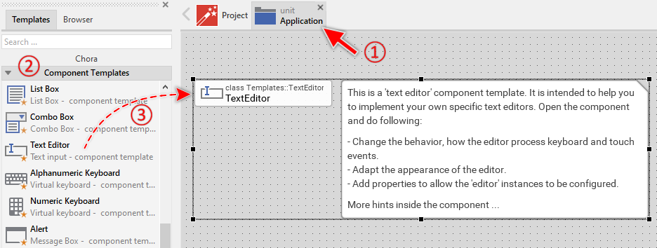
★Eventually name the new added component.
The new created Text Editor component appears accompanied by annotation providing helpful tips how to proceed. If undesired, you can select and delete the annotation.
Use the Text Editor component
Once you have created the Text Editor component, you can use it to assemble more complex components. Technically seen, you embed an instance of the Text Editor class in-place within some superior GUI component. At the runtime, the superior GUI component takes care of the correct initialization and the displaying of all embedded components, so they appear similarly as you have composed them at the design time.
Step 1. Add new Text Editor instance
The following are the typical steps to create a new instance of an already existing Text Editor component:
★First switch to the Composer page for the respective GUI component, where you want to add the new Text Editor.
★Then ensure that the Browser window is visible.
★Within the Browser locate the class of the previously created Text Editor. This can be done easily with Browser's own filter function.
★Select the found class in the Browser window.
★Drag & Drop the selected class into the Composer area.
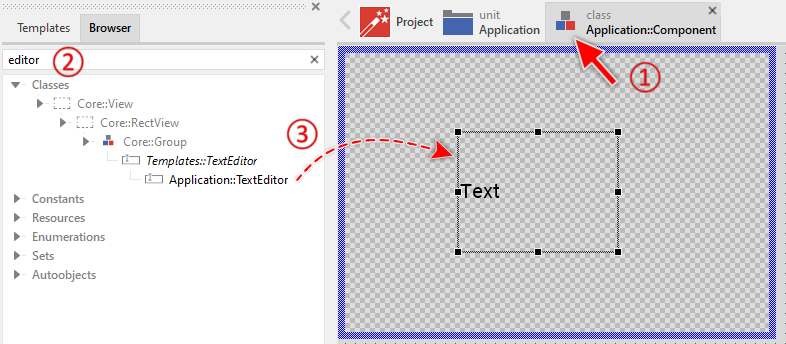
★Eventually name the new instance according to its function within the GUI component (e.g. FirstName).
Component templates are intended to create widgets which can be modified and adapted to your particular design expectations. In the following sections you will learn how to do this. Originally, if not yet modified, the Text Editor displays only the text. At the runtime a blinking caret symbol is shown. Our intention is to keep the component templates as minimalistic as possible so they don't distract you with less important design details.
Step 2. Inspect the Text Editor instance
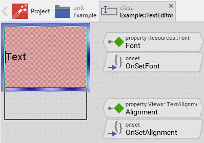
As long as the Text Editor is selected you can inspect and modify its properties conveniently in the Inspector window as demonstrated with the property Bounds in the screenshot below. This is in so far worth mentioning as diverse features of the Text Editor are controlled by the corresponding properties. If you are not familiar with the concept of a property and the usage of Inspector window, please read first the preceding chapter Compositing component appearance.
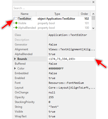
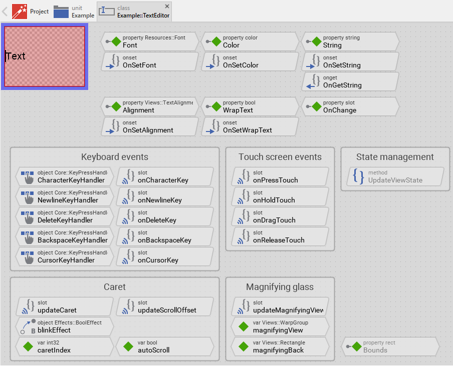
The Text Editor component descends from the Mosaic class Core::Group. Consequently, most of the properties listed in the above screenshot are inherited from this base class. Particular to the Text Editor are only few following properties:
Property |
Description |
|---|---|
Alignment |
The property Alignment determines how the editor should display the text rows if their size differs from the size of the editor. In this manner the rows can be aligned horizontally. The entire text block can be aligned vertically. |
Color |
The property Color controls the color of the text and the blinking caret. |
Font |
The property Font refers to the font object used to display the text. The text is determined by the property String. |
OnChange |
The property OnChange can refer to a slot method, which should be invoked by the text editor when the user modifies the text. |
String |
The property String stores the text of the editor. |
WrapText |
The property WrapText determines whether long text rows should be wrapped automatically. |
Step 3. Arrange the Text Editor within the superior component
Once added to the component, you can freely move the Text Editor instance, or you simply grab one of its corners and resize it in this way. You can control the position and the size of the component also by directly modifying its property Bounds. If you want the Text Editor to appear behind other views you can reorder it explicitly.
Step 4. Set focus to enable keyboard input
To enable the Text Editor to receive keyboard input, the editor must obtain focus. Focus is managed through the focus path mechanism. The Text Editor component can receive keyboard events only when:
★The editor instance is assigned to the Focus property of its superior component
★The superior component itself is focused (lies on the focus path)
This creates a chain of focused components from the root application down to the Text Editor, forming the focus path. Only components on this active focus path can process keyboard events. To give focus to a Text Editor instance, assign it to the Focus property of the superior component and ensure the superior component itself is focused in scope of its own superior component:
// Set focus to the TextEditor instance Focus = MyTextEditor;
This assignment should typically be done in a slot method that responds to a user action, such as pressing a button. The Text Editor template already implements automatic focus acquisition through touch. When the user touches the editor area, the focus path is automatically established leadin to the affected Text Editor instance.
If your GUI component contains multiple input fields (multiple Text Editor instances), you can implement focus navigation using the Tab key. The superior component should handle Tab key events and move focus between the editors. For example:
// In the superior component's keyboard handler if ( Focus == TextEditor1 ) Focus = TextEditor2; else if ( Focus == TextEditor2 ) Focus = TextEditor3; else Focus = TextEditor1;
Also possible, you can invoke the editor's method ObtainFocus() to establish the focus path to this editor. This will ensure that also all superior components are correctly focused:
// Set focus to the TextEditor instance MyTextEditor.ObtainFocus();
For more details about focus management and the focus path concept, see Understanding the Focus path.
Step 5. Access the content of the Text Editor
The text content of the editor is stored in and accessed through the String property. This property allows you to both set the initial text content and retrieve the current text that the user has entered or modified. To retrieve the current text from the editor, simply evaluate the String property. To assign text to the editor programmatically, modify the String property:
// Get the current text from the editor var string userInput = MyTextEditor.String; // Use the text content trace "User entered: " + userInput; [...] // Set initial text content MyTextEditor.String = "Hello World"; // Clear the editor MyTextEditor.String = ""; // Load text from data model MyTextEditor.String = DataModel.UserName;
You can validate the entered text by checking the String property:
// Check if editor is empty if ( MyTextEditor.String == "" ) { trace "Please enter some text"; return; } // Check text length if ( MyTextEditor.String.length < 3 ) { trace "Text is too short"; return; } // Check for specific content if ( MyTextEditor.String.find( "@", 0 ) < 0 ) { trace "Email address must contain @"; return; }
Step 6. Implement Text Editor's slot methods
When the user modifies the text in the editor (by typing new contents or deleting existing contents), the editor can notify the superior component about these changes. This notification mechanism uses the signal-slot paradigm. Each time the text is modified, the editor sends a signal to an associated slot method where your particular implementation is executed.
The Text Editor exposes for this purpose the property OnChange which can store a reference to a slot method. This slot method will be invoked automatically whenever the text content changes due to user input. You can initialize OnChange with already existing slot methods or you add a new one and implement it as desired. The following steps describe how to do this:
★First add a new slot method to your GUI component.
★Assign the slot method to the property OnChange of the affected Text Editor.
★Open the slot method for editing.
★In the Code Editor implement your desired operation to execute when the event occurs.
When you start the Prototyper now, you can interact with the editor. Thereupon the editor will trigger the associated slot method each time its content is modified by the user.
TIP
The notification is not sent when you programmatically modify the String property. This prevents unwanted recursive notifications and gives you full control over when to trigger notifications.
Example of an OnChange slot method intended to store the content of the editor inside a data model after each modification but only when the content is valid:
var string text = MyTextEditor.String; // Is the entered text valid? var bool isValid = ( text != "" ) && ( text.length >= 3 ) && ( text.find( "@", 0 ) >= 0 ); // Update the data model with the new content, if it is valid. if ( isValid ) Application::DataModel.DraftText = text;
Step 7. Configure Text Editor appearance and behavior
The Text Editor component exposes several properties that control its appearance and behavior. These properties allow you to customize the editor without modifying its internal implementation. Once you have added a Text Editor instance to your component, you can configure these properties in the Inspector window or programmatically in your code.
★The Font property determines which font is used to display the text. You can select any font resource available in your project.
★The Color property controls the color of both the text content and the blinking caret.
★The Alignment property determines how text rows are aligned horizontally and how the entire text block is aligned vertically within the editor's bounds.
★The WrapText property controls whether long text rows are automatically wrapped to fit within the editor's width.
Configuration examples:
// Single-line input field (username, password): UsernameEditor.Font = Resources::FontMedium; UsernameEditor.Color = #000000FF; UsernameEditor.WrapText = false; UsernameEditor.Alignment = Views::TextAlignment[AlignHorzLeft, AlignVertCenter]; // Multiline text area (comments, descriptions): CommentEditor.Font = Resources::FontMedium; CommentEditor.Color = #333333FF; CommentEditor.WrapText = true; CommentEditor.Alignment = Views::TextAlignment[AlignHorzLeft, AlignVertTop]; // Numeric input field: NumberEditor.Font = Resources::FontLarge; NumberEditor.Color = #0066CCFF; NumberEditor.WrapText = false; NumberEditor.Alignment = Views::TextAlignment[AlignHorzRight, AlignVertCenter]; // Centered title editor: TitleEditor.Font = Resources::FontExtraLarge; TitleEditor.Color = #000000FF; TitleEditor.WrapText = false; TitleEditor.Alignment = Views::TextAlignment[AlignHorzCenter, AlignVertCenter];
Open the component for editing
Component templates are intended to create widgets which can be adapted and enhanced to your particular design expectations. For this purpose, once you have added a new Text Editor component to your project, you can open the component class for editing. Thereupon the implementation of the component appears in a new Composer page:
Originally, if not yet modified, the Text Editor displays only the text content. At the runtime a blinking caret symbol is shown when the editor has focus. Our intention is to keep the component templates as minimalistic as possible so they don't distract you with less important design details. The Text Editor can react to touch and keyboard inputs.
This default functionality is implemented by following members belonging to the Text Editor. These members are explicitly intended to be modified. Understanding this internal structure is thus the first step before you start to adapt the Text Editor to your particular needs:
Icon |
Member |
Description |
|---|---|---|
|
Font |
The property Font refers to the font object used to display the text. The text is determined by the property String. |
|
OnSetFont |
The onset method belongs to the property Font. Each time the value of the property is changed, the code implemented in the method is executed to update the Text view and reset the scroll position. |
|
Color |
The property Color controls the color of the text and the blinking caret. |
|
OnSetColor |
The onset method belongs to the property Color. Each time the value of the property is changed, the code implemented in the method is executed to update the Text and Caret views with the new color. |
|
String |
The property String stores the text content of the editor. |
|
OnSetString |
The onset method belongs to the property String. Each time the value of the property is changed, the code implemented in the method is executed to process special control characters, update the Text view and reset the scroll position. |
|
OnGetString |
The onget method belongs to the property String. Each time the property is evaluated, this method is called to return the pure text content without special control characters. |
|
Alignment |
The property Alignment determines how the editor should display the text rows horizontally and the entire text block vertically. |
|
OnSetAlignment |
The onset method belongs to the property Alignment. Each time the value of the property is changed, the code implemented in the method is executed to update the Text view and reset the scroll position. |
|
WrapText |
The property WrapText determines whether long text rows should be wrapped automatically. |
|
OnSetWrapText |
The onset method belongs to the property WrapText. Each time the value of the property is changed, the code implemented in the method is executed to update the Text view and adjust the horizontal scrolling behavior. |
|
OnChange |
The property OnChange can refer to a slot method, which should be invoked by the text editor when the user modifies the text. |
|
Text |
This Text view displays the text content of the editor. The view is connected to the SlideTouchHandler for scrolling functionality and calls the updateCaret slot method whenever the text layout changes. |
|
Caret |
This Line view displays the blinking caret indicating the current text insertion position. Its visibility is controlled by the blinkEffect and the focused state of the editor. |
|
CharacterKeyHandler |
This key handler reacts to character key press events. When the user presses an alphanumeric key, the handler activates the method onCharacterKey which inserts the character at the caret position. |
|
onCharacterKey |
This slot method is called when the CharacterKeyHandler has been activated. The method inserts the input character at the current caret position and sends an OnChange notification. |
|
NewlineKeyHandler |
This key handler reacts to the Enter key. When pressed, it activates the method onNewlineKey which inserts a newline character at the caret position. |
|
onNewlineKey |
This slot method is called when the Enter key is pressed. The method inserts a newline character at the current caret position and sends an OnChange notification. |
|
DeleteKeyHandler |
This key handler reacts to the Delete key. When pressed, it activates the method onDeleteKey which removes the character at the caret position. |
|
onDeleteKey |
This slot method is called when the Delete key is pressed. The method removes the character at the current caret position and sends an OnChange notification. |
|
BackspaceKeyHandler |
This key handler reacts to the Backspace key. When pressed, it activates the method onBackspaceKey which removes the character preceding the caret position. |
|
onBackspaceKey |
This slot method is called when the Backspace key is pressed. The method removes the character before the current caret position and sends an OnChange notification. |
|
CursorKeyHandler |
This key handler reacts to cursor key press events (Left, Right, Up, Down). When pressed, it activates the method onCursorKey which moves the caret in the corresponding direction. |
|
onCursorKey |
This slot method is called when a cursor key is pressed. The method calculates the new caret position based on the pressed key and updates the caret accordingly. |
|
SimpleTouchHandler |
This touch handler processes touch interactions for caret positioning and magnifying glass activation. It covers the entire area of the editor. |
|
onPressTouch |
This slot method is called when the user touches the editor area. It obtains focus for the editor and positions the caret at the touched location. |
|
onHoldTouch |
This slot method is called when the user holds the finger on the editor for more than 300 milliseconds. It activates the magnifying glass feature for precise caret positioning. |
|
onDragTouch |
This slot method is called when the user moves the finger while touching. It either moves the caret (if magnifying glass is active) or redirects to scrolling mode. |
|
onReleaseTouch |
This slot method is called when the user releases the finger. It deactivates the magnifying glass feature. |
|
SlideTouchHandler |
This touch handler handles scrolling of the text content with physics-based inertia. It is connected to the Text view via its SlideHandler property. |
|
caretIndex |
This variable stores the current caret position as an index within the text string (0 = beginning, String.length = end). |
|
autoScroll |
This variable flags whether automatic scrolling should be performed to keep the caret visible after text modification or caret movement. |
|
magnifyingView |
This variable stores a reference to the temporary Views::WarpGroup object used to display the magnifying glass with enlarged text content. |
|
magnifyingBack |
This variable stores a reference to the temporary Views::Rectangle object used as background for the magnifying glass. |
|
updateCaret |
This slot method calculates and updates the pixel position of the caret based on the current caretIndex. It is called automatically when the text layout changes. |
|
updateScrollOffset |
This slot method adjusts the scroll position of the Text view to ensure the caret remains visible after text modification or caret movement. |
|
updateMagnifyingView |
This slot method calculates and updates the position of the magnifying glass views to follow the caret position during touch-based caret dragging. |
|
blinkEffect |
This Bool Effect toggles the visibility of the Caret view to create the blinking animation. It is enabled when the editor has focus and disabled otherwise. |
|
UpdateViewState |
This method is invoked automatically after the state of the component has been changed. In case of the Text Editor, the method controls the caret blinking effect based on the focused state. |


Understand the state management of the component
During its lifetime, the Text Editor will assume different states as direct effect of user interactions and as result of other superior state alternations within the GUI application. The most important state for the Text Editor is the Focused state, which determines whether the editor can receive keyboard input.
The Text Editor tracks this state through the UpdateViewState method. This method evaluates the common component state with the name Focused and controls the caret blinking animation accordingly:
// Activate the caret blinking if the editor component has the input focus if ( aState.contains( Core::ViewState[ Focused ])) blinkEffect.Enabled = true; // ... otherwise hide the caret else { blinkEffect.Enabled = false; Caret.Visible = false; }
The local variable is determined by testing whether the Focused state is contained in the aState parameter. When the editor lies on the focus path, this state is present, and the caret should be visible and blinking to indicate that the user can actively interact with the editor via keyboard.
When the component state Focused changes, the method UpdateViewState is invoked automatically. You don't need to worry about it. The Mosaic framework takes care of this invocation. In the default template, the state management is intentionally minimal - it only controls the caret blinking. Depending on your design expectations, you may want to extend the state management to handle additional visual feedback. For example:
★Change background color when editor is focused
★Show/hide a border around the editor based on focus state
★Display a label or hint text when editor is not focused
★Change text color when editor is disabled
To implement such extensions:
★Add the necessary views to your editor (e.g., background rectangle, border view)
★Modify the UpdateViewState method to update the views based on the current state:
// Determine the new state var bool isFocused = aState.contains( Core::ViewState[ Focused ]); var bool isEnabled = aState.contains( Core::ViewState[ Enabled ]); // Control caret blinking if ( isFocused ) blinkEffect.Enabled = true; else { blinkEffect.Enabled = false; Caret.Visible = false; } // Update additional views based on state if ( !isEnabled ) { Background.Color = #DDDDDDFF; // Gray background when disabled Text.Color = #888888FF; // Gray text when disabled } else if ( isFocused ) { Background.Color = #FFFFFFFF; // White background when focused Border.Color = #0066FFFF; // Blue border when focused Border.Width = 2; } else { Background.Color = #F5F5F5FF; // Light gray when not focused Border.Color = #CCCCCCFF; // Gray border when not focused Border.Width = 1; }
★Optionally you can add state variables to track the previous state, for example a variable named enabled. Then in the implementation of UpdateViewState you can compare the variable with the new state and so detect state alternations:
// Determine the new state var bool isEnabled = aState.contains( Core::ViewState[ Enabled ]); // Did the state 'Enabled' change? if ( isEnabled != enabled ) ... // Remember the state enabled = isEnabled;
Adapt the appearance of the component
Originally, if not yet modified, the Text Editor displays only the text content and a blinking caret when focused. Our intention is to keep the component templates as minimalistic as possible so they don't distract you with less important design details. It's up to you to adapt the editor to have the expected appearance. The available possibilities are explained in the following sections. Please note, that you can combine the different approaches according to your application case:
1. Modify the existing Text view
The Text Editor template contains the Text view which displays the text content. You can modify the properties of this view to change the default appearance. However, be careful not to change properties that are controlled by the editor's own properties (Font, Color, String, Alignment, WrapText). These are managed automatically through the onset methods.
You can safely modify following properties of the Text view:
★Bounds - To change the area where text is displayed within the editor
★Layout - To control how the text view adjusts when the editor is resized
★Padding - To add spacing around the text content
2. Modify the existing Caret view
The Caret view displays the blinking vertical line indicating the text insertion position. You can modify its appearance:
★Width1 and Width2 - To change the thickness of the caret line
★Color is controlled by the editor's Color property, but you can change this connection
3. Add background to the editor
To make the editor more visible, you can add a background rectangle:
★Add a Filled Rectangle view to the Text Editor component.
★Name the view Background.
★Arrange the rectangle to cover the entire editor area.
★Reorder the background view to appear behind the Text and Caret views.
★Optionally, modify the UpdateViewState method to change the background color based on the editor's state (focused/not focused).
4. Add border to the editor
To visually separate the editor from surrounding content, you can add a border:
★Add a Border view to the Text Editor component.
★Name the view Border.
★Arrange the border to surround the entire editor area.
★Optionally, modify the UpdateViewState method to change the border color and thickness based on focus state:
var bool isFocused = aState.contains( Core::ViewState[ Focused ]); // Control caret blinking if ( isFocused ) blinkEffect.Enabled = true; else { blinkEffect.Enabled = false; Caret.Visible = false; } // Update border based on focus state if ( isFocused ) { Border.Color = #0066FFFF; // Blue when focused Border.Width = 2; // Thicker when focused } else { Border.Color = #CCCCCCFF; // Gray when not focused Border.Width = 1; }
5. Replace the Caret view with other view
Per default the caret appears as vertical line. If desired, you can replace it with another view, for example with a Bitmap Frame view, which displays a bitmap, but can be adjusted in size similar to how the caret is adjusted in height depending on the used font:
★Delete the Caret view.
★Add a Bitmap Frame view to the component.
★Name the new view Caret (same name as the removed view).
★Configure the frame view to display the desired bitmap.
★Review the methods updateCaret, updateMagnifyingView and updateScrollOffset. The methods evaluate and modify the caret's properties Point1 and Point2. When using a frame view, the implementation has to be adapted to work with the Bounds property of the frame view. For example, the updateCaret method could be modified as shown below:
// Arrange the caret at the just determined position. The height of // the caret corresponds to the height of a text row drawn with the // font Caret.Bounds.point1 = pos - point( Caret.Bitmap.FrameSize.x / 2, Font.Ascent ); Caret.Bounds.point2 = pos + point( Caret.Bitmap.FrameSize.x - ( Caret.Bitmap.FrameSize.x / 2 ), Font.Descent );
Configure the layout of the component
The initial size of the Text Editor is determined by the thick blue border surrounding the Canvas area. It corresponds to the size that all instances of this Text Editor component will have by default. If desired, you can adjust the Canvas area and change this default size accordingly. This could be for example the case when you plan to create a large Text Editor. For this purpose you click and drag the edges of the surrounding border (see also Resize the Canvas area). Once the size is changed, you can then adapt (move, resize) the views existing within the component. For example, to make the Text Editor taller you adjust its bottom edge:
The resulting size of the Text Editor, however, is not necessarily fixed. It can be adjusted for each editor instance individually when the editor instance is arranged within a superior GUI component or it can change dynamically at the runtime. The GUI application can thus contain multiple instances of the editor, each with another size. From this arises the question, how the Text Editor will react to its size alternation?
In case of the Text view existing per default in the Text Editor template the view is automatically adjusted to fill the entire area of the editor. The same is true for the SimpleTouchHandler and SlideTouchHandler, which should usually fill the entire editor otherwise the user can't interact with it. All other views, you have added later to the Text Editor are not adjusted automatically.
To control the adjustment you have to explicitly configure for each view its Layout property. (see also Configure component layout). Let's assume, in order to display some border you have added a Border view to the Text Editor. Then you have arranged the view to fill the entire Canvas area. If you want now that the view grows and shrinks according to size changes of the Text Editor, you enable in the property Layout of this view following settings:
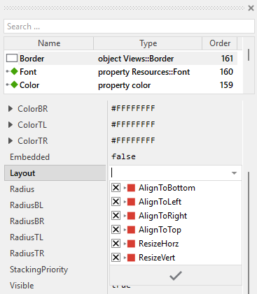
Now the Text Editor knows how to react to its size changes. Each editor instance can have individual size and the enclosed views are automatically arranged within the available area.
Implement the interface of the component
When creating your own Text Editor component you should ensure that instances of the editor can be configured to control all the features implemented in it. For example, if you have enhanced the editor to limit the maximum text length, you should allow this limit to be specified individually for each editor instance.
To control the features in your editor you use properties. A property can be understood as variable where the corresponding setting is stored, e.g. the background color. When the value of the property changes, the editor can react to it and update its appearace. The properties reflect thus the settings within your editor. Together they form the interface of the component.
In its original version, the Text Editor contains already several properties which control the font, color, text content, alignment, and text wrapping. In order to enhance this interface by your own properties, following steps are necessary:
★Add a new property to the Text Editor component.
★Name the property, e.g. BackgroundColor.
★Determine the data type matching its function, e.g. color.
★Set the initialization value to whatever value is by default used in the component. For example, if the background is white opaque by default, set the initialization value to be #FFFFFFFF (white color).
★The property is accompanied by its onset method. Open the onset method for editing.
★Implement the method, for example when the property is intended to set background color of the Text Editor:
// The value doesn't change - nothing to do. if ( pure BackgroundColor == value ) return; // Remember the property's new value pure BackgroundColor = value; // Update the affected views Background.Color = value.
Now when you use instances of the Text Editor component, you can configure the background color:
UsernameEditor.BackgroundColor = #FF0000FF; // red
Understand the handling of keyboard inputs
The Text Editor is an interactive component that can be controlled via keyboard or hardware buttons. For this purpose the template contains several Key Press Handler objects. Each handler is associated with a slot method that is invoked when the user presses a key matching the filter condition specified in the handler object.
The default template includes following keyboard handlers:
Handler |
Key Filter |
Associated Slot |
Description |
|---|---|---|---|
CharacterKeyHandler |
Core::KeyCode.CharacterKeys |
onCharacterKey |
Handles alphanumeric character input and inserts the character at the current caret position. |
NewlineKeyHandler |
Core::KeyCode.Enter |
onNewlineKey |
Handles the Enter key to insert a new line character at the current caret position. |
DeleteKeyHandler |
Core::KeyCode.Delete |
onDeleteKey |
Handles the Delete key to remove the character at the current caret position. |
BackspaceKeyHandler |
Core::KeyCode.Backspace |
onBackspaceKey |
Handles the Backspace key to remove the character preceding the caret position. |
CursorKeyHandler |
Core::KeyCode.CursorKeys |
onCursorKey |
Handles cursor keys (Left, Right, Up, Down) to move the caret through the text. |
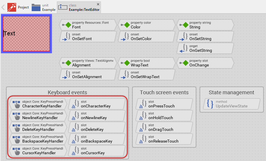
Each handler object is configured with following properties:
★Filter property specifies which key or key group triggers the handler
★OnPress property connects the handler to the corresponding slot method
★OnHold property (where applicable) enables key repetition when the user holds the key pressed
The implementation of each slot method takes care of the corresponding text editing operation:
★onCharacterKey inserts the pressed character, handling special control characters that need escaping
★onNewlineKey inserts a newline character and moves the caret to the next row
★onDeleteKey removes the character at the caret position
★onBackspaceKey removes the character before the caret position
★onCursorKey calculates the new caret position based on the pressed cursor key
After each text modification, the slot methods perform following actions:
★Update the String property of the Text view
★Adjust the caretIndex variable to the new caret position
★Set the autoScroll flag to ensure the caret remains visible
★Send a postsignal to OnChange to notify the superior component about the text modification
Usually you will not need to edit the implementation of these methods. They correspond already to what typical text editors do. Nevertheless, you are free to change this default functionality if you want some particular behavior to be implemented in your editor. For more details, please see the inline comments in the implementation of the respective method.
Understand the handling of touch screen inputs
The Text Editor can also be controlled via touch screen or mouse interactions. For this purpose the template contains two touch handler objects that enable the user to position the caret and scroll the text content.
Caret positioning
The Simple Touch Handler object named SimpleTouchHandler handles direct touch interactions for caret positioning. It covers the entire area of the editor and reacts to following touch events:
Event |
Associated Slot |
Description |
|---|---|---|
OnPress |
onPressTouch |
When the user touches the screen, this slot method obtains focus for the editor and positions the caret at the touched position. |
OnHold |
onHoldTouch |
When the user holds the finger on the screen for more than 300 milliseconds, this slot method displays the magnifying glass for precise caret positioning. |
OnDrag |
onDragTouch |
When the user moves the finger while touching the screen, this slot method either moves the caret (if magnifying glass is active) or redirects to the slide handler for scrolling. |
OnRelease |
onReleaseTouch |
When the user releases the finger, this slot method hides the magnifying glass again. |
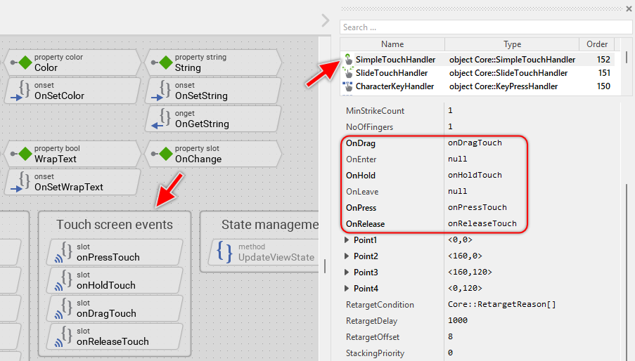
The SimpleTouchHandler implements intelligent behavior:
★Initial touch obtains focus and positions the caret at the touched position
★Touch-and-hold (300ms) activates the magnifying glass mode
★Dragging with magnifying glass moves the caret with visual feedback
★Dragging without magnifying glass (dragging before 300ms elapsed) switches to scrolling mode
For more details, please see the inline comments in the implementation of the respective method.
Text scrolling
The Slide Touch Handler object named SlideTouchHandler handles scrolling of the text content. It is configured with following properties:
★SlideHorz controls horizontal scrolling (disabled by default when WrapText is enabled)
★Friction determines the deceleration of inertial scrolling
The slide handler is automatically connected to the Text view via its SlideHandler property. This connection ensures that touch-based scrolling directly affects the text's ScrollOffset property.
The handler provides physics-based scrolling with inertia, allowing the user to flick the text content and have it continue scrolling naturally with friction-based deceleration.
If your device does not have a touch screen, both touch handlers and all associated slot methods (onPressTouch, onHoldTouch, onDragTouch, onReleaseTouch) are unnecessary and can be removed. See Add or remove touch handlers for details.
Understand the caret management
The caret is the blinking vertical line that indicates where the next character will be inserted in the text editor. The caret management involves several components working together to maintain, display, and animate the caret.
Caret view and position
The caret is displayed using a Line view named Caret. This view is configured as:
★A vertical line with Width1 and Width2 set to 2 pixels
★Color controlled by the editor's Color property
★Initial visibility set to false (becomes visible only when editor is focused)
The position of the caret is determined by the internal variable caretIndex, which stores the index within the text string where the caret is located. The value ranges from 0 (beginning of text) to the length of the text string (end of text).
Caret positioning logic
The slot method updateCaret is responsible for calculating and updating the caret's pixel position. This method is called automatically whenever:
★The text content changes
★The text view rearranges its content (connected via OnUpdate property of the Text view)
★The user moves the caret using keyboard or touch input
The positioning algorithm performs following steps:
// Get the pixel position of the sign right to the caret var point rowCol = Text.StringIndex2RowCol( caretIndex ); var point pos = Text.RowCol2Position( rowCol ); // Arrange the caret at the just determined position. The height of // the caret corresponds to the height of a text row drawn with the font Caret.Point1 = pos - point( 0, Font.Ascent ); Caret.Point2 = pos + point( 0, Font.Descent );
Caret blinking animation
The caret blinks to draw the user's attention. This blinking is implemented using the Bool Effect object named blinkEffect. The effect is connected directly to caret's Visible property and it is configured to toggle this property every 500 milliseconds. The blinking effect is controlled by the UpdateViewState method:
// Activate the caret blinking if the editor component has the input focus if ( aState.contains( Core::ViewState[ Focused ])) blinkEffect.Enabled = true; // ... otherwise hide the caret else { blinkEffect.Enabled = false; Caret.Visible = false; }
When the editor gains focus, the blinking animation starts. When focus is lost, the animation stops and the caret is hidden. Additionally, whenever the caret is moved or text is modified, the blink effect is restarted to ensure the caret is immediately visible. This prevents the situation where the caret might be invisible at the moment of movement, which could confuse the user:
// Restart the blink effect -> this ensures that the user can see the // caret while it is moved or the text is modified if ( blinkEffect.Enabled ) { blinkEffect.Enabled = false; blinkEffect.Enabled = true; }
Understand the magnifying glass feature
When the user touches the screen and holds the finger for a while, a magnifying glass appears showing an enlarged view of the text around the caret. This feature helps users position the caret precisely, especially on small screens or with small fonts. This behavior is usually well known from modern mobile phone devices.
Activation and behavior
The magnifying glass feature is implemented in the slot method onHoldTouch. When the SimpleTouchHandler detects that the user has held the finger on the screen for at least 300 milliseconds, the magnifying glass is activated:
// Does enter the mode? if (( SimpleTouchHandler.HoldPeriod >= 300 ) && ( magnifyingView == null )) { // Calculate the size of the area to augment var int32 height = Caret.Point2.y - Caret.Point1.y; var int32 width = height * 3; // Create magnifying glass views... }
Once activated, the magnifying glass remains visible as long as the user keeps the finger on the screen. During this time, moving the finger moves the caret, and the magnifying glass follows the caret position.
Visual implementation
The magnifying glass consists of two temporary views that are created dynamically and added to the superior component (Owner):
★magnifyingBack - A Views::Rectangle displaying a semi-transparent background providing contrast for the magnified content
★magnifyingView - A Views::WarpGroup displaying the enlarged text content with 2x magnification
The magnifying glass setup involves following steps. The code is found in the method onHoldTouch:
// The editor component should store its content in an off-screen bitmap // in order to be able to to show it augmented in an overlay 'magnifyingView' Buffered = true; // Create a temporary view to show the augmented content and to show the // 'magnifying glass' background magnifyingView = new Views::WarpGroup; magnifyingBack = new Views::Rectangle; // Prepare a magnifyingView to show an augmented content of the edited text // row. The content is augmented by the factor x 2 magnifyingView.Group = this; magnifyingView.Quality = true; magnifyingView.Opacity = 200; magnifyingView.SourceArea = rect( 0, 0, width, height ); magnifyingView.Point2.x = width * 2; magnifyingView.Point3.x = width * 2; magnifyingView.Point3.y = height * 2; magnifyingView.Point4.y = height * 2; // Make the just created views visible on the screen Owner.Add( magnifyingBack, 0 ); Owner.Add( magnifyingView, 0 );
Important aspects:
★The editor's Buffered property is set to true to enable off-screen rendering required for the WarpGroup view
★The magnification factor is 2x (width and height are doubled)
★The magnifying glass is added to the Owner component, not to the editor itself. In this manner the magnifying glass is visible outside the editor's area
Positioning and updating
The slot method updateMagnifyingView calculates the correct position for the magnifying glass based on the current caret position. The method is invoked whenever the position of the caret changes during touch interaction:
// Calculate the start position of the area to show in the magnifying // view. Preferably the caret should appear in the center of this area. var int32 srcX = caret.x - ( srcArea.w / 2 ); // However, the part of magnifying glass displaying the caret should // remain arranged horizontally within the editor area. if ( srcX < 0 ) srcX = 0; if (( srcX + srcArea.w ) > bounds.w ) srcX = bounds.w - srcArea.w; // The resulting start position of the area to augment magnifyingView.SourceArea.origin = point( srcX, caret.y ); // Now calculate the position for the magnifyingView. Preferably the // the view should be arranged so it shows the augmented caret // exactly above the origin caret var int32 dstX = ( bounds.x1 + caret.x ) - ( caret.x - srcX ) * 2; // Move the magnifyingView and its background by the just calculated offset magnifyingView.MoveView( ofs, false ); magnifyingBack.MoveView( ofs, false );
The positioning ensures that:
★The caret appears in the center of the magnifying glass
★The magnifying glass remains within the editor's boundaries
★The magnified caret aligns vertically with the original caret position
Deactivation
When the user releases the finger from the screen, the onReleaseTouch method removes the magnifying glass views and releases the off-screen buffer:
// Hide the views used temporarily to show the augmented editor content if ( magnifyingView != null ) { Owner.Remove( magnifyingView ); Owner.Remove( magnifyingBack ); magnifyingView = null; magnifyingBack = null; // Free the temporary used off-screen memory Buffered = false; }
Change the appearance of the glass feature
In its original version the magnifying glass is uses a semi-transparent rectangle as background. You are free to modify the configuration of the view. For example, you can change its color or you use other views for this purpose. In the last case, you should adapt the variable magnifyingBack to have data type corresponding to the type of the view, you intend to use instead of the rectangle, for example Views::Border. Then, in the method onHoldTouch adapt the code to create an instance of the desired view, for example Views::Border:
// Create a temporary view to show the augmented content and to show the // 'magnifying glass' background magnifyingView = new Views::WarpGroup; magnifyingBack = new Views::Border; [...]
The magnifying glass effect is achieved by zooming the content of the editor by factor 2. If desired you can adapt the implementation and calculate with other factor, for example 4. Additionally, you can disable the bi-linear filtering if you don't want the zoomed contents to appear blured. Following could be the necessary adaptation in the method onHoldTouch:
// Disable bi-linear filter magnifyingView.Quality = false; // Zoom factor 400% magnifyingView.Point2.x = width * 4; magnifyingView.Point3.x = width * 4; magnifyingView.Point3.y = height * 4; magnifyingView.Point4.y = height * 4; // Zoom factor 400% magnifyingBack.Bounds.size = point( width * 4, height * 4 ) + <20,20>;
If you changed the zoom factor, also the method updateMagnifyingView requires an adaptation:
// Zoom factor 400% var int32 dstX = ( bounds.x1 + caret.x ) - ( caret.x - srcX ) * 4;
Removing the magnifying glass feature
If you don't want the magnifying glass feature in your text editor, you can remove it:
★In SimpleTouchHandler set the properties OnHold and OnRelease to null.
★Delete the slot methods onHoldTouch and onReleaseTouch.
★Modify the slot method onDragTouch to not evaluate the variable magnifyingView. Instead adapt the condition to test the time elpsed during the touch interaction:
// Does the user currently drag the caret? Dragging begins after 300 ms. // Any movement before 300 ms starts scrolling. if ( SimpleTouchHandler.HoldPeriod >= 300 ) { // The original code ... } // No, then redirect the touch interaction to the slide touch handler when the // user moved the finger a little bit. In this manner the user can scroll the text. else { // The original code ... }
★Review the method updateCaret and remove code refering magnifyingView and updateMagnifyingView slot method.
★Delete the variables magnifyingView and magnifyingBack.
★Delete the slot method updateMagnifyingView.
Understand the text scrolling behavior
The Text Editor automatically manages scrolling to ensure that the caret remains visible when the user edits text or moves the caret. This involves two types of scrolling: automatic scrolling and manual scrolling.
Automatic scrolling to keep caret visible
The slot method updateScrollOffset ensures that the caret is always visible within the text editor's bounds. This method is invoked automatically (via postsignal) after text modifications or caret movements when the autoScroll flag is set.
The algorithm checks all four edges and calculates the necessary scroll offset. For example, if the caret is to the left of the visible area, calculates an offset to scroll right:
// Get the visible area of the text view var rect bounds = Text.Bounds; var int32 ofsX = 0; var int32 ofsY = 0; // Calculate an offset to scroll the text content if the caret lies // outside the visible area if ( Caret.Point1.x < bounds.x1 ) ofsX = bounds.x1 - Caret.Point1.x; if ( Caret.Point1.x > bounds.x2 ) ofsX = bounds.x2 - Caret.Point1.x; if ( Caret.Point1.y < bounds.y1 ) ofsY = bounds.y1 - Caret.Point1.y; if ( Caret.Point2.y > bounds.y2 ) ofsY = bounds.y2 - Caret.Point2.y; // Should the content be scrolled? if (( ofsX != 0 ) || ( ofsY != 0 )) Text.ScrollOffset = Text.ScrollOffset + point( ofsX, ofsY );
After scrolling, the method additionally checks whether the entire text content can fit within the visible area and adjusts the scroll position accordingly. This optimization ensures that, if text becomes shorter and fits completely, the scrolling is reset and the user doesn't see unnecessary blank space when text is deleted:
// The following code takes care of the automatic adjustment of the // text scroll position if after modifying the text, its area is small // enough to be completely visible. ofsX = Text.ScrollOffset.x; ofsY = Text.ScrollOffset.y; // Get the current text area var point size = Text.GetContentArea().size; // Does the area fit completely within the text editor? if ( size.x <= Text.Bounds.w ) ofsX = 0; if ( size.y <= Text.Bounds.h ) ofsY = 0; // If possible arrange the text so it fits within the text editor. Text.ScrollOffset = point( ofsX, ofsY );
Manual scrolling with touch gestures
Users can manually scroll the text content using touch gestures. This is handled by the SlideTouchHandler:
★The handler is connected to the Text view via its SlideHandler property
★Vertical scrolling is always enabled
★Horizontal scrolling is controlled by the SlideHorz property, which is automatically adjusted based on the WrapText property (see the method OnSetWrapText). When WrapText is enabled, horizontal scrolling is disabled because all text is wrapped to fit the visible width:
// If the text is wrapped automatically in rows, there is no need to // scroll the text horizontally. SlideTouchHandler.SlideHorz = !value;
The autoScroll flag
The internal variable autoScroll is set to true whenever:
★The user modifies the text (inserts or deletes characters)
★The user moves the caret using keyboard or touch input
★The text content or formatting changes programmatically
After the updateCaret method completes, it checks this flag and triggers updateScrollOffset if necessary. This delayed execution ensures that all text layout calculations are complete before the scroll position is adjusted:
// Should adjust the scroll position so that the caret remains in the visible // area? Finally clear the 'autoScroll' flag again. if ( autoScroll ) { postsignal updateScrollOffset; autoScroll = false; }
Understand special character handling
The Text Editor uses Views::Text view to display the text content. This view interprets the characters ~, ^ and % as special control characters that affect text formatting. To allow users to input and see these special characters literally, the Text Editor requires the respective character to be prefixed by the % (percent sign) character. Without the escape mechanism, users couldn't input these characters visibly.
Escape mechanism in OnSetString
When text is assigned to the String property, the OnSetString method processes the input string and adds escape '%' characters before each special control character:
// In the following steps disarm in the assigned Unicode string the special // control and escape signs... var string str = value; var int32 inx = str.find( '%', 0 ); // The special '%' escape sign is not visible until there is other // '%' sign in front of it. Convert all '%' signs into '%%' sequences while ( inx >= 0 ) { str = str.insert( "%", inx ); inx = str.find( '%', inx + 2 ); } inx = str.find( '^', 0 ); // The special '^' control sign is not visible until there is a '%' // sign in front of it. Convert all '^' signs into '%^' sequences while ( inx >= 0 ) { str = str.insert( "%", inx ); inx = str.find( '^', inx + 2 ); } // Similar processing for '~' and '\xAD' characters...
Removal of escape sequences in OnGetString
When the String property is evaluated, the OnGetString method removes all escape '%' characters to return the clean string without escape sequences. This ensures that when the application reads the text content, it receives the clean string without any escape characters:
// Get the current text view content var string str = Text.String; // In the following steps remove any special text view control signs var int32 inx = str.find( '%', 0 ); // The special control/escape signs are not visible until there is a // '%' sign in front of them. Remove all superfluous '%' signs while ( inx >= 0 ) { str = str.remove( inx, 1 ); inx = str.find( '%', inx + 1 ); } // Finally remove the <new line> sign at the end return str.left( str.length - 1 );
Handling in keyboard input
When the user inputs a special character via keyboard, the onCharacterKey method adds the necessary escape sequence:
var char ch = CharacterKeyHandler.CharCode; var string str = ch; // Precede all special control signs with the '%' escape sign. Otherwise // the user can't input nor see them if (( ch == '^' ) || ( ch == '~' ) || ( ch == '\xAD' ) || ( ch == '%' )) str = "%" + ch; // Take over the just input sign and adjust the caret position Text.String = Text.String.insert( str, caretIndex ); caretIndex = caretIndex + str.length;
Important: The caretIndex is adjusted by str.length (not just 1) because special characters are stored as two-character sequences (escape + character).
Handling in backspace and delete operations
When deleting characters, the onBackspaceKey and onDeleteKey methods check whether the character to be deleted is a special character and adjust the deletion count accordingly. This ensures that both the escape '%' and the special character are deleted together, maintaining the consistency of the escape mechanism:
// Get the sign which should be deleted from the text. var char ch = Text.String[ caretIndex - 1 ]; var int32 count = 1; // The sign was a special control sign? In this case the sign comes // together with the preceding '%' escape sign - otherwise the user // couldn't see the sign if (( ch == '^' ) || ( ch == '~' ) || ( ch == '%' )) count = 2; // Remove the affected text portion and adjust the caret position Text.String = Text.String.remove( caretIndex - count, count ); caretIndex = caretIndex - count;
Caret positioning with special characters
When the caret is positioned using cursor keys or touch input, the code checks whether the caret points to a special character and adjusts the position to refer to the escape character instead:
// The caret points to a special control sign? In this case the sign comes // together with the preceding '%' escape sign - otherwise the user couldn't // see the sign. Adjust the caret position to refer the escape sign. if (( ch == '^' ) || ( ch == '~' ) || ( ch == '%' )) newCaretIndex = newCaretIndex - 1;
This ensures that the caret is always positioned before the entire escape sequence, preventing the user from inserting characters between the '%' escape and the special character.
The trailing newline workaround
The Text Editor adds a trailing '\n' character to the displayed text as a workaround for a text flow parser issue (in the method OnSetString):
// Now show the new string in the editor's text view. The additional // <new line> is a workaround for a flow text parser issue Text.String = str + "\n";
This trailing newline is automatically removed when the string is retrieved (in the method OnGetString):
// Finally remove the <new line> sign at the end of text return str.left( str.length - 1 );
This ensures that the trailing newline is internal to the text view and doesn't appear in the actual text content returned by the editor.
Add or remove keyboard handlers
The Text Editor template includes five keyboard handlers by default. Depending on your application requirements and target device capabilities, you may want to add additional handlers or remove unnecessary ones.
Add a new keyboard handler
Following steps explain how to add a new keyboard handler to implement custom functionality. In this example, the editor is enhanced by a handler for the Escape key. When pressing this key, the content of the editor is cleared:
★Add a new Key Press Handler to the Text Editor component.
★Name the new handler according to its function, for example EscapeKeyHandler.
★Configure the Filter property to specify which key should trigger the handler, for example Core::KeyCode.Escape.
★Add a new slot method to handle the key press event, for example onEscapeKey.
★Connect the handler to the slot method by setting its OnPress property to onEscapeKey.
★Open the slot method for editing and implement your desired behavior. For example:
// Already cleared if ( Text.String == "\n" ) return; // Clear all text when Escape is pressed Text.String = "\n"; // Keep the trailing newline caretIndex = 0; // Inform the owner that the text has been modified postsignal OnChange;
★If the key press should repeat when the user holds the key down, also set the handler's OnHold property to the same slot method.
Similarly, you can enhance the editor to handle other keys. Following are examples of keyboard handlers that you might want to add:
Handler |
Filter |
Use Case |
|---|---|---|
HomeKeyHandler |
Core::KeyCode.Home |
Move caret to beginning of text |
EndKeyHandler |
Core::KeyCode.End |
Move caret to end of text |
Example of a slot method implementing Home key:
// Move caret to beginning of text if ( caretIndex != 0 ) { caretIndex = 0; postsignal updateCaret; autoScroll = true; }
Example of a slot method implementing End key:
// Move caret to end of text (before trailing newline) var int32 textLength = Text.String.length - 1; if ( caretIndex != textLength ) { caretIndex = textLength; postsignal updateCaret; autoScroll = true; }
Remove an existing keyboard handler
If your application doesn't need certain keyboard functionality, you can remove the corresponding handler. We recommend performing the steps in following order to avoid error messages:
★Identify which handler you want to remove. For example, if your text editor should not support multiline input, you can remove the NewlineKeyHandler.
★Delete the keyboard handler object (e.g. NewlineKeyHandler).
★Delete the associated slot method (e.g. onNewlineKey).
Similarly, if your target device has no physical keyboard and relies only on touch input and virtual keyboards, you can remove the keyboard handler related to cursor navigation keys:
★Delete the keyboard handler CursorKeyHandler.
★Delete the associated slot method onCursorKey.
Add or remove touch handlers
The Text Editor template includes two touch handlers that enable caret positioning and text scrolling on touch-screen devices. If your target device doesn't have a touch screen, or if you want to implement custom touch behavior, you can modify or remove these handlers.
Remove touch handlers for non-touch devices
If your device has no touch screen and relies only on keyboard input, you can remove the touch handlers. We recommend performing the steps in following order:
★In Text view set its property SlideHandler to null.
★Delete all touch-related slot methods: onPressTouch, onHoldTouch, onDragTouch, and onReleaseTouch.
★In the method updateCaret remove the code referring updateMagnifyingView and magnifyingView.
★Delete the variables magnifyingView and magnifyingBack.
★Delete the slot method updateMagnifyingView.
★Delete the SimpleTouchHandler object.
★Delete the SlideTouchHandler object.
★Delete the annotation groups Note2 (Touch screen events) and Note5 (Magnifying glass) that group these touch-related members.
After these steps, the text editor can still be used fully via keyboard input, but touch interactions will not be processed.
Remove only the magnifying glass feature
★In SimpleTouchHandler set the properties OnHold and OnRelease to null.
★Delete the slot methods onHoldTouch and onReleaseTouch.
★Modify the slot method onDragTouch to not evaluate the variable magnifyingView. Instead adapt the condition to test the time elpsed during the touch interaction:
// Does the user currently drag the caret? Dragging begins after 300 ms. // Any movement before 300 ms starts scrolling. if ( SimpleTouchHandler.HoldPeriod >= 300 ) { // The original code ... } // No, then redirect the touch interaction to the slide touch handler when the // user moved the finger a little bit. In this manner the user can scroll the text. else { // The original code ... }
★Review the method updateCaret and remove code refering magnifyingView and updateMagnifyingView slot method.
★Delete the variables magnifyingView and magnifyingBack.
★Delete the slot method updateMagnifyingView.
Keep only caret positioning (remove scrolling)
If you want touch-based caret positioning but not the scrolling:
★In Text view set its property SlideHandler to null.
★Delete the SlideTouchHandler object.
★In the slot method onDragTouch remove the else branch, so that no touch redirection is performed when the user drags the finger.
Add custom touch gestures
You can add additional touch handlers for custom gestures. For example, to add a double-tap gesture to select all text:
★The existing SimpleTouchHandler already counts tap strikes (see MaxStrikeCount property set to 3).
★Modify the onPressTouch slot method to detect double-tap:
// Double-tap detected? if ( SimpleTouchHandler.StrikeCount == 2 ) { // Select all text (implementation depends on whether you've added // text selection functionality) trace "Double-tap detected - select all text"; return; } // Single-tap behavior - focus and position caret if ( !HasViewState( Core::ViewState[ Focused ])) ObtainFocus(); // Position caret at touched location... // [keep existing code]
Add cue banner (placeholder text) feature
A cue banner text (also called placeholder or hint text) is a common UI pattern that displays informative text inside an empty input field, e.g. "Search ..." or "Enter password ...". The text disappears when the editor gains focus or when the input field is not empty. This feature helps users understand what type of input is expected:
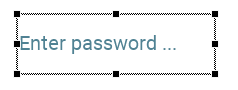
The placeholder can be implemented by adding a Text view that displays the hint text and controlling its visibility based on:
★The editor is not focused and the text content is empty → show placeholder
★The editor is focused OR the text content is not empty → hide placeholder
Following steps explain how to implement this feature:
Step 1. Add a new Text view to display the placeholder text
★Add a Text view to the Text Editor component.
★Name the view CueBannerText.
★Adjust the corners of the view so that it covers the same area as the main Text view.
★Reorder the view if necessary to ensure it appears behind the Caret and the original Text views but above any eventually added background views.
★Configure the Color property of the new text view according to your design expectations.
★Configure the Font property of the new text view to the same value as used in the regular text view. Originally this was Resources::FontMedium.
★Configure the Alignment property of the new text view to the same value as used in the regular text view. Originally this was Views::TextAlignment[AlignHorzLeft, AlignVertCenter].
★In the property Layout of the new text view enabled all options AlignToBottom, AlignToLeft, AlignToRight, AlignToTop, ResizeHorz, ResizeVert. In this manner the view will grow or shrink when the Text Editor component is resized at runtime.
Step 2. Ensure the cue banner text appears with font and alignment as the regular editor text view does
★In the method OnSetFont add following line of code:
CueBannerText.Font = value;
★In the method OnSetAlignment add following line of code:
CueBannerText.Alignment = value;
Step 3. Add a property to configure the cue banner text
★Add a new property named CueBanner with data type string and initial value "Text".
★Delete the automatically created OnGetCueBanner method - it is not needed in this application case.
★In the onset method OnSetCueBanner, implement:
// The value doesn't change - nothing to do. if ( pure CueBanner == value ) return; // Remember the new value pure CueBanner = value; // Update the placeholder text view CueBannerText.String = value;
Step 4. Control cue banner visibility in UpdateViewState
★In the UpdateViewState method add following code to show or hide the placeholder based on the focused state and text content
// Control placeholder visibility // Show placeholder only when: not focused AND text is empty CueBannerText.Visible = !aState.contains( Core::ViewState[ Focused ]) && ( Text.String.length <= 1 );
★In the OnSetString method add following code to force the execution of the method UpdateViewState and as consequence the update of the visibility of the placeholder text:
InvalidateViewState();
Usage example
Once implemented, you can configure the placeholder text for different editor instances:
// Configure text editors with different placeholder texts UsernameEditor.CueBanner = "Enter username..."; PasswordEditor.CueBanner = "Enter password..."; EmailEditor.CueBanner = "email@example.com"; SearchEditor.CueBanner = "Search...";
The placeholder text will automatically appear and disappear as the user interacts with the editor.
Control the length of the entered text
A common requirement for text input fields is to limit the maximum number of characters the user can enter. Following steps explain how to add a MaxLength property to implement this functionality:
Step 1. Add the property
★Add a new property to the Text Editor component.
★Name the new property MaxLength.
★Determine the data type as int32.
★Set the initialization value to 0 (meaning unlimited length by default).
★The property is accompanied by its onset method. Implement the onset method as shown below:
// The value doesn't change - nothing to do. if ( pure MaxLength == value ) return; // Remember the property's new value pure MaxLength = value; // If the current text exceeds the new limit, truncate it if (( value > 0 ) && ( String.length > value )) String = String.left( value );
Step 2. Enforce the limit in keyboard handlers
Now modify the keyboard input slot methods to check the length limit before inserting new characters:
★In the method OnSetString add following code at the beginning of the method:
// Truncate the assigned text if it is too long. if (( MaxLength > 0 ) && ( value.length >= MaxLength )) value = value.left( MaxLength );
★In the method onCharacterKey add following code at the beginning of the method:
// Check if adding this character would exceed MaxLength if (( MaxLength > 0 ) && ( String.length >= MaxLength )) return; // Don't insert the character [...]
★In the method onNewlineKey add following code at the beginning of the method:
// Check if adding this character would exceed MaxLength if (( MaxLength > 0 ) && ( String.length >= MaxLength )) return; // Don't insert the character [...]
Usage examples
Now when you use instances of the Text Editor component, you can configure the maximum length:
// Single-line username field with 20 character limit UsernameEditor.MaxLength = 20; UsernameEditor.WrapText = false; // Multi-line comment field with 500 character limit CommentEditor.MaxLength = 500; CommentEditor.WrapText = true; // Email field with no length limit EmailEditor.MaxLength = 0; // Unlimited
Limits input to specific characters (e.g., digits only for numeric input)
A common requirement for text input fields is to limit the input to specific characters, for example to digits for numeric inputs. This application case requires an adaptation of the method onCharacterKey. For example, to test whether the just entered character is a digit, following condition can be added at the beginning of the method. Entering a non digit character causes the method to exit ignoring the entered character:
// Ignore the entered character if it is not a digit. if ( !(( CharacterKeyHandler.CharCode >= '0' ) && ( CharacterKeyHandler.CharCode <= '9' ))) return;
Modify the entered characters
Another application case when using a Text Editor is an automatic correction or modification of the text just in the moment when the user enters it. For example, the text can be capitalized. This application case requires an adaptation of the method onCharacterKey to test and modify the entered characters. The following code snipped demonstrates the modification for the application case of automatically capitalized text:
var char ch = CharacterKeyHandler.CharCode; var string str = ch.upper; // Capitalize the entered character [...]
Adapt the Text Editor for password input
A common requirement for text editors is to display password input where the actual characters are masked with asterisks (*) or other symbols for security. The Text Editor template can be adapted to implement this functionality by intercepting the text display and replacing characters with mask symbols. Following steps explain how to implement password input:
★In the Text view modify the property String to the value "****\n". The view should display four asterisk signs instead of the the originally specified text "Text\n".
★The OnSetString method has to be reimplemented with the below demonstrated code. In the new version, the real text is stored in the property String itself and not in the Text view. The Text view limits to display as many asterisks as signs in the string assigned to the property String:
// Remember the real string in the memory associated to the property. pure String = value; // Ensure that the caret still refers to a sign within the string if ( caretIndex > value.length ) caretIndex = value.length; // Display as many '*' signs as characters in the assigned string. Text.String = string( '*', value.length ); // Ensure the caret is still visible later in the updateText slot method autoScroll = true; Text.ScrollOffset = <0,0>;
★Delete OnGetString method. It is not needed anymore.
★Delete NewlineKeyHandler and its associated slot method onNewlineKey. We assume, the password editor will not handle new-line characters.
★In the method onCursorKey delete following lines. They were used to handle Text view escaping of special characters. In the new version the Tetxview displays asterisks only, so no escaping is needed:
var char ch = Text.String[ newCaretIndex ]; // The caret points to a special control sign? In this case the sign comes // together with the preceding '%' escape sign - otherwise the user couldn't // see the sign. Adjust the caret position to refer the escape sign. if (( ch == '^' ) || ( ch == '~' ) || ( ch == '%' )) newCaretIndex = newCaretIndex - 1;
★In the method onPressTouch delete following lines. They were used to handle Text view escaping of special characters. In the new version the Tetxview displays asterisks only, so no escaping is needed:
var char ch = Text.String[ newCaretIndex ]; // The caret points to a special control sign? In this case the sign comes // together with the preceding '%' escape sign - otherwise the user couldn't // see the sign. Adjust the caret position to refer the escape sign. if (( ch == '^' ) || ( ch == '~' ) || ( ch == '%' )) newCaretIndex = newCaretIndex - 1;
★In the method onDragTouch delete following lines. They were used to handle Text view escaping of special characters. In the new version the Tetxview displays asterisks only, so no escaping is needed:
var char ch = Text.String[ newCaretIndex ]; // The caret points to a special control sign? In this case the sign comes // together with the preceding '%' escape sign - otherwise the user couldn't // see the sign. Adjust the caret position to refer the escape sign. if (( ch == '^' ) || ( ch == '~' ) || ( ch == '%' )) newCaretIndex = newCaretIndex - 1;
★The onCharacterKey method has to be reimplemented with the below demonstrated code. In the new version, the real text is stored in the property String itself and not in the Text view. The Text view limits to display as many asterisks as signs in the string assigned to the property String:
var char ch = CharacterKeyHandler.CharCode; // Take over the just input sign and adjust the caret position pure String = pure String.insert( ch, caretIndex ); caretIndex++; // After this operation the editor shows one '*' more. Text.String = string( '*', pure String.length ) + "\n"; // Ensure the caret is still visible later in the updateText slot method autoScroll = true; // Inform the owner of this text editor component, that the text has been // modified by the user postsignal OnChange;
★Similarly, replace the implementation of the onDeleteKey method with the below shown code:
// No signs following the caret -> Nothing to delete if ( caretIndex >= pure String.length ) return; // Remove the affected text fragment pure String = pure String.remove( caretIndex, 1 ); // After this operation the number of visible '*' is 1 less Text.String = string( '*', pure String.length ) + "\n"; // Ensure the caret is still visible later in the updateText slot method autoScroll = true; // Inform the owner of this text editor component, that the text has been // modified by the user postsignal OnChange;
★Similarly, replace the implementation of the onBackspaceKey method with the below shown code:
// No signs preceding the caret -> Nothing to delete if ( caretIndex == 0 ) return; // Remove the affected text portion and adjust the caret position pure String = pure String.remove( caretIndex - 1, 1 ); caretIndex--; // After this operation the number of visible '*' is 1 less Text.String = string( '*', pure String.length ) + "\n"; // Ensure the caret is still visible later in the updateText slot method autoScroll = true; // Inform the owner of this text editor component, that the text has been // modified by the user postsignal OnChange;
Limitations and considerations
★The magnifying glass feature will show the masked characters, not the real password. Probably, you will prefer to remove the magnifying glass feature from the password Text Editor. See the section Understand the magnifying glass feature above for more details how to do that.
★If you prefer a different mask character (e.g., bullet '•' Unicode \x2022), replace the '*' asterisks by '\x2022'. In such case please don't forget to include the respective character code to the font used by the Text Editor. See also Determine the set of font glyphs.
Use Text Editor with Virtual Keyboard
When the target device doesn't have a physical keyboard, text input can still be accomplished using a virtual keyboard displayed on the screen. The Text Editor component template works seamlessly with virtual keyboard components, such as the Alphanumeric Keyboard or Numeric Keyboard template. As soon as the virtual keyboard is visible on the screen, it automatically generates keyboard events that the Text Editor receives and processes - just as if the user were pressing keys on a physical keyboard.
Understanding the integration
The integration between the Text Editor and a virtual keyboard is based on the focus path mechanism. When a Text Editor has focus (lies on the focus path), it receives all keyboard events - whether they originate from a physical keyboard or are generated by a virtual keyboard component. This automatic event routing ensures that no special configuration is needed in the Text Editor itself. The component processes character input, cursor key navigation, backspace, and delete operations identically, regardless of the event source.
The virtual keyboard generates keyboard events by calling the DriveKeyboardHitting() method, which sends events to the root object (application component). These events are then automatically forwarded along the focus path to the currently focused component. If a Text Editor is focused, it receives the events through its keyboard handlers (CharacterKeyHandler, DeleteKeyHandler, BackspaceKeyHandler, etc.) and processes them normally.
Showing and hiding the virtual keyboard
The most common pattern for virtual keyboard integration is to show the keyboard when the Text Editor gains focus and hide it when focus is lost. This provides an intuitive user experience where the keyboard automatically appears when text input is needed and disappears when it's not required.
To implement this functionality, you need to:
★Create an instance of a virtual keyboard component in your Application
★Implement methods in the Application component to show and hide the keyboard
★Modify the Text Editor's UpdateViewState method to call these methods based on focus state changes
Step 1. Add a virtual keyboard to the Application
First, you need to add a virtual keyboard component to your Application component. For this example, we'll use the Alphanumeric Keyboard template:
★Create a new Alphanumeric Keyboard component from the template if you haven't already done so.
★Switch to the Composer page for your Application component.
★Add an instance of the Alphanumeric Keyboard to the Application component.
★Name the keyboard instance, for example Keyboard.
★Position the keyboard at the bottom of the screen where you want it to appear when shown.
★Configure the keyboard's Visible and Enabled properties to false by default (the keyboard should be hidden initially).
Step 2. Implement keyboard show/hide methods in Application
Now you need to add two methods to the Application component that take care of presenting and hiding the virtual keyboard. These methods will be called by the Text Editor when its focus state changes:
★Add a new method to the Application component.
★Name the method ShowKeyboard.
★In the Code Editor, implement the method to show the keyboard and assign it to the VirtualKeyboard property:
// This method is called by text editors when they need the virtual keyboard // Is the keyboard already visible? Nothing to do if ( VirtualKeyboard != null ) return; // Make the keyboard visible and enabled Keyboard.Visible = true; Keyboard.Enabled = true; // Assign the keyboard to the VirtualKeyboard property of the Application (root) // component. This is essential for proper keyboard event routing. VirtualKeyboard = Keyboard;
★Add another new method to the Application component.
★Name the method HideKeyboard.
★Implement the method to hide the keyboard:
// This method is called by text editors when they no longer need the virtual keyboard // Is the keyboard already hidden? Nothing to do if ( VirtualKeyboard == null ) return; // Clear the VirtualKeyboard property first VirtualKeyboard = null; // Hide and disable the keyboard Keyboard.Visible = false; Keyboard.Enabled = false;
Step 3. Modify the Text Editor's UpdateViewState method
Now you need to modify the Text Editor component to call these Application methods when its focus state changes. This is done in the UpdateViewState method:
★Open the Text Editor component for editing.
★Locate and open the UpdateViewState method.
★Modify the method implementation to detect focus state changes and invoke the keyboard show/hide methods:
// Always invoke the inherited version of the method super( aState ); // Determine whether the editor has focus var bool isFocused = aState.contains( Core::ViewState[ Focused ]); // Activate the caret blinking if the editor component has the input focus if ( isFocused ) { blinkEffect.Enabled = true; // Show the virtual keyboard when the editor gains focus var Application::Application app = (Application::Application)GetRoot(); if ( app != null ) app.ShowKeyboard(); } // ... otherwise hide the caret else { blinkEffect.Enabled = false; Caret.Visible = false; // Hide the virtual keyboard when the editor loses focus var Application::Application app = (Application::Application)GetRoot(); if ( app != null ) app.HideKeyboard(); }
The code uses (Application::Application)GetRoot() to access the Application component and cast it to the correct type. Replace Application::Application with the actual fully qualified name of your application class if it differs. The GetRoot() method returns the root object, which is your application component. The typecast ensures we can access the ShowKeyboard and HideKeyboard methods.
Multiple text editors with one keyboard
If your application contains multiple Text Editor instances, the same virtual keyboard can serve all of them. The focus path mechanism automatically ensures that keyboard events are delivered to whichever editor currently has focus:
★When the user touches the first text editor, it gains focus and shows the keyboard
★When the user then touches a second text editor, focus moves to the second editor automatically
★The keyboard remains visible and now sends events to the second editor
★Only when focus leaves all text editors (e.g., when the user presses a button) does the keyboard hide
To implement this behavior, each Text Editor calls ShowKeyboard when it gains focus and HideKeyboard when it loses focus. The ShowKeyboard method checks if the keyboard is already visible and does nothing if so, avoiding unnecessary animations or state changes.
Customizing keyboard layout per editor
Different text editors in your application might require different keyboard layouts. For example, a numeric input field needs only digits, while a general text field needs the full alphanumeric keyboard. To implement this you can enhance the ShowKeyboard method to accept a parameter indicating which layout to use. In the method evaluate the parameter and ensure the desired virtual keyboard is visible and enabled. Other keyboards remain hidden.