Creating components from templates: Value Display
With this template you can add a new Value Display component to your project. Value Display is a kind of virtual instrument to show e.g. measured values. As such this widget is not suitable to be controlled by the user interactively.
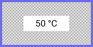
Components created with this template are intended to be adapted to your particular design expectations. After adding the new Value Display you should edit the component, change its appearance and if desired also its behavior. Once you have adapted the component, you can embed instances of this Value Display wherever you need in your GUI project. Because it serves as template, it is intentionally kept very simple. Nevertheless, Value Displays created by the template are working widgets. If desired, they can already be used as they are. The following figure demonstrates the default appearance of the Value Display created by using the here described component template:
The approach with component templates has two functions. Primarily the templates should simplify the development of new components. Instead of creating the Value Display from scratch you can use the available template. The second function is more educative. The template implements fully working Value Display component you can investigate and learn about the corresponding programming aspects. The template is well documented. It contains annotations and inline comments with instructions helping you to understand how the component works and how it can be adapted to your particular needs.
This chapter provides an overview how the Value Display component template is used within your own application and how you adapt this component according to your particular needs. You will find here also further details concerning the internal implementation of the Value Display component.
Component templates versus ready-to-use widgets
Besides the here described Value Display component template, Embedded Wizard provides also a ready to use Value Display widget. It is finished implemented and ready to be used as it is. Within a certain limits, the appearance and partially also the behavior of the Value Display widget can be configured. The advantage of the approach is, that to customize it you don't need to write a single line of code. The flexibility of the provided widget, however, is limited by its implementation.
With the component template you are not limited. But you have to take care of the adaptation of the so created component. You have to write code. More deep understanding is required. Summarized, the ready to use widgets follow a convenient, simple but also limited approach where you don't need to write a single line of code. With the here described component templates you have to write code by which you are flexible to create very individual and sophisticated widgets. Which of the both approaches applies to you does depend on your application case. By understanding the differences in the both concepts you can select the optimal one.
Add new Value Display component
To create a new Value Display component from a template you simply Drag & Drop it between the Templates window and the Composer with an opened unit. This is important in that by using the component templates you add in fact a new class to your project. Classes, in turn, can exist within units only. The following are the typical steps to create a new Value Display component from a template:
★First switch to the Composer page for the respective unit, where you want to add the new Value Display component.
★Then ensure that the Templates window is visible.
★In Templates window switch to the folder Component Templates.
★In the folder locate the Value Display template.
★Drag & Drop the template into the Composer window:
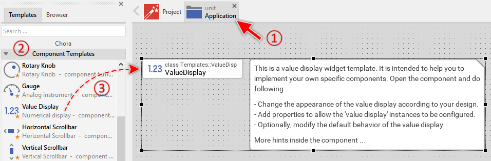
★Eventually name the new added component.
The new created Value Display component appears accompanied by annotation providing helpful tips how to proceed. If undesired, you can select and delete the annotation.
Use the Value Display component
Once you have created the Value Display component, you can use it to assemble more complex components. Technically seen, you embed an instance of the Value Display class in-place within some superior GUI component. At the runtime, the superior GUI component takes care of the correct initialization and the displaying of all embedded components, so they appear similarly as you have composed them at the design time.
Step 1. Add new Value Display instance
The following are the typical steps to create a new instance of an already existing Value Display component:
★First switch to the Composer page for the respective GUI component, where you want to add the new Value Display.
★Then ensure that the Browser window is visible.
★Within the Browser locate the class of the previously created Value Display. This can be done easily with Browser's own filter function.
★Select the found class in the Browser window.
★Drag & Drop the selected class into the Composer area.
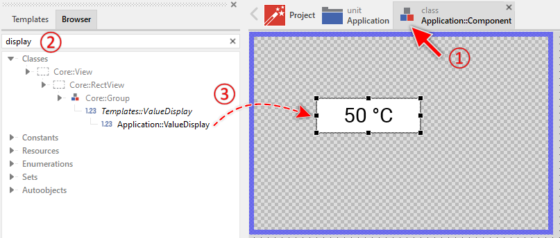
★Eventually name the new instance according to its function within the GUI component (e.g. VoltageView).
Component templates are intended to create widgets which can be modified and adapted to your particular design expectations. In the following sections you will learn how to do this. Originally, if not yet modified, the Value Display appears as a white rectangle with black text displaying the value. Our intention is to keep the component templates as minimalistic as possible so they don't distract you with less important design details.
Step 2. Inspect the Value Display instance
As long as the Value Display is selected you can inspect and modify its properties conveniently in the Inspector window as demonstrated with the property Bounds in the screenshot below. This is in so far worth mentioning as diverse features of the Value Display are controlled by the corresponding properties. If you are not familiar with the concept of a property and the usage of Inspector window, please read first the preceding chapter Compositing component appearance.
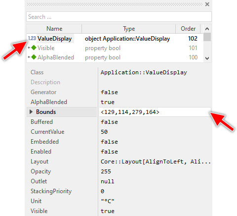
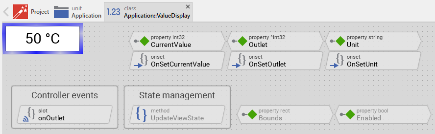
The Value Display component descends from the Mosaic class Core::Group. Consequently, most of the properties listed in the above screenshot are inherited from this base class. Particular to the Value Display are only few following properties:
Property |
Description |
|---|---|
CurrentValue |
The property CurrentValue stores the momentary value of the component. |
Outlet |
The property Outlet can refer to any other int32 property the value display component should remain synchronized with. When the referred property is modified by another widget, the value display is automatically notified to remain in sync with the property. This approach follows the Model-View-Controller (MVC) programming paradigm. Here the value display component represents the view and the property referred via Outlet can be seen as a part of the model. See also Outlet properties. |
Unit |
The property Unit stores an optional string to append to the displayed value. |
Step 3. Arrange the Value Display within the superior component
Once added to the component, you can freely move the Value Display instance, or you simply grab one of its corners and resize it in this way. You can control the position and the size of the component also by directly modifying its property Bounds. If you want the Value Display to appear behind other views you can reorder it explicitly.
Step 4. Determine the Value Display's current value
The Value Display is intended to display an integer value as formatted text. The displayed value corresponds to the component's property CurrentValue. By evaluating this property you can simply query the value which is actually displayed in the affected widget. Accordingly, when you modify the property CurrentValue, the affected Value Display will implicitly update its text. For example:
// Evaluate the current value of the widget. if ( ValueDisplay.CurrentValue > 80 ) ... [...] // Change the value of the widget. ValueDisplay.CurrentValue = 50;
In addition to the numeric value, the Value Display can show a unit string (e.g. "°C", "V", "km/h") through the property Unit. This unit text is appended to the displayed value automatically:
// Set the unit to be displayed after the value ValueDisplay.Unit = "°C"; ValueDisplay.CurrentValue = 23; // Will display "23 °C"
Step 5. Connect the Value Display with a data provider
To simplify the development of GUI applications, the Value Display implements a technique permitting you to connect it directly to a data provider. Once connected, the widget will remain in sync with the value stored actually in this provider. This technique corresponds to the model-view-controller (MVC) programming paradigm, where the Value Display has the function of the view and the associated data provider serves as model. If you associate in your application several value displays and other widgets to one and the same data provider value, the underlying mechanisms will ensure, that after interacting with one widget all other affected Value Displays do update their state automatically.
The connection between the Value Display and the data provider is established by assigning to the component's property Outlet a reference to a property existing within the data provider and storing the interesting value. Since Value Display is intended to deal with integer values, the property suitable to be connected via reference to the Value Display has to be declared with int32 as its data type. Accordingly, the value of the referenced property corresponds to the Value Display's current value.
Summarized, after assigning a reference to an existing int32 property to the Value Display's own property Outlet, the widget adapts its own state to automatically correspond to the actual value of the associated property. You don't need to write a single line of code to benefit from this mechanisms. The aspects underlying this technique are explained in the sections Outlet properties and Notifications and Observer.
Open the component for editing
Component templates are intended to create widgets which can be adapted and enhanced to your particular design expectations. For this purpose, once you have added a new Value Display component to your project, you can open the component class for editing. Thereupon the implementation of the component appears in a new Composer page:
Originally, if not yet modified, the Value Display appears composed of a white rectangle background and a black text view displaying the current value together with the unit string. Our intention is to keep the component templates as minimalistic as possible so they don't distract you with less important design details. The text shown in the component corresponds to widget's CurrentValue and Unit properties.
This default functionality is implemented by following members belonging to the Value Display. These members are explicitly intended to be modified. Understanding this internal structure is thus the first step before you start to adapt the Value Display to your particular needs:
Icon |
Member |
Description |
|---|---|---|
|
CurrentValue |
The property CurrentValue stores the momentary value of the component. This value is displayed as text. |
|
Unit |
The property Unit stores an optional string to append to the displayed value (e.g. "°C", "V", "km/h"). |
|
OnSetCurrentValue |
The onset method belongs to the property CurrentValue. Each time the value of the property is changed, the code implemented in the method is executed to update the displayed text. |
|
OnSetUnit |
The onset method belongs to the property Unit. Each time the unit string is changed, the code implemented in the method is executed to update the displayed text. |
|
Outlet |
The property Outlet can refer to any other int32 property the component should remain synchronized with. When the referred property is modified by other widget or the application logic, the Value Display is automatically notified to remain in sync with the property. This approach follows the model-view-controller (MVC) programming paradigm, where the Value Display has the function of the view and the property referred via Outlet serves as model. See also Outlet properties. |
|
OnSetOutlet |
The onset method belongs to the property Outlet. Each time a new property reference is assigned to Outlet, the code implemented in the method is executed to register the Value Display as observer for the referred property. |
|
onOutlet |
This internal slot method will receive a signal, if the value of the property referred by Outlet has been changed by another widget or by the application logic. In response to this notification, the Value Display will update its own CurrentValue property to reflect the new value of the referred property. |
|
Background |
This Filled Rectangle view displays in the template the background of the Value Display. The background is white per default. |
|
Text |
This Text view represents the displayed value with unit string. The text content is formatted from the property CurrentValue and Unit. |
|
UpdateViewState |
This method is invoked automatically after the state of the component has been changed. In case of the Value Display, the method updates the view Text so it reflects the component's current value and unit. |


Understand the state management of the component
During its lifetime, the Value Display will assume different states depending on the displayed value. To track its current state the Value Display implements the method UpdateViewState. The following code snippet demonstrates the corresponding operations:
Text.String = string( CurrentValue ) + " " + Unit;
In case of the Value Display, the method UpdateViewState formats the current value as a string and appends the unit text. This formatted string is then assigned to the Text view for display. The default implementation uses the simple integer-to-string conversion.
You can modify this default implementation and, for example, format the value with different precision or add leading zeros. Let's assume you want to always display the value with at least 3 digits and leading zeros. In such case, you would need to make following modifications in the Value Display component:
★In the method UpdateViewState change the string formatting according to the desired format:
Text.String = string( CurrentValue, 3 ) + " " + Unit;
If desired, you are free to add further formatting logic to your Value Display. For example, the component could display different text colors depending on the value range. Let's assume, the Value Display should change its text color to red if CurrentValue exceeds a predetermined threshold value (e.g. 90). If your application case requires the Value Display to distinguish this additional state, you do following:
★In the UpdateViewState method adapt the implementation as follows:
// Format the value Text.String = string( CurrentValue ) + " " + Unit; // Change color to red if value exceeds threshold if ( CurrentValue >= 90 ) Text.Color = #FF0000FF; // Red else Text.Color = #000000FF; // Black
This mechanism allows you to implement any custom logic for how the value is displayed and styled based on the component's state.
Adapt the appearance of the component
Originally, if not yet modified, the Value Display appears composed of a white rectangle background and a black text view. Our intention is to keep the component templates as minimalistic as possible so they don't distract you with less important design details. It's up to you to adapt the widget to have the expected appearance. The available possibilities are explained in the following sections. Please note, that you can combine the different approaches according to your application case:
1. Modify existing views
The Value Display template contains per default the views Background and Text. If desired, you can modify the views. For example, you can change the text color, font, or alignment. You can also adjust these properties depending on the actual state of the component. For this purpose you change the implementation of the above explained method UpdateViewState responsible for tracking the state alternations within the Value Display.
When you open the method UpdateViewState you will see that it formats the value and unit as a string. You can enhance this implementation and, for example, colorize the text depending on its actual value. The text could then change between green and red colors if the value exceeds a certain threshold. For this purpose you add following code to the method UpdateViewState:
// Format the displayed text Text.String = string( CurrentValue ) + " " + Unit; // Colorize the text according to its actual value. If the value // exceeds 50, the text appears red. if ( CurrentValue > 50 ) Text.Color = #FF0000FF; // <-- red color else Text.Color = #00FF00FF; // <-- green color
You can also directly modify the properties of the Text view in Inspector window. For example, you can:
★Select the Text view in Composer.
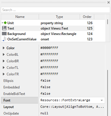
★In Inspector window, modify the property Font to use a different font resource (e.g., Resources::FontExtraLarge for larger text).
★Change the property Alignment to adjust text positioning (e.g., Views::TextAlignment[ AlignHorzCenter, AlignVertCenter ] for centered text).
★Modify the property Color to change the default text color.
2. Remove existing views
If not needed, you can delete the per default existing views Background and Text. Doing this, please don't forget to also remove all references to the deleted views from the implementation of the UpdateViewState method. Otherwise you will get error messages next time the Composer contents is reloaded. To avoid this error message we recommend to perform the steps in following order:
★In the UpdateViewState method verify the implementation to not refer anymore to the undesired view.
★Now you can delete the affected view.
3. Add further views to the component
You can add further views to your Value Display. For example, you can add an Image view to display an icon representing the measured quantity (voltage icon, temperature icon, etc.). Or you can add another Text view to display a label or caption. The appearance of the views (e.g. colors) can be fixed, predetermined at the design time. Or it can change according to the actual state of the component. Following steps explain the workflow:
★First add the desired view to the component. For example add an Image view.
★Name the just added view according to its function in the component. For example Icon.
★In order to arrange the view within the Value Display, move the view, or you simply grab one of its corners and resize it in this way. If you want the view to appear behind other views you can reorder it explicitly.
★In Inspector window configure the properties of the just added view. For example, in case of the Image view you can select the bitmap to display.
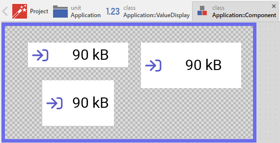
The following figure demonstrates a Value Display component enhanced with an icon view:
★Optionally, you can update the properties of the view in the UpdateViewState method according to the component's current state. For example, you could change which icon is displayed depending on the value range:
// Format the displayed text Text.String = string( CurrentValue ) + " " + Unit; // Change icon depending on value range if ( CurrentValue < 30 ) Icon.Bitmap = Application::LowValueIcon; else if ( CurrentValue < 70 ) Icon.Bitmap = Application::MediumValueIcon; else Icon.Bitmap = Application::HighValueIcon;
4. Replace existing views
Also possible, you can replace the existing views by other views. For example, in the original version, the Value Display displays the value using an ordinary Text view. To make the component more sophisticated, you could replace it by e.g. Attributed Text view which supports HTML-like formatted text. For this purpose:
★Think about which view is adequate as replacement for the old view existing per default in the component. An overview of existing views is found in the section Using Views.
★Delete the old view.
★Add the desired view to the component.
★Name the just added view to have the name of the previously removed view.
★Eventually move the view, or you simply grab one of its corners and resize it in this way. If you want the view to appear behind other views you can reorder it explicitly.
★If necessary, in Inspector window configure the properties of the just added view.
★If necessary, modify the implementation of other methods existing in the component if these evaluate/modify the properties of the replaced view.
Configure the layout of the component
The initial size of the Value Display is determined by the thick blue border surrounding the Canvas area. It corresponds to the size that all instances of this component will have by default. If desired, you can adjust the Canvas area and change this default size accordingly. This could be for example the case when you plan to create a large Value Display. For this purpose you click and drag the edges of the surrounding border (see also Resize the Canvas area). Once the size is changed, you can then adapt (move, resize) the views existing within the component. For example, to make the component wider you adjust its right edge:
The resulting size of the Value Display, however, is not necessarily fixed. It can be adjusted for each component instance individually when the instance is arranged within a superior GUI component or it can change dynamically at the runtime. The GUI application can thus contain multiple instances of the Value Display, each with another size. From this arises the question, how the Value Display will react to its size alternation?
In case of the views existing per default in the Value Display template (e.g. Background and Text), the views are automatically adjusted to fill the area of the component. All other views you have eventually added later to the component are not adjusted automatically.
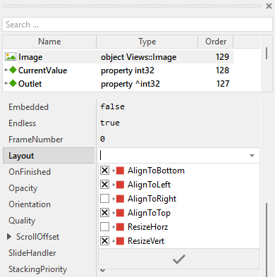
To control the adjustment you have to explicitly configure for each view its Layout property. (see also Configure component layout). Let's assume, in order to display an icon you have added an Image view to the component. Then you have arranged the view on the left side of the Canvas area. If you want now that the view remains aligned to the left edge when the component is resized and filling the entire hight, you enable in the property Layout of this view following settings:
Now the Value Display knows how to react to its size changes. Each component instance can have individual size and the enclosed views are automatically arranged within the available area:
Implement the interface of the component
When creating your own Value Display component you should ensure that instances of the component can be configured to control all the features implemented in it. For example, if you have enhanced the component to display an icon, you should allow this icon bitmap to be specified individually for each instance. In this way several Value Display instances can exist at the same time, each displaying another icon.
To control the features in your component you use properties. A property can be understood as variable where the corresponding setting is stored, e.g. the icon bitmap to display in the Value Display. When the value of the property changes, the component can react to it and update its appearance accordingly. The properties reflect thus the settings within your component. Together they form the interface of the component.
Usually, each particular setting within a component is represented by the corresponding property. Thus, a Value Display where icon and label can be configured will require two properties: one for the icon bitmap and one for the label text. In its original version, the Value Display contains already three properties CurrentValue, Unit and Outlet. It allows the component instance to configure its actual state (the value and the unit string) or to exchange data with the component. In order to enhance this interface by your own properties, following steps are necessary:
★Add a new property to the Value Display component.
★Name the property according to the setting it should represent. For example, the property intended to store the icon bitmap could be named Icon.
★Determine the data type of the property. For example, the property intended to store the icon bitmap will have the type Resources::Bitmap.
★Determine the initialization value of the property. This value should correspond to the component's default state. For example, the property intended to store the icon could be initialized with null if no icon should be shown by default.
★The property is accompanied by its onget method. Except particular cases, this method is not needed and can be deleted now.
★The property is accompanied by its onset method. Open this method for editing.
★Adapt the implementation of the onset method so it updates the Value Display according to its new value. For example, in case of the property intended to store the icon bitmap, you will probably update some Image view where the icon is displayed:
// The value doesn't change - nothing to do. if ( pure Icon == value ) return; // Remember the property's new value. pure Icon = value; // Update the view to display the just modified icon. IconView.Bitmap = value;
That is all. Now when you deal with instances of the Value Display component, you can evaluate and modify the properties similarly to how you access variables. Especially, when an instance is selected, you see in Inspector window the property and can change it there. The modification is immediately visible in the Composer window.
If desired, the properties can also be modified at the runtime of your application. For example, you could change the displayed icon or unit depending on what is being measured. For this purpose you access and modify the affected property directly within Chora code:
// Change what is being displayed based on current measurement mode if ( measurementMode == MeasurementMode.Temperature ) { ValueDisplay.Icon = Application::TemperatureIcon; ValueDisplay.Unit = "°C"; } else if ( measurementMode == MeasurementMode.Voltage ) { ValueDisplay.Icon = Application::VoltageIcon; ValueDisplay.Unit = "V"; }
Understand the Outlet updates
The Value Display can be connected via its property Outlet with any other int32 property the component should remain synchronized with. When the referred property is modified by other widgets or by the application logic, the component is automatically notified to remain in sync with the property. This approach follows the model-view-controller (MVC) programming paradigm, where the Value Display has the function of the view and the property referred via Outlet serves as model. See also Outlet properties.
In order to react to alternations of the referred property (to receive notifications broadcasted by other widgets connected with the same property), the Value Display implements the method onOutlet. Each time the referred property is notified, this slot method is automatically invoked and following code is executed:
// Read the current value of the associated property and update accordingly // the state of the component. if ( Outlet != null ) CurrentValue = Outlet^;
In order to be invoked, the method onOutlet needs to be registered with the referred property as so-called observer. The corresponding code is implemented in the onset method OnSetOutlet. Thus, just in the moment when a property reference is assigned to the component's Outlet property, following code is executed:
// Check if the new outlet differs from the currently used outlet if ( pure Outlet == value ) return; // Detach from the previous outlet if ( pure Outlet != null ) detachobserver onOutlet, pure Outlet; // Store the new outlet ... pure Outlet = value; // ... and attach to the new one if ( value != null ) attachobserver onOutlet, value; // Finally, retrieve the current state of the property associated via 'Outlet'. if ( value != null ) postsignal onOutlet;
Adapt the component for different data types
In the default implementation, the Value Display works with int32 values. However, you might need to display other types of values, such as floating-point numbers for precise measurements. The template can be easily adapted to work with different data types:
Display floating-point values
To modify the Value Display to work with float values instead of integers, following steps are necessary:
★Select the property Outlet and change its data type from ^int32 to ^float.
★Open the method UpdateViewState and adapt the string formatting to include decimal precision:
// Format float value with 2 decimal places Text.String = string( CurrentValue, 0, 2 ) + " " + Unit;
★If necessary, adjust the default value of CurrentValue property to be a floating-point literal (e.g., 50.0 instead of 50).
Now the Value Display can show precise floating-point values like "23.45 °C" or "3.14 V".
Display boolean states
For simple on/off or true/false indications, you can adapt the Value Display to work with boolean values:
★Change the data type of CurrentValue property to bool.
★Change the data type of Outlet property to ^bool.
★Modify the UpdateViewState method to display appropriate text for boolean states:
// Display "ON" or "OFF" depending on boolean value if ( CurrentValue ) Text.String = "ON" + " " + Unit; else Text.String = "OFF" + " " + Unit;
This approach allows you to create status indicators that show textual representations of boolean states.
Format the displayed value
The Value Display provides various possibilities to format how the numeric value is displayed. The formatting is controlled in the UpdateViewState method. Here are some common formatting techniques:
Leading zeros
To display values with a minimum number of digits, use the second parameter of the string() constructor:
// Display value with at least 3 digits, padded with leading zeros Text.String = string( CurrentValue, 3 ) + " " + Unit; // Examples: "001 °C", "050 °C", "123 °C"
Hexadecimal representation
For technical applications, you might want to display values in hexadecimal format:
// Display value in hexadecimal with base 16, using 4 digits Text.String = "0x" + string( CurrentValue, 4, 16 ) + " " + Unit; // Examples: "0x001F", "0x00FF", "0x1234"
Floating-point precision
When working with float values, control the number of decimal places:
// Display float with 1 decimal place Text.String = string( CurrentValue, 0, 1 ) + " " + Unit; // Examples: "23.5 °C", "100.0 V" // Display float with 3 decimal places Text.String = string( CurrentValue, 0, 3 ) + " " + Unit; // Examples: "23.456 °C", "3.142 V"
Conditional formatting
You can also apply different formatting based on the value range:
// Use different precision based on value magnitude if ( CurrentValue < 10.0 ) Text.String = string( CurrentValue, 0, 3 ) + " " + Unit; // High precision for small values else Text.String = string( CurrentValue, 0, 1 ) + " " + Unit; // Lower precision for large values
Custom text prefixes and suffixes
Besides the unit string, you can add additional formatting:
// Add descriptive text if ( CurrentValue < 0 ) Text.String = "Below zero: " + string( CurrentValue ) + " " + Unit; else Text.String = "Value: " + string( CurrentValue ) + " " + Unit;