Creating components from templates: Vertical Scrollbar
With this template you can add a new Vertical Scrollbar component to your project. Vertical Scrollbar is a widget intended to show the current position within a large document (e.g. within a long list with thousand of items). In its original version, the Scrollbar component template is not intended to react to user inputs. However, if such behavior is expected, you can enhance the component accordingly
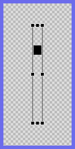
Components created with this template are intended to be adapted to your particular design expectations. After adding the new Vertical Scrollbar you should edit the component, change its appearance and if desired also its behavior. Once you have adapted the component, you can embed instances of this Vertical Scrollbar wherever you need in your GUI project. Because it serves as template, it is intentionally kept very simple. Nevertheless, Vertical Scrollbars created by the template are working widgets. If desired, they can already be used as they are. The following figure demonstrates the default appearance of the Vertical Scrollbar created by using the here described component template:
The approach with component templates has two functions. Primarily the templates should simplify the development of new components. Instead of creating the Vertical Scrollbar from scratch you can use the available template. The second function is more educative. The template implements fully working Vertical Scrollbar component you can investigate and learn about the corresponding programming aspects. The template is well documented. It contains annotations and inline comments with instructions helping you to understand how the component works and how it can be adapted to your particular needs.
This chapter provides an overview how the Vertical Scrollbar component template is used within your own application and how you adapt this component according to your particular needs. You will find here also further details concerning the internal implementation of the Vertical Scrollbar component.
Component templates versus ready-to-use widgets
Besides the here described Vertical Scrollbar component template, Embedded Wizard provides also a ready to use Vertical Scrollbar widget. It is finished implemented and ready to be used as it is. Within a certain limits, the appearance and partially also the behavior of the Vertical Scrollbar widget can be configured. The advantage of the approach is, that to customize it you don't need to write a single line of code. The flexibility of the provided widget, however, is limited by its implementation.
With the component template you are not limited. But you have to take care of the adaptation of the so created component. You have to write code. More deep understanding is required. Summarized, the ready to use widgets follow a convenient, simple but also limited approach where you don't need to write a single line of code. With the here described component templates you have to write code by which you are flexible to create very individual and sophisticated widgets. Which of the both approaches applies to you does depend on your application case. By understanding the differences in the both concepts you can select the optimal one.
Add new Vertical Scrollbar component
To create a new Vertical Scrollbar component from a template you simply Drag & Drop it between the Templates window and the Composer with an opened unit. This is important in that by using the component templates you add in fact a new class to your project. Classes, in turn, can exist within units only. The following are the typical steps to create a new Vertical Scrollbar component from a template:
★First switch to the Composer page for the respective unit, where you want to add the new Vertical Scrollbar component.
★Then ensure that the Templates window is visible.
★In Templates window switch to the folder Component Templates.
★In the folder locate the Vertical Scrollbar template.
★Drag & Drop the template into the Composer window:
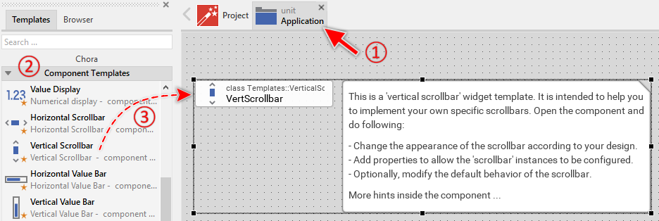
★Eventually name the new added component.
The new created Vertical Scrollbar component appears accompanied by annotation providing helpful tips how to proceed. If undesired, you can select and delete the annotation.
Use the Vertical Scrollbar component
Once you have created the Vertical Scrollbar component, you can use it to assemble more complex components. Technically seen, you embed an instance of the Vertical Scrollbar class in-place within some superior GUI component. At the runtime, the superior GUI component takes care of the correct initialization and the displaying of all embedded components, so they appear similarly as you have composed them at the design time.
Step 1. Add new Vertical Scrollbar instance
The following are the typical steps to create a new instance of an already existing Vertical Scrollbar component:
★First switch to the Composer page for the respective GUI component, where you want to add the new Vertical Scrollbar.
★Then ensure that the Browser window is visible.
★Within the Browser locate the class of the previously created Vertical Scrollbar. This can be done easily with Browser's own filter function.
★Select the found class in the Browser window.
★Drag & Drop the selected class into the Composer area.
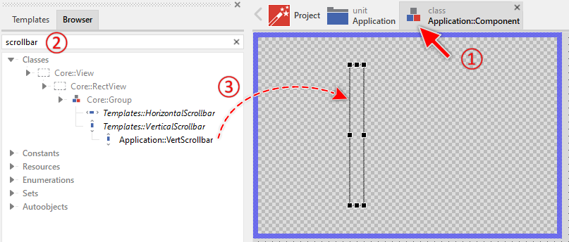
★Eventually name the new instance according to its function within the GUI component.
Component templates are intended to create widgets which can be modified and adapted to your particular design expectations. In the following sections you will learn how to do this. Originally, if not yet modified, the Vertical Scrollbar will visualize the scroll position by displaying a black rectangle. Our intention is to keep the component templates as minimalistic as possible so they don't distract you with less important design details.
Furthermore, please note, the just added scrollbar is not yet configured with the scroll range and position. Therefore it appears empty.
Step 2. Inspect the Vertical Scrollbar instance
As long as the Vertical Scrollbar is selected you can inspect and modify its properties conveniently in the Inspector window as demonstrated with the property Bounds in the screenshot below. This is in so far worth mentioning as diverse features of the Vertical Scrollbar are controlled by the corresponding properties. If you are not familiar with the concept of a property and the usage of Inspector window, please read first the preceding chapter Compositing component appearance.
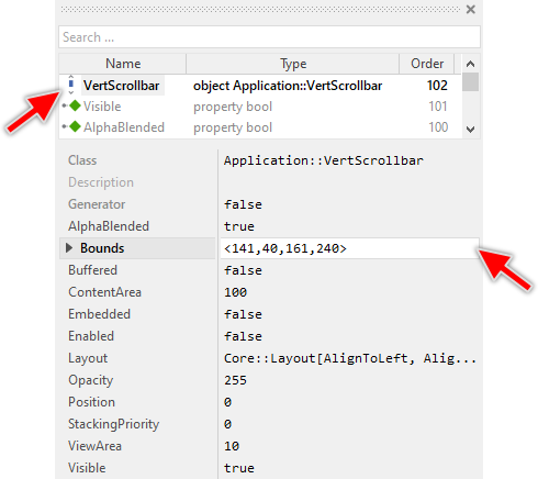
The Vertical Scrollbar component descends from the Mosaic class Core::Group. Consequently, most of the properties listed in the above screenshot are inherited from this base class. Particular to the Vertical Scrollbar are only few following properties:
Property |
Description |
|---|---|
ContentArea |
The property ContentArea determines the size of the entire content to scroll. This usually corresponds to the size of the document (image, text, etc.) you want to present to the user. Generally the value ContentArea >= ViewArea. |
Position |
The property Position determines the current scroll position within the entire content. Generally the value lies in the range 0 .. ( ContentArea - ViewArea ). |
ViewArea |
The property ViewArea determines the size of the visible portion of the entire content. This usually corresponds to the size of the viewport where the user can see the document (the image, text, etc.). Generally the value ViewArea <= ContentArea. |
Step 3. Arrange the Vertical Scrollbar within the superior component
Once added to the component, you can freely move the Vertical Scrollbar instance, or you simply grab one of its corners and resize it in this way. You can control the position and the size of the component also by directly modifying its property Bounds. If you want the Vertical Scrollbar to appear behind other views you can reorder it explicitly.
Step 4. Determine the scrollbar's content and view area
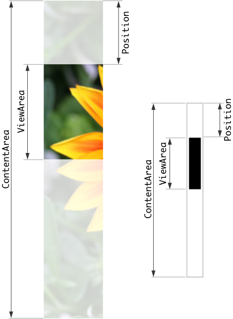
The Vertical Scrollbar is intended to visualize the current scroll position within a larger document or content area. It displays a movable thumb whose position and size reflect what portion of the content is currently visible. The scrollbar operates based on three key properties: ContentArea, ViewArea, and Position.
The property ContentArea specifies the total size of the content (document, list, image, etc.) in pixels. The property ViewArea specifies how much of this content is currently visible to the user. The proportion between ViewArea and ContentArea determines the size of the scrollbar's thumb - a smaller visible portion results in a smaller thumb. For example:
// Configure scrollbar for a long list with 1000 items Scrollbar.ContentArea = 1000 * 50; // 1000 items, each 50 pixels high Scrollbar.ViewArea = 500; // viewport shows 500 pixels at once [...] // Update scrollbar when user scrolls Scrollbar.Position = currentScrollOffset;
The property Position determines the current scroll offset and ranges from 0 (at the beginning of the content) to ContentArea - ViewArea (at the end). The following figure demonstrates the relations between the three properties:
Open the component for editing
Component templates are intended to create widgets which can be adapted and enhanced to your particular design expectations. For this purpose, once you have added a new Vertical Scrollbar component to your project, you can open the component class for editing. Thereupon the implementation of the component appears in a new Composer page:
Originally, if not yet modified, the Vertical Scrollbar appears composed of a single black rectangle representing the thumb. Our intention is to keep the component templates as minimalistic as possible so they don't distract you with less important design details. The Vertical Scrollbar automatically shows and hides itself. When the properties ContentArea, ViewArea or Position are changed, the scrollbar appears briefly and then disappears automatically after a short delay.
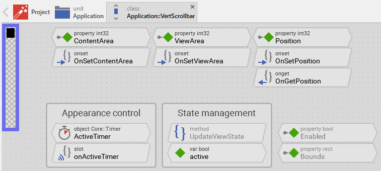
This default functionality is implemented by following members belonging to the Vertical Scrollbar. These members are explicitly intended to be modified. Understanding this internal structure is thus the first step before you start to adapt the Vertical Scrollbar to your particular needs:
Icon |
Member |
Description |
|---|---|---|
|
ContentArea |
The property ContentArea determines the size of the entire content to scroll. This usually corresponds to the size of the document (image, text, etc.) you want to present to the user. Generally the value ContentArea >= ViewArea. |
|
ViewArea |
The property ViewArea determines the size of the visible portion of the entire content. This usually corresponds to the size of the viewport where the user can see the document. Generally the value ViewArea <= ContentArea. |
|
Position |
The property Position determines the current scroll position within the entire content. Generally the value lies in the range 0 .. ( ContentArea - ViewArea ). |
|
OnSetContentArea |
The onset method belongs to the property ContentArea. Each time the value of the property is changed, the code implemented in the method is executed to restart the auto-hide timer and update the scrollbar's appearance. |
|
OnSetViewArea |
The onset method belongs to the property ViewArea. Each time the value of the property is changed, the code implemented in the method is executed to restart the auto-hide timer and update the scrollbar's appearance. |
|
OnSetPosition |
The onset method belongs to the property Position. Each time the value of the property is changed, the code implemented in the method is executed to restart the auto-hide timer and update the thumb's position. |
|
OnGetPosition |
The onget method belongs to the property Position. Each time the value of the property is evaluated within an expression, the code implemented in the method is executed to ensure that the returned value lies within the valid range 0 .. ( ContentArea - ViewArea ). |
|
ActiveTimer |
This timer object controls the auto-hide behavior of the scrollbar. When the timer expires (default 500ms), the slot method onActiveTimer is called and the scrollbar disappears. |
|
onActiveTimer |
This internal slot method is called when the ActiveTimer expires. It requests an update of the scrollbar's appearance to hide the scrollbar again. |
|
Thumb |
This Filled Rectangle view represents the scrollbar's thumb. Its position and size are calculated automatically based on the properties ContentArea, ViewArea and Position. The thumb is black per default. |
|
UpdateViewState |
This method is invoked automatically after the state of the component has been changed. In case of the Vertical Scrollbar, the method calculates and updates the position and size of the thumb based on the scroll properties. |
|
active |
This variable stores the current state of the scrollbar. It is true if the scrollbar is currently visible (because the user is actively scrolling or has scrolled recently). |


Understand the state management of the component
During its lifetime, the Vertical Scrollbar will assume different states. Unlike interactive widgets, the scrollbar has only one primary state to track: whether it is currently active (visible) or inactive (hidden). To track this state the Vertical Scrollbar manages the above mentioned state variable: active. This variable is evaluated and updated within the implementation of the method UpdateViewState.
The scrollbar becomes active when its properties ContentArea, ViewArea or Position are modified, indicating that the user is scrolling content. The ActiveTimer is then restarted to keep the scrollbar visible for a brief period. When the timer expires, the scrollbar becomes inactive and hides itself:
// Estimate the new state var bool isActive = ActiveTimer.Enabled; [...] // Update visibility based on state Thumb.Visible = isActive; // Remember the new state active = isActive;
The method UpdateViewState is invoked automatically when properties change or when the timer expires. You don't need to worry about triggering it. However, if you modify the scrollbar to add custom animations or effects, you may need to explicitly request an invocation of UpdateViewState using the method InvalidateViewState.
Depending on your design expectations the default state management may require adaptations. For example, if you want the scrollbar to always remain visible (without auto-hiding), you can simply remove the ActiveTimer member and its associated slot method onActiveTimer. In such case, you should also modify the UpdateViewState method to always show the thumb:
// Always show the thumb (without auto-hide functionality) Thumb.Visible = ContentArea > ViewArea;
Adapt the appearance of the component
Originally, if not yet modified, the Vertical Scrollbar appears as a simple black rectangle representing the thumb. Our intention is to keep the component templates as minimalistic as possible so they don't distract you with less important design details. It's up to you to adapt the scrollbar to have the expected appearance. The available possibilities are explained in the following sections. Please note, that you can combine the different approaches according to your application case:
1. Modify existing views
The Vertical Scrollbar template contains per default the view Thumb. If desired, you can modify this view. For example, you can display it with other colors depending on the actual state of the scrollbar. For this purpose you change the implementation of the above explained method UpdateViewState responsible for tracking the state alternations within the Vertical Scrollbar.
When you open the method UpdateViewState you will see that it calculates the position and size of the thumb and updates its visibility. By modifying this implementation you can change the appearance. For example, you can change the thumb color when the scrollbar is active. The thumb remains visible in this case, its color changes however:
// Update appearance based on state if ( isActive ) Thumb.Color = #FF0000FF; // red when active else Thumb.Color = #CCCCCCFF; // gray when inactive Thumb.Visible = true;
In case of the Vertical Scrollbar component the implementation of the UpdateViewState method also calculates the position and size of the view Thumb based on the proportion between ViewArea and ContentArea. Per default, the thumb can move within the entire height of the scrollbar except 2 pixels margins at its top and bottom end:
// Get the area where the thumb is allowed to appear. Also determine the min. // size of the thumb. var int32 topEdge = 2; var int32 bottomEdge = Bounds.h - 2; var int32 minThumbSize = 10; var int32 thumbSize = bottomEdge - topEdge; var int32 thumbPos = topEdge; // The min. thumb size may not exceed the size of the scrollbar itself. if ( minThumbSize > ( bottomEdge - topEdge )) minThumbSize = bottomEdge - topEdge; // Calculate the size of the thumb. It corresponds directly to the proportion // between the visible and the entire content area. if ( ViewArea < ContentArea ) thumbSize = ( thumbSize * ViewArea ) / ContentArea; // Avoid the thumb to become too small. if ( thumbSize < minThumbSize ) thumbSize = minThumbSize; // Knowing the thumb size, calculate its position within the scrollbar's area. if ( ViewArea < ContentArea ) thumbPos = ( Position * ( bottomEdge - topEdge - thumbSize )) / ( ContentArea - ViewArea ) + topEdge; // Finally adjust the position and size of the view representing the thumb. Thumb.Bounds.y1 = thumbPos; Thumb.Bounds.y2 = thumbPos + thumbSize;
If desired, this implementation can be modified and the position and size of the thumb can be calculated in a different manner (for example, with other margins or minimum size). This is explained separately in the section Understand the calculation of thumb's position and size.
2. Add further views to the component
You can add further views to your Vertical Scrollbar. For example, you can add a Filled Rectangle view to display a background track or a Frame view to display a decorative border. The appearance of the views (e.g. colors) can be fixed, predetermined at the design time. Or it can change according to the actual state of the scrollbar. For example, when the scrollbar is active, a background track can appear with different color or opacity. Following steps explain the workflow:
★First add the desired view to the component. For example add a Filled Rectangle view.
★Name the just added view according to its function in the component. For example Track.
★In order to arrange the view within the Vertical Scrollbar, move the view, or you simply grab one of its corners and resize it in this way. If you want the view to appear behind other views you can reorder it explicitly.
★In Inspector window configure the properties of the just added view. For example, in case of a Filled Rectangle view you can select the color of the rectangle.
★In the UpdateViewState method adapt the implementation to update the properties of the view according to the scrollbar's current state. This can be, for example, the visibility of the track view depending on whether the scrollbar is active. For this purpose you could add following code to the method:
// Update the appearance of the Track view. Track.Visible = isActive;
3. Replace existing views
Also possible, you can replace the existing view by other views. For example, in the original version, the Vertical Scrollbar displays the thumb as an ordinary filled rectangle. To make the component more sophisticated, you could replace the here used Filled Rectangle view by e.g. Frame view to display a bitmap-based thumb. For this purpose:
★Think about which view is adequate as replacement for the old view existing per default in the component. An overview of existing views is found in the section Using Views.
★Delete the old view.
★Add the desired view to the component.
★Name the just added view to have the name of the previously removed view (e.g. Thumb).
★Eventually move the view, or you simply grab one of its corners and resize it in this way. If you want the view to appear behind other views you can reorder it explicitly.
★If necessary, in Inspector window configure the properties of the just added view.
★Modify the implementation of UpdateViewState method to update the bounds of the replaced view. The calculation of thumbPos and thumbSize remains the same, but you may need to adapt how these values are applied to your new view.
Configure the layout of the component
The initial size of the Vertical Scrollbar is determined by the thick blue border surrounding the Canvas area. It corresponds to the size that all instances of this Vertical Scrollbar component will have by default. If desired, you can adjust the Canvas area and change this default size accordingly. This could be for example the case when you plan to create a wider scrollbar. For this purpose you click and drag the edges of the surrounding border (see also Resize the Canvas area). Once the size is changed, you can then adapt (move, resize) the views existing within the component. For example, to make the Vertical Scrollbar wider you adjust its right edge:
The resulting size of the Vertical Scrollbar, however, is not necessarily fixed. It can be adjusted for each scrollbar instance individually when the scrollbar instance is arranged within a superior GUI component or it can change dynamically at the runtime. The GUI application can thus contain multiple instances of the scrollbar, each with another size. From this arises the question, how the Vertical Scrollbar will react to its size alternation?
In case of the view existing per default in the Vertical Scrollbar template (Thumb), the view is not automatically adjusted to follow size changes of the scrollbar. Its position and size are calculated dynamically in the UpdateViewState method based on the scroll properties.
If you have added further views (e.g. a background track), you may want these views to automatically adjust when the scrollbar is resized. To control the adjustment you have to explicitly configure for each view its Layout property. (see also Configure component layout). Let's assume, you have added a Filled Rectangle view to display a background track. Then you have arranged the view to fill the entire Canvas area. If you want now that the view grows and shrinks according to size changes of the Vertical Scrollbar, you enable in the property Layout of this view following settings:
Now the Vertical Scrollbar knows how to react to its size changes. Each scrollbar instance can have individual size and the background track is automatically arranged within the available area.
Implement the interface of the component
When creating your own Vertical Scrollbar component you should ensure that instances of the scrollbar can be configured to control all the features implemented in it. For example, if you have enhanced the scrollbar to display with specific colors or have added custom appearance options, you should allow these settings to be specified individually for each scrollbar instance.
To control the features in your scrollbar you use properties. A property can be understood as variable where the corresponding setting is stored, e.g. the color to use for the thumb. When the value of the property changes, the scrollbar can react to it and update its appearance accordingly. The properties reflect thus the settings within your scrollbar. Together they form the interface of the component.
Usually, each particular setting within a component is represented by the corresponding property. In its original version, the Vertical Scrollbar contains already three properties ContentArea, ViewArea and Position. These are the essential properties for operating the scrollbar. In order to enhance this interface by your own properties (e.g. to control colors, images, or other visual aspects), following steps are necessary:
★Add a new property to the Vertical Scrollbar component.
★Name the property according to the setting it should represent. For example, the property intended to store the thumb color could be named ThumbColor.
★Determine the data type of the property. For example, the property intended to store the thumb color will store a color.
★Determine the initialization value of the property. This value should correspond to the scrollbar's default state. For example, the property intended to store the thumb color should be initialized with the color the scrollbar will display if no other color is specified (e.g. #000000FF for black).
★The property is accompanied by its onget method. Except particular cases, this method is not needed and can be deleted now.
★The property is accompanied by its onset method. Open this method for editing.
★Adapt the implementation of the onset method so it updates the scrollbar according to its new value. For example, in case of the property intended to store the thumb color, you will probably update the Thumb view where the color is used:
// The value doesn't change - nothing to do. if ( pure ThumbColor == value ) return; // Remember the property's new value. pure ThumbColor = value; // Update the view to display the just modified color. Thumb.Color = value;
That is all. Now when you deal with instances of the Vertical Scrollbar component, you can evaluate and modify the properties similarly to how you access variables. Especially, when the scrollbar instance is selected, you see in Inspector window the property and can change it there. The modification is immediately visible in the Composer window.
If desired, the properties can also be modified at the runtime of your application. For example:
// Adapt scrollbar color based on theme if ( DarkThemeEnabled ) Scrollbar.ThumbColor = #FFFFFF80; else Scrollbar.ThumbColor = #000000FF;
Configure the auto-hide behavior
The Vertical Scrollbar is configured per default to automatically hide after a short delay. This delay is controlled by the ActiveTimer member. The timer is restarted each time the properties ContentArea, ViewArea or Position are modified. When the timer expires, the scrollbar disappears.
To configure the delay duration, modify the property Begin of the ActiveTimer object. The value is specified in milliseconds. The default value is 500ms (half second):
// Configure longer delay (1 second) ActiveTimer.Begin = 1000; // Configure shorter delay (200ms) ActiveTimer.Begin = 200;
If you want the scrollbar to remain always visible without auto-hiding, you can remove the auto-hide functionality:
★Remove the timer-related code from the onset methods OnSetContentArea, OnSetViewArea and OnSetPosition. Keep only the InvalidateViewState() call.
★Modify the UpdateViewState method to always show the thumb when there is content to scroll:
// Always show the thumb when there's content to scroll Thumb.Visible = ContentArea > ViewArea;
★Delete the ActiveTimer object.
★Delete the slot methodonActiveTimer.
Understand the calculation of thumb's position and size
The position and size of the scrollbar's thumb correlate directly with the three properties ContentArea, ViewArea and Position. The thumb's size represents the proportion of visible content relative to the total content. The thumb's position represents where in the content the user is currently viewing. The code responsible for these calculations is implemented in the above explained method UpdateViewState:
// Get the area where the thumb is allowed to appear. Also determine the min. // size of the thumb. var int32 topEdge = 2; var int32 bottomEdge = Bounds.h - 2; var int32 minThumbSize = 10; var int32 thumbSize = bottomEdge - topEdge; var int32 thumbPos = topEdge; // The min. thumb size may not exceed the size of the scrollbar itself. if ( minThumbSize > ( bottomEdge - topEdge )) minThumbSize = bottomEdge - topEdge; // Calculate the size of the thumb. It corresponds directly to the proportion // between the visible and the entire content area. if ( ViewArea < ContentArea ) thumbSize = ( thumbSize * ViewArea ) / ContentArea; // Avoid the thumb to become too small. if ( thumbSize < minThumbSize ) thumbSize = minThumbSize; // Knowing the thumb size, calculate its position within the scrollbar's area. if ( ViewArea < ContentArea ) thumbPos = ( Position * ( bottomEdge - topEdge - thumbSize )) / ( ContentArea - ViewArea ) + topEdge; // Finally adjust the position and size of the view representing the thumb. Thumb.Bounds.y1 = thumbPos; Thumb.Bounds.y2 = thumbPos + thumbSize;
In this default implementation, the thumb can move within the entire height of the scrollbar except 2 pixel margins at its top and bottom end, and has a minimum size of 10 pixels. You can modify these values according to your design expectations. For example, to enlarge the margins and increase the minimum thumb size:
★In the method UpdateViewState change the initialization of the variables as desired:
var int32 topEdge = 5; // 5 pixel top margin var int32 bottomEdge = Bounds.h - 5; // 5 pixel bottom margin var int32 minThumbSize = 20; // 20 pixel minimum thumb size
The calculation itself follows a simple proportional formula:
•Thumb size = (available space * ViewArea) / ContentArea
•Thumb position = (Position * movable range) / scrollable range + topEdge
This ensures that the thumb accurately represents the scroll state of the content.
Perform state changes with animations
In the section Adapt the appearance of the component you learned how state alternations within the Vertical Scrollbar are processed and how views existing in the component are updated in order to reflect the actual state. Accordingly, when the scrollbar becomes active (user scrolls content), it appears. When the auto-hide timer expires, the scrollbar disappears. The default implementation performs such appearance updates instantly, just in the moment when the respective state change took place.
If desired, you can modify the Vertical Scrollbar to update its appearance with animations. For example, instead of instantly showing/hiding the scrollbar, it can fade-in/out the views or animate the thumb's opacity. For this purpose you use the Animation Effects. With an Animation Effect you can animate a property of a view existing in the scrollbar. Following are the steps how to do this:
★Depending on the data type of the property to animate, add the appropriate Animation Effect to the Vertical Scrollbar. For example, to animate the color, add a Color effect.
★Connect the effect object with the property to animate. For example, if you want to animate the color of the Thumb view, connect the Color effect with the property Color of the Thumb view.
★Configure the duration and eventually the desired timing (easing) for the animation.
★Once started, the effect will animate the property endlessly. In our case, however, the animation should stop at its end. For this purpose set the effect's property NoOfCycles to the value 1.
★Configure the key values for the animation. In case of the effect for color animation, it is the start and end values. For example, to animate the color between transparent and opaque black, configure the effect's property Value1 with #00000000 and the property Value2 with #000000FF. This step is appropriate if the key values are fixed, known at the design time.
★Open the method UpdateViewState and modify its implementation to trigger the effect object when the scrollbar switches between active and inactive states. For example in case of the above mentioned Int32 effect to animate the thumb opacity, following implementation could be adequate:
// Estimate the new state var bool isActive = ActiveTimer.Enabled; // Switching from not active -> active state. Start the animation. if ( isActive && !active ) { ColorEffect.Reversed = false; ColorEffect.Enabled = true; } // Switching from active -> not active state. Start the animation. else if ( !isActive && active ) { ColorEffect.Reversed = true; ColorEffect.Enabled = true; } // The visibility of the thumb is now controlled by its color. // The thumb view itself remains visible the whole time. Thumb.Visible = true; // Remember the new state active = isActive;
★Since the color of the affected view is now modified with animation, you will eventually need to adapt its initial value to correspond to the default state of the scrollbar. For example, you might need to set the property Color of the view Thumb to the value #00000000 (default is transparent/hidden).
Integrate the scrollbar with scrollable content
The Vertical Scrollbar is typically used together with scrollable content containers like Core::Outline or Core::VerticalList. To keep the scrollbar synchronized with the scrolling content, you need to connect the scrollbar's properties with the container's scroll information. For example, when using with a Core::Outline container:
★Add both the scrollable container Core::Outline and the Vertical Scrollbar instance to your GUI component.
★Implement a slot method that updates the scrollbar when the container's scroll position changes:
// Update scrollbar to reflect outline's scroll state Scrollbar.ContentArea = Outline.GetContentArea( Core::ViewState[ Visible ]).h; Scrollbar.ViewArea = Outline.Bounds.h; Scrollbar.Position = -Outline.ScrollOffset.y;
★Assign this slot method to the Outline's OnUpdate property.
This approach ensures that whenever the user scrolls the content, the scrollbar automatically updates to reflect the new scroll position. The scrollbar will show and hide automatically according to its auto-hide timer configuration.
For horizontal scrolling content, you would similarly connect to the horizontal scroll properties and use a horizontal scrollbar instead.