Creating components from templates: Line Chart
With this template you can add a new Line Chart component to your project. Line Chart is a component intended to display line diagrams composed of continuous line segments connecting data points. As such this widget is not suitable to be controlled by the user interactively.
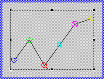
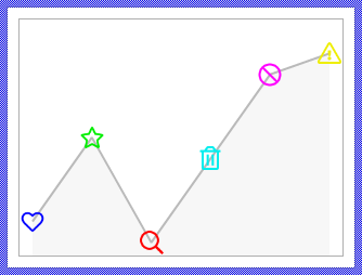
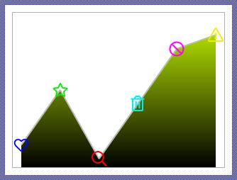
Components created with this template are intended to be adapted to your particular design expectations. After adding the new Line Chart you should edit the component, change its appearance and if desired also its behavior. Once you have adapted the component, you can embed instances of this Line Chart wherever you need in your GUI project. Because it serves as template, it is intentionally kept very simple. Nevertheless, Line Charts created by the template are working widgets. If desired, they can already be used as they are. The following figure demonstrates the default appearance of the Line Chart created by using the here described component template:
The approach with component templates has two functions. Primarily the templates should simplify the development of new components. Instead of creating the Line Chart from scratch you can use the available template. The second function is more educative. The template implements fully working Line Chart component you can investigate and learn about the corresponding programming aspects. The template is well documented. It contains annotations and inline comments with instructions helping you to understand how the component works and how it can be adapted to your particular needs.
This chapter provides an overview how the Line Chart component template is used within your own application and how you adapt this component according to your particular needs. You will find here also further details concerning the internal implementation of the Line Chart component.
The Line Chart component internally manages multiple view instances (image views for data points and path views for line segments) to display the data. Each data point requires its own image view, which means that the more points you need to display simultaneously, the more memory and CPU resources are consumed. Therefore, this chart type is best suited for displaying a limited number of data values at once. The definition of "limited" depends on your target system's capabilities - devices with more CPU power and RAM can handle more complex charts with more data points.
For applications that need to display many data values (e.g., hundreds or thousands of data points), the Graph component template is a more efficient alternative as it uses a different rendering approach optimized for larger datasets. However, keep in mind that even the Graph component requires more CPU processing as the number of displayed values increases.
Add new Line Chart component
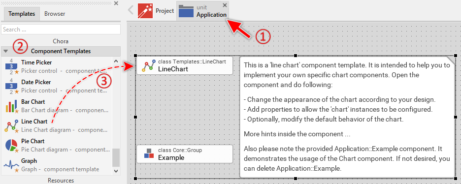
To create a new Line Chart component from a template you simply Drag & Drop it between the Templates window and the Composer with an opened unit. This is important in that by using the component templates you add in fact a new class to your project. Classes, in turn, can exist within units only. The following are the typical steps to create a new Line Chart component from a template:
★First switch to the Composer page for the respective unit, where you want to add the new Line Chart component.
★Then ensure that the Templates window is visible.
★In Templates window switch to the folder Component Templates.
★In the folder locate the Line Chart template.
★Drag & Drop the template into the Composer window:
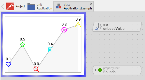
In order to demonstrate the usage of the Line Chart component, the template includes an Example component. This example demonstrates practical usage patterns including how to implement the data loading via OnLoadValue slot method and how to animate point values using animation effects. It is recommended to study this example component before deletion to understand these important concepts. If not needed afterwards, just select and delete the Example class.
★Eventually name the new added component.
The new created Line Chart component appears accompanied by annotation providing helpful tips how to proceed. If undesired, you can select and delete the annotation.
Use the Line Chart component
Once you have created the Line Chart component, you can use it to assemble more complex components. Technically seen, you embed an instance of the Line Chart class in-place within some superior GUI component. At the runtime, the superior GUI component takes care of the correct initialization and the displaying of all embedded components, so they appear similarly as you have composed them at the design time.
Step 1. Add new Line Chart instance
The following are the typical steps to create a new instance of an already existing Line Chart component:
★First switch to the Composer page for the respective GUI component, where you want to add the new Line Chart.
★Then ensure that the Browser window is visible.
★Within the Browser locate the class of the previously created Line Chart. This can be done easily with Browser's own filter function.
★Select the found class in the Browser window.
★Drag & Drop the selected class into the Composer area.
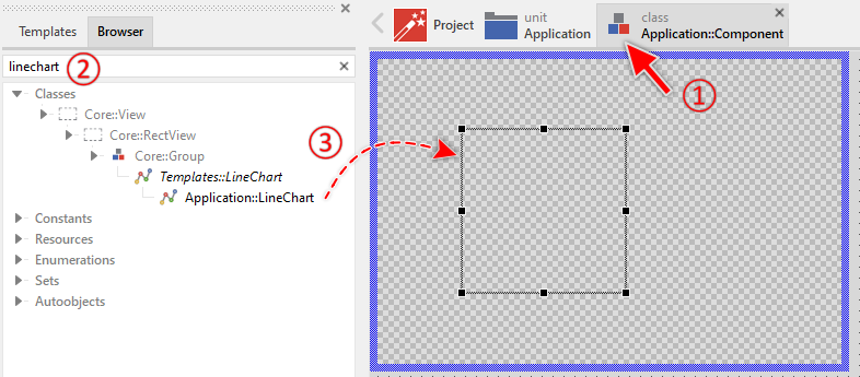
★Eventually name the new instance according to its function within the GUI component.
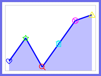
Component templates are intended to create widgets which can be modified and adapted to your particular design expectations. In the following sections you will learn how to do this. Originally, if not yet modified, the Line Chart displays the values as line segments connecting data points, with optional filled area behind the line and bitmap images at each point. Our intention is to keep the component templates as minimalistic as possible so they don't distract you with less important design details.
Please note, the just added line chart is still empty (it does not contain any data). Therefore no line segments or points are shown. To understand how to properly provide data to the chart, it is recommended to study the Example component which demonstrates the implementation of the OnLoadValue slot method and shows how to animate point values.
Step 2. Inspect the Line Chart instance
As long as the Line Chart is selected you can inspect and modify its properties conveniently in the Inspector window as demonstrated with the property Bounds in the screenshot below. This is in so far worth mentioning as diverse features of the Line Chart are controlled by the corresponding properties. If you are not familiar with the concept of a property and the usage of Inspector window, please read first the preceding chapter Compositing component appearance.
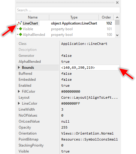
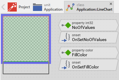
The Line Chart component descends from the Mosaic class Core::Group. Consequently, most of the properties listed in the above screenshot are inherited from this base class. Particular to the Line Chart are only few following properties:
Property |
Description |
|---|---|
FillColor |
The property FillColor stores the color to fill the area behind the line segments. Set to transparent color to disable the fill. |
LineColor |
The property LineColor stores the color to draw the line segments connecting the data points. |
LineWidth |
The property LineWidth stores the width of the drawn line segments expressed in pixel units. |
NoOfValues |
The property NoOfValues stores how many data points are currently managed within the chart component. This value should correspond to the number of data entries the chart presents to the user. |
OnLoadValue |
The property OnLoadValue should refer to a slot method, which will be invoked by the chart component in order to load the data for a given point. The slot method receives no parameters. Instead, within the slot method implementation you access the Index variable to identify which point is being loaded, and set the Value, Color and Frame variables to specify the point's data. |
Orientation |
The property Orientation determines whether the chart should be displayed with normal or rotated orientation. |
PointBitmap |
The property PointBitmap stores the bitmap resource used to display all data points. If the bitmap contains multiple frames, individual frames can be selected for each point by setting the Frame variable in the OnLoadValue slot method. If the bitmap is an alpha-only bitmap, each point can be colorized individually by setting the Color variable. |
Step 3. Arrange the Line Chart within the superior component
Once added to the component, you can freely move the Line Chart instance, or you simply grab one of its corners and resize it in this way. You can control the position and the size of the component also by directly modifying its property Bounds. If you want the Line Chart to appear behind other views you can reorder it explicitly.
Step 4. Determine the number of points and configure appearance
The Line Chart is intended to display multiple data points connected by line segments. The number of points is determined by the widget's property NoOfValues. By evaluating this property you can query how many points are currently displayed in the affected widget. When you modify the property NoOfValues, the Line Chart will automatically update to show the correct number of points and connecting line segments. For example:
// Query the current number of points var int32 count = LineChart.NoOfValues; [...] // Change the number of points to display 8 points LineChart.NoOfValues = 8;
The appearance of the line segments and filled area is controlled by several properties:
Property |
Description |
|---|---|
LineColor |
Specifies the color of the line segments connecting the points. |
LineWidth |
Specifies the width of the line segments in pixel units (minimum value is 1). |
FillColor |
Specifies the color to fill the area behind the line segments. Set to transparent #00000000 to disable filling. |
PointBitmap |
Specifies the bitmap resource used to display all data points. Can be a multi-frame bitmap or alpha-only bitmap for colorization. |
For example, to configure the chart's visual appearance:
// Configure line segment appearance LineChart.LineColor = #0000FFFF; // Blue lines LineChart.LineWidth = 2; // 2 pixels wide // Configure filled area behind the line LineChart.FillColor = #0000FF40; // Semi-transparent blue fill // Configure point markers LineChart.PointBitmap = Resources::SymbolIconsMedium;
The points are arranged automatically within the chart area with equal spacing and are distributed evenly across the available space. The following figures demonstrate different Line Chart configurations:
Step 5. Provide data for the points
The Line Chart loads data dynamically at runtime through a callback mechanism. To provide the data (value, color, and frame number) for each point, you need to implement a slot method and connect it to the chart's OnLoadValue property. The chart will invoke this slot method automatically whenever it needs to load or reload data for a point.
The data exchange between the Line Chart and your slot method uses four variables that are members of the Line Chart component:
Variable |
Description |
|---|---|
Index |
This variable identifies which point is being loaded. The first point has index 0, the second point has index 1, and so on. Your slot method should read this variable to determine which data to provide. |
Value |
This variable should be set by your slot method to specify the vertical (or horizontal for rotated orientations) position of the point. The value ranges from 0.0 to 1.0, where 0.0 means the bottom edge (or left edge for rotated orientations) and 1.0 means the top edge (or right edge). |
Color |
This variable should be set by your slot method to specify the color of the point. This is particularly useful when using alpha-only bitmaps for PointBitmap, allowing each point to be colorized individually. |
Frame |
This variable should be set by your slot method to specify which frame from the PointBitmap should be displayed for this point. This is useful when using multi-frame bitmaps to show different icons for different data points. |
The following example demonstrates a typical implementation pattern:
★First add a new slot method to your GUI component.
★Name the slot method according to its function, for example onLoadPointData.
★Implement the slot method to provide the data based on the Index variable:
// Determine which point is being loaded var int32 pointIndex = LineChart.Index; // Based on the index, provide the corresponding data // Here we access some data source (e.g., array, data model, etc.) var float pointValue = GetDataValue( pointIndex ); var color pointColor = GetDataColor( pointIndex ); var int32 pointFrame = GetDataFrame( pointIndex ); // Assign the data to the Line Chart variables LineChart.Value = pointValue; LineChart.Color = pointColor; LineChart.Frame = pointFrame;
★In the Inspector window when configuring the Line Chart instance, connect the slot method to the Line Chart by assigning it to the OnLoadValue property.
A simpler example without external data sources could look like this:
var float val = 0.0; var color clr = #000000FF; var int32 frame = 0; // Provide data based on point index switch ( LineChart.Index ) { case 0 : { val = 0.3; clr = #FF0000FF; frame = 0; } // Red point at 30%, icon frame 0 case 1 : { val = 0.7; clr = #00FF00FF; frame = 1; } // Green point at 70%, icon frame 1 case 2 : { val = 0.5; clr = #0000FFFF; frame = 2; } // Blue point at 50%, icon frame 2 case 3 : { val = 0.9; clr = #FFFF00FF; frame = 3; } // Yellow point at 90%, icon frame 3 default :; } // Assign the values LineChart.Value = val; LineChart.Color = clr; LineChart.Frame = frame;
When the underlying data changes and the Line Chart needs to update its appearance, you must explicitly request the reload operation by calling the method InvalidateValues. This method accepts two parameters specifying the range of points to reload:
// Reload all points LineChart.InvalidateValues( 0, LineChart.NoOfValues - 1 ); // Reload only points 3, 4, and 5 LineChart.InvalidateValues( 3, 5 ); // Reload a single point (point number 7) LineChart.InvalidateValues( 7, 7 );
After calling InvalidateValues, the Line Chart will automatically invoke your OnLoadValue slot method for each affected point to reload its data. This mechanism allows you to efficiently update only the points that have changed, without needing to refresh the entire chart.
Step 6. Configure chart orientation
The Line Chart can display line diagrams in four different orientations controlled by the property Orientation. This property accepts values from the enumeration Views::Orientation:
Orientation |
Description |
|---|---|
Views::Orientation.Normal |
Points are arranged horizontally from left to right. The Value determines the vertical position (0.0 at bottom, 1.0 at top). |
Views::Orientation.Rotated_90 |
Points are arranged vertically from top to bottom. The Value determines the horizontal position (0.0 at right, 1.0 at left). |
Views::Orientation.Rotated_180 |
Points are arranged horizontally from right to left. The Value determines the vertical position (0.0 at top, 1.0 at bottom). |
Views::Orientation.Rotated_270 |
Points are arranged vertically from bottom to top. The Value determines the horizontal position (0.0 at left, 1.0 at right). |
You can configure the orientation in the Inspector window or programmatically:
// Display line chart with normal orientation (left to right, bottom to top) LineChart.Orientation = Views::Orientation.Normal; // Display line chart rotated 270 degrees (bottom to top, left to right) LineChart.Orientation = Views::Orientation.Rotated_270;
The following figure demonstrates the four different orientations:
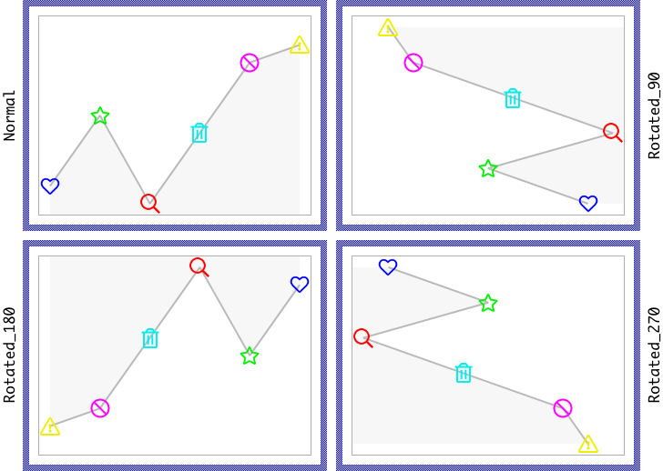
TIP
In its original implementation the orientation doesn't affect the rotation of the images. In following sections you will learn how that can be adapted, if such application case is required.
Open the component for editing
Component templates are intended to create widgets which can be adapted and enhanced to your particular design expectations. For this purpose, once you have added a new Line Chart component to your project, you can open the component class for editing. Thereupon the implementation of the component appears in a new Composer page:
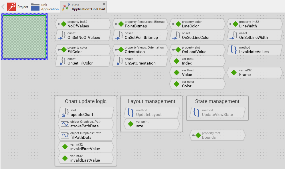
Originally, if not yet modified, the Line Chart appears with an empty canvas area. The line segments and data points are created dynamically at runtime using path-based views and image views. Our intention is to keep the component templates as minimalistic as possible so they don't distract you with less important design details. The line segments are displayed using Views::StrokePath view, the filled area is displayed using Views::FillPath view, and the data points are displayed as Views::Image views, each configured and positioned according to the data provided through the OnLoadValue callback mechanism.
This default functionality is implemented by following members belonging to the Line Chart. These members are explicitly intended to be modified. Understanding this internal structure is thus the first step before you start to adapt the Line Chart to your particular needs:
Icon |
Member |
Description |
|---|---|---|
|
NoOfValues |
The property NoOfValues stores how many data points are currently managed within the chart component. This value should correspond to the number of data entries the chart presents to the user. |
|
OnSetNoOfValues |
The onset method belongs to the property NoOfValues. Each time the value of the property is changed, the code implemented in the method is executed to adjust the internal path data structures and schedule an update of all points. |
|
PointBitmap |
The property PointBitmap stores the bitmap resource used to display all data points. |
|
OnSetPointBitmap |
The onset method belongs to the property PointBitmap. Each time the value of the property is changed, the code implemented in the method is executed to request an update of all points. |
|
LineColor |
The property LineColor stores the color to draw the line segments connecting the data points. |
|
OnSetLineColor |
The onset method belongs to the property LineColor. Each time the value of the property is changed, the code implemented in the method is executed to update the StrokePath view's color. |
|
LineWidth |
The property LineWidth stores the width of the drawn line segments expressed in pixels. |
|
OnSetLineWidth |
The onset method belongs to the property LineWidth. Each time the value of the property is changed, the code implemented in the method is executed to update the StrokePath view's width. |
|
FillColor |
The property FillColor stores the color to fill the area behind the line segments. |
|
OnSetFillColor |
The onset method belongs to the property FillColor. Each time the value of the property is changed, the code implemented in the method is executed to update the FillPath view's color and visibility. |
|
Orientation |
The property Orientation determines whether the chart should be displayed with normal or rotated orientation. |
|
OnSetOrientation |
The onset method belongs to the property Orientation. Each time the value of the property is changed, the code implemented in the method is executed to reload all point data with the new orientation. |
|
OnLoadValue |
The property OnLoadValue can refer to any slot method that should be invoked to load the data for a point. When the Line Chart needs to load data, it will invoke this slot method. |
|
Index |
This variable identifies the point which is about to be loaded by the external slot method OnLoadValue. The external slot method should read this variable to determine which point's data to provide. |
|
Value |
This variable is intended to receive the value for the currently loaded point. The external slot method OnLoadValue should set this variable. The value ranges from 0.0 to 1.0 corresponding to the point's vertical or horizontal position. |
|
Color |
This variable is intended to receive the color for the currently loaded point. The external slot method OnLoadValue should set this variable. The value determines the color of the image frame shown at point's position. |
|
Frame |
This variable is intended to receive the frame number from the PointBitmap for the currently loaded point. The external slot method OnLoadValue should set this variable. |
|
invalidFirstValue |
This internal variable stores the index of the first point which needs an update. Used internally by the update logic. |
|
invalidLastValue |
This internal variable stores the index of the last point which needs an update. Used internally by the update logic. |
|
size |
This internal variable stores the previous size of the chart component. It is used to detect when the component is resized and needs a complete update of all points. |
|
updateChart |
This internal slot method manages the creation, positioning, and updating of all point views and the path data for line segments. It is invoked automatically when points need to be loaded or reloaded. |
|
InvalidateValues |
This method forces the chart component to reload the data for one or more points. It accepts two parameters specifying the range of points to reload. |
|
strokePathData |
This Graphics::Path object stores the coordinates for the line segments connecting the points. The object is used by the StrokePath view. |
|
fillPathData |
This Graphics::Path object stores the coordinates for the filled area behind the line segments. The object is used by the FillPath view. |
|
StrokePath |
This Views::StrokePath view displays the line segments connecting the data points using the coordinates from strokePathData. |
|
FillPath |
This Views::FillPath view displays the filled area behind the line segments using the coordinates from fillPathData. |
|
Outline |
This Outline view serves as the container for all point image views. The Outline manages the points. |
|
UpdateLayout |
This method is invoked automatically after the size of the component has changed. It detects size changes and triggers a complete reload of all points. |
|
UpdateViewState |
This method is invoked automatically after the state of the component has changed. In case of the Line Chart, this method can be used to update the chart's appearance based on state changes (enabled, focused, etc.). |


Understand the chart update logic
The Line Chart component manages data points and line segments dynamically at runtime. Unlike static views that are defined at design time, the points are created, positioned, and removed automatically as needed, and the line segments are calculated and updated in path data structures. This dynamic behavior is controlled by the above mentioned slot method updateChart and the method InvalidateValues.
The update workflow
The update workflow follows these steps:
★When the chart needs to reload data (triggered by property changes or explicit InvalidateValues calls), the variables invalidFirstValue and invalidLastValue are set to mark the range of points that need updating.
★The updateChart slot method is scheduled for execution using postsignal.
★When updateChart executes, it processes all points from index 0 to NoOfValues - 1.
★For each point, the method checks if a Views::Image view already exists. If not, it creates a new one.
★If the point is within the invalidFirstValue to invalidLastValue range, the data is loaded by invoking the external OnLoadValue slot method.
★The point's position is calculated based on the Orientation, Value, and available space.
★The point's color, bitmap, and frame number are updated from the Color, PointBitmap and Frame variables.
★The point's position is stored in the strokePathData object.
★After all points are processed, the fillPathData object is created by copying the strokePathData and adding closing edges to form a closed shape.
★If NoOfValues was reduced, excess image views are removed.
The following code snippet from the updateChart method demonstrates the core update logic:
// Search for already existing Views::Image views var Views::Image view = (Views::Image)Outline.FindNextView( null, Core::ViewState[]); // Process all points for ( i = 0; i < noOfValues; i++ ) { // Should this point be reloaded? var bool reload = ( i >= invalidFirstValue ) && ( i <= invalidLastValue ); // Create new view if needed if ( !view ) { view = new Views::Image; reload = true; view.Embedded = true; Add( view, 0 ); } // Load the data? if ( reload ) { // Query the data from external slot method Index = i; Value = 0.0; Color = #00000000; Frame = 0; signal OnLoadValue; // Limit value to valid range if ( Value < 0.0 ) Value = 0.0; if ( Value > 1.0 ) Value = 1.0; // Update the view's properties view.Bounds.size = pointSize; view.Color = Color; view.Bitmap = PointBitmap; view.FrameNumber = Frame; // Calculate and set the view's position // ... (position calculation code) // Update the position in the path data describing the line segments strokePathData.SetNode( 0, i, x - bounds.x, y - bounds.y ); } // Find next view view = (Views::Image)Outline.FindNextView( view, Core::ViewState[]); } // Create filled area path from line segments fillPathData.Begin ( 0, startX, startY ); fillPathData.AddCopy( 0, strokePathData, 0, 0, strokePathData.GetNoOfEdges( 0 )); fillPathData.AddLine( 0, endX, endY ); fillPathData.Close ( 0 ); // Remove excess views if NoOfValues was reduced while ( view ) { var Core::View tmpView = view; view = (Views::Image)Outline.FindNextView( view, Core::ViewState[]); Remove( tmpView ); }
Point positioning algorithm
The position of each point is calculated based on several factors:
Factor |
Description |
|---|---|
Orientation |
Determines the arrangement direction and which axis the Value affects. |
PointBitmap |
The size of the bitmap determines how much space each point occupies and affects the available drawing area. |
Value |
The normalized value (0.0 to 1.0) determining the point's position along the value axis. |
Available space |
The bounds of the Outline view, reduced by the point bitmap size to ensure points are fully visible. |
Point index |
The position of the point in the sequence, used to calculate spacing along the data axis. |
For example, with Views::Orientation.Normal orientation (left to right arrangement, bottom to top values):
var float x = bounds.x1 + pointSizeX2 + ( ofsX * i ); // X based on index var float y = bounds.y2 - pointSizeY2 - ( rangeY * Value ); // Y based on value // Position image centered at calculated x,y point view.Bounds.origin = point( int32(( x - pointSizeX2 ).round ), int32(( y - pointSizeY2 ).round )); // Store point coordinates in path data (relative to Outline bounds) strokePathData.SetNode( 0, i, x - bounds.x, y - bounds.y );
Path data management
The Line Chart uses two Graphics::Path objects to store the coordinates of the line segments:
Path Object |
Description |
|---|---|
strokePathData |
Contains the coordinates for the line segments connecting the data points. Used by the StrokePath view to draw the lines. |
fillPathData |
Contains a closed shape created from strokePathData plus additional edges to close the area. Used by the FillPath view to fill the area behind the line segments. |
The strokePathData is built incrementally during the point processing loop by calling SetNode for each point. After all points are processed, the fillPathData is created by copying the stroke path and adding closing edges:
// Create filled area based on orientation switch ( Orientation ) { case Views::Orientation.Normal : { // Start at bottom-left, copy all points, close at bottom-right fillPathData.Begin ( 0, pointSizeX2, bounds.h ); fillPathData.AddCopy( 0, strokePathData, 0, 0, strokePathData.GetNoOfEdges( 0 )); fillPathData.AddLine( 0, bounds.w - pointSizeX2, bounds.h ); fillPathData.Close ( 0 ); } // ... other orientations }
Selective updates with InvalidateValues
The InvalidateValues method allows efficient updates of specific point ranges without reloading all points:
method void InvalidateValues( arg int32 aFirstValue, arg int32 aLastValue ) { // Nothing to invalidate if ( aFirstValue > aLastValue ) return; // Remember the range - build union with previously invalidated values invalidFirstValue = math_min( invalidFirstValue, aFirstValue ); invalidLastValue = math_max( invalidLastValue, aLastValue ); // Schedule the update postsignal updateChart; }
This mechanism is particularly useful when animating individual points or updating only a subset of the data. For example, in the Example component, only point #2 is invalidated when the animation effect changes its value:
// Only reload point #2 LineChart.InvalidateValues( 2, 2 );
Adapt the appearance of the component
Originally, if not yet modified, the Line Chart displays points as simple bitmap images connected by line segments, with an optional filled area behind the line. Our intention is to keep the component templates as minimalistic as possible so they don't distract you with less important design details. It's up to you to adapt the widget to have the expected appearance. The available possibilities are explained in the following sections. Please note, that you can combine the different approaches according to your application case:
1. Modify the Outline, StrokePath and FillPath views
The chart component contains three main views that determine its visual appearance:
View |
Description |
|---|---|
Outline |
Defines the area where data points are displayed. Points are managed as children of this view. |
StrokePath |
Displays the line segments connecting the data points. You can adjust its color (LineColor property) and width (LineWidth property). |
FillPath |
Displays the filled area behind the line segments. You can adjust its color (FillColor property) or hide it by setting color to transparent. |
You can adjust these views' size, position, and layout behavior:
★Select the view in the Composer.
★Configure the view's property Layout to control how it resizes when the chart component itself is resized. See Configure the layout of the component for details.
IMPORTANT
The Outline, StrokePath, and FillPath views should have matching bounds to ensure proper alignment of points, line segments, and filled area. If you resize one view, adjust the others accordingly.
2. Replace Image views with other view types
In its default implementation, the Line Chart uses Image views to display data points. You can modify the updateChart method to use other view types instead, such as:
★Rectangle for points as colored rectangles
★Border for points as outlined shapes
★Text for points as text labels displaying values
To replace the view type, follow these steps:
★Open the slot method updateChart for editing.
★Replace all occurrences of Views::Image with your desired view class name. For example, to use rectangle views:
// OLD: var Views::Image view = (Views::Image)Outline.FindNextView( null, Core::ViewState[]); // NEW: var Views::Rectangle view = (Views::Rectangle)Outline.FindNextView( null, Core::ViewState[]);
★Also replace the view creation code:
// OLD: view = new Views::Image; // NEW: view = new Views::Rectangle;
★Replace the view casting in the cleanup loop:
// OLD: view = (Views::Image)Outline.FindNextView( view, Core::ViewState[]); // NEW: view = (Views::Rectangle)Outline.FindNextView( view, Core::ViewState[]);
★Adapt the property assignments to match the new view type. For example, if using Views::Rectangle, you might want to set only the Color property and configure a fixed size:
// Set the rectangle size and color: view.Bounds.size = <10, 10>; view.Color = Color;
★If the new view type doesn't use bitmaps, you can remove the PointBitmap and Frame handling.
3. Customize the point positioning algorithm
The default positioning algorithm distributes points evenly across the available space along one axis, while positioning them according to their Value along the perpendicular axis. You can modify this behavior in the updateChart method to implement custom layouts.
For example, instead of even distribution, you can use fixed pixel spacing:
// Calculate position with fixed 20-pixel spacing between points var int32 spacing = 20; var float x = bounds.x1 + pointSizeX2 + ( i * spacing );
Or you can implement non-linear scaling for the value axis:
// Apply logarithmic scaling to the value var float scaledValue = math_log( Value + 1.0 ) / math_log( 2.0 ); var float y = bounds.y2 - pointSizeY2 - ( rangeY * scaledValue );
4. Modify line segment appearance
Beyond the basic LineColor and LineWidth properties, you can enhance the StrokePath view with additional styling:
★Select the StrokePath view in the Composer.
★In the Inspector window, you can configure additional properties:
★Cap - Controls the appearance of line endpoints (Graphics::PathCap.Flat, Round, Square, Triangle)
★Join - Controls the appearance of line corners (Graphics::PathJoin.Miter, Round, Bevel)
★MiterLimit - Controls the miter join sharpness
For example, to create rounded line segments:
StrokePath.Cap = Graphics::PathCap.Round; StrokePath.Join = Graphics::PathJoin.Round;
5. Add gradient fills
Instead of solid colors for the line segments and filled area, you can use gradient fills by configuring the corner color properties of the StrokePath and FillPath views. Both views provide four color properties that determine the color at each corner of the view's bounds:
Property |
Description |
|---|---|
ColorTL |
Color at the top-left corner of the view. |
ColorTR |
Color at the top-right corner of the view. |
ColorBL |
Color at the bottom-left corner of the view. |
ColorBR |
Color at the bottom-right corner of the view. |
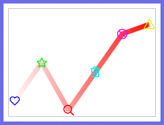
By setting these properties to different colors, you create a four-point gradient that interpolates smoothly between the corner colors. For example, to add a vertical gradient fill to the area behind the line segments, you could adapt the OnSetFillColor method as shown below. This method assigns the specified color value to the top edge of the FillPath view while the bottom edge is configured with black color:
// No changes - nothing to do if ( value == pure FillColor ) return; // Remember the new color. pure FillColor = value; // Adapt the view displaying the filled background segments. // The color is associated to the top edge of the view. // The bottom edge is black resulting in a vertical color gradient FillPath.ColorTL = value; FillPath.ColorTR = value; FillPath.ColorBL = #000000FF; FillPath.ColorBR = #000000FF; FillPath.Visible = value.alpha > 0;
In its original version, the FillPath view is pre-configured with a common transparent color in its property Color. Modifying the individual corner properties will thus has no effect since the resulting color is derived from both values, the common Color and individual (e.g. ColorTL) properties. You will need to correct it:
★Select the FillPath view.
★In Inspector look for the selected view's property Color.
★Click on this property and press the keys CtrlR to restore the original (inherited) value. Alternative, enter the white opaque color #FFFFFFFF in this property.
Similarly, you could modify the Line Chart to display the line segments with a horizontal gradient. To achieve that adapt the OnSetLineColor method as shown below. This method assigns the specified color value to the right edge of the StrokePath view while the left edge is configured with transparent version of the assigned color. In this manner the line segments are faded-in from the left to the right:
// No changes - nothing to do if ( value == pure LineColor ) return; // Remember the new color. pure LineColor = value; // Adapt the view displaying the line segments StrokePath.ColorTL = color( value.red, value.green, value.blue, 0 ); StrokePath.ColorBL = StrokePath.ColorTL; StrokePath.ColorTR = value; StrokePath.ColorBR = value;
The StrokePath is similarly to the FillPath view pre-configured with a common color, here black opaque in its property Color. Modifying the individual corner properties will thus has no effect since the resulting color is derived from both values, the common Color and the individual (e.g. ColorTL) properties. You will need to correct it:
★Select the StrokePath view.
★In Inspector look for the selected view's property Color.
★Click on this property and press the keys CtrlR to restore the original (inherited) value. Alternative, enter the white opaque color #FFFFFFFF in this property.
The following figures show the Line Charts after the above modifications. On the left the filled area appears with a vertical gradient. On the right, the lines appear with a horizontal gradient:
6. Add decorative views to the chart
You can enhance the Line Chart by adding decorative views such as backgrounds, grid lines, axis labels, or legends:
★Add the desired views to the Line Chart component. For example, add Text views for labels or Line views for grid lines.
★Name the added views according to their function (e.g., GridLineHorizontal, AxisLabelY, ChartBackground).
★Arrange and configure the views in the Composer.
★Configure their Layout property to control resizing behavior.
★If the views should update dynamically based on chart data, modify the UpdateViewState or UpdateLayout methods to update their properties.
For example, to add a background grid:
★Add multiple Views::Line views for horizontal and vertical grid lines.
★In the UpdateLayout method, calculate and set their positions based on the current chart size:
// Position horizontal grid line at 25% height GridLine25.Point1 = point( Outline.Bounds.x1, Outline.Bounds.y2 - ( Outline.Bounds.h / 4 )); GridLine25.Point2 = point( Outline.Bounds.x2, Outline.Bounds.y2 - ( Outline.Bounds.h / 4 )); // Position horizontal grid line at 50% height GridLine50.Point1 = point( Outline.Bounds.x1, Outline.Bounds.y2 - ( Outline.Bounds.h / 2 )); GridLine50.Point2 = point( Outline.Bounds.x2, Outline.Bounds.y2 - ( Outline.Bounds.h / 2 )); // Position horizontal grid line at 75% height GridLine75.Point1 = point( Outline.Bounds.x1, Outline.Bounds.y2 - ( Outline.Bounds.h * 3 / 4 )); GridLine75.Point2 = point( Outline.Bounds.x2, Outline.Bounds.y2 - ( Outline.Bounds.h * 3 / 4 ));
Configure the layout of the component
The initial size of the Line Chart is determined by the thick blue border surrounding the Canvas area. It corresponds to the size that all instances of this Line Chart component will have by default. If desired, you can adjust the Canvas area and change this default size accordingly. For this purpose you click and drag the edges of the surrounding border (see also Resize the Canvas area). Once the size is changed, you can then adapt (move, resize) the views existing within the component, particularly the Outline, StrokePath, and FillPath views. For example, to make the Line Chart taller you adjust its bottom edge:
The resulting size of the Line Chart, however, is not necessarily fixed. It can be adjusted for each component instance individually when the instance is arranged within a superior GUI component or it can change dynamically at the runtime. The GUI application can thus contain multiple instances of the Line Chart, each with another size. From this arises the question, how the Line Chart will react to its size alternation?
In case of the Outline, StrokePath, and FillPath views existing per default in the Line Chart template, these views are automatically adjusted to fill the area of the widget. All other views you have eventually added later to the Line Chart are not adjusted automatically.
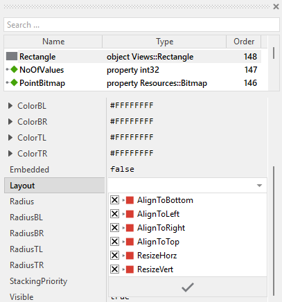
To control the adjustment you have to explicitly configure for each view its Layout property. (see also Configure component layout). Let's assume, in order to display a background decoration you have added a Rectangle view to the Line Chart. Then you have arranged the view within the Canvas area according to your design expectation. If you want now that the view grows and shrinks according to size changes of the Line Chart, you enable in the property Layout of this view following settings:
Now the Line Chart knows how to react to its size changes. Each widget instance can have individual size and the enclosed views are automatically arranged within the available area.
When the Line Chart component is resized, the UpdateLayout method is invoked automatically. This method detects the size change and triggers a complete reload of all points by calling InvalidateValues. This ensures that the points and line segments are repositioned correctly to fill the new available space:
// If size changed, force update of all points if ( size != aSize ) { InvalidateValues( 0, NoOfValues ); size = aSize; }
If you add views that should update their position or size when the chart is resized, you can extend the UpdateLayout method with your own calculations as alternative approach to configuring the view's property Layout. For example, to position a text label at the bottom center of the chart:
// Position caption at bottom center CaptionText.Bounds.origin = point(( aSize.x - CaptionText.Bounds.w ) / 2, aSize.y - 30 ); // Update points if size changed if ( size != aSize ) { InvalidateValues( 0, NoOfValues ); size = aSize; }
Implement the interface of the component
When creating your own Line Chart component you should ensure that instances of the widget can be configured to control all the features implemented in it. For example, if you have enhanced the component to display some caption text or a legend, you should allow this text to be specified individually for each instance. In this way several Line Chart instances can exist at the same time, each displaying another caption or having different visual characteristics.
To control the features in your component you use properties. A property can be understood as variable where the corresponding setting is stored, e.g. the caption text to display in the Line Chart or whether a grid should be visible. When the value of the property changes, the component can react to it and update its appearance accordingly. The properties reflect thus the settings within your widget. Together they form the interface of the component.
Usually, each particular setting within a component is represented by the corresponding property. Thus, a Line Chart where caption and grid visibility can be configured will require two properties: one for the caption text and one for the grid visibility flag. In its original version, the Line Chart contains already six properties NoOfValues, PointBitmap, LineColor, LineWidth, FillColor, Orientation and OnLoadValue. These allow the component instance to configure the number of points, their appearance, line styling, filled area color, orientation, and the data source. In order to enhance this interface by your own properties, following steps are necessary:
★Add a new property to the Line Chart component.
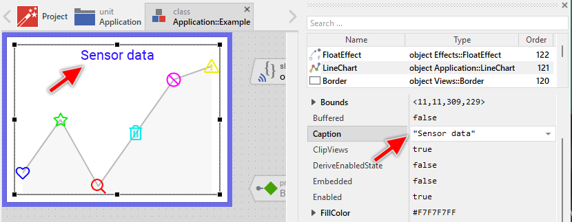
★Name the property according to the setting it should represent. For example, the property intended to store the caption text could be named Caption.
★Determine the data type of the property. For example, the property intended to store the caption text will store a string. A property controlling grid visibility would store a bool.
★Determine the initialization value of the property. This value should correspond to the widget's default state. For example, the property intended to store the caption text should be initialized with exact the string the widget will display if no other text is specified (e.g. "Chart").
★The property is accompanied by its onget method. Except particular cases, this method is not needed and can be deleted now.
★The property is accompanied by its onset method. Open this method for editing.
★Adapt the implementation of the onset method so it updates the Line Chart according to its new value. For example, in case of the property intended to store the caption text, you will probably update some Text view where the caption is displayed:
// The value doesn't change - nothing to do. if ( pure Caption == value ) return; // Remember the property's new value. pure Caption = value; // Update the view to display the just modified caption. CaptionText.String = value;
Another example: if you have added a property to control the visibility of a background grid:
// The value doesn't change - nothing to do. if ( pure ShowGrid == value ) return; // Remember the property's new value. pure ShowGrid = value; // Update the grid lines visibility GridLine1.Visible = value; GridLine2.Visible = value; GridLine3.Visible = value;
That is all. Now when you deal with instances of the Line Chart component, you can evaluate and modify the properties similarly to how you access variables. Especially, when an instance is selected, you see in Inspector window the property and can change it there. The modification is immediately visible in the Composer window:
If desired, the properties can also be modified at the runtime of your application. The caption, for example, can be adapted to provide useful information for the user concerning the displayed data. For this purpose you access and modify the affected property directly within Chora code:
var string sensorName = ... // Let the Line Chart display concrete details about the data source. LineChart.Caption = "Sensor: " + sensorName;
Extend the data loading mechanism
In its original implementation, the Line Chart loads three attributes for each data point: the Value (determining the point's position), the Frame (for selecting a bitmap frame), and Color (for colorizing the frame bitmap). These attributes are stored in the corresponding variables and are set by the external OnLoadValue slot method during the data loading process. If your application requires more sophisticated point representations, you can extend this mechanism by adding additional variables to store extra attributes.
Common scenarios for extending the data loading mechanism include:
★Individual bitmaps for each point (when different points should display entirely different bitmaps, not just different frames)
★Text labels to display on or near each point
★Individual opacity values per point
★Custom tooltips or status information
★Point-specific sizes (when points should have different dimensions)
Adding new data attributes
The following steps demonstrate how to add a new attribute to be loaded for each point. As an example, we will add support for individual text labels displayed next to each point:
★Add a new variable to the Line Chart component.
★Rename the variable according to the attribute it should store, e.g. Label.
★Configure the data type of the variable to match the attribute type. For a text label, use string.
★Open the updateChart slot method for editing.
★In the section where the external slot method OnLoadValue is invoked, initialize your new variable with a default value before calling the slot method:
// Load the data? if ( reload ) { // Query the data from external slot method Index = i; Value = 0.0; Color = #00000000; Frame = 0; Label = ""; // <-- Initialize the new attribute signal OnLoadValue; // ... rest of the code }
★After the OnLoadValue slot method returns, use the new variable to configure additional views or properties. Since we want to display text labels, we need to manage text views alongside the image views. See Managing multiple view types per point for the complete pattern.
★The external OnLoadValue slot method should now set this new variable. Modify your slot method implementation accordingly:
var float val = 0.0; var color clr = #000000FF; var int32 frame = 0; var string label = ""; // Provide data based on point index switch ( LineChart.Index ) { case 0 : { val = 0.3; clr = #FF0000FF; frame = 0; label = "Low"; } case 1 : { val = 0.7; clr = #00FF00FF; frame = 1; label = "High"; } case 2 : { val = 0.5; clr = #0000FFFF; frame = 2; label = "Medium"; } case 3 : { val = 0.9; clr = #FFFF00FF; frame = 3; label = "Peak"; } default :; } // Assign the values LineChart.Value = val; LineChart.Color = clr; LineChart.Frame = frame; LineChart.Label = label;
Using individual bitmaps per point
If you want each point to display a completely different bitmap (not just different frames from the same multi-frame bitmap), add a variable of type Resources::Bitmap:
★Add a new variable named PointIcon with type Resources::Bitmap.
★Initialize it with null in the updateChart method before calling OnLoadValue:
Index = i; Value = 0.0; Color = #00000000; Frame = 0; PointIcon = null; signal OnLoadValue;
★Use the individual bitmap in the view configuration:
// Use individual bitmap if provided, otherwise fall back to PointBitmap property view.Bitmap = PointIcon? PointIcon : PointBitmap;
★In the external slot method, provide the bitmap:
var Resources::Bitmap icon = null; // Select bitmap based on point index switch ( LineChart.Index ) { case 0 : icon = Icons::Temperature; case 1 : icon = Icons::Pressure; case 2 : icon = Icons::Humidity; default :; } LineChart.Value = ...; LineChart.PointIcon = icon;
Managing multiple view types per point
If your points consist of multiple views (e.g., an image for the point marker and a text view for the label), you need to manage both view types in the updateChart method. The simplest approach is to arrange the views pairwise (e.g. Image1, Text1, Image2, Text2, Image3, Text3, ...). This approach requires the loop to be modified to search for views of the common type (Core::View or Core::RectView if all your views are rectangle-based), and then check each view's actual type. Since each point manages two views, you need to call FindNextView twice per iteration.
Here's the general pattern for managing pairwise views:
// Start with the first view in the Outline var Core::View view = Outline.FindNextView( null, Core::ViewState[]); // Process all points for ( i = 0; i < noOfValues; i++ ) { var bool reload = ( i >= invalidFirstValue ) && ( i <= invalidLastValue ); var Views::Image imageView = null; var Views::Text textView = null; // Process the first view (should be the point Image) if ( view != null ) { imageView = (Views::Image)view; // If typecast succeeded, this is an Image view. Then move to the next view if ( imageView != null ) view = Outline.FindNextView( view, Core::ViewState[]); } // If no Image view exists, create one if ( imageView == null ) { imageView = new Views::Image; imageView.Embedded = true; Add( imageView, 0 ); reload = true; } // Process the second view (should be the label Text) if ( view != null ) { textView = (Views::Text)view; // If typecast succeeded, this is a Text view. Then move to the next view if ( textView != null ) view = Outline.FindNextView( view, Core::ViewState[]); } // If no Text view exists, create one if ( textView == null ) { textView = new Views::Text; textView.Embedded = true; textView.Font = Resources::FontSmall; Add( textView, 0 ); reload = true; } // Load the data if needed if ( reload ) { // Query the data from external slot method Index = i; Value = 0.0; Color = #00000000; Frame = 0; Label = ""; signal OnLoadValue; // Limit the resulting value to the range 0.0..1.0. if ( Value < 0.0 ) Value = 0.0; if ( Value > 1.0 ) Value = 1.0; // Update the image view's properties imageView.Bounds.size = pointSize; imageView.Color = Color; imageView.Bitmap = PointBitmap; imageView.FrameNumber = Frame; // Calculate point position based on orientation var float x; var float y; // ... (calculate position as shown in previous sections) // Arrange the image view centered at calculated position imageView.Bounds.origin = point( int32(( x - pointSizeX2 ).round ), int32(( y - pointSizeY2 ).round )); // Update the position in the path data describing the line segments strokePathData.SetNode( 0, i, x - bounds.x, y - bounds.y ); // Update the text view's label textView.String = Label; textView.Color = #000000FF; textView.Font = Resources::FontSmall; // Position the label (e.g., centered above the point. Text width is 40px) textView.Bounds = rect( int32( x.round ) - 20, int32(( y - pointSizeY2 ).round ) - textView.Font.Ascent - textView.Font.Descent, int32( x.round ) + 20, int32(( y - pointSizeY2 ).round )); } } // Create filled area from line segments (same as before) switch ( Orientation ) { case Views::Orientation.Normal : { fillPathData.Begin ( 0, pointSizeX2, bounds.h ); fillPathData.AddCopy( 0, strokePathData, 0, 0, strokePathData.GetNoOfEdges( 0 )); fillPathData.AddLine( 0, bounds.w - pointSizeX2, bounds.h ); fillPathData.Close ( 0 ); } // ... other orientations } // Remove excess views if NoOfValues was reduced // Since each point has 2 views, we need to remove pairs while ( view != null ) { var Core::View tmpView = view; view = Outline.FindNextView( view, Core::ViewState[]); Remove( tmpView ); }
The following figures show the result of this adaptation assuming the OnLoadValue slot method provides for each point the corresponding label text:
Enable scrolling of large Line Chart contents
When your Line Chart needs to display a large number of points that exceeds the available screen space, the recommended approach is to embed the entire Line Chart component within an Outline view. This allows users to scroll through all the chart content interactively.
★Enlarge the Line Chart component to be large enough to display all points correctly. For example, if you want to display 100 points each 25 pixel wide, configure the Line Chart to have the width of 2500 pixel.
★In your superior GUI component (containing the Line Chart instance), add an Outline view that defines the visible area (viewport) for the chart.
★Reorder the Outline view behind the existing Line Chart.
★Set the property Embedded of the Line Chart instance to true. In this manner the instance will be controled by the Outline Box lying beind it. See also Put a view under the control of the Outline Box.
★Add a Slide Touch Handler to enable interactive scrolling through touch gestures.
★Assign the Slide Touch Handler to Outline's property SlideHandler.
★Configure the Slide Touch Handler's properties (SlideHorz or SlideVert) according to the chart orientation.
When implemented this way:
★The Outline view acts as a scrollable viewport that clips the Line Chart to its boundary area.
★The Slide Touch Handler detects touch gestures and updates the Outline's ScrollOffset property.
★The entire Line Chart component (with all its points) moves within the Outline viewport, allowing users to scroll and view all points.
★The Line Chart itself remains unchanged - all its internal logic for point positioning and updates works exactly as before.
Configuration notes
★For vertical orientation (Normal or Rotated_180 orientation):
★Configure the Line Chart width to: NoOfValues * size of a point
★Set SlideHorz = true on the Slide Touch Handler
★The Outline viewport width determines how many points are visible at once
★For horizontal orientation (Rotated_90 or Rotated_270 orientation):
★Configure the Line Chart height to: NoOfValues * size of a point
★Set SlideVert = true on the Slide Touch Handler
★The Outline viewport height determines how many points are visible at once
Additional customization
You can enhance the scrolling behavior by configuring the Slide Touch Handler:
★Configure friction and acceleration to control the scrolling physics and inertia effects.
★Configure snap positions to make scrolling stop at specific points positions for better alignment.
★Configure rubber band behavior to control what happens when scrolling reaches the boundaries.
For detailed information about the Outline view and its scrolling capabilities, please refer to the Outline documentation.